 Over the past two days, I have been discussing a Special College Report article that is in the current issue of Time Magazine (October 7, 2013). It is titled Class of 2025 How They’ll Learn and What They’ll Pay.
Time discusses the debates going on over traditional education with a core curriculum and other academics who would rather have students attend a more specialized set of courses that allows them to set their curriculum. It seems, however, that all parties involved are most concerned with students having the skills to do critical thinking upon graduation which will make them more successful in the work force.
I had two personal life experiences I wanted to share. Last Saturday in Part 1, I discussed a course I took on the History of Napoleon at Texas A&M Univerity in the early 1980s from the late Dr. Shirley Black.
Yesterday in Part 2, I discussed the Time Magazine article, Online learning will make college cheaper. It will also make it better by L. Rafael Reif, President of MIT, Mr. Reif states that “digital learning is the most important innovation in education since the printing press.” He then describes the benefits of digital learning.
Today, in this third part of this series, I am moving ahead in time and discussing a MOOC class I took early this year from Professor Alberto Cairo titled introduction to Infographics and Data Visualization. I am also currently sitting in the latest section of this course Professor Cairo is teaching that began this month.
Alberto Cairo
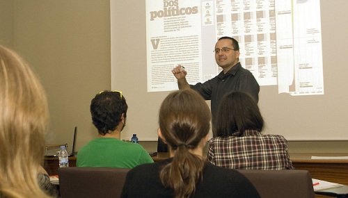 Alberto Cairo is a Professor of the Professional Practice at the School of Communication of the University of Miami. He teaches courses on information graphics and visualization, and is interested in the convergence between visual communication, journalism, cognitive science, cartography, and statistics.
He is the author of the books Infografía 2.0: Visualización interactiva de información en prensa (Alamut, Spain, 2008) and The Functional Art: an Introduction to Information Graphics and Visualization (Peachpit Press/Pearson Education, 2012). He’s working on a new book, tentatively titled The Insightful Art: Storytelling with Data, Charts, Maps, and Infographics, to be published at the end of 2014 by Peachpit Press, too. He’s also the author of a 12-hour video tutorial about how to use Adobe Illustrator to produce information graphics: http://www.thefunctionalart.com/
Between June 2010 and December 2011, Cairo was the director for Infographics and Multimedia at Editora Globo, the magazine division of the biggest media group in Brazil, where he acted as an executive editor for the weekly news magazine Época and as an internal consultant for the other 12 publications of the group. He has also been an assistant professor at the School of Journalism, University of North Carolina-Chapel Hill, between 2005 and 2009. He was the James H. Schumaker Term Assistant Professor in 2008 and 2009.
Alberto Cairo led the creation of the Interactive Infographics Department at El Mundo (elmundo.es, Spain), in 2000. Cairo’s team won more Malofiej and Society for News Design (SND) infographics international awards than any other news organization worldwide between 2001 and 2005.
Cairo has been an invited lecturer and keynote speaker at all most influential international conferences on visual journalism and design. He has taught and consulted for educational institutions and media companies in more than twenty countries.
Professor Cairo’s MOOC Course, Introduction to Infographics and Data Visualization
This course is an introduction to the basics of the visual representation of data. In this class students learn how to design successful charts and maps, and how to arrange them to compose cohesive storytelling pieces. The class will also discuss ethical issues when designing graphics, and how the principles of Graphic Design and of Interaction Design apply to the visualization of information.
The course has a theoretical component, and covers the main rules of the discipline, and also a practical one: to design basic infographics and mock ups for interactive visualizations.
Is this class for me?
This class is tailored for journalists and designers. However, it may be a good fit also for anyone with an interest in the visual display of information.
You do not need any previous experience in infographics and visualization to take this course. With the readings, video lectures and tutorials available through the course, you will acquire enough skills to start producing compelling simple infographics almost right away.
How much time will I need every week?
The answer depends on many factors, including your previous experience in this area. My suggestion is to plan between 6-12 hours of work a week. In most cases, that should be the minimum necessary to read the materials, watch the videos, and complete the assignments.
What will I learn?
-
How to analyze and critique infographics and visualizations in newspapers, books, TV, etc., and how to propose alternatives that would improve them.
-
How to plan for data-based storytelling through charts, maps, and diagrams.
-
How to design infographics and visualizations that are not just attractive but, above all, informative, deep, and accurate.
-
The rules of Graphic Design and of Interaction Design, applied to infographics and visualizations.
-
Optional: How to use Adobe Illustrator for creating infographics.
Signing up
I first found out about the course by visiting Mr. Cairo’s Website, http://thefunctionalart.com, after I had purchased his book to read. I had tried to sign up for the first session of this course taught in 2012, but it filled up very quickly (5,000 students were enrolled). I went on full alert to make sure I was able to sign up for the second offering, which started last January. Even with a cap of 5,000 students, the class filled quickly, but I was quick and able to enroll.
Communication
Mr. Cairo started each week by sending us an e-mail “New message from Alberto Cairo” which had a few notes and a link to the course News and Announcements forum. In the forum, Mr. Cairo posted detailed instructions for the week along with any recommendations and insights into the assignment. Between Mr. Cairo and Rachel Barrera, his Graduate Assistant for the class, I received e-mails every few days to let us know what the expectations were, informational items, etc. I felt the communication level was just right and both of them answered e-mail questions in a very timely manner.
Lectures
The lectures were all taught from video. The MOOC philosophy is to keep lectures around 12 minutes or less in length, which works out to about five videos to watch per hour lecture. The reasoning behind this is that our attention span starts to lapse after 15 minutes, so if the class is broken down into smaller chunks, we are more inclined to watch a shorter session on a particular topic as well as retain the information better. For the first week of class, Mr. Cairo’s videos were 2:32 minutes, 6:17 minutes, 12:03 minutes, 8:04 minutes, 9:51 minutes, 14:20 minutes, and 5:35 minutes. His style of lecture is to tell you a story related to the topic. I found the individual lectures very informative, interesting and the time went by very quickly when watching them.
I was surprised to see one of the week 1 lectures for the current class is 54:38 long. I think the reasoning behind this was it was from a presentation he made at a conference and these are usually around an hour long.
Reading
Mr. Cairo gave us a lot of different materials for reading. For example, in the second week of the course, we were assigned the following:
1. Read the interviews with John Grimwade (Condé Nast Traveler) and Steve Duenes/Xaquín GV (The New York Times).
2. Read Data Visualization for Human Perception, by Stephen Few.
Also, each week, Mr. Cairo would provide us links to additional articles, videos, and blogs he put together. They were optional, but again very useful. He also sent us an e-mail each week of links to other interesting materials to read.
Discussion
Each week, we were required to participate in the discussion forums. Whether it was to post our opinion on a topic or review other classmates assignments, we had to post 2-3 entries each week. At first, I did not think I would like this, but found this to be one of the most enjoyable parts of the class. When reviewing other classmate’s projects and assignments, we had 5,000 different examples to choose from, so there should have been discussions that appealed to everyone. I was very fortunate since the ones I picked were very interesting to read. Since we had a large pool of people from many different walks of life, we had a lot of diversity in why they created the design they did, their personal or professional interest in that topic, and the actual visualization they produced often gave me ideas for projects I was working on at work. Even after I finished my mandatory 2-3 entries to review, I often went back and read others I thought were of interest. For the final assignment we were able to pick our own topic. I frequented the discussion forum a lot just to see the variety of topics and infographics my classmates created. I was a bit frustrated that time did not permit me to view them all.
Quizzes
We had two quizzes early in the class. If you read the materials and watched the lectures, you will have no problem with these.
Projects/Assignments
We had three projects to complete as part of the class. The first was to create a topical interactive graphic. The second was to create a visualization, and the third project was to create an infographic.
I was fortunate that several of my classmates allowed me to blog about their completed assignments. Here are links to a few of these blogs.
- Diana Troncoso’s infographic, Beyond Stealing Bread (Violence in Mexico).
- Jim Uden and Chad Luttrell, A Study of the Effects of Penalties in the NFL
- Gerd Winter, How innovation & labour regulation relate to national wealth
- Soazig Clifton, Teenage Pregnancy in England and Wales
Best Quote
“Christmas cards do not cause Christmas to happen, but the two are highly correlated in time.”
Summary
As I now think back some more on my past experience in Professor Cairo’s MOOC class early this year, I feel that the theme of this blog series was accomplished in that class – that all parties involved are most concerned with students having the skills to do critical thinking upon graduation which will make them more successful in the work force. The assignments in this class provided course content in dozens of small conceptual modules of instruction and building on that through the iteration of immediate practice, feedback and reinforcement. We were able to better retain the concepts and were better prepared to put them into practice once the course was over. I also feel strongly that you will get out of a MOOC course what you are willing to put into it. I took this course very seriously and set my goal of getting the Certificate of Completion for the class (which I did). To get this, I had to do all of the course work. This class was something I wanted to take to enhance my skills as well as my career. I also took this course because I had read Mr. Cairo’s book, The Functional Art, and wanted to learn more from him. In regards to the readings, I was fortunate that I had already read most of Mr. Cairo’s book and had previously read many of the articles he assigned, such as Stephen Few’s material, so the reading assignments were not as steeped for me. However, I did go out and read a lot of the supplemental materials that I found of interest too.
Professor Cairo’s lecture style follows the form of story telling. He told the story about John Snow and the 1854 Cholera Epidemic in London, which made me go out and buy Steven Johnson’s book to read about it in more detail. I also loved the story and explanation of how we interpret circles and why not to use them in data visualizations.
When Mr. Cairo offers his next version of this class, I highly recommend you take it if you have the opportunity (sign up early!) I still find myself longing for more and hope Mr. Cairo or his counterparts like Stephen Few, Nigel Holmes, Colin Ware or Edward Tufte offer similar MOOC courses in the near future.
Tomorrow: My Critique of the Time Magazine Graph
