Over the past three days, I have been discussing a Special College Report article that is in the current issue of Time Magazine (October 7, 2013). It is titled Class of 2025 How They’ll Learn and What They’ll Pay.
The first three parts are as follows:
Part 1, Teaching Methods that involved critical thinking I experienced early in my education when I took a course on the History of Napoleon at Texas A&M Univerity in the early 1980s from the late Dr. Shirley Black.
Part 2, I discussed the Time Magazine article, Online learning will make college cheaper. It will also make it better by L. Rafael Reif, President of MIT, Mr. Reif states that “digital learning is the most important innovation in education since the printing press.” He then describes the benefits of digital learning.
Part 3, I discussed the a MOOC class I took earlier this year from Professor Alberto Cairo titled introduction to Infographics and Data Visualization.
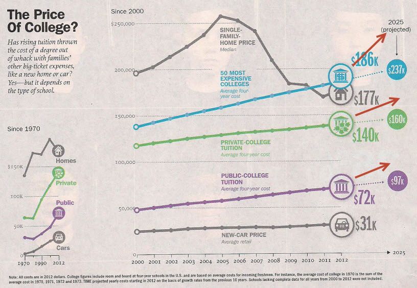
Today, in this fourth and final part of this series, I provide a critique of The Price of College graph from the aforementioned Time Magazine article.
The Price of College Graph
The question the Time magazine graph wants to answer is if rising tuition has made the price of a degree out of reach as opposed to other big-ticket expenses a family would have. The graph is a horizontal line graph with five series: house, 50 most expensive colleges, public tuition, private tuition, and new car price. The series is based on 2012 dollars and runs for 12 years from 2000 – 2012.
I tried to first focus on the lines related to tuition. As we can see, all of them are increasing over the 12-year period. However, the author of the graph then projects what these costs will be by the year 2025, which is the focus of the Special College Report. They show us the projected numbers, but just have then linearly following the path of the existing line. I have shown with red arrow lines where they actually would appear based on the Y axis (cost). I think if they had allowed the lines to increase to its value on the Y axis, the rise of tuition then shows the dramatic increase in the future. More specifically, the 50 most expensive colleges has a dramatic increase.
It would have also been nice to see them also project a single family home and a new car out to the year 2025. I realize the house market is in flux, but again, we are projecting. Will the housing market fully recover and houses double by then? Will new cars continue its incremental increase or will there be a spike upward or downward?
Also, it would be nice to have some indicator that shows that private college tuition is approximately double of public college tuition. Is there a want to quantify (or justify) the additional cost of sending your child to a private school (I’ll pick on my alma mater for this; is four years at Harvard worth the extra cost versus going to Texas A&M?).
The small graph in the bottom left corner is interesting in that it shows the actual increase for the past 40 years. However, should it have been overshadowed by the larger graph in this example or have been shown separately so it is in front and in full focus? Clear, over the 40 year span, all costs are dramatically increasing except for the housing bubble crash of the past 5 years or so.
In Summary
I hope you enjoyed this four-part series on The Class of 2025 and How We Learn. I will be working in New York City the next few weeks and will be blogging about interesting data visualization topics related to New York.
Until next time.
Best Regards,
Michael
