
I hope you enjoyed Part 2 of this series where I discussed the Financial Times Graphic Continuum developed by Dr. Jon Schwabish and designer Severino Ribecca. Later, the Financial Times would develop the Visual Vocabulary poster inspired by the Graphic Continuum (I will discuss this in a little more detail in a minute).
But the main focus of this post is to discuss how Andy Kriebel took the Visual Vocabulary poster and translated it into an interactive chart chooser tool using Tableau. Not only does this help expand chart literacy for visual developers, but each example Andy provides in the various categories visually shows Tableau Desktop developers how to create that chart by reviewing the “code” for that worksheet.
Also, for reference, almost five years ago, I blogged about Andy’s conversion of the Financial Times Visual Vocabulary poster to Tableau. Here is a link to my original post.
The Graphic Continuum evolves into the Visual Vocabulary
Although the Graphic Continuum helped broaden data visualization developers’ knowledge of chart literacy, there was concern that it may have presented an overly simplified and prescriptive view of chart design and usage. Dr. Schwabish even acknowledged it “does not include every type of graphic, nor does it display every link between visualizations”.
Prescriptive analytics is the process of using data to determine an optimal course of action. By considering all relevant factors, this type of analysis yields recommendations for next steps. Because of this, prescriptive analytics is a valuable tool for data-driven decision-making.
Catherine Cote, Harvard Business School Online
Just like the invention of mechanisms for representing language is inextricably related to issues of literacy—that is, to issues of who can use the script and what it can be used for. Competence with the visual language of charts, in both viewing and gaining knowledge from them, is known as chart literacy. High levels of chart literacy are required for using a familiar grammar and syntax for the design and use of different charts for a wide range of categorical meanings and deeper insight. Charts are our words to communicate our analysis of data; just like words and sentences would provide meaning in the English language.
This is analogous to how music composers create music by designing sequences of beats and notes which make up the musical piece. They create and arrange the rhythmic and melodic parts within a musical work using musical notation. Music composition includes setting the key, time signature and tempo.
To address this gap, the Financial Times developed a learning resource inspired by the Graphic Continuum. The FT Visual Vocabulary was at the core of a newsroom-wide training session aimed at improving chart literacy. Their goal was not an attempt to teach everyone how to make charts, but how to recognize the opportunities to use them effectively alongside words.

Andy Kriebel
This is where Andy Kriebel comes in.

Andy Kriebel is the Global Head Coach at The Information Lab Data School. He is a Tableau Zen Master and was inducted into the Tableau Visionary Hall of Fame. Andy’s foray into data visualization began with building project management dashboards for teams in Vietnam in 2005. Andy stumbled upon Tableau in 2007 when he was desperate for help to quickly create dashboards using SSAS cubes (HISTORICAL NOTE: Tableau v3.0 was released in 2007 which introduced dashboards, so Andy was definitely an early user of Tableau Dashboards!). Since then, it’s been Andy’s personal mission to help as many people as possible “see and understand” their data using Tableau. Data is knowledge, but Andy believes that seeing data is insight. Since then, his drive led to a life-changing opportunity at Facebook. In August 2009 he launched vizwiz.com, which provides examples of data visualization best practices, methods for improving existing work, and tips and tricks with Tableau Software. He also has written several blog series including #MakeoverMonday, #TableauTipTuesday and #WorkoutWednesday.
In 2018, Andy started building all of these charts from the FT Visual Vocabulary in Tableau. His goal was to provide everyone in the Tableau Community examples they could use and learn from. He refers to it as a labor of love. He has had this reviewed and vetted by his team at The Information Lab as he iterated his way through creating this.
Per Mr. Kriebel,
There are 72 charts in total, most of which I built myself or with help of tutorials from the community. To build the violin plot, equalized cartogram, and heat map examples, I prepared the data in Alteryx and the output was shape files. The scaled cartogram was built using Tilegrams by Pitch Interactive based on this tutorial from Ken Flerlage.
He also provided a list of people who may not have been the original creators of the charts, but where key resources he relied on to create the charts in his Tableau workbook. He wanted to expand kis skills trying to create charts that were new to him. He learned how to create these charts and passed that knoweldge down to the Tableau community.
| Chart | Person | Link |
|---|---|---|
| Diverging Stacked Bar | Steve Wexler | Data Revelations |
| Surplus/Deficit Filled Line | Jeffrey Shaffer | Data +Science |
| Violin Plot | Ben Moss | YouTube / Alteryx App |
| Sunburst Chart | Leonid Golub | Super Data Science |
| Arc Chart | Ken Flerlage | KenFlerlage.com |
| Venn Diagram | Leonid Golub | Super Data Science |
| Radar Chart | Adam McCann | Dueling Data |
| Scaled Cartogram | Ken Flerlage | KenFlerlage.com |
| Sankey Diagram | Leonid Golub | Super Data Science |
| Chord Diagram | Noah Salvaterra | DataBlick |
The Visual Vocabulary – Tableau Version
Here is a link to Andy’s workbook on Tableau Public.
Tableau Visual Vocabulary Workbook Link
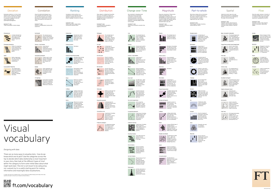
Below is a screenshot of the main page and the nine category of different charts he provides in his workbook.

How to use this workbook
- Start on the Visual Vocabulary tab.
- Click on the text in any section to get to the chart types associated with that topic.
- To go back to the beginning, click on the Visual Vocabulary tab.
- Download the workbook to see how the charts are built. You should be able to swap your data out for any chart type fairly easily.
- Give credit to the creator of the chart as appropriate.
Mr. Kriebel has generously made this workbook available for download. He points out that the creation of this workbook has taken up a tremendous amount of his time, so he would appreciate it not being downloaded and then re-posted as if it’s your own work.
Andy’s Notes
- This is NOT meant to be an exhaustive list of charts that can be built with Tableau. This is based on the charts created by the Financial Times for their Visual Vocabulary.
- Actions can sometimes be quite slow to respond on Tableau Public. If you download the workbook, it will be much more responsive.
- There’s a mobile version as well.
- Images of each set of charts can be found on Google Photos.
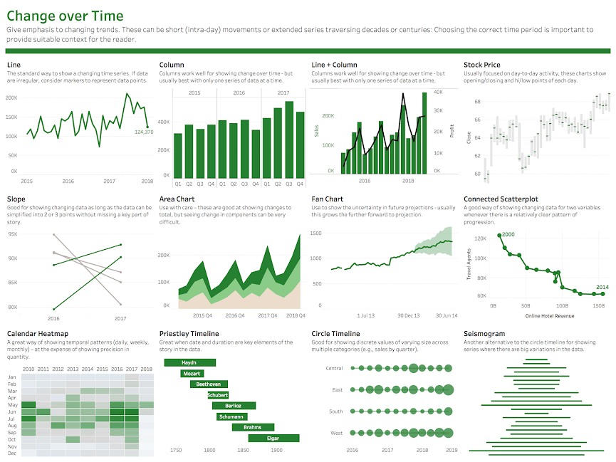
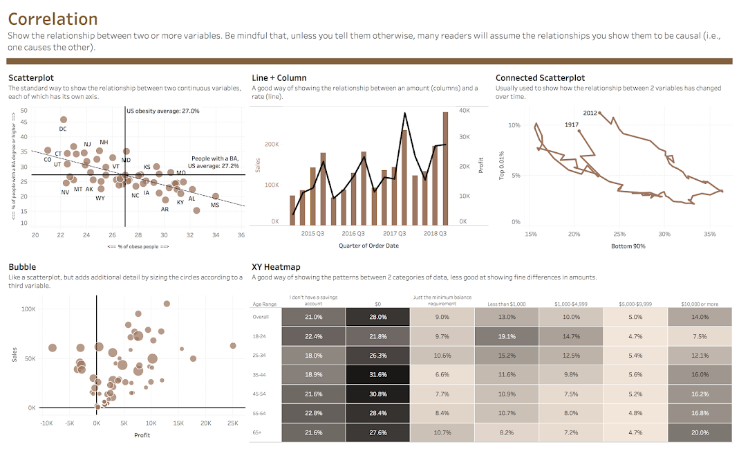
Here are some examples of the chart categories available in this workbook.

The Ultimate Selfless Person
Andy may not remember when we first met, but I do. It was at the 5th Annual Tableau Conference in San Diego in 2012. I ran into a friend of mine, Bryan Brandow, who worked at Facebook. I knew Bryan from our MicroStrategy days. He had seats saved up front to see Malcom Gladwell speak. He introduced me to one of his co-workers at Facebook, Andy Kriebel. I remember Andy waving people down, and saying something like “Hey, come on and sit with us!” This is how I like to think of Andy. Always helping other. The selfless person.
Andy has always been front and center in the Tableau community. Andy is probably one of the main reasons I have a career doing what I love to do; visualizing data using Tableau (shoutout to Jim Dehner, Ken Flerlage, Kevin Flerlage, Luke Stanke, Bridget Cogley, and Joshua Milligan too – you all got me here too!). Andy has always shared his thoughts, insights and examples with the Tableau community. He is generous with his knowledge and collaborates with the community as you can see from the list of great people he worked with on this. He has been a tireless champion for Tableau and the community at large. All of us in the Tableau community owe him a debt of gratitude for his energy, passion and collaborative nature.
WHAT’S AHEAD IN THIS SERIES?
As I mentioned in Parts 1 and 2, there is so much to tell you about these pioneers in Chart Literacy. In some cases, I am just scratching the surface. I provide the sources for my research below and encourage you to review the more detailed information they provide.
Here are some of the future parts of this series (I will post Part 4 in May after TC23). NOTE: I am trying to post the parts of this series in historical chronological order. I have added the year after each part for reference below.
- Part 1: Chart Suggestions-A Thought-Starter – Dr. Andrew Abela (2009)
- Part 2: Financial Times, Jonathan Schwabish and The Graphic Continuum (2014)
- Part 3: Financial Times Visual Vocabulary: Tableau Edition – Andy Kriebel (2018)
- Part 4: Which Visualization? A Quick Reference – Steve Franconeri (2019)
- A beautiful color poster showing all the chart choices (chart.guide)
- JLL Business Intelligence Style Guidance for Tableau (JLL / Simon Beaumont)
- Qualitative Chart Chooser 3.0 (Jennifer Lyons & Stephanie Evergreen)
- The Tableau Chart Catalog (The Flerlage Twins)
I hope you will continue to follow me on this journey, ask questions, offer your thoughts and feedback on the different methodologies. What a great time to be in the field of data visualization!
Best Regards and Happy Vizzing,
Michael
SOURCES
- Smith, Alan, Simple techniques for bridging the graphics language gap, Financial Times, August 17, 2016, https://www.ft.com/content/304419ec-63a3-11e6-8310-ecf0bddad227.
- –, Literacy: the uses of writing, Britannica, https://www.britannica.com/topic/writing/Literacy-the-uses-of-writing.
- Kriebel, Andy, What I learned from recreating the Financial Times’ Visual Vocabulary in Tableau, Tableau.com, September 27, 2018, https://www.tableau.com/blog/what-i-learned-recreating-financial-times-visual-vocabulary-tableau-94516.
- ToTheBeat, Composers and Authors: How to Make Music, magicinmusic.com, July 31, 2020, https://magicinmusic.com/composers-and-authors/.
- –, Information Lab Team, The Information Lab UK, https://www.theinformationlab.co.uk/team/.
- Kriebel, Andy, About Me, Vizwiz.com, https://www.vizwiz.com/p/history.html.
