
Readers:
Previously, The Financial Times Graphics team created the Visual Vocabulary to help provide us good choices when we need to create data visualizations. From Dr. Andrew Abela, who in 2009 released his diagram, titled “Chart Suggestion—A Thought Starter” to Stephen Few who has provided us chart choice guidance over the years, we have been searching for the grail or wisdom for which chart would be the best one for us to use for our dataviz purposes.
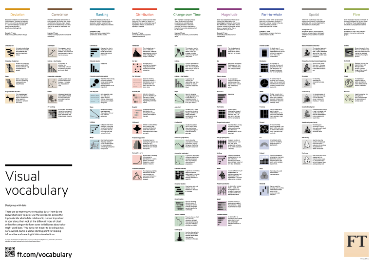
Here is a screenshot of the Visual Vocabulary published by The Financial Times Graphics team.
Over the past month, Andy Kriebel has been building all of these charts in Tableau so that everyone in the Tableau Community would have examples they could use and learn from. He refers to it as a labor of love. He has had this reviewed and vetted by his team at The Information Lab as he iterated his way through creating this.
Per Mr. Kriebel,
There are 72 charts in total, most of which I built myself or with help of tutorials from the community. To build the violin plot, equalized cartogram, and heat map examples, I prepared the data in Alteryx and the output was shape files. The scaled cartogram was built using Tilegrams by Pitch Interactive based on this tutorial from Ken Flerlage.
He also provided a list of people who may not have been the original creators of the charts, but where key resources he relied on to create the charts in his Tableau workbook.
|
Chart
|
Person
|
Link
|
|---|---|---|
| Diverging Stacked Bar | Steve Wexler | Data Revelations |
| Surplus/Deficit Filled Line | Jeffrey Shaffer | Data +Science |
| Violin Plot | Ben Moss | YouTube / Alteryx App |
| Sunburst Chart | Leonid Golub | Super Data Science |
| Arc Chart | Ken Flerlage | KenFlerlage.com |
| Venn Diagram | Leonid Golub | Super Data Science |
| Radar Chart | Adam McCann | Dueling Data |
| Scaled Cartogram | Ken Flerlage | KenFlerlage.com |
| Sankey Diagram | Leonid Golub | Super Data Science |
| Chord Diagram | Noah Salvaterra | DataBlick |
The Visual Vocabulary – Tableau Style
First, here is a link to Andy’s workbook on Tableau Public.
Tableau Visual Vocabulary Workbook Link
Below is a screenshot of the main page of his workbook.
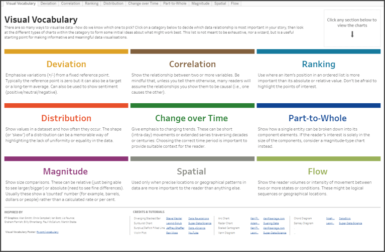
How to use this workbook
- Start on the Visual Vocabulary tab.
- Click on the text in any section to get to the chart types associated with that topic.
- To go back to the beginning, click on the Visual Vocabulary tab.
- Download the workbook to see how the charts are built. You should be able to swap your data out for any chart type fairly easily.
- Give credit to the creator of the chart as appropriate.
Mr. Kriebel has generously made this workbook available for download. He points out that the creation of this workbook has taken up a tremendous amount of his time, so he would appreciate it not being downloaded and then re-posted as if it’s your own work.
Andy’s Notes
- This is NOT meant to be an exhaustive list of charts that can be built with Tableau. This is based on the charts created by the Financial Times for the Visual Vocabulary.
- Actions are quite slow to respond on Tableau Public. If you download the workbook, it’s much more responsive.
- There’s a mobile version as well.
- Images of each set of charts can be found on Google Photos.
In Closing
 Mr. Kriebel has always shared his thoughts, insights and examples with the Tableau community. He is generous with his knowledge and collaborates with the community as you can see from the list of great people he worked with on this. All of us in the Tableau community owe Mr. Kriebel a debt of gratitude for his energy, passion and collaborative nature.
Thanks, Andy!
