
I hope you enjoyed Part 1 of this series where I discussed Dr. Andrew Abela’s Chart Suggestions-A Thought-Starter tool for choosing the best chart to visualize your data. As I described, you would select the best answer to a few questions, and then you would be able to determine the best chart(s) for your data visualization. Choosing the right chart for data visualization is key to providing a more immediate grasp by the viewer of what information the chart is trying to convey. This will help them gain quicker insight and make better actionable decisions.
Almost five years ago, I blogged about Andy Kriebel’s conversion of the Financial Times Visual Vocabulary to Tableau. Here is a link to my original post. Before I discuss Andy’s Tableau version (that will be Part 3 later this month), let me discuss what drove the creation of the original Financial Times Graphic Continuum by Jon Schwabish and designer Severino Ribecca.
Financial Times Graphic Continuum
In September 2015, the Pew Research Center did some analysis that suggested, overall, only 63 percent of American adults can correctly interpret a scatter plot, a relatively common type of chart for showing the relationship between two variables. The figure was higher (79 percent) for college graduates, but only half of those with a high school education or less could read the chart correctly.
Based on this statistic, we may be tempted to just exclude charts that are more complex from our data visualizations. We would have a world where scatter plots would be excised from the common vocabulary of newspapers, business reports and presentations. But such charts can succinctly illustrate complex stories we may not be able to do with other charts or words alone. As the Financial Times points out as an example, their scatter plot relating to the referendum on EU membership, by John Burn-Murdoch, was their top-performing tweet of all 24,000 published by the Financial Times for 2016.
The Pew research suggests that education is important. Back in 2016, most students of certain subjects such as science, economics, and mathematics, spent a portion of their studies learning how to create charts and chart interpreting skills, but for many of the other educational disciplines, these skills were not emphasized or even taught at all.
However, in 2016 (and even today in 2023), a more serious problem is the lack of Chart Literacy. Professionals who may have learned how to create charts and data visualizations may have never learned how to effectively present data visually to non-expert audiences.
This is where Jonathan Schwabish comes in.

Before, I discuss what Dr. Schwabish created to help solve this problem, let me tell you a bit about him.
Jonathan Schwabish is an economist by training with an M.A. and Ph.D. in Economics from Syracuse University and an undergraduate degree in Economics from the University of Wisconsin at Madison. In 2010, Dr. Schwabish was working at the Congressional Budget Office (CBO) in Washington when he attended a workshop held by Edward Tufte, who is consider the Father of Data Visualization (see my blog post on Dr. Tufte from 2013 here). The workshop inspired Dr. Schwabish, and he saw it as an opportunity to extend his role at CBO as technical reviewer of research documents into broader areas of presentation and communication. He started to work on improving the visual presentation of CBA analysis. His work caught others’ attention, and it even impacted the transformation of technical 70-page documents into shorter, focused, visually led pieces, which even resulted in infographics being used in Congress during budget debates.
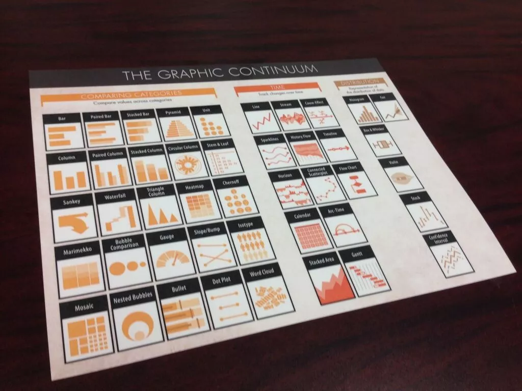
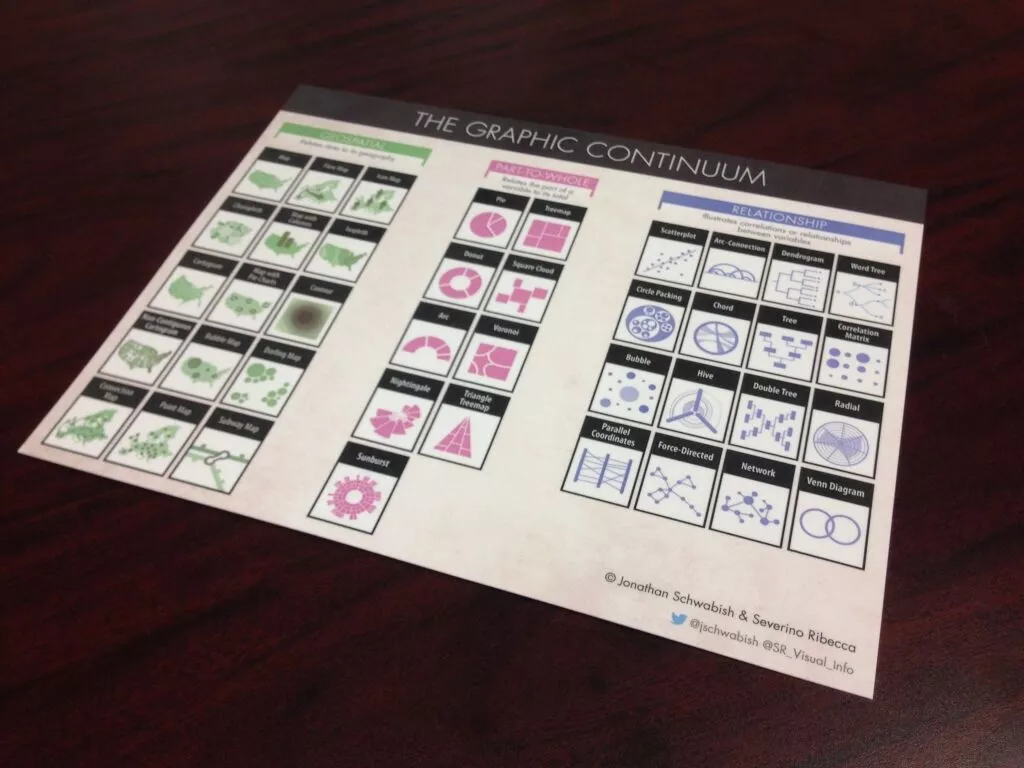
To address this gap in chart literacy, Dr. Schwabish worked with designer Severino Ribecca to create the Graphic Continuum. He describes it as
“Our view of the many different types of visualizations available to us when we encode and present data. We’ve plotted nearly 90 different graphics across five main categories: Distribution (Time), Comparing Categories, Geospatial, Part-to-Whole, and Relationships. The space does not include every type of graphic, nor does it display every link between visualizations, but we view it as a thought-starter. We hope readers will use it to develop ideas, consider different options, or simply as a piece of art.”
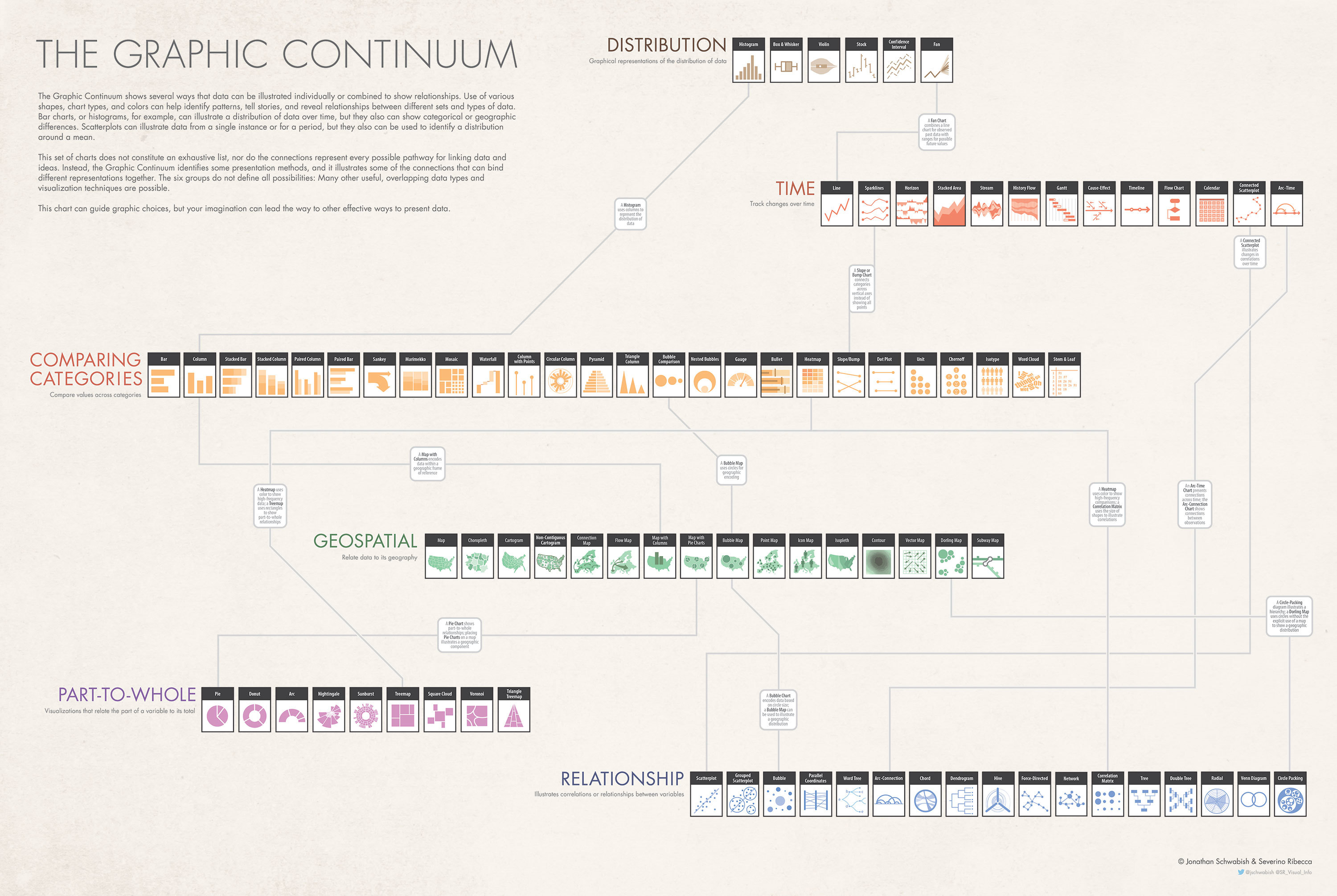
Also, the Graphic Continuum helps to guard against xenographphobia, a term used by the journalist Maarten Lambrechts to describe a fear of unusual graphics.

In 2014, Dr. Schwabish and Severino Ribecca won the Bronze, in the Infographic category, for that year’s KANTAR Information is Beautiful Awards.
Designer Severino Ribecca (photo on left) described data visualization this way.
I believe data visualisation to be an important tool to educate and inform people on complex subjects. By making information more visual, people can understand a difficult topic a lot quicker than reading through large paragraphs of text or massive spreadsheets.
Later that year, Dr. Schwabish and Severino Ribecca released the Graphic Continuum – Desktop Version.
WERE ANY NEW CHART TYPES INTRODUCE IN THE GRAPHIC CONTYINUUM?
Yes, the category Geospatial was added. Tableau describes Geospatial Visualization as follows,
These visualizations focus on the relationship between data and its physical location to create insight. Any positional data works for spatial analysis. What makes geospatial visualizations unique is the scale. A diagram of circuits on a microchip explores position, but it is not geospatial. It does not map to Earth or another planetary body. A map of the stars is also not considered geospatial, but a map of the surface of Mars is. Geovisualization overlays variables on a map using latitude and longitude to foster insight.
Maps are the primary focus of geospatial visualizations. They range from depicting a street, town, or park or subdivisions to showing the boundaries of a country, continent, or the whole planet. They act as a container for extra data. This allows you to create context using shapes and color to change the visual focus. They help identify problems, track change, understand trends, and perform forecasting related to specific places and times.
Today, Dr, Schwabish continues to work to communicate his research in better ways and to help others do the same. He currently is a Senior Fellow in The Urban Institute’s Income and Benefits Policy Center. He is also a member of the Institute’s Communication team where he specializes in data visualization and presentation design. On his web site, PolicyViz, he shares blog posts and tutorials on aspects of data visualization and data communication, as well as hosts his popular PolicyViz Podcast. Through each of these efforts, he is interested in helping others do a better job communicating their data. He also offers teaching, speaking, and consulting services to reach beyond what he can offer on his website.
WHAT’S AHEAD IN THIS SERIES?
As I mentioned in Part 1, there is so much to tell you about these pioneers in Chart Literacy. In some cases, I am just scratching the surface. I provide the sources for my research below and encourage you to review the more detailed information they provide.
Here are some of the future parts of this series (I will post Part 3 later this month).
- Part 1: Chart Suggestions-A Thought-Starter – Dr. Andrew Abela
- Part 2: Financial Times, Jonathan Schwabish and The Graphic Continuum
- Part 3: Financial Times Visual Vocabulary: Tableau Edition – Andy Kriebel
- A beautiful color poster showing all the chart choices (chart.guide)
- JLL Business Intelligence Style Guidance for Tableau (JLL / Simon Beaumont)
- Which Visualization? A Quick Reference (Steve Franconeri)
- Qualitative Chart Chooser 3.0 (Jennifer Lyons & Stephanie Evergreen)
- The Tableau Chart Catalog (The Flerlage Twins)
I hope you will continue to follow me on this journey, ask questions, offer your thoughts and feedback on the different methodologies. What a great time to be in the field of data visualization!
Best Regards and Happy Vizzing,
Michael
SOURCES
- Smith, Alan, Simple techniques for bridging the graphics language gap, Financial Times, August 17, 2016, https://www.ft.com/content/304419ec-63a3-11e6-8310-ecf0bddad227.
- Jonathan Schwabish, About, PolicyViz.com, https://policyviz.com/about/.
- Data Visualization Society, 2014 Information is Beautiful Awards, The Graphic Continuum — Information is Beautiful Awards.
- –, A Guide To Geospatial Visualizations, Tableau Software (A Salesforce Company), https://www.tableau.com/data-insights/reference-library/visual-analytics/geospatial.
- Ribecca, Severino, Web Site, http://www.severinoribecca.one/.
