Choosing the right chart for data visualization is key to providing a more immediate grasp by the viewer of the chart along with them being able to gain insight quicker to make actionable decisions.
It has been 10 years since I first blogged about how to choose the best chart for data visualization. Dr. Andrew Abela’s Chart Suggestions-A Thought-Starter was one of the first chart help guides I came across and it helped me immensely. Here is a link to my original post.
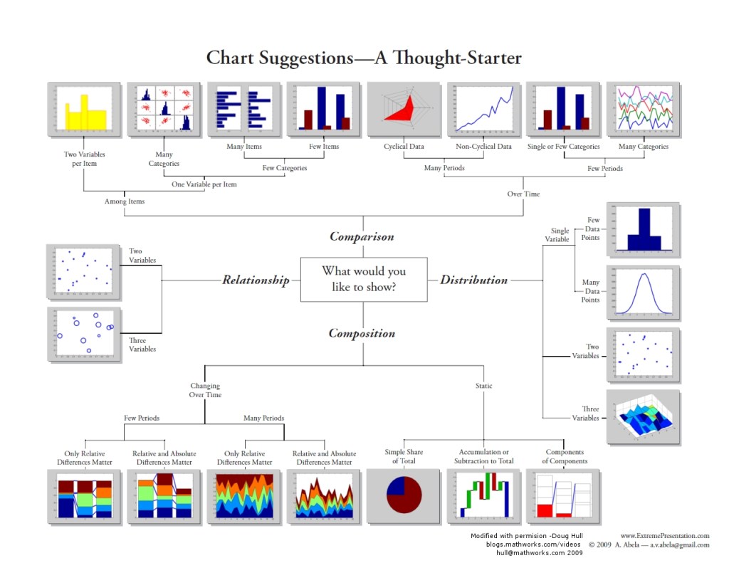
Dr. Abela’s chart chooser is probably the best known one throughout the Data Visualization & Analytics worldwide community. He originally created it in 2009 as part of the Extreme Presentation Method (NOTE: The version I show below is a later version created by Doug Hull and is in color. Dr. Abela’s original version was in grayscale). To put this in perspective, it has only been a mere 14 years that we have had a chart chooser tool such as this to help guide us in selecting the best chart to visualize data for insight. I would like to think we are still early on our chart choosing journey today.

What are the chart types?
Dr. Abela’s chart chooser starts by asking you a question: “What Would You Like to Show?“, and based on how you answer this question, the charts can be grouped into four types (NOTE: We will discuss later in this series how this grouping has evolved over time).
Comparison: This is when we want to compare the different categorical values or attributes within the data with each other. There are some variants, depending on the data. For example: Does the data include the time variable? How many time periods? How many variables and categories does the data present?
Composition: This is when we want to know how the data is composed, that is, what general characteristics are present in the data set. There are some variants, depending on the data. For example: Are there changes over time? How many time periods are there? In static data, do you have values that accumulate?
Distribution: This is when we want to understand how the individual data points are distributed within the entire data set. Depending on the number of variables in which we want to analyze the distribution, we can choose bar charts, line charts or scatter charts.
Relationship: In this case, we are interested in knowing how the values and attributes are related to each other. To relate the values, scatter charts are usually used when two variables are involved, and bubble charts are used when three variables are involved.
Of these four types, it is likely that the majority of questions are addressed best by the first two types, Comparison and Composition, unless you have advanced statistical analysis needs.
Most questions can be solved with a few types of basic charts, although multiple variants can be applied for each specific situation. We can say that the most used charts are those of bars and lines and all their variants (horizontal or vertical, simple or stacked, etc.). When a high degree of detail is required, the data table is generally used.
What’s Ahead in This Series?
When I sat down to write this blog post, I naively thought I would be able to talk about this in a single post. However, I have so much more to tell you. There are some wonderful chart choosers that have been created since Dr. Abela created his chart chooser in 2009. Beautiful insightful, colorful posters, interactive chart choosers written in Tableau, and even chart choosers as part of a corporate style guide within a Center of Excellence.
Here are some of the future parts of this series (in no particular order).
- Financial Times Visual Vocabulary: Tableau Edition (Andy Kriebel)
- A beautiful color poster showing all the chart choices (chart.guide)
- JLL Business Intelligence Style Guidance for Tableau (JLL / Simon Beaumont)
- Which Visualization? A Quick Reference (Steve Franconeri)
- Qualitative Chart Chooser 3.0 (Jennifer Lyons & Stephanie Evergreen)
- The Tableau Chart Catalog (The Flerlage Twins)
Over the next few weeks (months?), I will be discussing these various chart choosers, comparing and contrasting what each one has to offer. I hope you continue to follow me on this journey, ask questions, offer your thoughts and feedback on the different methodologies.
Best Regards and Happy Vizzing,
Michael
Sources
- Abela, Dr. Andrew, Chart Suggestion-A Thought-Starter, ExtremePresentation.com, 2009, https://extremepresentation.com/.
- Hull, Doug, Choosing a visualization in MATLAB, MathWorks, April 26, 2012, https://blogs.mathworks.com/videos/2012/04/26/choosing-a-visualization-in-matlab/?s_tid=srchtitle_chart%20choose_2.
- Morales, Jose Miguel, How to choose the right chart for your data, biuwer.com, June 29, 2020, https://biuwer.com/en/blog/how-to-choose-the-right-chart-for-your-data/.

