Brian Moore Bio
I am a senior Data Visualization & Analytics Consultant at Cleartelligence, Inc., a co-organizer of the Boston Tableau User Group, a co-organizer of #TheSDGVizProject, and all-around Tableau Fanatic. I have been working with data in various analytical roles for over a decade but was introduced to Tableau about 5 years ago by my incredibly talented wife, Jacqui Moore (she taught me everything I know 😉). Since then, my career has been centered around Data Visualization, but it wasn’t something I was really passionate about until about a year ago when I discovered the incredible online community (again, thanks to my wife). To say that the community has motivated and inspired me would be a serious understatement. Now, I spend my days building dashboards for clients and my nights building dashboards for community projects, data viz competitions, and mostly, just for fun.
QUESTIONS
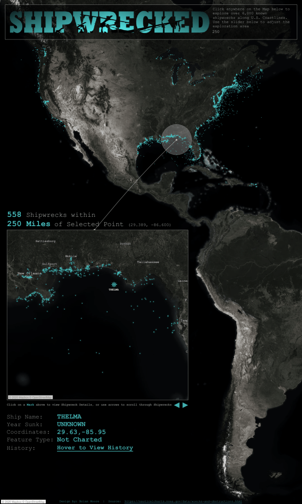
Link: https://public.tableau.com/profile/brian.moore7221#!/vizhome/Shipwrecked_15850880498570/Shipwrecked
Michael: Hello, Brian. I loved your #IronQuest submission, Shipwrecked. I am a big follower of stories on the findings of sunken ships. I had the good fortune of meeting Dr. Robert Ballard many years ago after he found the Titanic. Can you tell my readers the process you followed to develop this (e.g., find the data, analyze, and design the dataviz)?
Brian:
Thank you, Michael! I’ve had this idea kicking around for a while now. A friend of mine has this picture in her living room with data on shipwrecks in the Great Lakes.

The first time I saw it, I knew I wanted to build a Shipwreck viz in Tableau. I had it on the backburner for a while, but when the March #IronQuest topic was announced I knew it was time to start looking for some Shipwreck data.
At first, I was hoping to find a global dataset but I kind of knew that that was wishful thinking. After checking Kaggle and Data.World, a quick Google Search on “Shipwreck Data” brought me to the National Oceanic and Atmospheric Administration website. There, I found an open dataset with over 10,000 shipwrecks identified by the AWOIS (Automated Wreck and Obstruction Information System). There wasn’t enough information on each wreck to do much in-depth analysis, but it did have the location data, which was what I was most interested in.
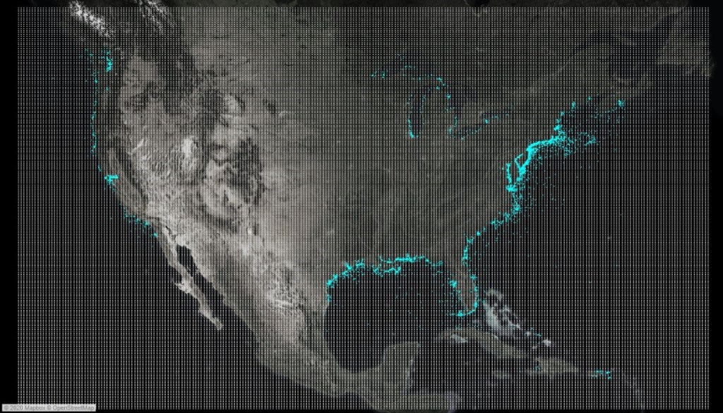
I wanted the viz to be very interactive, something that would really let users explore the data. Ken Flerlage, in his post Fun With Tableau 2019.2 Parameter Actions shared a really cool technique, combining parameter actions and an invisible grid that would capture the x and y coordinates of wherever the user placed their mouse. In my case, I created a grid of 62,500 lat/lon points covering the entire Contiguous U.S. Here’s what the map looks like with the grid visible.
This technique lets users click anywhere on the map, whether or not any shipwrecks exist at that point. Then I used parameter actions to capture that latitude and longitude in two parameters and used a buffer calc to display the circle around the selected point, and as a filter to “zoom” into that area in the lower map. Lastly, I used a couple more parameter actions along with some rank and distance calcs, to let users “scroll” through all of the shipwrecks in the selected area.
The final design, as usual, looked absolutely nothing like my original vision. For a while I was playing with the idea of designing it like a vintage nautical map. I had some nice design elements built for that idea, but with my limited MapBox knowledge, I wasn’t able to build a map that fit well with that style. But as I was playing around in MapBox I kind of stumbled into building this black and white satellite view. After that, it was just a matter of picking a mark color that really “popped”, adding some effects to make the marks “glow” a little bit (thank you to Vinodh Kumar for help with that), and then building a header that incorporated the mark color and the theme of the dashboard.
Michael: You are a Senior Data Viz & Analytics Consultant at Cleartelligence. Can you discuss how you use Tableau in your consultant role?
Brian:
I’ve only been at Cleartelligence for a few months, but I can honestly say I’ve never worked with so many just absolutely brilliant people. It really is an all-star team. We have experts specializing in every aspect of the data landscape, from data engineering to predictive analytics and everything in between. My focus is mainly on Data Prep and Data Visualization using a combination of Alteryx and Tableau.
Before joining Cleartelligence, I had always worked at companies with pretty mature Tableau implementations and data structures to support it. The awesome thing about being a consultant is that you get to help companies really see and interact with their data for the first time. Picture a customer that spends 10-20 hours a week manually aggregating data from a bunch of spreadsheets to create a bunch of static bar charts, copying those into separate PowerPoint slides and then emailing them out to different distribution lists due to security concerns. Now picture that same customer’s face when you automate that process and provide a suite of branded, interactive and permissioned dashboards with subscriptions, email alerts, and mobile access. That wide-eyed, astonished stare is what I love about Tableau and what I love about being a consultant.
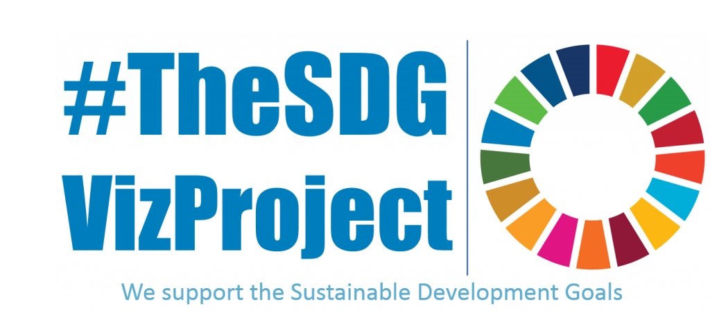
Michael: You recently started #TheSDGVizProject. Can you tell my readers a bit about this project and how they can help?
Brian:
Absolutely! #TheSDGVizProject is a community project that my wife Jacqui, my good friend Vinodh Kumar, and I launched back in February. For anybody not familiar with the Sustainable Development Goals (SDG’s), it’s a set of 17 comprehensive and interconnected Global Goals developed and adopted by all of the U.N. countries in 2015 as part of a 15-year plan to improve the lives and prospects of all people.

The Goals are incredibly important, literally aimed at making the world a better place for everyone, but the majority of people that I’ve talked to about the SDG’s have never heard of them. There has been a global call to action to get more people involved and that’s what we’re trying to do. Each month we focus on one of the 17 goals, we blog about the status of the goal, we share related data sets, we build and share data visualizations and encourage the community to do the same, and we blog about ways that we are contributing to the goal and ways that the community can as well.
The project is only a few months old, but we’ve been blown away by how well it’s been received and by the level of participation we’ve had so far. The next step for the project is to start partnering with more organizations and other community projects to help expand the project’s impact and its reach. This month alone we started working with The Centre for Humanitarian Data, under the United Nations’ Office for the Coordination of Humanitarian Affairs, to start providing more diverse datasets related to each month’s goal, and we’re partnering with Lindsay Betzendahl and #ProjectHealthViz. So, this is a really exciting month for us and we have some more exciting announcements in the coming months.
There are a lot of ways that our community can participate in #TheSDGVizProject. If you’re able to build a viz, that’s amazing, but we know not everyone has time for that. One of our main goals is to spread awareness so if you see a viz tagged with #TheSDGVizProject, please like it, share it, amplify it in whatever way you can. But perhaps the best way to participate in the project is to contribute to that month’s goal directly. Read our monthly blog on ways that you can contribute, commit to one of the actions, and please, let us know about it! See our website for more information on the project!
Michael: You are co-organizer of the BostonTUG. Can you tell my readers a bit about the BostonTUG and the kinds of activities you have each month?
Brian:
The BostonTUG is incredible. We are very fortunate to have such a large and active local Tableau community, as well as an amazing leadership team. We really like variety and try as much as possible to mix up the events we hold each month. We’ve had workshops, expert panels, Data Viz competitions, hack-a-thons, keynote presentations from data experts around the world, we really try to do something different every time. We’re also fortunate to have a large network of really supportive local business, sponsors, and community members that give us access to a wide variety of venues, so we’re able to go to a brand-new location for nearly every event. Probably the only consistent thing between events is our focus on the community, which is why we kick off every event by shining a spotlight on one of our community members in our series of #WickedVizzah presentations.
We had some truly incredible events planned for this Spring and Summer but, like many other TUGs around the world, we are postponing all live events for the safety of our community. We can’t wait to host another event, but in the meantime, we’re working on ways to bring our community together digitally and will be announcing some fun virtual events in the coming weeks.
Michael: Can you tell me your three favorite Tableau tips and tricks?
Brian:
At the last Tableau Conference (TC19), I had the pleasure of competing in the Tableau Community Tip Battle, which was kind of a bracket style Tip competition between members of Tableau User Groups around the world. In the first two rounds, we had one minute to demo a Tableau tip and it was up to the judges to determine who advances to the next round. The final round was a live Iron Viz style dashboarding face-off. A good place to start would probably be to share the tips I had presented there.
Tip #1
There are so, so, so many things that I love about Tableau and very few things that I dislike, but one thing that really bothers me is the default “highlighting” that occurs when you click on a mark in a dashboard. That mark retains its formatting, but all of the other marks get this weird, washed out affect. One tip that I use in every single one of my dashboards is to use a highlight action, along with either a set or parameter action to gain better control over the default “highlighting” behavior. Here’s an example.

I wrote up detailed instructions on how to do this in a blog post on sonsofheirarchies.com, which is a Tableau-centric blog run by Community legend Mark Bradbourne, and which I have recently joined as a regular contributor. You can find that post here
Tip #2
This tip is less technical but can have a huge impact on your dashboard design. For every dashboard I build, for business or pleasure, I use Tableau for visualizing the data, and I use programs like PowerPoint and more recently Figma, to design my dashboards. Tableau is an incredibly powerful tool, but it lacks some design functionality that you can incorporate with other programs, like drop-shadows, custom shapes, and way more options for fonts. Personally, I like to build an entire background image in a slide in PowerPoint, export that slide as an image, and then bring that image into my dashboard. In PowerPoint you can set the size of the slide equal to the size of your dashboard (one inch in PowerPoint = 100 pixels in Tableau), so that you can guarantee a perfect fit when adding your image in Tableau. Here are a few examples of recent vizzes with and without the PowerPoint background.
Tip #3
This is less of a tip and more of just general advice for anybody looking to improve their Data Visualization skills. Get more involved with the community. Go to Tableau User Groups, share your work publicly and ask for feedback, participate in community projects, find inspiration in other people’s work, and don’t be afraid to ask the community for help. I joined the community about a year ago, and my technical and design skills have grown more in that time than in the previous 4 or 5 years of using Tableau. So if you’re lurking on the outskirts of the community, which is where I think most of us were at some point, please dive in, and if you need help getting started, reach out to me or any of these other amazing people.
Michael: What is next on your “To Do” list? What can the Tableau community expect to see from you in the near future?
Brian:
Hopefully more collaborative vizzes. I worked on my first collaboration towards the end of last year with Adam Mico (you can find the viz here) and it was such an awesome experience. I have a few other collaborative projects in the works, so keep an eye out for those. Beyond that, my focus will mainly be on growing and supporting #TheSDGVizProject, organizing and providing some great virtual content for the BostonTUG, writing more how-to tutorials for sonsofheirarchies.com, and participating in and supporting some of the other amazing community projects like #ProjectHealthViz, #IronQuest, and #Viz5.
Tableau Public
Link: https://public.tableau.com/profile/brian.moore7221#!/