Eva Murray Bio
As Exasol’s Technology Evangelist, I am responsible for communicating with our customers, partners, prospects and the wider community to share how our analytical database can help them get more value out of their data and – quite frankly – make their workday much more enjoyable.
I took on the role recently after focusing on our technology partnership with Tableau and ‘all things Tableau’ for the previous few years.
My Tableau journey started almost 7 years ago, when I was working in Australia for a large bank and was tasked with evaluating BI tools. After using Tableau there and moving into a consulting and training role, I moved to Germany and joined Exasol. And that’s when my engagement with the Tableau community really began.
I started participating in #MakeoverMonday and in 2017 joined Andy Kriebel in running the project. Over time, I realised that my passion is to help people understand, work with and fall in love with data by giving them a platform for learning about data analysis and visualization and for connecting with like-minded people.
So that’s what I’ve been doing ever since :-).
I have two websites: the main one is www.trimydata.com where I blog about #MakeoverMonday and the occasional career/development advice.
Recently I also started a food blog on www.trimygreens.com which covers my other passion: I LOVE cooking and baking (and eating) and decided its time to share my favourite recipes with the world.
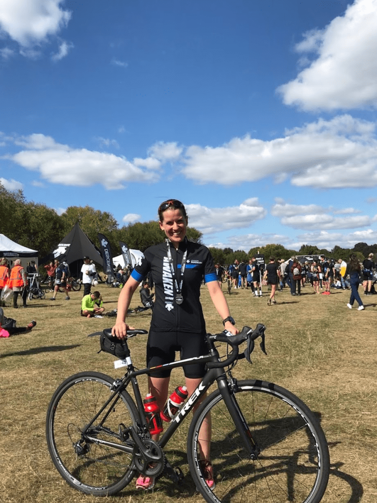
When I’m not working or cooking, you can find me on my bike or going for a run. I used to compete in triathlons but found the racing part of it rather stressful, so now I ‘just’ train and leave the racing to the other people.
QUESTIONS
Order Link: https://www.amazon.com/MakeoverMonday-Improving-Visualize-Analyze-Chart/dp/1119510775
Michael: Hello, Eva. It is truly an honor getting the opportunity to interview you for my blog. I think the data visualization community owes you a collective heartfelt “Thank You” for all you do for the community with #MakeoverMonday. My first question has two parts.
- Can you talk about what #MakeoverMonday is and how it will help people in the data visualization community who participate?
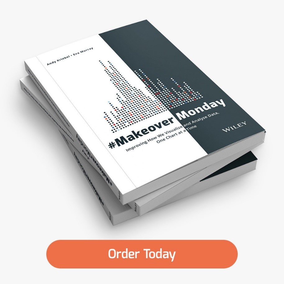
- Tell us about the book Andy Kriebel and you wrote related to #MakeoverMonday. I have read it and keep it by my desk as a reference. Can you tell my readers why this book is so essential to people who create datavizzes?
Eva:
Hi Michael, thanks for interviewing me for your blog. I’ve seen the many different community spotlight interviews you’ve done and I thought “I need to join that party!”, so thanks for having me.
And to you and everyone else: you are welcome. Everyone out there contributes to making this such a fun and supportive community. That makes it much easier for me to make my contributions :-).
- Sure! #MakeoverMonday is a social data project that happens pretty much entirely online through our website, data.world and Twitter. Our mission is to improve the way we visualize and analyse data – one chart at a time.
To deliver on this mission, Charlie Hutcheson and I publish a data visualization that we find ‘in the wild’ each week, together with the supporting dataset and any relevant background information.
We challenge our community to re-imagine the viz using the same data but improving on those things where the original falls short.
We have hundreds of regular participants, creating thousands of visualizations over the course of the year.
To help our community members improve and grow their skills, we provide feedback through a webinar each Wednesday. We go through a subset of submissions and share our feedback on people’s analyses, design, layout, storytelling and anything else that comes to mind.
Our goal is to help people get better in how they communicate with data and it’s a joy to watch people improve week after week.
All the details on how to participate can be found on www.makeovermonday.co.uk - Our book #MakeoverMonday is a compilation of the many lessons learned (and shared) throughout this project. Our intention was to put together a resource for anyone working with data, sharing our recommendations and observations on what works and what doesn’t, how to to simplify their visualizations to make them more effective as well as tackling common analysis challenges.
What I like about the book is that anyone at any level of experience and expertise will find something useful in it.
Some people will get a lot of value out of the technical analytical chapters, while others enjoy browsing the 300+ images to get inspiration and ideas for their own work.
Michael: You are a Technology Evangelist | Product and Partners at Exasol. Can you discuss how you use Tableau and Alteryx in your current role and a little bit about Exasol?
Eva:
In my current role I use Tableau very frequently to demonstrate the capabilities of our database.
In essence, what Exasol allows you to do is to analyse ALL your data at speed and at scale, leading to better, more thorough analyses, while also making your day more fun, because you don’t have to see ‘the spinner’ when working in Tableau.
I use Tableau to build demos on massive datasets, ranging from 100 million to 3 billion records. And it works as smoothly and effortlessly as if I’m using a simple Excel spreadsheet.
Exasol has had a long-standing technology partnership with Tableau and many of our customers use Tableau as their primary or sole BI tool to find answers to their questions, to discover new insights and to get a better understanding of all the data they have available.
Understanding their pain points, their user experience and their day-to-day work is important for me and having used Tableau as a customer and consultant in previous roles during my time in Australia, gives me an appreciation of what organisations are aiming to do and what they might struggle with.
I use Alteryx to create demo datasets. My Alteryx skills are still at a beginner level, but I am working to improve that, because it’s a very handy tool for wrangling all the messy data I come across and build neat datasets to then tackle in Tableau.
I also use both tools to communicate to our Exasol community of users, customers and partners, how Tableau and Alteryx can be used in combination with Exasol.
Michael: I have to ask you this. Can you tell me your three favorite Tableau tips and tricks?
Eva:
Okay, the one thing I try to always do to save me time and my sanity is to format things at the workbook level (via the menu at the top), rather than at a sheet or field level. Removing gridlines is one thing that comes to mind that I do at the workbook level.
Another trick I like to use is – well, it’s not even a trick, maybe more of a preference – to use containers for everything on my dashboard. I’m quite particular about formatting and with containers it’s a lot easier to keep things neat and tidy.
And one trick I LOVE using is the ‘always show’ or ‘always hide’ mark labels, something you can select from the context menu when clicking on a data point. I find this so useful for labeling specific data points, but not everything else.
Michael: You recently started a healthy food site, TriMyGreens. Can you tell my readers the inspiration behind starting this site and some of your favorite foods to cook?
Link: https://trimygreens.com/
Eva:
I have had a pretty healthy obsession with food and cooking for the last 15 years. I always say that food is my love language. So when we went into lockdown due to COVID-19, I suddenly found myself with 2.5 hours extra time each day because I wasn’t commuting into central London anymore.
So I decided to finally launch my food blog to share my/our favourite dishes.
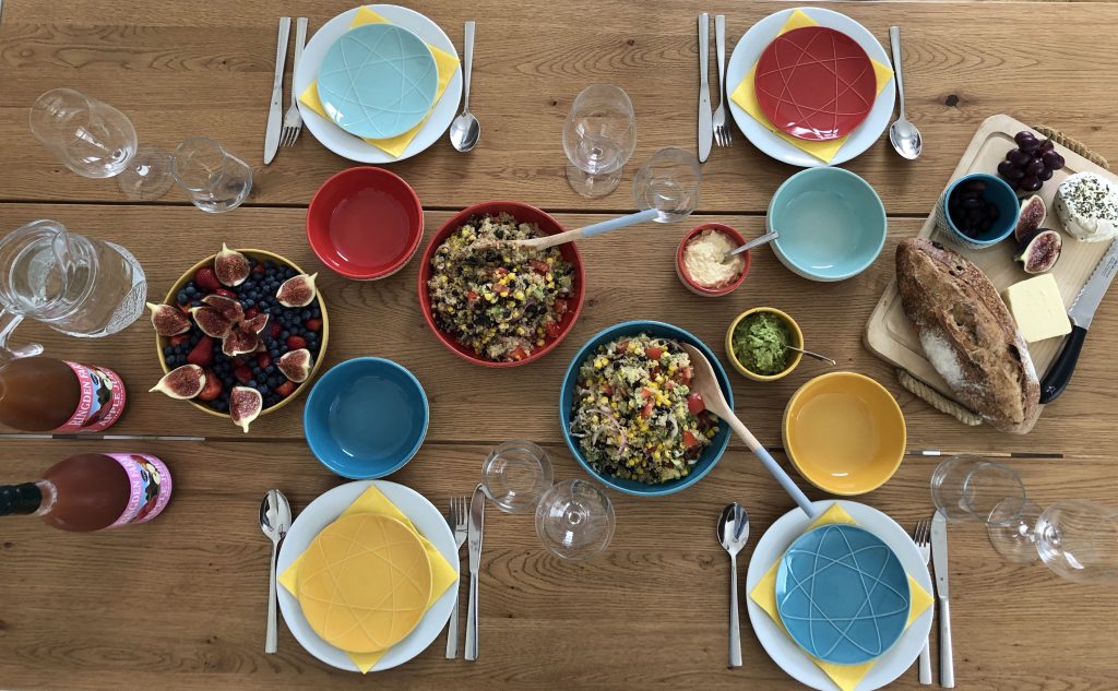
What to expect? Just a bunch of tasty foods with simple recipes and no glossy instagram-worthy pictures.
We often eat everything before I even get a chance to take a picture, so blog posts are not yet as regular as I’d like them to be.
The inspiration was that I noticed more and more people cooking and baking their favourite foods at home and I decided to contribute to the pool of recipes and ideas.
Partly, my desire to write about food and cooking also came from the frustration I have with many great food blogs that are covered in advertisement, pop-up windows and pop-up videos, where 20 very similar pictures need to be scrolled through (including very looooong stories about what inspired a dish) before I finally get to the recipe.
So I decided that my blog will be the style I’d like to read for myself: a single picture that gives me a realistic (!) idea what the end result will look like, a short paragraph or two with any necessary comments or guidance, followed by the recipe.
No ads, no videos, no annoying cookie selections.
Michael: In the past when I watched your #MakeoverMonday reviews, you always show great style in the preparation of your dataviz titles. It is a style I try to emulate. I think a title is very important in that it is the part of a dataviz that needs to grab your attention. Also, your discussion in the past about reviewing and re-reading the wording in the title is invaluable. Can you tell my readers how to create a great dataviz title?
Eva:
Oh that is a really important question. I have seen lots of titles over the years of looking at and reviewing #MakeoverMonday visualizations. Like you say, the title is really important.
I like to think of it like the cover of a book, the front door (and front yard) of a house or the first impression someone has of you when you walk into a room.
I find these analogies helpful for determining the tone I want to set with my title.
Is the data about a fun topic and do I want my viz to be playful with a whimsical title?
Or is the topic more serious and I want to challenge my audience with a poignant question?
There is room for humor, for questions, for a bit of drama or something quite neutral, but it is important to choose the right time and topic for each of those approaches.
I would also be a bit careful when it comes to titles that contain ‘insider jokes’ that could be lost on the general audience. For #MakeoverMonday our audience tends to be ‘anyone on Twitter/the internet’, so I like to play it safe and create titles that will not be misunderstood or cause offence.
One helpful check is to show your viz and title to someone who doesn’t know anything about the topic and see how they react to it. If it misses the mark, it’s time for a bit more work.
I understand that we can sometimes get very attached to what we find funny or clever, but if it doesn’t work for our audience, it’s time to push the ego aside and find a better approach.
Michael: What is next on your “To Do” list? What can the Tableau community expect to see from you in the near future?
Eva:
Currently I am in the process of finishing the manuscript of my second book. I am writing a practical guide for creating and building analytics communities in organisations, with lots of tips, suggestions and case studies from the analytics communities I am part of.
I am looking forward to submitting the final version so I can get a few hours back each week.
What else is next for me?
I am using my spare time to experiment in my kitchen (so watch out for more recipes), to ramp up my training and to learn about a variety of technical topics.
In recent months, due to my workload, I have spent less time on social media and my aim is to continue with that approach. So there might be fewer tweets, but with the goal of sharing valuable information, interesting articles, helpful tips and the occasional light-hearted post.
Because what we all need right now – I think – is to have reasons to smile and laugh.
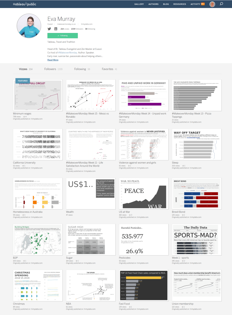
Tableau Public
Link: https://public.tableau.com/profile/eva.murray#!/