
Siddharth Dayama Bio
Sid leads the Visual Analytics team in Customer Service Operations in Verizon where his team builds business intelligence and analytics dashboard solutions that democratize and distribute data in an intuitive and visual form to business leaders, helping them make data driven decisions. He was invited to speak and was recognized as one of top 5 customer speakers at the 2018 and 2019 Tableau Conference. Tableau has also published a case study on Sid’s work at Verizon which has become one of the most viewed case studies on Tableau’s website. His work was also featured in the leadership series of the Journal of Data Visualization Society.
Previously, Sid was Head of Analytics & Finance at WTA Networks where he worked with some of the world’s best athletes and brands on monetizing their fan-base. His work in digital analytics covered designing, tracking, analyzing and reporting KPI’s to increase adoption and engagement on Web, Mobile & Social platforms for clients including Maria Sharapova, Novak Djokovic, Ana Ivanovic, Kei Nishikori, Porsche and Nike. Sid also led the acquisition due diligence of GamerDNA, the second largest gaming information network at the time and was instrumental in Social Channel Inc’s merger with the Women’s Tennis Association to form WTA Networks.
Formerly, he has also worked for a hedge fund analyzing securities in the media & entertainment space to identify suitable investment positions.
Sid holds a Master’s from New York University specializing in Entertainment Finance and was awarded the Graduate Teaching Fellowship to conduct lectures on Financial Accounting at NYU Stern School of Business. An early Ethereum investor, he is a crypto-currency enthusiast and actively contributes to Blockchain communities.
QUESTIONS
TC19 Session Link: https://tc19.tableau.com/learn/sessions/verizon-advanced-customer-service-analytics-drive-cx-over-118-million-retail
Michael: Hello, Sid. I recently watched the video for your session at TC19, Verizon: Advanced Customer Service Analytics to drive CX for over 118 million Retail Connections. As part of my responsibilities at work, I also develop contact analytics dashboards and scorecards, so your session really hit home for me.
In your presentation, you discuss some of the thought processes and techniques that went into developing your Call Driver Executive Summary dashboard. Can you discuss some of those thoughts and techniques for my readers?
Sid:
Holistically speaking, in customer service analytics we track and analyze several metrics to answer four key questions – How many calls did we get and why, how long were the calls and why, how many customers are calling us repeatedly and why and lastly, were customers satisfied with our service, if not then why. The why piece here is answered through speech analytics. Majority of the calls handled are recorded which are then transcribed into text from speech and after applying NLP techniques keywords are extracted which are then bucketed into several call reason categories.
From an executive perspective, sometimes we have an interesting problem in Verizon with respect to analyzing call reason categories. It is the opposite of what most other organizations have. We have a problem of plenty or a problem of choice if you will. When our executives want to analyze the call reasons sometimes they come to a landing page on which we have 65 tabs giving call reason information. Even when they get to the individual tabs most of them although insightful are focused on the metadata rather than synthesized insight. They are too granular. An analogy I like to use is that a lot of the times executives are looking for a balance sheet of the business. A balance tells you the state of the business at a given snapshot of time laying out the assets, liabilities and shareholder’s equity. What we were giving the executives is the accounting ledger instead of a balance sheet.
So, to solve for this we have built a Call Center Executive Summary Dashboard showcasing important strategic KPI’s that give you a high-level view of how our call center operations is performing. Moreover, this was implemented in a hub and spoke model where all the granular views that are already built are tethered as satellite dashboards to the mothership executive summary. The objective here was not to cannibalize on the 65 tabs that are already there but to compliment and capitalize on to provide a consolidated balance sheet of the call center activity. Using the hamburger menu, viz in tooltips, sheet-swaps, measure-swaps, dimension hierarchies and parameter/set actions we have built-in a host of slicing and dicing capabilities so that the user can find insights at different levels of granularity in a single dashboard and does not have to leave the view to go to other dashboards and lose context.
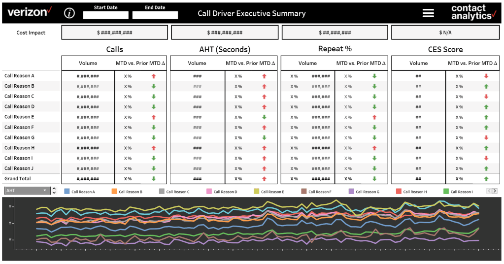
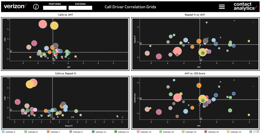
The first tab has four individual swim lanes displaying metrics for each key question I mentioned before. Each section showcases volumes in total as well as segmented by different call reasons along with month over month percentage changes and a dollar cost impact. Hovering over these call reasons initiate viz in tooltip pop-ups showing sub call drivers within a call reason. The time trend line graphs help us understand how these metrics have performed over time. In the second tab we look at relationships amongst these KPI’s through a multidimensional correlation matrix. For example in the top right scatter plot the x-axis is Average Handle Time of calls while the y-axis is the Repeat Percentage and when we plot the different call reasons highlighted by color and the size of the circle denoting volume of calls we can easily now identify which call reasons have a higher than avg. handle time but still have a higher repeat percentage. This helps the business investigate why are customers calling us back again with these same problems even when the agents have spent considerable amount of time solving them before.
Michael: You are a Senior Manager – Data Analytics at Verizon. Can you discuss your team’s responsibilities and how you use contact analytics to help provide insight into Verizon’s call center operations?
Sid:
Sure, I lead the Visual Analytics team in Customer Service Operations in Verizon where we build end-to-end business intelligence solutions that democratize and distribute data in an intuitive and visual form so that business experts can slice and dice millions of rows themselves without writing code and extract valuable and actionable insights at will, on a near real-time basis. Through our dashboards we want to leverage data driven decision making in the business to optimize operations, reduce costs and enhance customer experience.
We maintain one of the biggest tableau sites in Verizon and my team has developed and deployed 800+ automated dashboards to more than 5,500 stakeholders, garnering 250K+ views. Now if you look at the demand side we have more than 5.5K stakeholders in business demanding insights but on the supply side we are just 16 publishers developing dashboards and supplying insights. As you can see, we are a very lean but a high impact team. If you look at the publisher to user ratio that is about 1 publisher to about 340 users and the way we are able to maintain that throughput and engagement is through continuously trying to provide a best-in class user experience. We think a lot about creating a highly engaging and sticky environment on our site and to give you one example, another number I am extremely proud of is the Avg. Dashboard Load Time. We are at 4.18 seconds compared to industry standards of 7 to 8 secs.
We have also developed a scoring system to set priorities for refreshing extracts taking into consideration how large the extracts are, how frequently they need to be updated, how many dashboards are utilizing that extract and how many people are using the dashboard and to what frequency etc.
Some key areas my current and previous team has had tremendous success in include:
- Optimizing Call Center Operations where we analyze KPIs such as Call Volume, Handle Time, Call Drivers, Repeat Rates, Call sentiment etc. to reduce the need for customers to call us repeatedly. Certain cohorts of customers are calling us 43% less after implementing the data driven solutions we’ve proposed. Our dashboards also help in workforce planning and call routing to get the right call to the right agent.
- Optimizing Field Technician Dispatches where we have applied cutting-edge geo-spatial mapping techniques using map box satellite maps and google street view API’s to survey a geographical distribution of our dispatch rates. This has helped stakeholders in the Dispatch Research Center (DRC) to reduce dispatches by 62% for certain cohorts of customers.
- Measuring performance of digital channels where we have tracked acquisition and engagement metrics for our web & mobile platforms and performance of new digital product launches such as the Fios Chatbot and Alexa & Google Home Assistants etc.
- Fios content contract negotiations where our dashboards has helped measure channel blackout impacts on churn and call centers during negotiations with content networks.
Michael: Also, as part of your TC19 presentation, you discussed Project Omicron. Can you tell my readers about the initiative at Verizon that inspired you to do this project and what Project Omicron is?
Sid:
One of the Verizon mottos that inspires me the most is “We don’t wait for the future. We build it.” And the way we try to practice this in our visual analytics team is through VizLabs where we build concept dashboards. I encourage everyone in the team to undertake at least one uncalled for project a year and I mean uncalled for in a good sense where it is not a usual client request or a report that is being asked by someone higher in the chain of command. We have two rules to build concept dashboards 1) You must find an interesting problem to solve and think fundamentally and from first principles. 2) You must glean something interesting from everyday life to get inspired i.e get some inspiration from non-work related environments.
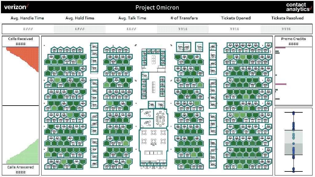
My concept dashboard for this year is Project Omicron and I feel it is a good example of how data viz will be helping call center ops in the future. The idea came about by fusing visualization concepts from the field of finance such as the S&P 500 heat-map on CNBC during opening bell and the Ask-Bid spread area charts depicting real-time demand/supply in stock/currency trading platforms with the visualizations I have built in the dispatch operations space such as geo-spatial heat maps, satellite maps and google street views to analyze a location based impact. I am deeply fond of geo-spatial mapping and sometimes I think of solutions via spatial co-ordinates. Jokingly, if the matrix is real the programmer is animating on a schema with X, Y and Z coordinates. Also, spatial mapping need not always be geo-spatial mapping and I thought what if we take spatial mapping indoors to monitor the customer service ops activity on the call center floor on a location by location basis. Enter Project Omicron! Imagine a dashboard showcasing a floorplan of a call center where you can view operational efficiency on a workstation-by workstation basis in real-time. The dashboard will show in real time how many calls are coming in, how many calls are getting answered, where are they getting answered and which agent is answering them, which agent is going beyond a threshold for any operational metric. Now imagine executives in the headquarters analyzing this information for any call center across the country anytime they want in real-time. It is like a data driven ring or canary for the enterprise world. In my opinion future trends in BI are moving towards solutions that help identify bottlenecks and permute the root cause of issues faster to solve optimization problems and for that you would need visualizations that provide location specific insight and render as real-time as possible. I also feel, with respect to front-end platforms there would be more and more applications using Augmented/Mixed/Virtual Reality which would allow developers to visualize several dimensions of data in an integrated and intuitive and a much more immersive fashion.
Michael: Can you tell me three of your favorite Tableau Desktop tips and tricks?
Sid:
I would say the native viz animations which was just released in version 2020.1 would be on the top of the list. Viz animations are very useful for conveying movement, or a change. They make it much easier to follow the transition between sorts or the movement of marks over time. An extremely popular application is the bar-chart and line chart races. There are several videos that have gone viral on social platforms recently showing a raking of countries and how they change over time over a metric. Another one that is famous is the top grossing films at the box office and how they have changed over time.
The second one on the list is Viz in Tooltip. It is such an awesome way to show additional pertaining information for an insight without sacrificing real estate and only when needed. Viz in Tooltip allows you to place visualizations into tooltips, revealing them on hover or selection of individual marks. The data in the viz is automatically filtered to the mark you hover on or select.
And my third favorite is the geo-spatial analytics features. With Choropleth maps, Heat Density Maps, Flow Maps, Satellite Maps, Topographic Maps, Spider Maps etc. coupled with spatial functions such as MakePoint, MakeLine, Distance and Buffer calculations there are so many possibilities to analyze a geo location-based impact for business initiatives.
Michael: What is next on your “To Do” list? What can the Tableau community expect to see from you in the near future?
Sid:
With the Covid-19 situation, my plan for 2020 analytics conferences has shifted a bit but I’d love to speak at TC again this year either in-person or remote! I am also planning to organize a company-wide internal analytics summit in Verizon later in the year. Also, I really feel like sharing data viz best practices with the analytics community at large and for that I am planning to start a YouTube channel and provide some advanced data viz tips and tricks. I would also love to meet with analytics and data science students in universities to share how we apply visual analytics in the industry to solve complex business problems.
