
Hello Readers.
Way back in 2018, I starting reading Tableau and Data Visualization posts (and humorous videos) from these two brothers, Kevin and Ken Flerlage. Both of them were very talented and funny. Kevin even posted a funny video with him dressed as an elf, and unknown to her, singing a Christmas song along with his wife who was in the shower.
I consider Kevin and Ken good friends. They are the epitome of what the Tableau Community (and the #datafam) should be: selfless, kind, caring, sharing, always willing to help out their fellow “Tableauians.” No question was too much to ask or too beneath them to explain. They are truly the good guys in this Tableau story.
Like Taylor Swift, when you see Kevin and Ken walking around a Tableau Conference, a legion of fans follow. Like the Swifties, I too am always on the lookout for them at conferences. So, am I a “Flerlageie?”
Below is a group photo from TC23. I have placed a green circle around them (Ann Jackson is also in that circle; here is a link to an interview I did with Ann back in 2018 too). If you look at Kevin and Ken’s faces, you can see the love and joy they have for what they do.

I was fortunate to catch up with them recently to see what is new with them and how their views on Tableau and Data Visualization has evolved over the past six years.
QUESTIONS
1) So 2023 was a year of big change for both of you. Can you tell us about your new venture.
Yes, of course. It’s been super exciting. For several years now, Ken and I have tossed around the idea of going out on our own. In fact, probably three years ago, we had conversations with a couple of other community members regarding their experience of running their own business. Ken and I just weren’t excited about the idea of having to set up all these systems, legal contracts, MSAs, etc. So we connected back with Serena Roberts, COO of Moxy Analytics, who had mentioned in passing, that we should just come work for her. She was excited and we were too!
After a number of conversations with the coleaders of Moxy, the aforementioned Serena Roberts and CEO Laura Madsen, we ended up joining Moxy right before the 2023 Tableau Conference. It’s been absolutely fantastic. Moxy is a small, but mighty team of six, and although we are small, the leadership and people are incredible! But best of all, the two of us get to work together every day! It’s been amazing. Plus we have some incredible clients that we get to work with regularly.
I think the best aspect of it all is the fact that we offer services that not only allow us to build dashboards (which we love), but also to provide coaching and advice (which we equally love). We offer services such as our Fractional Data Hero that allows us to essentially be on staff for X hours a month and a client can utilize us for whatever their needs are (dashboard development, coaching, design reviews, Server & Cloud training, etc.). We also provide our Tableau Lifeline which is an ad-hoc, 1-hour appointment that you can book online where we can help users get out of a sticky Tableau problem. In addition to this, we also provide Tableau project work and a Tableau training BootCamp.
For more information, check out https://www.moxyanalytics.com/flerlagetwins or just reach out to us.
2) Do you consider developing dashboards with Tableau an art or a science? Or maybe both?
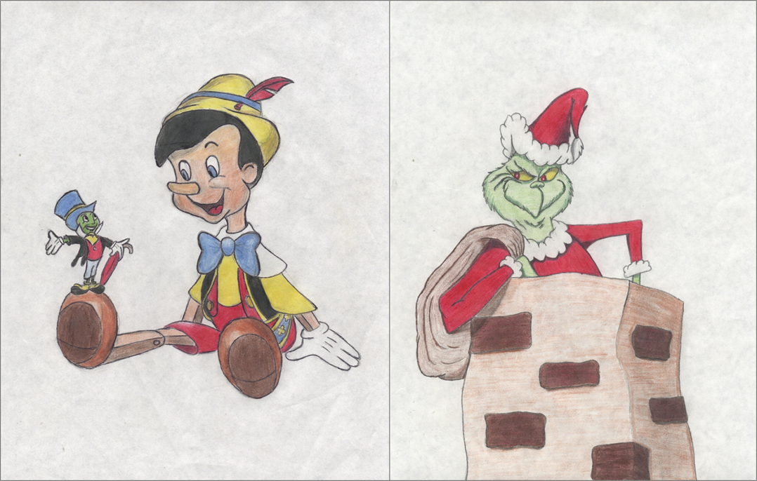
Well, to begin to answer that, let’s go back to elementary school. Although we were outside a ton, when we were not, we were typically drawing. We would draw pictures of Madballs and Garbage Pail Kids (if you remember those), Transformers, Disney cartoons, anything. We would sit there for hours. I’ve included a couple of our drawings from when we were around 10 years old. Fast forward to High School and we both LOVED art class. But we also both LOVED math. We took every math class they offered – at that time, it only went up to Calculus I.
When we discovered Tableau, we both thought it was the closest thing to sitting down for 5 hours and just drawing. Except that with Tableau, we were drawing with data. It was (and is) this perfect combination of left brain and right brain, mathematics and art. We both work with Tableau all day every day and then often play and create with it in our spare time. We love it so much! Nerd Alert!
Except that with Tableau, we were drawing with data.
Kevin and Ken Flerlage
So back to your question, we are unanimous that Tableau is both art and science/math. We consider ourselves lucky to have found this software package that we are so inclined to.
3) I have read and heard great things about your new Tableau class you offer. Can you talk a little about that and what makes your training different than other training out there ?
So our Tableau Bootcamp is for beginners and intended to help users achieve a basic-to-intermediate level of Tableau proficiency. We cover tons of Tableau topic ranging from building charts, using the marks cards, calculations, parameters, and much more. But as you eluded to, we really think our training course is different for a number of reasons. 1) We really focus in on understanding data visualization. We spend a ton of time talking about best practices, color, removing clutter, and even get into accessibility. 2) Both of us are involved in every single training session – two Tableau Visionaries for the price of one. 3) It’s well over 20 hours of content. 4) It’s super fun with lots of twin competition (like Kevin > Ken Boolean calculations) and numerous cameos from Adam Sandler…like this slide pulled directly from our training:

For more information, check out https://www.moxyanalytics.com/theflerlageway or contact us directly.
4) So, I interviewed both of you back in 2018. I interviewed Ken in February 2018 (just under 2 years using Tableau and right before he was selected as a Tableau Visionary) and interviewed Kevin in July 2018 (just 5 months into using Tableau). In those interviews, I asked you both the same general question: “I am going to put you on the spot here. Tell us three Tableau tips that you consider priceless?”. I thought it would be fun if we have you answer those questions again, 6 years later, to see how your responses differed from then and from each other. Let’s start out with Kevin:
From my Interview with Kevin in 2018 (5 months into using Tableau):
- Several of my visualizations have included music. My Seinfeld viz (Kramer’s Lollipop) played the Seinfeld theme as soon as the viz was opened. My Super Mario Bros viz played music when you pressed start and then changed theme song music as you toggled between Super Mario Bros, Super Mario Bros 2, and Super Mario Bros 3. The former was set up to simply auto-play and the latter was set up with dashboard actions. The trick, however, isn’t necessarily in how the music is played, but how it is arranged on the dashboard so that it remains unseen. You place the object near the edge of your dashboard then simply use the Layout tool to move it off of your dashboard. You’ll still hear the music, you just don’t have to see it!
- After a month of using Tableau, my African Water Crisis viz was honored with viz of the day. I cannot tell you how surprised and excited I was (it was actually my first goal from the time I started using Tableau). What I found most interesting was the overwhelming response to the water bottle chart showing access to clean water per region. Since then, the “filled shape chart” has become my favorite technique/trick and it is so easy! (It’s so easy, it’s almost disappointing). Because of the overwhelming response, my brother encouraged me to write a guest blog on his site. You can read all about that technique here.
- When creating my Candy Land viz, I used a few resources on the web to determine how to navigate between story point tabs using filter actions. The end result was a seamless way to move from one tab to another by just clicking buttons within each dashboard. There was no need to click on the tabs themselves. I knew this was possible, but the article from Niccolo Cirone on The Data School website set me loose. It’s a really great trick to make navigation much cleaner.
Kevin in 2024:
First off, to respond to my tips above, you can really tell that I wasn’t doing this for a living at that point in time, it was just a way to learn and have fun. I’ll also note that I don’t think the music thing (#1 above) really works anymore and that the navigation using filter actions (#3 above) is now completely obsolete due to the introduction of dashboard navigation buttons in version 2018.3. I’ll also comment on #2 above. That was my first Viz of the Day and a week later, I accidentally deleted it. I was soooo mad! I luckily had a backup and restored it, but if you search in the Viz of the Day gallery and click on the link to that viz, it still doesn’t load – because it doesn’t exist! Finally, I’ll note that Ken and I talked about how we would answer this question and we agreed that we wouldn’t repeat any of the other person’s answers, so I volunteered myself to go first! I do know for a fact that he would have included the first tip had he gone first.
- Transparent Shapes – man, I have written and spoken about these things a hundred times and probably because they are soooo useful. I literally use them in every single workbook I create, whether for work or for fun. They are just so versatile. I won’t go into a ton of detail, but if you aren’t using these in your work, please check out our transparent shapes blog post and also check out the last section of our 2022 Tableau Conference presentation (this recording is from the Florida TUG).
- Fake Highlight from Brian Moore – Brian Moore is one of the absolute best in the business and he came up with one of my favorite Tableau tricks ever. I call it the “Fake Highlight” and he simply calls it “The Highlight Technique”. It’s a simple trick to set up that removes that default highlighting in Tableau. This is great for when a dashboard encourages users to click in order to drill down and/or explore. Check out his blog post here where he talks about several methods, including his highlight technique.
- Table Calcs from LODs – I used to struggle with setting up Table calculations. I found myself just sort of clicking around in order until I got the expected result. This is obviously not very efficient and can be dangerous if you really don’t know how you arrived at that result. That was the case until I had an epiphany that you could actually read Table Calculations in the same manner that you set up Fixed LODs – which I was pretty good at. (Below is a snapshot of how this works). This was an ABSOLUTE GAME CHANGER for me and now I simply know how to set them up with very little effort. Check our Understanding Table Calculations Using Fixed LODs blog post for full details.

Now it’s Ken’s turn:
From my Interview with Ken in 2018 (22 months into using Tableau):
- I’d probably start with the sheet swapping technique (Hashu Shenkar, The Information Lab) that allows you to change the sheet based on a parameter or filter. While one would think that this has limited use cases, it can be incredibly powerful and there are lots of other tricks, such as Robert Rouse’s collapsible menu, that is based on the same basic technique. I’ve used this in a few visualizations which I’ll be publishing soon. And I’ll soon be writing about a new trick I developed based on this technique.
- The second technique I’ll mention is not really a Tableau technique at all. When I first started using Tableau, I read a blog by Josh Tapley on using PowerPoint for some basic graphics work. Since reading that, PowerPoint has become an invaluable tool for adding a bit of design flair to my visualizations. To give you an example, I used PowerPoint on the 3D Star Map for three different things: 1) The viz title 2) Custom shapes for the stars, and 3) The icons indicating how to rotate the viz.
- The final technique I’ll mention is what I’ll call data layering. There is likely a better term for it, but this is the idea of duplicating data through joins or other methods in order to enable better visualization of the data in Tableau. For example, in The Beauty of Pi, I duplicated my data multiple times so that I could create an image-based sheet selector. Each image is a separate custom shape, which then filters the data to one of the multiple “layers,” displaying the selected visual. Matt Chambers wrote a great blog post on this in November which I’d highly recommend: How To: Tableau Sheet Selector with Dashboard Actions.
Ken in 2024:
- Order of Operations Tricks – Understanding the Tableau Order of Operations, particularly the different types of filters, can be so helpful when you want your view to compute in a very specific order. There are so many things you can do with the Order of Operations, such as using context filters to force a filter to compute before Top N filters or FIXED LODs. And some of my favorite tricks are using table calculation filters to filter a data set after everything else has been computed. I’ve shared some of these tips on my blog on The Tableau Order of Operations.
- Toggle Tricks – When you click a mark in Tableau, it gets selected. Sometimes you don’t want this, such as when you’re creating a toggle button. There are several techniques for deselecting that mark, but most have limitations. So, my go-to technique is one I learned from Jacob Olsufka. Essentially, we add a “toggle” table containing two rows—typically with values 1 and 2. We then use a filter action to force the view to toggle between the two values and this filtering causes marks to be deselected. I’ve written about this several times, but you can check out my blog, Customize Your Tableau Filters, for a detailed walkthrough of how to use this technique. While this seems like a very niche technique, I’ve found that I use it quite frequently to create various UX enhancements on dashboards.
- Join/Relationship Tricks – I’ve spent a fair amount of my career doing data engineering type work, so I’ve learned lots of cool tricks using joins. So many of these techniques can be applied directly in Tableau to do things like data densification, getting prior year or month data, calculating running totals, and creating scaffolds. While I typically recommend that you push as much of this data modeling as possible to the data source—before accessing the data in Tableau—these can be a lifesaver when you need them. I’ve written about some of these techniques in 3 Creative Uses for Relationships/Joins in Tableau.
Thank you for reading my revisit interview with Kevin and Ken. If you happen to run into them at TC24 in San Diego, don’t be shy about saying “Hi.” And don’t forget to arrive early for their sessions; it is well worth the wait and your time. And if anyone gives you any grief about being a fanboy or fangirl for Kevin and Ken, just tell them to shake it off!
