
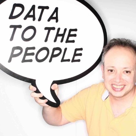
Rodrigo Calloni Bio
Rodrigo describes himself as
“A simple guy that likes to use Tableau and loves to have fun (sometimes the other way around). I also am a trustful friend that will do everything to help others to succeed in whatever they want to be. And, most importantly, proud dad of #babyAlice and #babyJulia.
Oh, yes, at work they label me as a Learning and Knowledge Management Specialist.”
Questions
Michael: Hi Rodrigo. When I think of Tableau and Twitter, I think of you. You are one of the most positive, encouraging people in the Tableau community. Can you tell my readers how you got started using Tableau?
Rodrigo: First of all, thanks a lot for the introduction to the question. I really, really should police myself more on using Twitter (my +6K tweets tells a lot), but at least I try to show this positivity and, basically, have fun. BTW, key advise to you all, most of my tweets should NOT be taken seriously!
I am the typical incidental Tableau user. I started using Tableau as part of the efforts to develop an Open Data platform for my employer.
The long story: I am originally a Librarian but I tailored myself to deal with the systems that make a library execute its functions. And it was at the Library that requests were coming to get access to our organization data. The team that works at the Reference Desk captured the message and came up with the proposal to have a place for all our public data. Then as I was the system guy, I got involved in the technical part of this development, working with an external company to make it happen. Tableau was then presented to us as a tool to build charts, visualize data and allow people to consume it more easily. Basically, it would be a way to allow people with low data literacy to have some sort of access and understand the data that we were proving. At the end, we never used Tableau on the website but it was too late to “cure” me from loving it. It took a while to get comfortable with it (in special due to some unexpected family situation) and I still keep learning every day by using the tool both at work and in my personal life.
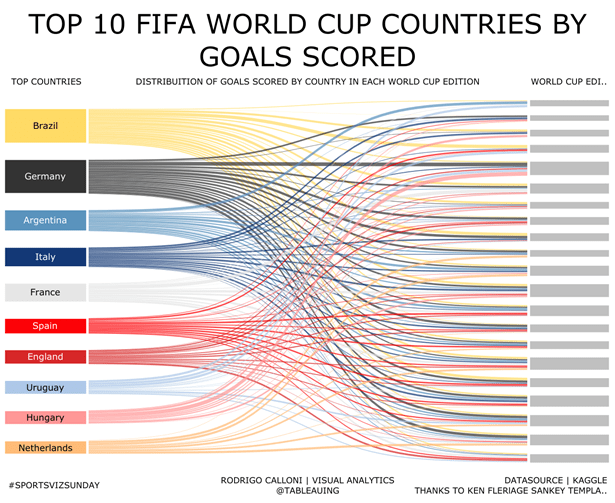
Michael: I really like your Top 10 FIFA World Cup Countries by Goals Scored data visualization you have out on Tableau Public. Can you talk about the process you go through to gather data, design and build a data visualization like this one?
Rodrigo: That was a funny story. The 2018 Fifa World Cup was getting closer and I had this idea of building a Sankey chart that could display the distribution of goals of national teams across all editions. Luckily the dataset of all goals was posted in Kaggle and I got access to it. But then the struggle, how to build the chart in Tableau? Well, I would try to Google it for some examples but before that, I sent a DM to the “Zen Master to be” Ken Flerlage asking if he knew how to build it. And guess what, not only he knew (of course, he knows it all), but he was developing a template and offered it to me for testing. Some days later, working during my lunch break, I got to a version that is closer to what the viz came to be at the end. Then I reserved the day to publish it: 100 days to World Cup start.
Note: the static image doesn’t show, but I really like the viz in tooltip on this one!
Michael: Can you tell my readers a little bit about #babyAlice and how they can help?
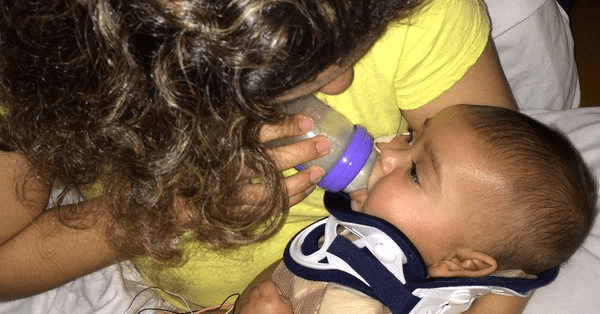
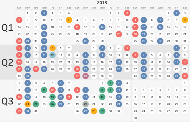
Rodrigo: As I mention in the first question, just as I was introduced to Tableau I had experienced two life-changing experiences. First, the born of #babyAlice on June 2014 (right in the middle of the Open Data project). Then, on January 5, 2015, around 5:45pm, the accident that resulted in almost her death and that left her with some injuries and several development delays. This really had a cascade effect in our lives but from the beginning, we decided to do all we can to make Alice the happy girl that she used to be. Really, Alice was a baby that was always smiling to folks when we were out with her. It was very traumatic to see that smile gone and to learn that her vision (among other issues) was injured. Alice acquired a condition named CVI (Cortical Vision Impairment) that basically broke the connection between her eyes and her brain. All she could see at the start was a kaleidoscope of colors and lights. So imagine this: you are a person learning data visualization to make people understand what they see better… And the little angel that we have a home may never be able to see or understand those. After spending a month in hospital and rehabilitation program (basically to heal her brain and stop it from bleeding) we came home and started an intense therapy program that we still continue today. The viz bellow represents all days when Alice had a therapy session so far this year:
Last month we had her first stem cell therapy injection, hoping that she can regenerate some of these missing connections and also boost up her brain. And it is a pretty expensive procedure that is not fully covered by health insurance. Also, last Monday I drove Alice to Pittsburg where her CVI doctor did her annual assessment. And she continues to amaze us with her resiliency, she keeps improving little by little!
The Tableau community provided us with great support via a GoFundMe project that we launched for Alice’s benefit. I believe that we got at least 1,200 donations from all the kind people from twitter. I really can’t thank you guys and gals enough!
The GoFundMe is still open because, as I mentioned, this was the first session. It is hard to detect evolution (we will do some brain scans to see if her activity there improved since) but I feel on my heart that, yes, these cells are helping her. She is being able to articulate more, play more (in special after the arrival of her little sister, #babyJulia) and understand life a little better. All these signs make us believe that she will be able to make it. She will be able to live well, have fun, and see daddy’s data viz, and understand it.
GoFundMe Link: https://www.gofundme.com/building-alice039s-brain
Michael: Can you tell us three of your favorite Tableau Desktop tips and tricks?
Rodrigo: That’s a hard question! There are so many tips out there. But let’s take the challenge:
1 – Drag and Drop a text file or Excel file from your computer to Tableau canvas to quickly load the data.
2 – Drag and Drop fields inside a Calculated Field box.
3 – Drag a Reference Line out of the canvas to remove.
Michael: What is still missing from Tableau Desktop (assume we are talking about the latest iteration v2018.2 and what we know about v2018.3) and why do we need it?
Rodrigo: I love typography. And the way Tableau (Server, Online and Public) handle fonts is far from the needs of data designers. All these are web platforms so the lack of support for more fonts is very frustrating. So it is not really a problem with Tableau Desktop (the custom fonts do work there) but what is the point of making a fantastic viz with some cool fonts and then realize that it will resolve Times New Roman instead? Tableau must find a way to allow us to use at least Web Fonts, like the ones Tableau uses in its own corporate page. That’s why I keep the #allfontsmatter dream alive.
Michael: What is next on your “To Do” list? What can the Tableau community expect to see from you in the near future?
Rodrigo: My To do list is now! I just started a new blog fully in Portuguese (http://tableaudicas.com.br) and my goal is to create a space to share tips and engage with the Brazilian folks that are using Tableau. I see very few people from Brazil (or Portugal) interacting in the community and this has to change. So I hope I can succeed and get folks participating in activities such as #makeovermonday, #vizforsocialgood, or at least showing their faces on Twitter. We are extremely creative Country (see our Carnaval parties!) and I believe the day Brazilians understand how Tableau can liberate the creativity to tell their data stories, we will see amazing vizzes that will inspire the whole community.
Tableau Public Link: https://public.tableau.com/profile/calloni#!/

