Aurélien Vautier Bio
Hello, my name is Aurélien. I live in Nantes which is a small city located on the west coast of France. First, I would like to thank Michael for giving me the opportunity to express my ideas on his blog. I have been following you for several years and your work is remarkable.
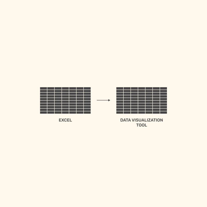
After studying computer and design, I decided to focus my career on data processing in 2014. From 2015 to 2017, I joined different IT service companies to help clients on Digital Analytics topics. That’s when I discovered data visualization and Tableau.
I immediately fell in love with data visualization and the Tableau tool, at that time still not widely used in 2017 and I was not fortunate enough to have access to Tableau. It was at the end of 2017 that I had the chance to meet the director and the sales manager of The Information Lab France. I was able to start the adventure through multiple missions, such as dashboarding and coaching. Then in 2018 I had the chance to follow the Train the Trainer program in London to become an official trainer for Tableau Software.
At that point it was clear that I had joined my three passions : Design, Dataviz and training.
Recently I started to create a series of illustrations create images on several themes such as data visualization best practices, funny situation or daily problems from our data lives, dashboard design, user adoption, data mindset, etc.
QUESTIONS
Michael (Question #1): Hello, Aurélien. It is truly an honor getting the opportunity to interview you for my blog. You are such a creative and insightful person. I love your Truthful Dataviz Tips you post on LinkedIn and Twitter. They are not only painfully truthful sometimes, but also offer some humor for us in the Dataviz community.
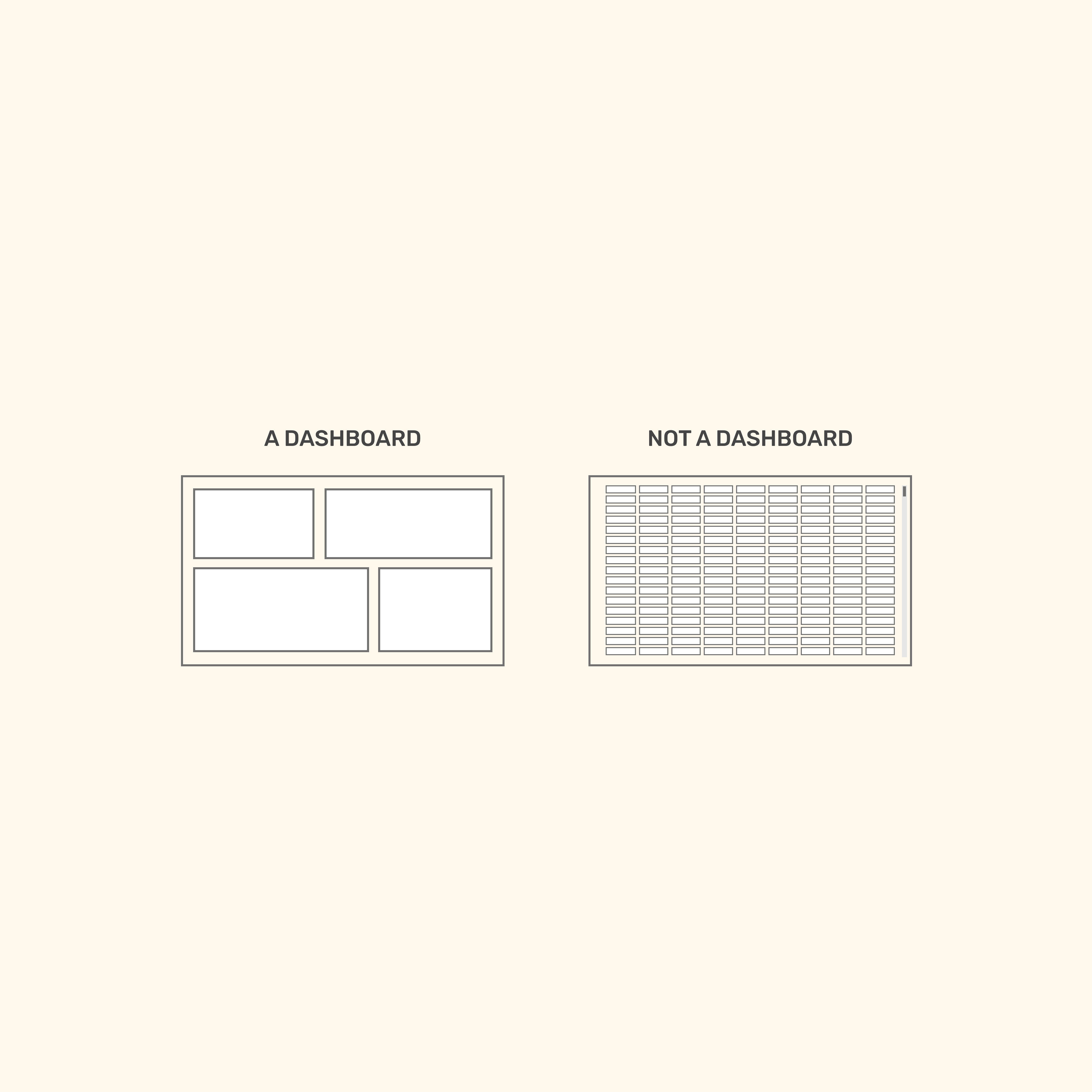
One of your recent Truthful Dataviz Tips created a lot of comments.
‘You said, “Could we all agree on that“? And then showed an image of a Dashboard and Not a Dashboard (Excel/Table/Grid).
One of the first comments you received was from Dobrin Stoilov. Here is what he said.
Well, I have seen stakeholders that prefer the one on the right.
A dashboard in a spreadsheet format.
And your response was:
Which, by definition, is not a dashboard. I think that’s a key point to help people take action: help them understand what a dashboard is and how it can allow them to make better decisions.
I agree with your reply. How are our business partners to know what they want on a dashboard if they do not know what a dashboard is (“How do you know what you don’t know!”)? So, how do you introduce this concept to them? Do you first gather requirements about the data and what kind of metrics they want to see, or do you introduce the dashboard at the same time you are gathering requirements? And why use the approach you use?
Aurélien (Response to Question #1):
First, I believe it is extremely important to present what data visualization is, what a dashboard is and how it can help users improve their daily lives before going into the details of requirements gathering. Imagine we live in a world where you have absolutely no idea what a car is, you arrive at a dealership because you need a car to go to work, and the first thing the salesperson asks you is “What type of gas do you think you’ll use in your car?”
Sounds crazy right? But this is the most common question asked at the beginning of an interview. I first need to understand what a car is, how it can help me and how it can improve my daily life, then I need to know how much this car will cost me, if it fits in my budget, if it is adapted to my needs: do I need an electric car? A large trunk for my shopping and suitcase, a powerful air conditioner if I am sensitive to heat, etc.
The steps that I follow almost systematically are the following:
1 – Receive the request and interview the requester/customer to clarify the need and reformulate it if necessary.
2 – Evaluate the need in relation to the company’s vision and strategy. Also, will it bring value to the company? Monetary, efficiency, ethics, brand image, etc.
3 – Create the story mapping: from the need to the mockup. The objective here is to define the best combination of measures and dimensions to establish the most relevant chart for the end users.
4 – Ensure the presence and quality of data, if necessary, create the necessary dataset.
5 – Create the prototype: on Figma for instance, to get closer to the result. Or directly in the data visualization tool to quickly create a first draft to submit it to users for validation.
6 – Receive and integrate feedback.
The next steps are less complex: create the kick-off presentation and start the developments.
Michael (Question #2): Staying with the first question, Ilia Ilinskii, commented,
Sometimes specialists require universal instruments and flexible filters to be able to play around with data and dive deep into problems. Here, I mostly disagree with the idea that we, as analysts, should stigmatize dashboards and classify them as “dash” and “not dash” or “bad dash” and “good dash.”
I think we should be more flexible with stakeholder requirements. If a manager wants a table without filters and slices, and it is a comfortable view for them, I will accept it if that manager or team is the only user of that one.
For instance, some users consider a large variety of filters and visualizations more complicated and harder to use than just a table. So, “it depends.” And it mostly depends on your agreement with the stakeholder.
One more thing: I decided to debate this idea because I believe that inflexibility from our analyst side may build a wall between us and the business. When we decide for other people what is better for them, we close the opportunity to ask for feedback from their side.
Again, I agree with most of this. If you don’t provide your business partners with what they want (e.g., Table/Grid), they may circumvent you and ask others to create this Dataviz for them. It may be different between companies, but as Ilia said, we could alienate our business partners and they could just shut down on us.
Thoughts on this?
Aurélien (Response to Question #2):
In my experience, nine times out of 10 when a user asks for a table it is because they have only used tables in their professional life and has been acculturated by data through Excel. In some cases, I understand the need and the constraints and accept to create a table in this tool provided that the user is convinced that it is the best representation of the data for their need and that this tabular approach has no or little impact on the performance of the dashboard.
I disagree with Ilia on the decision making for others, however. In a different context, I think it’s true, but in a professional context where businesses call on data visualization experts, I think it’s coherent above all to be critical, but especially to listen to their advice.
You probably know this quote from Steve Jobs:
“It doesn’t make sense to hire smart people and then tell them what to do; we hire smart people so they can tell us what to do.” – Steve Jobs.
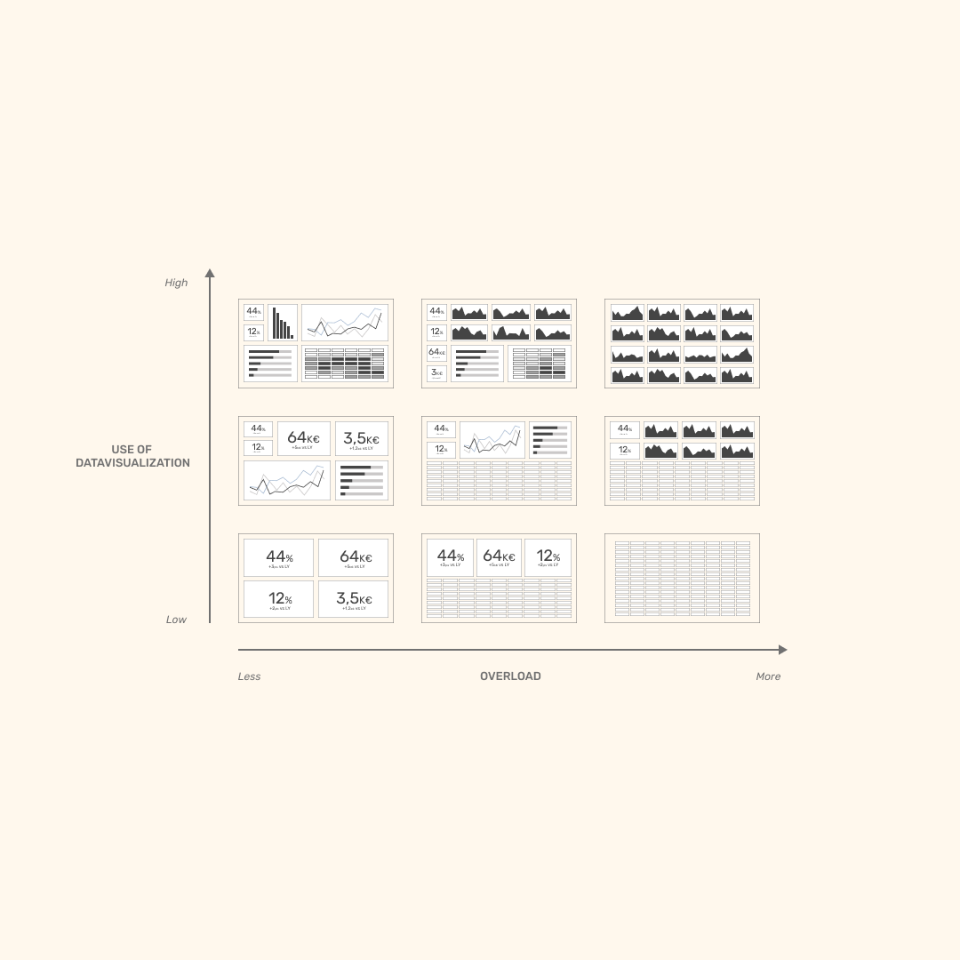
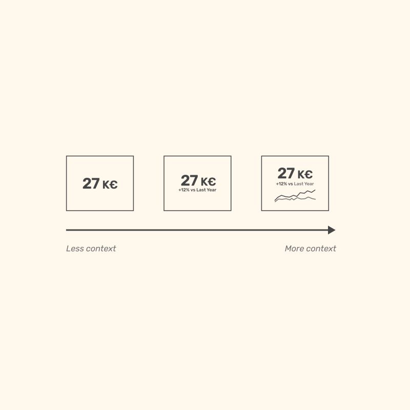
Michael (Question #3): In one of your recent posts, you show the diagram above and state:
Your audience is struggling using Dataviz while they use tables all day long?
You don’t know where to start?
Here is your transition cheat code: 𝗖𝟯 𝗕𝟮 𝗔𝟮 𝗔𝟭
1st month: 𝗕𝟮 (BANs +2 viz + table)
2nd month: 𝗔𝟮 (BANs + 2 viz)
3rd month: 𝗔𝟭 (BANs + 4 viz)
Transiting from tables to dashboards is a challenge for some users. Can you explain this transition cheat code chart a little more and how we can most effectively use it?
Aurélien (Response to Question #3):
Here I wanted to illustrate the mental and visual transition from a table to a data visualization to give elements to people who only have words to convince the end users. The idea is to first understand that a table has a flaw from the start, which is cognitive overload. Based on this observation and the benefits of data visualization, I think it’s interesting to use this cheat code to make users understand the field of possibilities, as they don’t understand the added value of data visualization now. When we are facing an audience that has been using tables for a long time and does not intend to change, I think that we should not try to convince them by words, but rather by proof. I then deliver the expected table on the new data visualization tool, but I also propose in a second dashboard a data visualization that would correspond to something quite close to A2 or A1. The gap is so wide that it can be daunting, but in my experience, just by suggesting it, users often end up being intrigued and click through to discover the capabilities of visual exploration. They are most of the time immediately seduced.
About the above illustration, I plan to create several more that, depending on the services, needs and maturity levels, could allow for a smooth transition.
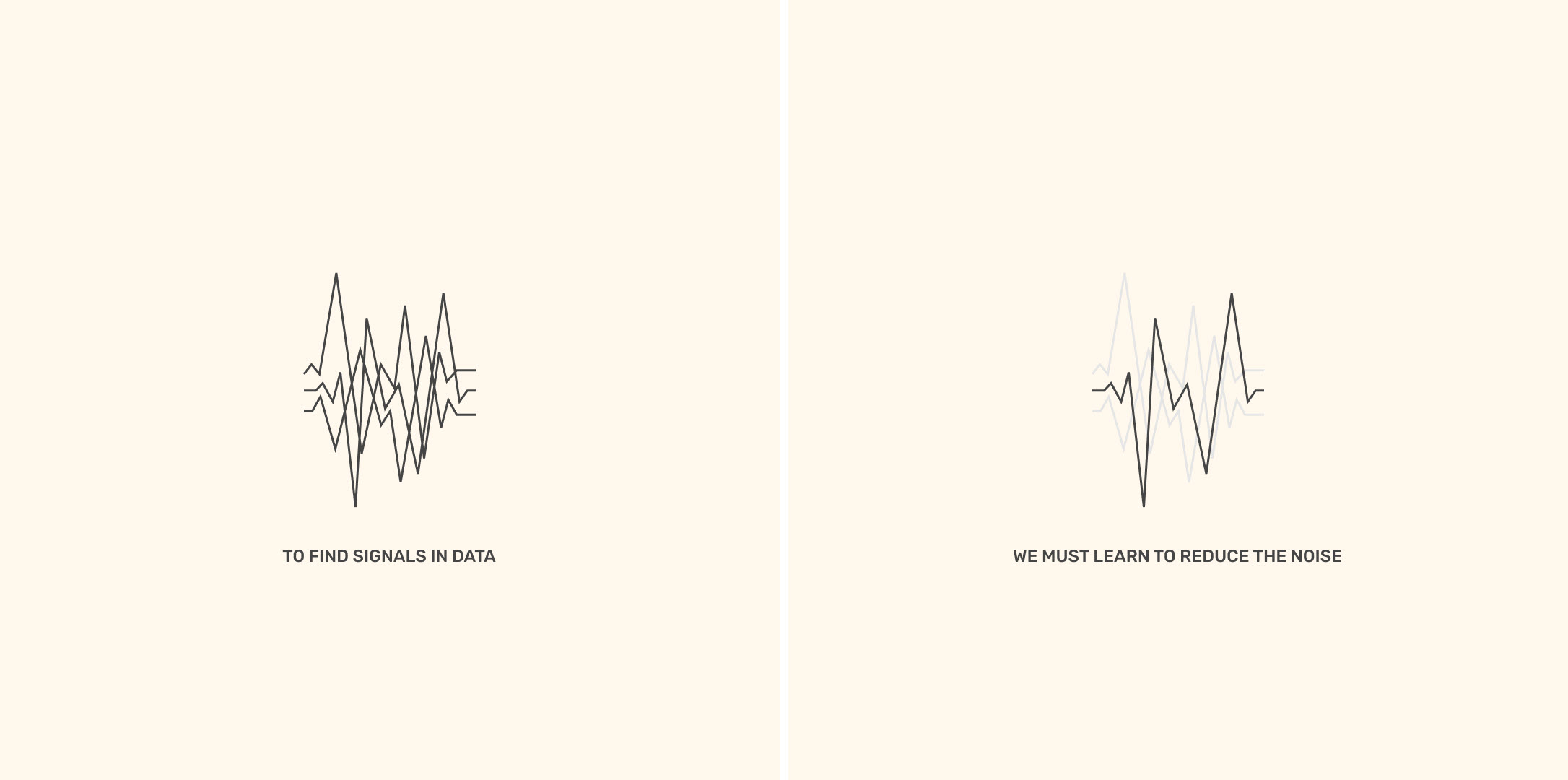
Michael (Question #4): In one of your recent posts, you quote Stephen Few.
“To find signals in data, we must learn to reduce the noise – not just the noise that resides in the data, but also the noise that resides in us. It is nearly impossible for noisy minds to perceive anything but noise in data.”
― Stephen Few, Signal: Understanding What Matters in a World of Noise
How do we reduce the noise in our minds to see the data more clearly?
Aurélien (Response to Question #4):
That’s a great question! I think it all starts with asking the right questions, for example: where are we now? Where do we want to go? What makes sense to us? Why do we need to visualize data? Why do we need a dashboard? This may sound obvious, but in the workshops I give, it is very common to spend at least 30 minutes on the questions: why do you want to use data visualization? What is the purpose of your dashboard?
To reduce the noise in us, it is also important to have method, experience, and process. If you lack method, you will probably have to rebuild your dashboard very soon. If you don’t have a process, you may forget the essential steps and answer the wrong question. If you don’t have experience, you will have a well-defined need and well-established processes, but a dashboard that doesn’t answer the right question or bring the expected value.
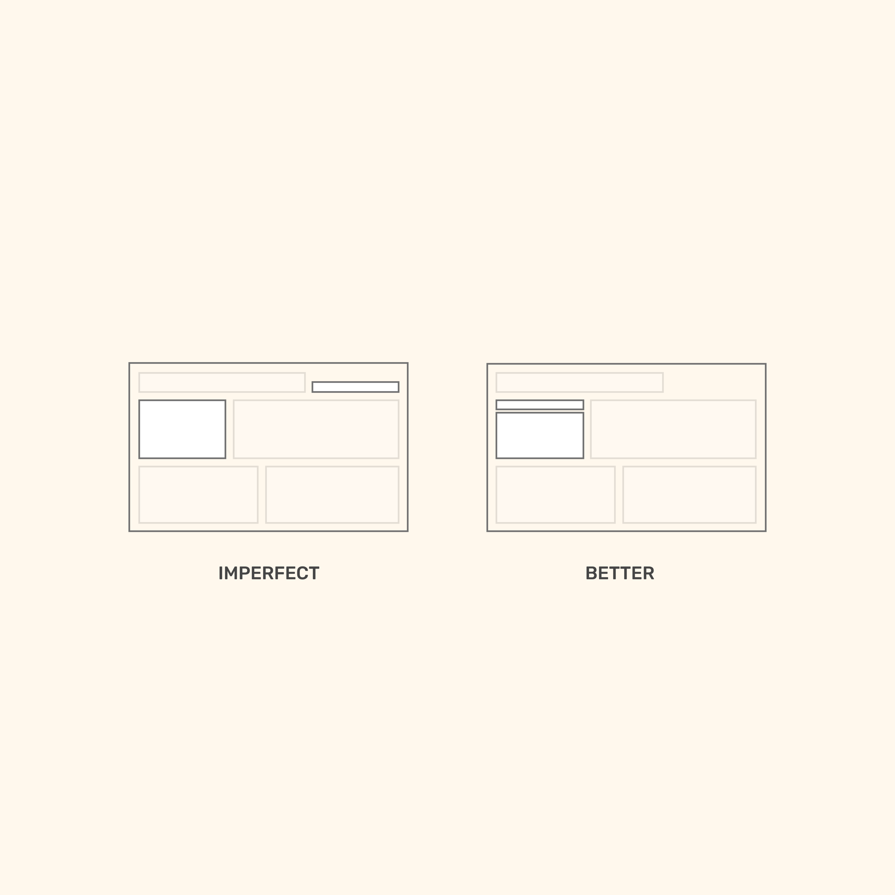
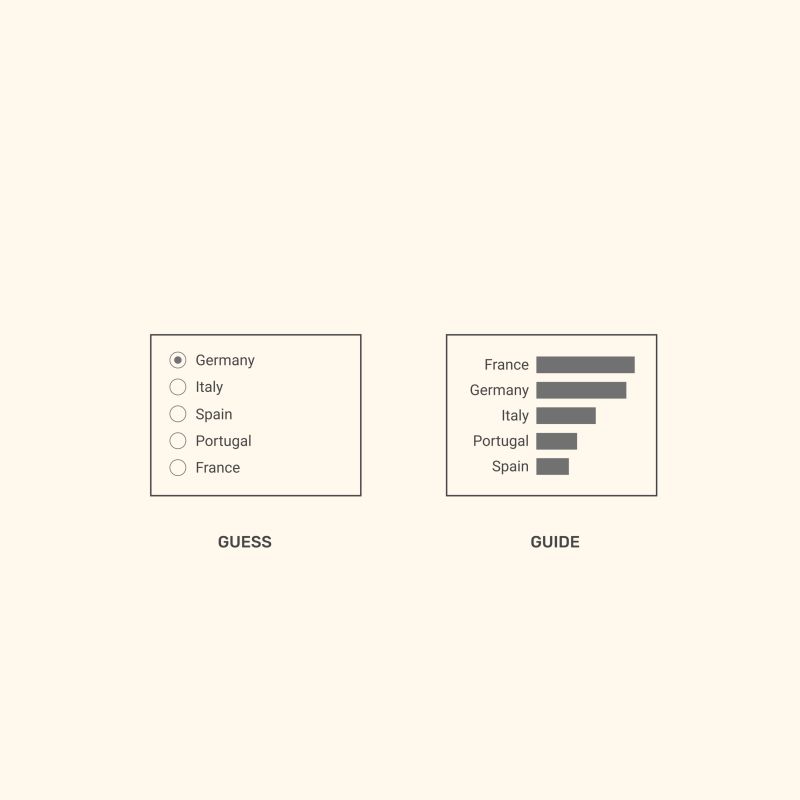
Michael (Question #5): In the Truthful Dataviz Tip above, you state, “The closer you place your filters to your target, the better. Place your filters the closest to your target. Thanks to this visual proximity, end users will understand their link.”
Can you discuss this a little bit more?
Aurélien (Response to Question #5):
The user won’t instinctively understand that there is a link between the filter and the chart in question, so he will have to browse the dashboard, try out a few filters to see the changes on the dashboard, you will have to take more time to experiment and understand the dashboard. However, the time spent demystifying and understanding the dashboard is a frustrating time that we don’t want to leave a mark on the end-users’ first discovery of the dashboard. What we want most of all is to have reactions, why not positive emotions, about the results brought by the dataviz on our dashboard. If the questions are about the positioning of the filters, the choice of colors, the choice of graphs or the general reading of the dashboard, we know that the design lacked precision. I dare to hope for you that this discovery takes place at the time of the first tests and not after the production launch 🙂
Michael: Thank you, Aurélien, for sharing your tips and insights today.
More of Aurélien’s Truthful Dataviz Tips
Below are more examples of Aurélien’s Truthful Dataviz Tips. You can find him on Twitter at https://twitter.com/AurelienVautier and on LinkedIn at https://www.linkedin.com/in/aur%C3%A9lien-vautier-163b71a3/.