

David Napoli Bio
David Napoli has worked with data for over 20 years as an analyst, actuary, statistician, research manager, and director. His experience includes evaluation and outcomes studies, ROI analysis, IBNR determination, predictive modeling, risk adjustment methodologies, advanced data visualization, dashboard design and implementation, database development and management, and identifying and evaluating trends and forces in data. David has extensive experience working with claims data, including for Medicaid, Medicare, and Commercial lines of business. He recently held the position of Director of Business Intelligence for a nonprofit health plan.
David’s educational background includes Bachelor’s and Master’s degrees in aeronautical engineering (yes – he was a rocket scientist), and early in his career he realized he desired to concentrate his professional efforts in an industry focused on helping people more than his fondness for space exploration. He also completed coursework towards his doctorate in Health Services Research with a focus on Biostatistics at the University of Colorado School of Public Health (All but Dissertation), and teaches Data Analytics and Data Visualization courses part-time for General Assembly and the Leeds School of Business at the University of Colorado Boulder.
Questions
Michael: Hi David. I have been following your newsletter for a while now. What motivated you to start a newsletter and what kinds of topics do you focus on in it?
David: I started using Nuzzel to help me keep informed on all whom I follow on Twitter – which is in excess of 3,000, an unmanageable amount to sanely follow in a timeline 😁, not to mention work / consulting / teaching / hockey parent responsibilities tend to mean I only have a small window to hop on Twitter in the early AM and late PM. Nuzzel automatically aggregates all of the links shared on your timeline for set periods (previous hour, last 8 hours, last 24 hours, etc.), and is a very time-efficient way to keep up on the latest items and discussions. So I had not initially set out to create a newsletter, but as I was deriving value and wonderful insight from “standing on the shoulders of giants”, I wanted to pay it forward in some way … and since there was a newsletter option within the platform, it was almost a no-brainer to at least give it a try, and if others found value and were interested in reading what I had a passion for, it would be a natural “win-win”. So now I pull together the newsletter each evening, and in doing so I continue my continuous learning journey and get to share it with just over 100 newsletter subscribers, which is more than I had ever anticipated.
The topics I choose to share are my professional passions – data visualization, business intelligence, statistics, analytics workflow, data dexterity (a concept I am attempting to formalize into a full course curriculum), and health care. As my initial reasoning for using Nuzzel was to create an efficient continuous learning mechanism for myself, the topics I shared just flowed from what I loved learning about and wanted to share with others who either shared that same passion or perhaps had a desire to start learning, and I could offer a “spark” to get them started.
Link: https://nuzzel.com/biff_bruise
Michael: In the description of the Introduction to Data Analytics course you teach at the General Assembly, you state,
Data drives decisions; are you part of the conversation around data?
Can you tell my readers how data drives decisions and how we become part of the conversation around data?
David: I would tend to say “data properly and effectively transformed into understanding” drives decisions, but that was a bit too wordy for the site. 😁 So what I eluded to a bit above is what I attempt to do in my classes to foster the right environment, appropriate knowledge, and proper approaches for becoming part of the conversation around data … and this, IMHO, can be wholly done through the concept of Data Dexterity.

Data Dexterity is centered around communication of information to provide understanding which focuses on the amalgamation of data science, social sciences, and humanities – or as Giorgia Lupi (photo, above) stated it best, Data Humanism. The high-level framework for Data Dexterity – which I am more than happy to discuss more of – is as follows:
- Acknowledge error … Uncertainty is Information (which will be my blog site once I finally get the time to get it working and written)
- Identify assumptions … be transparent in data efforts
- Find the weakest link … challenge assumptions, evaluate quality
- Understand the business model … which is not equivalent to the organization’s vision / mission statement
- Separate past performance from future results … time allowed for testing and retesting, validation and re validation (continuous monitoring)
- Question the picture … recognize biases, in data, analytic methods, and visuals
- Don’t confuse feelings for measurement … this one on its surface can be contentious, but what my intent is to recognize the importance of not just quantitative analysis, but qualitative, too – value must be placed on feelings and behaviors, but they differ from “pure” measurement, and appropriate qualitative approaches must be applied
- Suspect the co(pany) they keep … apply analytic skepticism all along the analytic workflow, and the “co” applies to items such as coincidence and correlation
- Hold credentials at arm’s length … do not become enamored with sophisticated analytics and/or visual approaches in and of themselves – when applied appropriately, for the right audience, they can be invaluable to promote clarity, but focus on what the audience needs for understanding
- Respect the human condition … behind every number or analytic result is the story of the human condition – engage the audience through that story
- Do not start with the answer … follow established procedures, data governance, and ethical boundaries in every step of the analytic workflow – these will guide you to the appropriate messaging of the human condition to create understanding for your audience, shows integrity in everything you do, and fosters trust to be created
- Information visualization is a language … with many dialects – and it comes with the capability to explain the world, show & tell stories, elaborate ambiguous messages … the power is nearly endless, and you know what “power” brings. 😁
Michael: Can you tell us some best practices for evaluating the quality and structure of a dataset?
David: As I teach an entire course in this, boiling it down to just a few elements will obviously leave some key components out of the discussion … but I will do my best to touch on some that may not be immediately obvious.
First and foremost – plot the data. Obviously with numeric data this is much more readily achievable than with character / string data, but even with the latter, counts of certain strings – such as by procedure or diagnoses – can be performed to compare against expectations and to determine if any anomalous data exists … and there are effective methods for visualizing qualitative data, as Stephanie Evergreen has a great post on exactly this. I always start with visually evaluating data in some way, shape, or form before I proceed with any of the next steps of the analytic workflow (data transformation, methods, etc.).
Another best practice that may not be overtly obvious is having a firm understanding of the business at hand. This can best be established through establishing a rapport with subject matter experts within the department(s) that have knowledge of the data involved. These discussions will lead to understandings and insights of the data that can not be established from just reviewing the data, be it within a data warehouse, a spreadsheet, and/or a visual representation. Establishing business acumen will create a baseline from which data quality can be evaluated, as well as provide deeper knowledge from which meaningful questions can be determined to ask of data.
The last best practice for evaluating the quality and structure of data I will mention here (and I am more than happy to discuss more for those that are interested!) is documentation. Building trust in analytics efforts comes, in part, from transparency of efforts, and this includes where and how data was sourced, what (if any) assumptions and/or transformations were made, what missing data may exist, what data may have been used as proxy for other unobtainable data elements, and so on. Creating a data governance process that supports capturing these findings not only will help current and future analytic efforts, but can provide the business clarity into the thoroughness taken with the evaluation process and – hopefully – build an environment of trust between the analytic and business groups.
Michael: When you work with clients and/or your business partners, what are some of the common data pain points they want to resolve?
David: The one data pain point that has been a constant for me over the last ~20 years has been the lack of quality in health care claims data. If you have seen one health care claims data structure, you now know just one health care claims data structure … which may not even apply to the entire dataset. Contract changes, legislation changes, claims processing rule changes – these all impact what ends up in a health care claims data system … and that is just part of a very long list of confounders to quality health care claims data. All of these elements impact the ability to determine proper claims payment amounts, which claim record is the most recent version, what the appropriate units are for a given procedure, and impacts risk adjustment and other predictive modeling efforts.
Other common data pain points I have dealt with – and continue to do so – are in determining meaningful data to evaluate … such as combining claims data with EMR (electronic medical record) data, and incorporating social determinants of health data, which must be sourced from a wide variety of locations, such as local public health departments, Social Vulnerability Index, Area Deprivation Index, and (much) more.
The last common data pain point I will mention is the need for a complete “source of truth” for all reporting and analytics, one in which is overseen by appropriate data governance policies, procedures, and appropriated trained and supported governance roles, such as a Data Governance Committee, Data Steward, and more. True health care data catalogs and data warehouses are few and far between, and I have spent more than a fair portion of my career pushing for these systems and their supporting structure, but technology and people, to be put in place to allow for effective understandings to be developed with meaningful data.
Michael: What are some ways we can use data visualization to help people better understand the health services industry?
David: Data Humanism is the key element that will help drive this understanding. Rooting every analysis, every presentation, every result provided in the human condition will create an environment of caring that will grow beyond the health services industry and take hold within communities.
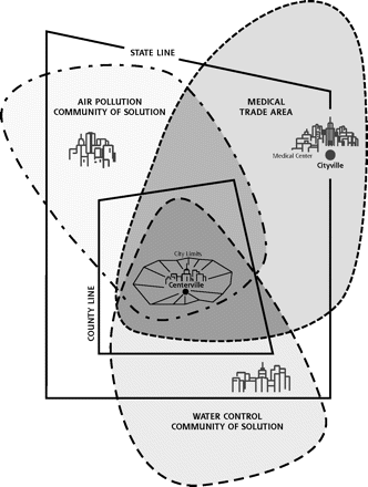
This is at the heart of the data stories I have created over the last ~20 years – the concept is not a new one, as it was published in the Folsom Report over 50 years ago … it is called “Communities of Solution”. I have used data visualization to show & tell the stories of how the efforts of Communities of Solution – public health organizations, the medical community, health plans, and community organizations and resources – coming together positively impacted the quality of life of those living in their communities. These visuals drive home the stories that “health is local”, show the importance of working together for the greater good of our fellow humans, and provide insights to those involved on what works, what can be improved, and what there is still to do.
The last item I will touch on here (there are many more, but I will leave those for follow-up discussions which I hope this post will generate) that data visualization can help with is in fostering improvement in population’s understanding of health care experience literacy. Health care self-efficacy is an issue with many people, as lack of transparency of the health care system and the confusing system in and of itself creates an environment which makes it difficult to say the least for people to care for themselves and know what are the right choices to make to lead to improved health. This concept is a broader take on a method called PAM, or the Patient Activation Measure. Data visualization methods can be used to help further understanding of the human condition, through focused narrative of individual’s and community’s data, answering the question of “Why this is important?” to all involved (and HIPAA regulations of course being paramount in any such methods of visual delivery).
Michael: O.K., I have to ask. Your Twitter handle is @Biff_Bruise. What does this mean?
David: In short, a nickname bestowed upon me by a former coworker upon seeing my dusty and scraped-up self arrive at work after hitting the deck during my morning bike commute. 😎
As those that follow me on Twitter may know, I am an avid cyclist, and have been so for many years. Quite some years ago (15+), one morning while I was bike commuting in to work, I was on a stretch of road where I saw quite a bit of gravel coming up around a bend I would be taking, which was left over from a previous snow storm. There also happened to be a car immediately to my left, so my choices were…
- Swerve left and get hit by a car
- Swerve right and end up plowing into a curb
- Ride through the gravel and take my chances
I chose (3) – and my front wheel immediate washed out. I went down, slid on the road, hit said curb, and then went up and over and slid across the sidewalk.
Amazingly I did not injure myself (or at least that is what I initially thought, as none of my cycling gear was torn and nothing hurt), nor damage my bike beyond some scratches – I was able to get back on the bike and ride the rest of the way to work. When I arrived at work, my coworker – a fellow cyclist – greeted me with “Hey Biff! Yeah, you … Biff Bruise!” when I walked in … and then told me to check under my winter cycling gear – which, while my clothing had not a single tear, my skin was “road rashed” from shoulder to ankle.
Thankfully the road rash healed and I have not stopped cycling, but the nickname stuck … so much so, by the next day, my name tag at my cube had been changed to “Biff Bruise”. 😁
