
Readers:
In Part 1 of my deep dive into Trending in Tableau, I went over the the different ways of adding trend lines, how trends are calculated by Tableau after querying the data source, and how trend lines are drawn based on various elements in the view.
In Part 2, I will go over how to customize trend lines as well as the Trend Model.
In Part 3, I will finish up this deep dive by discussing how to analyze Trend Models.
I hope you enjoy this series about trending in Tableau.
Best regards,
Michael
Customizing Trend Lines and Trend Models
 As I mentioned in Part 1, much of the context, dataset, and Tableau Workbook, I am using for this blog post comes with the book I mention as the primary source, at the end of this blog post (see book cover, right).
Customizing trend lines
Let’s move on to another example using real estate trends. For this example, I will be using the Real Estate Listings data source provided with the book on the right. The scatter plot below shows a comparison of Real Estate Listings by Price and Square Feet.
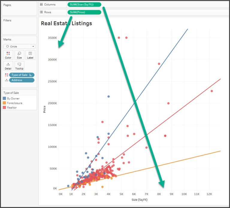
In the screenshot above, I show a scatterplot with the sum of Size (Sq Ft) on Columns to define the X-axis and the sum of Price on Rows to define the Y axis. Address has been added to the Detail of the Marks card to define the level of aggregation. So each mark on the scatterplot is a distinct address at a location defined by the size and price. Type of Sale has been placed on Color. Trend lines are shown. Based on Tableau’s default settings there are three: one trend line per color.
Assuming a good model, the trend lines demonstrate how much and how quickly Price is expected to rise with an increase in size for each type of sale.
TIP
In this data set we have two fields, Address and ID, either of which define a unique record. Adding one of those fields to the level of detail effectively dis-aggregates the data and allows us to plot a mark for each address. Sometimes you may not have a field in the data that defines uniqueness. In those cases, you can disaggregate the data by unchecking Aggregate Measures from the Analysis menu.
Alternately, you can use the drop-down menu on each of the measure fields on Rows and Columns to change them from measures to dimensions while keeping them continuous. As dimensions, each individual value will define a mark. Keeping them continuous will retain the axes required for trend lines.
Now, let’s look at some of the options available for trend lines. You can edit trend lines by using the menu and navigating to Analysis | Trend Lines | Edit Trend Lines… or by right-clicking on a trend line and then selecting Edit Trend Lines…. When you do, you’ll see a dialog box similar to this:
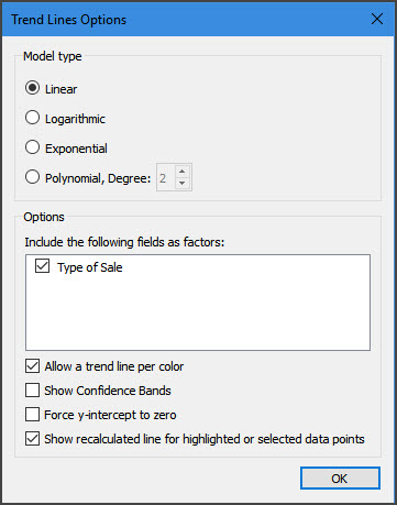
In the dialog box, we are provided with the following:
- Options for selecting a Model type
- The ability to select applicable fields as factors in the model
- Allowing discrete colors to define distinct trend lines
- Showing confidence bands
- and Forcing the y-intercept to zero.
We will examine these options in further detail. For now, experiment with the options for a bit. Notice how either removing the Type of Sale field as a factor or unchecking the Allow a trend line per color option results in a single trend line.
You can also see the result of excluding a field as a factor in the following view where Type of Sale has been added to Rows:
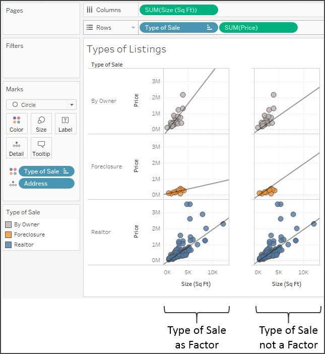
In the screenshot above, in the left portion, Type of Sale is included as a factor. This results in a distinct trend line for each type of sale. When Type of Sale is excluded as a factor of the same trend line, which is the overall trend for all types, it is drawn three times. This technique can be quite useful for comparing subsets of data to the overall trend.
Trend models
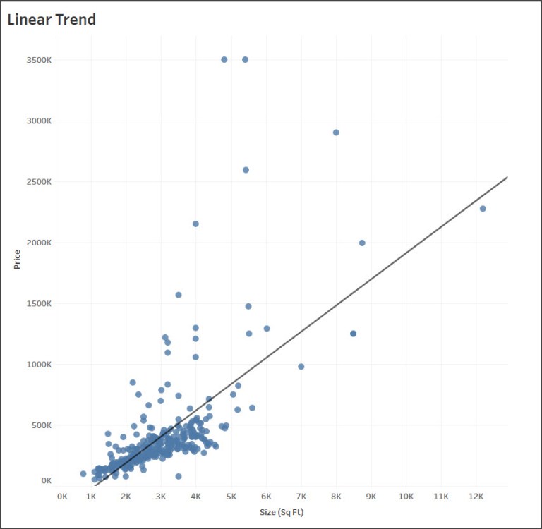
Let’s go back to the original scatter plot we started with today. I am going to use a single trend line as we consider the trend models available. The following models can be selected from the Trend Line Options window:
Linear
We use this model if we assumed that, as Size increases, the Price will increase at a constant rate. No matter how much Size increased, we’d expect Price to increase such that new data points fell close to the straight line.
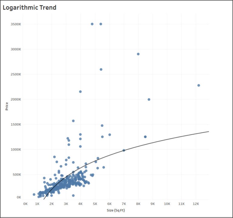
Logarithmic
We would use this model if we expect that there is a law of diminishing returns in effect. That is, size can only increase so much before buyers will stop paying much more.
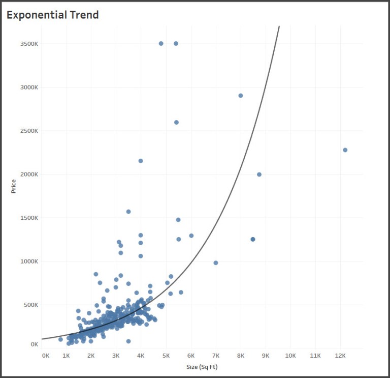
Exponential
We would use this model to test the idea that each additional increase in size results in a dramatic (exponential!) increase in price.
Exponential – Defined [2]
In mathematics, an exponential function is a function of the form
in which the input variable x occurs as an exponent. A function of the form
, where
is a constant, is also considered an exponential function and can be rewritten as
, with
.
As functions of a real variable, exponential functions are uniquely characterized by the fact that the growth rate of such a function (i.e., its derivative) is directly proportional to the value of the function. The constant of proportionality of this relationship is the natural logarithm of the base
:


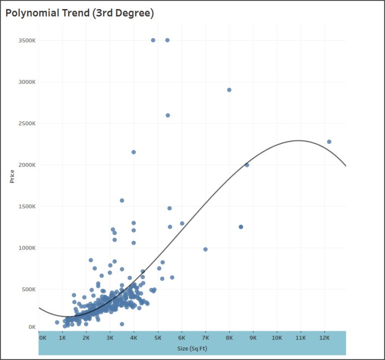
Polynomial
We would use this model if we felt the relationship between Size and Price was complex and followed more of an S shape curve where, initially, increasing the size dramatically increased the price but at some point price leveled. You can set the degree of the polynomial model anywhere from two to eight. The trend line shown below is a 3rd degree polynomial.
Next: Analyzing Trend Models
Source:
[1] I relied heavily on the fantastic Tableau book written by Joshua Milligan titled Learning Tableau 10, Second Edition (see cover image below). I will be blogging a review of this book in the next few weeks. Click here to purchase you own copy of this book.
[2] Wikipedia, Exponential Function, https://en.wikipedia.org/wiki/Exponential_function.
