
Readers:
Since my life now seems very centered in the Tableau World, I have decided to add a new blog topic called Tableau Deep Dive. I will, to the best of my ability, take a deep dive into a topic related to Tableau Desktop or Tableau Server.
My first dipping of my toe in these waters will focus on Trends. One of the great features of Tableau is that it enables you to quickly enhance your data visualizations with statistical analysis. Built-in features such as trending, clustering, distributions, and forecasting, allow you to quickly add value to your visual analysis. Additionally, Tableau integrates with R, an extensive statistical platform that opens up endless options for statistical analysis of your data. [1]
In Part 1, I will go over the different ways of adding trend lines, how trends are calculated by Tableau after querying the data source, and how trend lines are drawn based on various elements in the view.
In Part 2, I will go over how to customize trend lines as well as the Trend Model.
In Part 3, I will finish up this deep dive by discussing how to analyze Trend Models.
I hope you enjoy this series about trending in Tableau.
Best regards,
Michael
Trending in Tableau
 Much of the context, dataset, and Tableau Workbook, I am using for this blog post comes with the book I mention as the primary source, at the end of this blog post (see book cover, right).
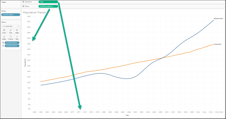
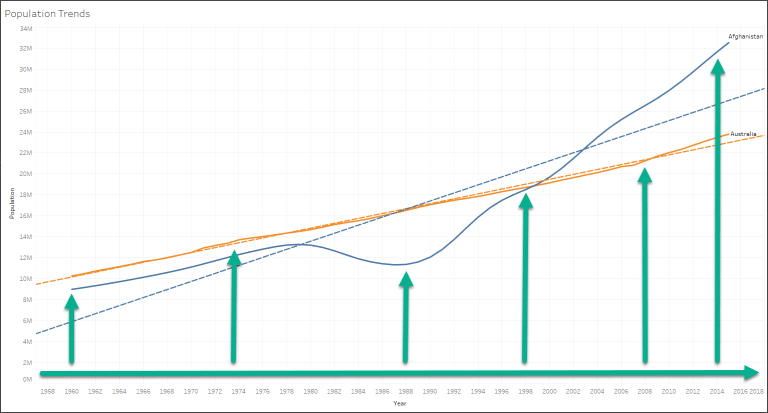
The dataset contains one record for each country for each year from 1960 to 2015, measuring population. I will use this dataset to look at the historical trends of various countries. In the example below, I show the change in population over time for Afghanistan and Australia. The Country Name has been filtered to include only Afghanistan and Australia and the field has additionally been added to the Color and Label shelves.
Observations
The growth of the two countries’ populations was fairly similar up to 1980. At that point, the population of Afghanistan went into decline until 1988 when the population of Afghanistan started to increase. At some point around 1996, the population of Afghanistan exceeded that of Australia. The gap has grown even wider since 1996.
Adding Trend Lines
Tableau offers several ways of adding trend lines:
- From the menu, navigate to Analysis | Trend Lines | Show Trend Lines
- Right-click an empty area in the pane of the view and select Show Trend Lines
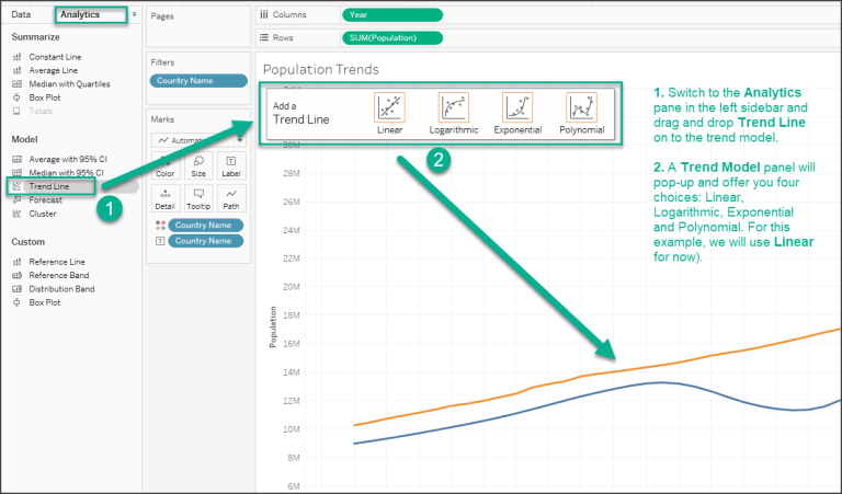
- Switch to the Analytics pane in the left sidebar and drag and drop Trend Line on to the trend model of your choice (we’ll use Linear for now and we will discuss it in more detail later in this post)
A screenshot of the third option is shown below:
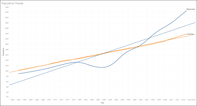
There will be two trend lines added to your view (one for each country). These lines are thinner than the regular line and are dashed. Later on in this post, I will show you how to customize these lines. Now you view should look like this.
Trends are calculated by Tableau after querying the data source. Trend lines are drawn based on various elements in the view:
The two fields that define X and Y coordinates: The fields on Rows and Columns that define the x and y axes describe coordinates allowing Tableau to calculate various trend models. In order to show trend lines, you must use a continuous (green) field or discrete (blue) date fields and have one such field on both Rows and Columns. If you use a discrete (blue) date field to define headers, the other field must be continuous (green).
Additional fields that create multiple, distinct trend lines: Discrete (blue) fields on the Rows, Columns, or Color shelves can be used as factors to split a single trend line into multiple, distinct trend lines.
The trend model selected: We’ll examine the differences in models later in this post.
Notice in the screenshot above that there are two trend lines. Since Country Name is a discrete (blue) field on Color it defines a trend line per color by default.
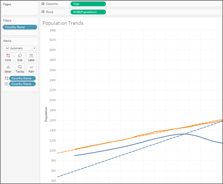
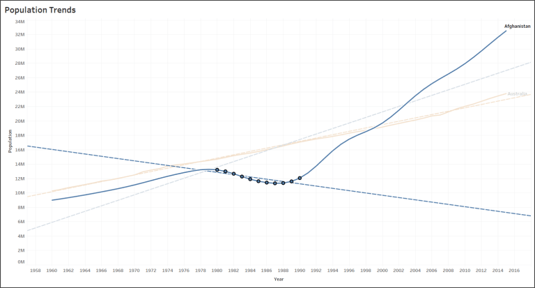
Earlier, we observed that the population for Afghanistan increased and decreased within various historical periods. Notice that the trend lines are calculated along the entire date range (see screenshot below). What if we want to see different trend lines for those time periods?
One way to do this is to simply select the marks in the view for the time period of interest. Tableau will, by default, calculate a trend line for the current selection. Below is an example where the points for Afghanistan from 1980 to 1990 have been selected and a new trend is displayed:
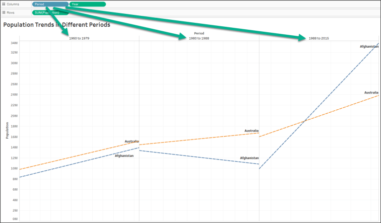
Another option is to tell Tableau to draw distinct trend lines using a discrete field on Rows, Columns, or Color.
Create a calculated field called Period that defines discrete values for the different historical periods using the code below.
IF [Year] <= 1979
  THEN "1960 to 1979"
ELSEIF [Year] <= 1988
  THEN "1980 to 1988"
ELSE "1988 to 2015"
END
When you place this new calculated field on Columns, you’ll get a header for each time period, which breaks the lines and causes separate trends to be shown for each time period (see screenshot below). You can also see that Tableau keeps the full date range in the axis for each period. You can set an independent range by right-clicking one of the date axes by selecting Edit Axis, and then checking the option for Independent axis range for each row or column.
Next: Customizing Trend Lines and Trend Models
Source:
[1] I relied heavily on the fantastic Tableau book written by Joshua Milligan titled Learning Tableau 10, Second Edition (see cover image below). I will be blogging a review of this book in the next few weeks. Click here to purchase you own copy of this book.


That’s really helpful.