
Readers:
 I have been a big fan of Stephen Few for many years. It was over a decade ago that I attended my first workshop with him in San Diego, California at TDWI. Through his web site, Perceptual Edge. I have followed Steve’s work over the years ( actually even before the workshop) and even “refreshed” my dataviz knowledge when I attended his three-day data visualization workshops back in 2013 in Portland, Oregon. I have always found Steve to be honest and very direct in his positions and opinions on the state of the data visualization discipline. Showing Steve something you might think is “the best ever” will be met with thoughtful, constructive feedback, so make sure you wear your thick skin when you show him something (and I mean this is a very positive way!).
Recently, Steve published his latest Visual Business Intelligence Newsletter, Journey to Zvinca: The Making of a New Chart (a PDF version of the newsletter can be found here).
Below is my synopsis of Steve’s discussion of this in his newsletter. I hope you find this new visualization as exciting as I do.
I encourage you to read Steve’s newsletter and learn more about the new Zvinca Plot.
Best Regards,
Michael
What is a Zvinca?
I will let Steve answer that in his own words.
At the time that I (“Steve”) was working on this, a fellow named Daniel Zvinca, who has been active for many years in discussions on my website, proposed to me the seed of another potential solution. I was too wrapped up in my own idea of wrapped graphs to fully appreciate its merits at the time, but Daniel reminded me of it a few months ago.
Daniel was trained and worked for many years as a mechanical engineer, but eventually developed the skills of a software developer, which he has applied to data sense-making, including data visualization, for several years now. He and I had the pleasure of meeting a few years ago when he drove from his home in Romania to the city of Utrecht, in the Netherlands, where I was teaching a workshop. We’ve had many interesting discussions over the years and have disagreed on occasions, but this new seed of an idea that he shared with me in 2013 eventually sparked a collaboration that has produced a new form of display. Much to Daniel’s chagrin, I proposed that we call it a “Zvinca Plot.” The names that Daniel proposed were more descriptive (“Layered Graph,” “Accordion Graph,” etc.), but less memorable, so I prevailed. Let me take you on an abbreviated
version of the journey that Daniel and I took together to bring the Zvinca Plot to life.
The Problem Daniel (and Steve) Were Trying to Solve
The problem Daniel was trying to solve was the scenario when we need to display a set of quantitative values in a way that makes it easy to read and compare those values, it usually works best to sort them in order from high to low or from low to high and represent them either as bars in the form of a bar graph or as individual data points in the form of a dot plot. Depending on the size and resolution of the screen or page, bar graphs and dot plots can accommodate a hundred values or so, but what if we need to examine more—perhaps a thousand or more? How can we preserve the perceptual effectiveness of these graphs while scaling up the number of values?
Daniel was trying to solve the scenario when we need to display a set of quantitative values in a way that makes it easy to read and compare those values.
Steve discusses in his newsletter where, in the past, he created a “wrapped graph” by splitting a single graph into adjacent columns of bars or dots, which can easily extend the number of values five-fold or more. But, what do you do in the case where you need to
extend the number of values further? When faced with this problem, Daniel realized that he could split the values into subsets, similar to how Steve was splitting them into columns, but could display those subsets relative to a single quantitative scale.
Below is a data set containing 1,000 values. Daniel’s insight will become evident as you consider this example.

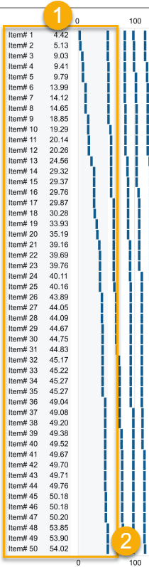 So, the best way to examine this example is by beginning with the single quantitative scale, which extends horizontally along the X axis and ranges in value from 0 to 1,300. Notice that this is just a standard linear scale, no different from one that would appear in a regular bar graph or dot plot. If you notice, in the the orange rectangle I added, when you start viewing this graph from the lowest value in the upper left corner (1) to the highest value in the lower right corner (2), this data set of 1,000 values has been split into 20 columns (3) of 50 values each (4).
The categorical labels along the left edge (Item #1, Item #2, etc.), which would ordinarily appear as actual labels (e.g., Sally Smith, John Doe, Melissa Abernathy, etc.), are currently associated with the highlighted column of values that range from 4.42 to 54.02. The next column of values begins at slightly greater than 54.02 and ranges to approximately 80. Because this particular data set is skewed toward the right (i.e., toward higher values), the final rightmost column of values spans a broader range from 606 to 1,296.
In this example, each row contains 20 values. Notice, however, that they are quite distinct from one another. They never overlap and their horizontal positions can be seen, read, and compared with relative ease.
Keep in mind that this example with 1,000 values does not represent the upper limit of this graph. On a screen of reasonable size and resolution, a much larger number of values could be displayed.
Steve discusses how one of Daniel’s potential names was a “Layered Graph,” because, in a sense, it layers multiple subsets of values on top of one another in the same horizontal space. It does so, however, in a way that does not result in over-plotting (i.e., data points on top of one another) because each value in sequence is located in a different row and by the time you get to the first value in the next subset (i.e., in the next column of values), it differs enough from the value to the left to avoid overlapping. This is so simple a solution, but brilliant, nonetheless, for it has never been previously proposed.
I encourage you to read the full in-depth article in Steve’s newsletter. Then, he discusses why data points rather than bars. Also, his discusses various distributions you can use with the Zvinca Plot. Again, a PDF version of Steve’s newsletter can be found here).
Source: Few, Stephen, Journey to Zvinca: The Making of a New Chart, Perceptual Edge, Visual Business Intelligence Newsletter, July/August/September 2017, http://www.perceptualedge.com/articles/visual_business_intelligence/journey_to_zvinca.pdf.

Good article, however I’m afraid you used a picture of the wrong person. The real Dan’s linked in page : https://www.linkedin.com/in/daniel-zvinca-a835586/?locale=ro_RO
Don’t worry, he didn’t mind.
Hi Wilfried. Thank you for letting me know. I fixed the photo of Dan. Best regards, Michael