I continue to showcase some of the beautiful work done by students who attended Professor Cairo’s Introduction to Infographics and Visualization MOOC course in October 2013 that just completed.
The one is to showcase is a redesign assignment by Kamila Zhussupova.
Here is Kamila’s explanation of her redesign.
Hi, this is my variant of the infographic (as an online version).
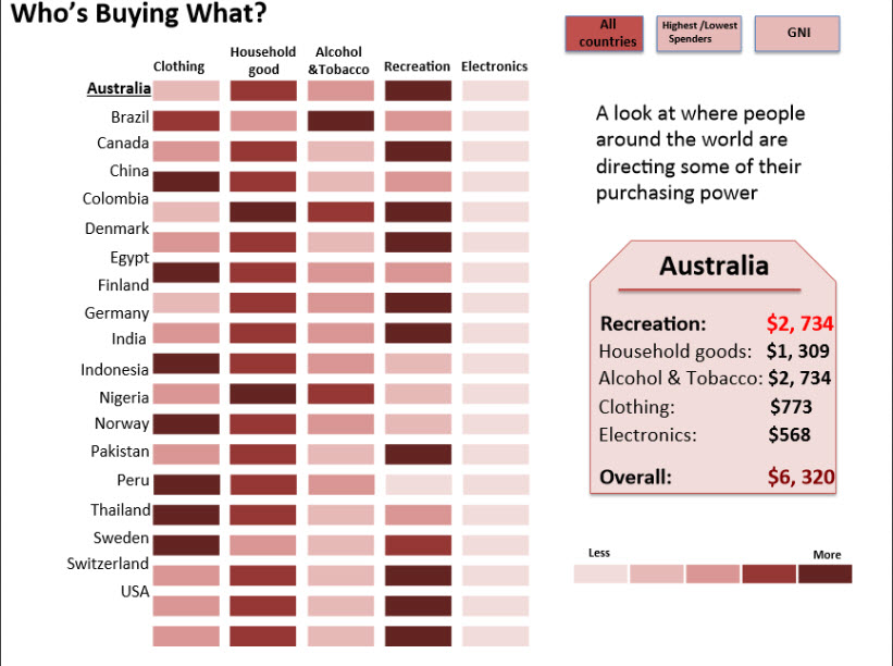
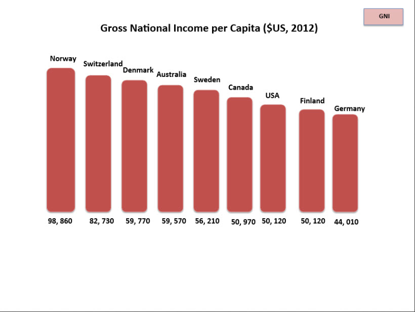
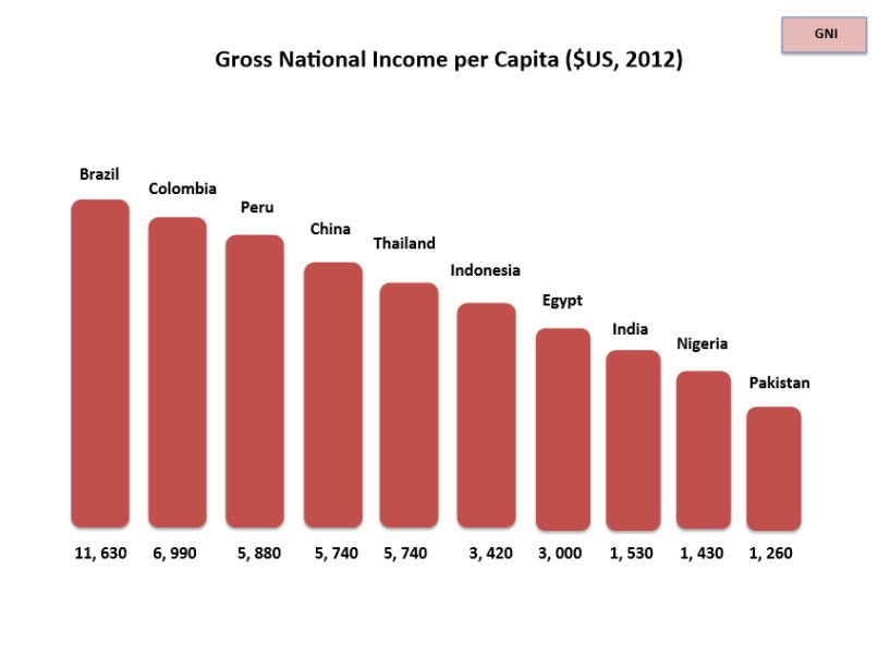
I have tried it to organize in three sectors. All countries, Highest and Lowest Spenders and countries by GNI (Gross National Income per capita in 2012, World Bank Data).
Page/sector – All countries – shows main trends. For example, in general, people spend on recreation and householding goods. Electronic goods are not popular and etc. Also on this page you can click on the country and see information in detail about its spending.
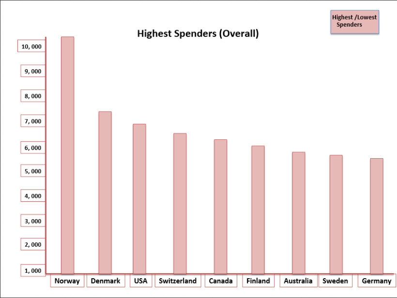
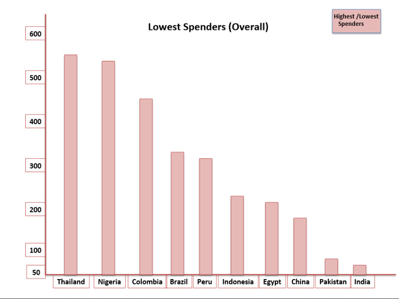
Highest and Lowest Spenders and countries by GNI – are shown in bar charts. Charts are supposed to be in one page (one page for Highest and Lowest Spenders, one for GNI by country – another one page). But couldn’t do it well visual. So, just keep in mind this.
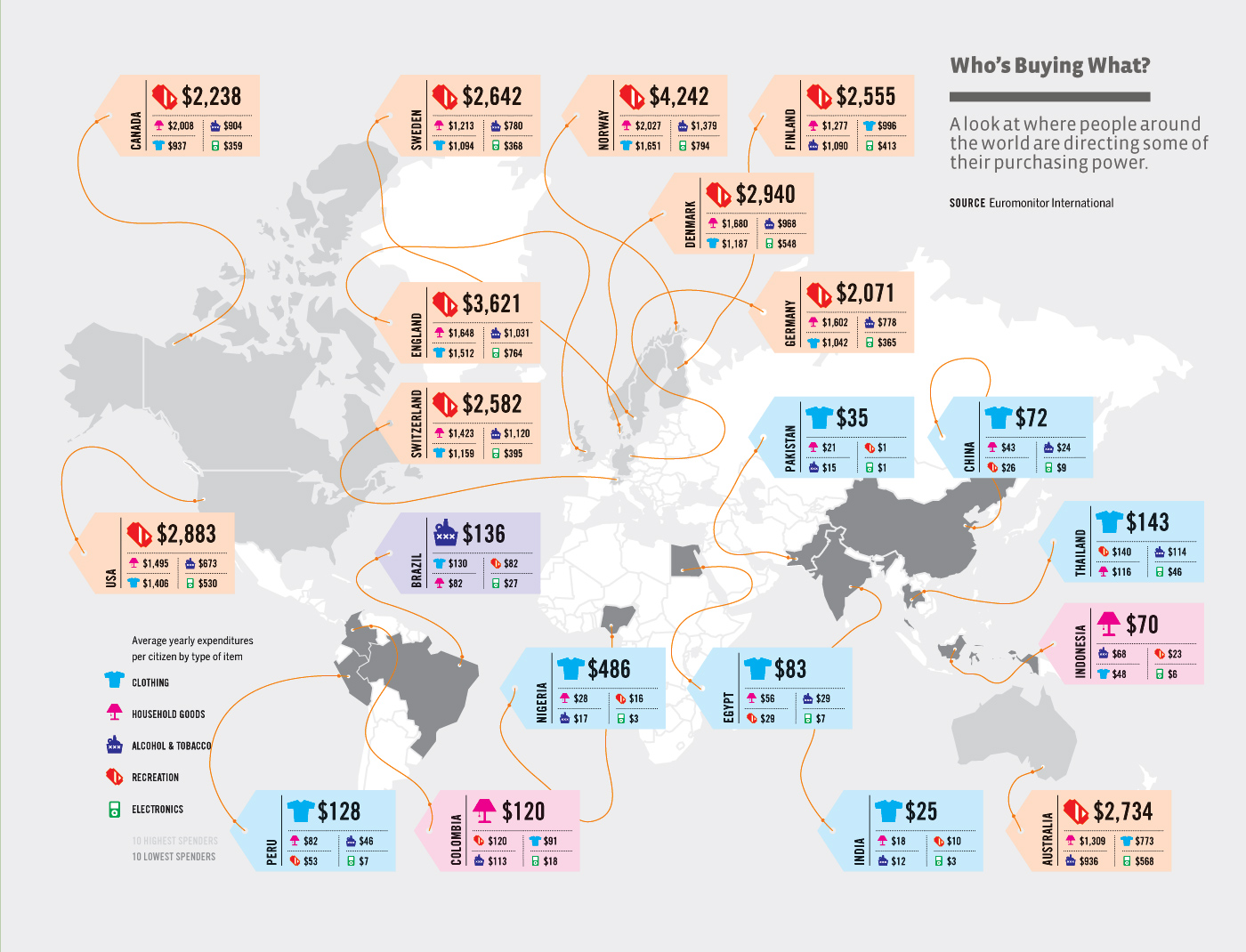
Below is the original information graphic design the students were suppose to review, analyze and re-design.
Here is Kamila’s redesign.