Readers:
As I did when I originally attended Professor Cairo’s Introduction to Infographics and Visualization MOOC course last January, I am showcasing some of the beautiful work done by his current students in the October 2013 class that just completed.
The first one I am going to showcase is a redesign assignment by Julien Hennequart.
Julian focused on three parts of the design for his project.
-
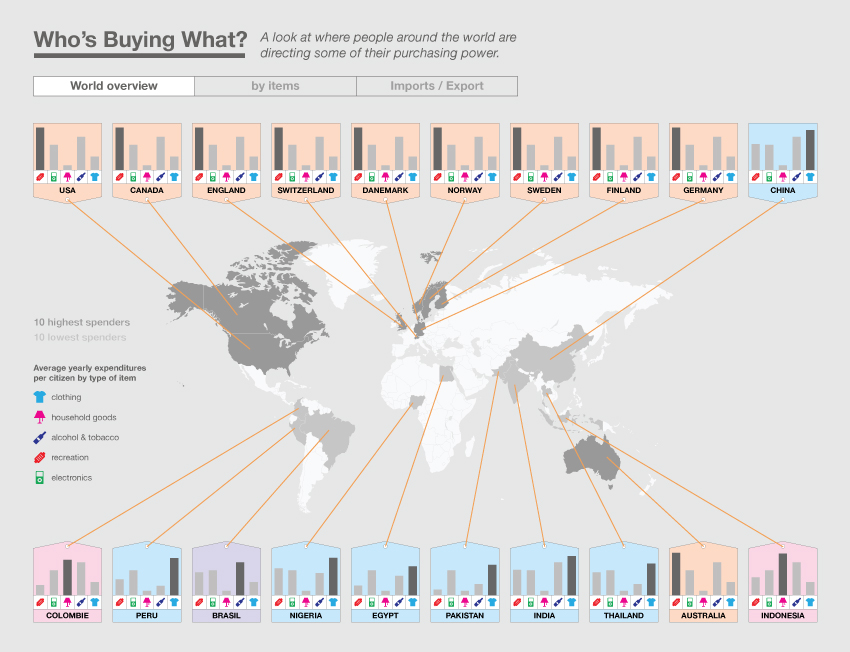
An overview of the subject, basically the same as the original but with a better organisation.
-
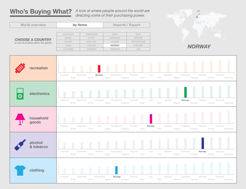
The second page is on the position of countries relative of each items.
-
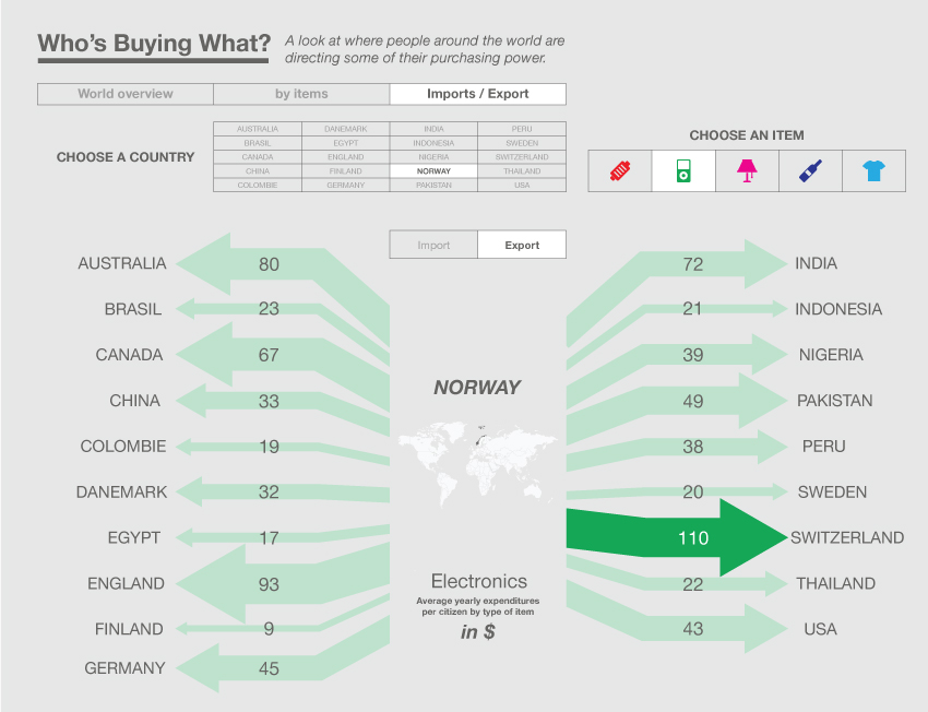
And the last one, a work on the import/export of the items.
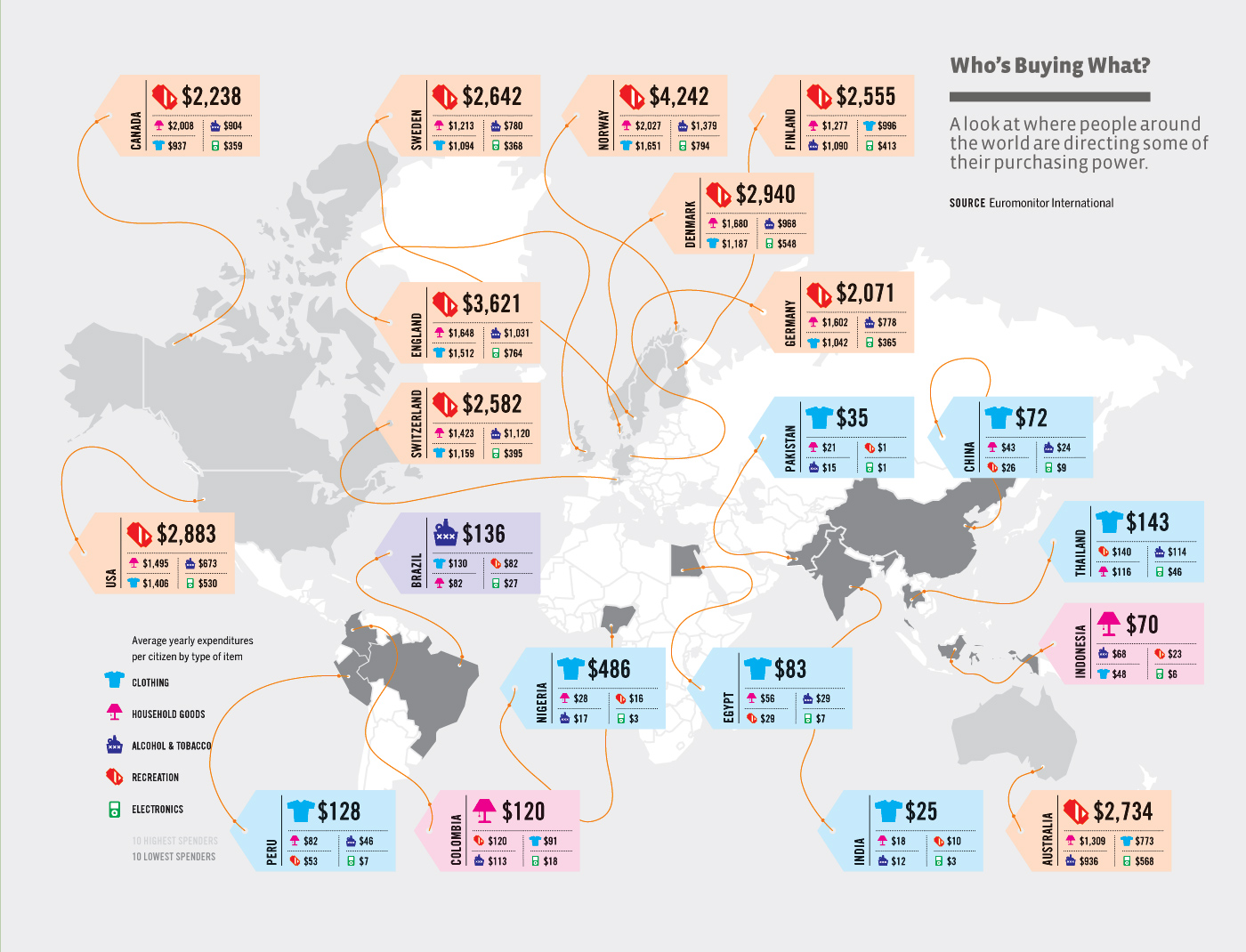
Below is the original information graphic design the students were suppose to review, analyze and re-design.
Here is Julian’s redesign.
Professor Cairo’s comments on his review of Julian’s assignment were as follows:
This is arguably the graphic that better preserves the looks of the original one, while making it much more interesting and easy to read. Good job.
