 Henry Charles Beck (June 4, 1902 – September 18, 1974), known as Harry Beck, was an English engineering draftsman best known for creating the present London Underground Tube map in 1931. Beck drew up the diagram in his spare time while working as an engineering draftsman at the London Underground Signals Office. London Underground was initially skeptical of Beck’s radical proposal — it was an uncommissioned spare-time project, and it was tentatively introduced to the public in a small pamphlet in 1933. It immediately became popular, and the Underground has used topological maps to illustrate the network ever since. [SOURCE]
Before Beck
Prior to the Beck diagram, the various underground lines had been laid out geographically, often superimposed over the roadway of a city map. This had the feature that the centrally located stations were very close together and the out-of-town stations were spaced apart. From around 1908 a new type of ‘map’ appeared inside the train cars (see more on this below); it was a non-geographic linear diagram, in most cases a simple straight horizontal line, which equalized the distances between stations. By the late 1920s most Underground lines and some mainline (especially LNER) services displayed these, many of which had been drawn by George Dow. Some writers have postulated that these in part inspired Beck.
Tube map of 1908
The first combined map was published in 1908 by the Underground Electric Railways Company of London (UERL) in conjunction with four other underground railway companies using the “Underground” brand as part of a common advertising initiative (see below).
The map showed eight lines – four operated by the UERL and one from each of the other four companies:
- UERL lines:
- Bakerloo tube – brown
- Hampstead tube – grey
- Piccadilly tube – yellow
- Metropolitan District Railway – green
- Other lines:
- Central London Railway – blue
- City and South London Railway – black
- Great Northern and City Railway – orange
- Metropolitan Railway – red
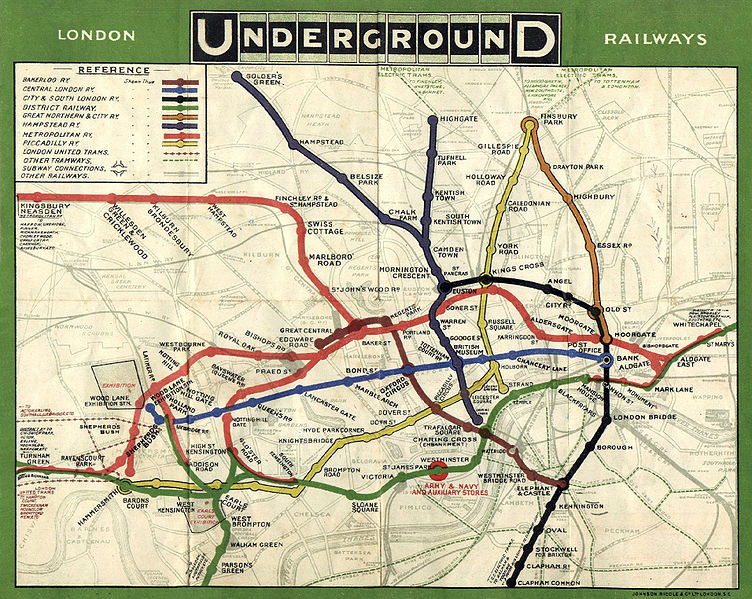
Being geographically-based presented restrictions in this early map; to enable sufficient clarity of detail in the crowded central area of the map, the extremities of the District and Metropolitan lines were omitted, so a full network diagram was not provided. The problem of truncation remained for nearly half a century. Although all of the western branches of the District and Piccadilly lines were included for the first time in 1933 with Harry Beck’s first map, the portion of the Metropolitan line beyond Rickmansworth did not appear until 1938 and the eastern end of the District line did not appear on the map until the mid-1950s.
The route map continued to be developed and was issued in various formats and artistic styles until 1920, when, for the first time, the geographic background detail was omitted in a map designed by MacDonald Gill. This freed the design to enable greater flexibility in the positioning of lines and stations. The routes became more stylised but the arrangement remained, largely, geographic in nature. The 1932 edition was the last geographic map to be published, before the diagrammatic map was introduced.
Beck’s concept
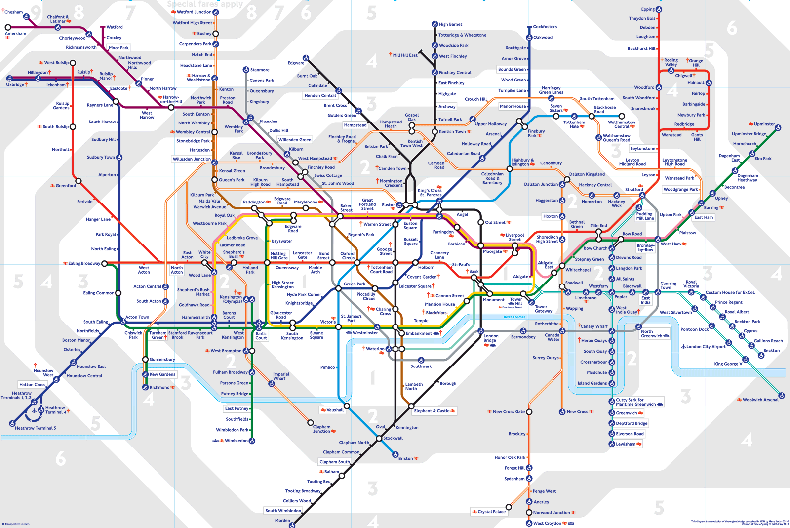
But it was clearly Beck who had the idea of creating a full system map in color. He believed that passengers riding the trains were not too bothered about the geographical accuracy, but were more interested in how to get from one station to another, and where to change. Thus he drew his famous diagram, looking more like an electrical schematic than a true map, on which all the stations were more or less equally spaced. Beck first submitted his idea to Frank Pick of London Underground in 1931, but it was considered too radical as it did not show distances relative from any one station to the others. After a successful trial production of 500 copies of Beck’s map in 1932, the map was given its first full publication in 1933 (700,000 copies) and the reaction of the travelling customers proved it to be sound design; it immediately required a large reprint after only one month.

The map after Beck
Beck continued to update the Tube map on a freelance basis, but the future Victoria Line was added in 1960 by the Publicity Officer, Harold Hutchison. Many other changes were also introduced to the map without Beck’s approval.
Beck struggled furiously to regain control of the map, but responsibility for it was eventually given to a third designer, Paul Garbutt. Garbutt changed the style of the map to look more like Beck’s maps of the 1930s, and also introduced the “vacuum flask” shape for the Circle Line. Although Beck preferred this version to Hutchison’s, he wasn’t completely satisfied. He started to make a new map, based on both his earlier works and Garbutt’s ideas. When this version too was rejected, despite its simplicity and ease of reading, Beck realized London Transport would never publish any map in his hand. Nevertheless he continued to make sketches and drawings for the map until his death.
Anomalies
A physical anomaly is that the City Branch of the Northern Line actually passes to the west of Mornington Crescent on the West End Branch; Beck’s original map showed this correctly, but later versions show the City Branch to the east of Mornington Crescent.
Other works by Henry Beck
In 1938 he produced a diagram of the entire rail system of the London region (as far as St Albans in the north, Ongar in the north-east, Romford in the east, Bromley in the south-east, Mitcham in the south, Hinchley Wood in the south-west, Ashford in the west, and Tring in the north-west). It included both the Underground and mainlines. It was not published at the time but was seen in Ken Garland‘s book, first published in 1994, and it took until 1973 until any official attempt was made to replicate a rail diagram for the entire London region.
Beck produced at least two versions of a diagram for the Paris Métro. The project, which Beck was never commissioned to do, may have been begun, according to Ken Garland, as early as before the start of World War II. A version dating from approximately 1946 is published in Garland’s book. His second version is published for the first time in Mark Ovenden‘s book about the Paris Métro and is on display at the London Transport Museum.


Hi Michael,
I would love to know if you, by any chance, have a high resolution copy of the 1908 map.
I absolutely love it, and would love to have the chance to print it as a poster for my house.
Thanks!
Hi Anahi:
Unfortunately, that is the only photo I have. What I recommend is looking online for shops that sell reproduction historical maps. I have seen quite a few shops like this out there.
Thanks for visiting my blog. I hope to hear from you again soon.
Regards,
Michael
I have tree old undergroundmaps from 1931. Do you know where I can sell them?
I live in Stockholm.