Readers:
Today, I am blogging my interview with Ken Flerlage, one of the most creative creators of Tableau data visualizations in the industry today.
 Ken has worked in information technology for nearly twenty years, doing everything from application development to database and ERP administration. While he loves IT in general, Ken found his true passion about five years ago, when he was given an opportunity to work in the analytics field full time. He started out working with QlikView and he quickly understood why data visualization was a total game changer. While QlikView was a good tool, Ken was completely blown away when he started working with Tableau. After taking a job as a Business Intelligence Architect at Bucknell University in 2016 and learning that they used Tableau, Ken started to play with the platform. At first, he didn’t do much with Tableau at work, but it quickly became a hobby (or, perhaps, an obsession) and he started seeing opportunities to visualize data everywhere he looked. From there, Ken started sharing his work on his blog, www.kenflerlage.com, began engaging in the Tableau community and continued to hone his skills. And, about a year and a half later, Ken was very proud to have just earned the title of Tableau Zen Master.
An Interview With Ken Flerlage
Michael: Hi Ken, it is very nice to finally meet you. I have followed your blog and your work for quite a while now. If you don’t mind I am going to dive right into the questions.
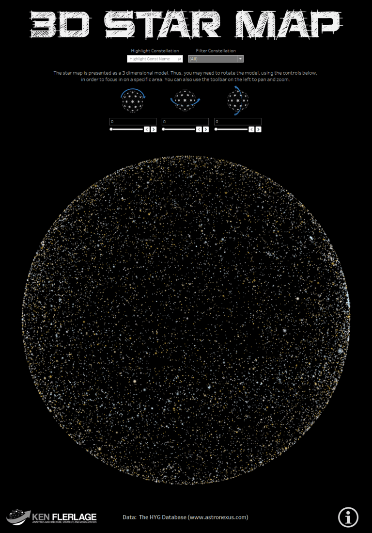
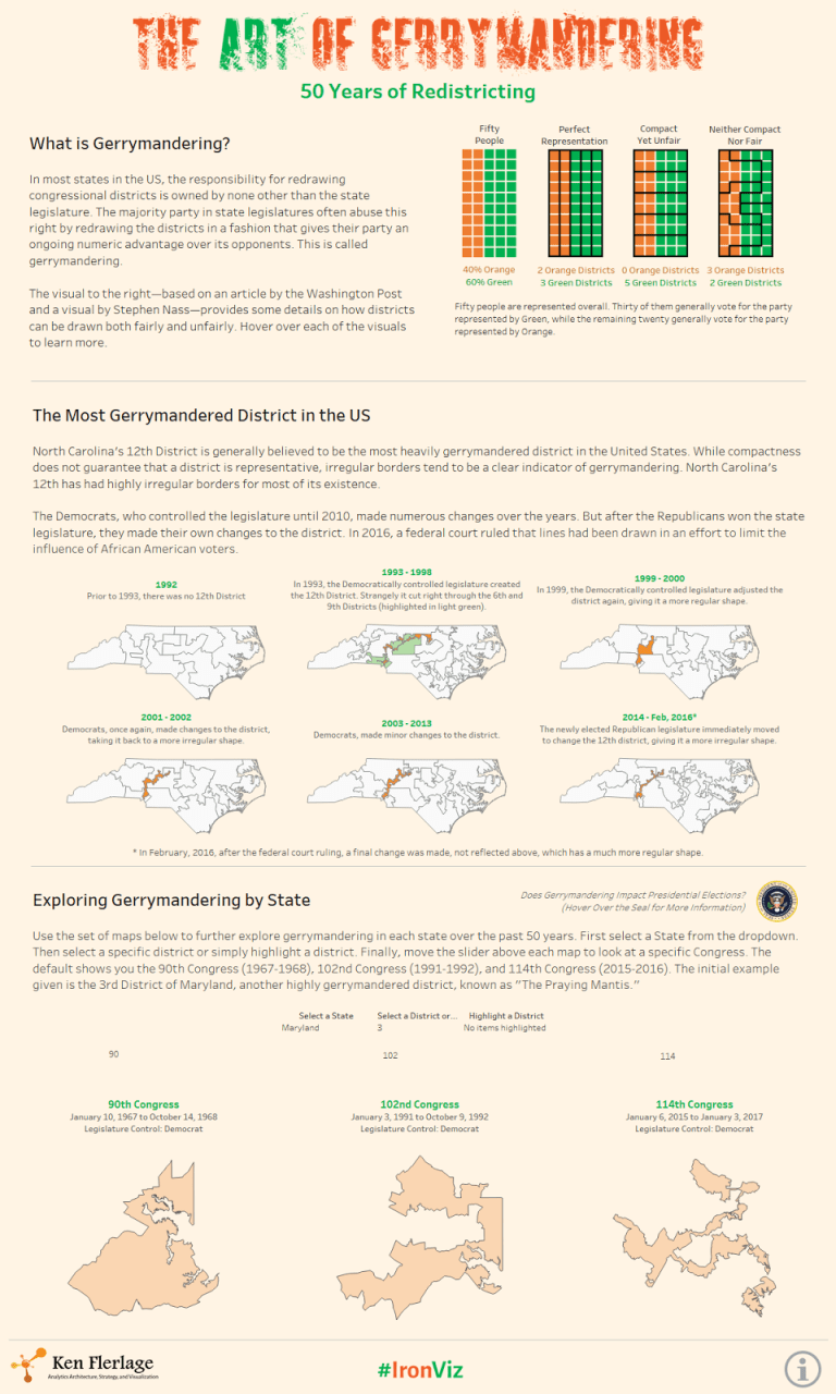
Michael: You have produced some of the most beautiful and interesting data visualizations I have seen, such as The Art of Gerrymandering and The Killing Fields. In particular, I love your 3D Star Map you recently posted. Can you tell us your motivation to create this dataviz and the process you followed to create it?
Ken: I’ve always been interested in lots of different subjects—religion, science, philosophy, psychology, politics, etc.—thus the variety of topics on which I create visualizations. I’ve been particularly fascinated with astronomy and astrophysics since I first read A Brief History of Time by Stephen Hawking. I wish I could tell you a great story about being inspired to create the 3D star map, but the truth is that it just came to me. I had the thought to create a map of the visible stars and allow users to pan around and view their favorite stars and constellations. But I really had no idea how to create it. Eventually, I stumbled on some astronomy forums that discussed using the stellar measures, Right Ascension and Declination to calculate 3D coordinates of stars and that was all I needed to put it in motion. This was an incredibly fun project to work on and I’m very proud of the result.

Michael: Many of your data visualizations are grounded in very advanced mathematics. Can you tell us a little bit about your work at Bucknell University; that is, what do you do when you are not creating datavizzes?
Ken: I work as a Business Intelligence Architect at Bucknell University. Along with the other members of the BI team, we are responsible for strategy, architecture, delivery, and operations of the university’s data and analytics platforms. We try to empower our user community to leverage these platforms, so our users tend to build more reports and dashboards than we do. Instead, our focus is on keeping the systems operational, providing support, and acting as internal consultants, as well as building data models to make reporting and analytics easier for our end users.
Michael: O.K., I am going to put you on the spot here. Tell us three Tableau tips that you consider priceless.
Ken: This is such a great question and it’s really difficult to answer. For the past 1.5 years, I feel like I’ve been drinking through the firehose in my Tableau learning, so there are so many tricks and techniques that I found invaluable. I’d probably start with the sheet swapping technique (Hashu Shenkar, The Information Lab) that allows you to change the sheet based on a parameter or filter. While one would think that this has limited use cases, it can be incredibly powerful and there are lots of other tricks, such as Robert Rouse’s collapsible menu, that is based on the same basic technique. I’ve used this in a few visualizations which I’ll be publishing soon. And I’ll soon be writing about a new trick I developed based on this technique.
The second technique I’ll mention is not really a Tableau technique at all. When I first started using Tableau, I read a blog by Josh Tapley on using PowerPoint for some basic graphics work. Since reading that, PowerPoint has become an invaluable tool for adding a bit of design flair to my visualizations. To give you an example, I used PowerPoint on the 3D Star Map for three different things: 1) The viz title 2) Custom shapes for the stars, and 3) The icons indicating how to rotate the viz.
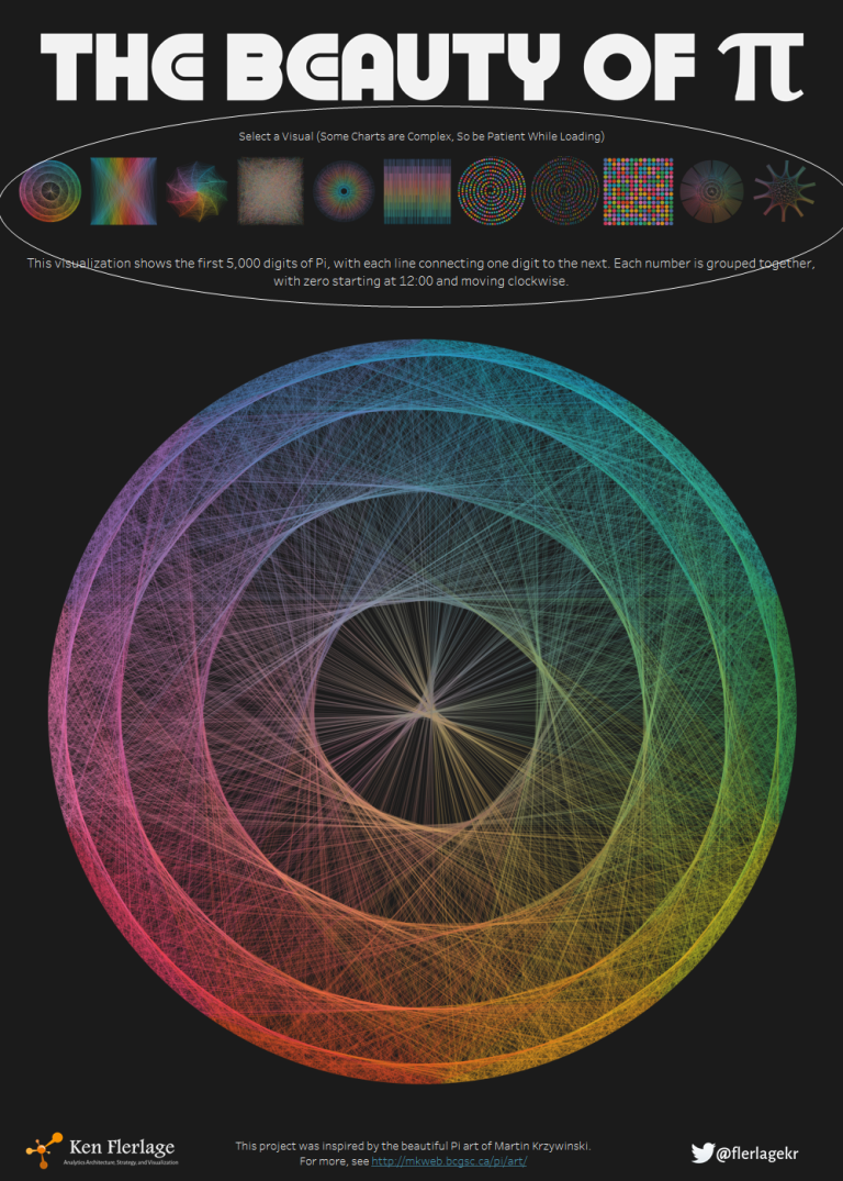
The final technique I’ll mention is what I’ll call data layering. There is likely a better term for it, but this is the idea of duplicating data through joins or other methods in order to enable better visualization of the data in Tableau. For example, in The Beauty of Pi, I duplicated my data multiple times so that I could create an image-based sheet selector. Each image is a separate custom shape, which then filters the data to one of the multiple “layers,” displaying the selected visual. Matt Chambers wrote a great blog post on this in November which I’d highly recommend: How To: Tableau Sheet Selector with Dashboard Actions.
Michael: You have a strong background in database and architecture. One of my favorite expressions I have heard is “I am drowning in data, yet I am starving.” That is, I have a heck of a lot of data, but I cannot easily find the answers I need. How would you propose we solve this dilemma?
In my opinion—and this is coming from an IT guy—IT departments need to get out of the way.
Ken: This is a difficult dilemma to solve. I think one of the biggest problems we’ve had historically is that people have always needed to go through their IT departments to get at their data. And, unfortunately, the demand for data to help inform decisions will always outstrip IT departments’ abilities to meet that demand. I don’t think this is necessarily because of a desire for control, but rather a result of the complexity of old-fashioned business intelligence tools and the prevalence of waterfall project methodologies. In my opinion—and this is coming from an IT guy—IT departments need to get out of the way. This is why I am a huge proponent of self-service analytics. Instead of IT departments managing long, drawn-out reporting writing projects, we need them to first focus on providing the right platforms to their users—platforms that allow them to bring in their own data and analyze it themselves. From there, the focus should be on empowering users through training, consultation, etc. so that he has the skills to leverage those platforms properly.
Michael: In the past, you have worked with MicroStrategy and QlikView as your BI & Analytics tools. Where has Tableau exceeded the capabilities of these tools and where has it fallen short? BTW, I worked with MicroStrategy as my tool of choice for 12 years.
Ken: As mentioned in my bio, QlikView was a real game changer for me. It was my first experience with visual analytics and I was blown away by the ability to create quick, insightful dashboards with the tool. I was a QlikView fanboy for about 3 years…until I discovered Tableau. Now don’t get me wrong, Qlik still has some great products, but in my opinion, Tableau is way out ahead of every other visual analytics platform and I don’t see this changing anytime soon. The platform is like nothing I’ve ever seen before, allowing you to easily create simple yet powerful visualizations in minutes, but also providing you with a platform that allows you to create anything you could ever imagine.
Tableau is way out ahead of every other visual analytics platform and I don’t see this changing anytime soon.
My experience with MicroStrategy was not particularly hands-on. I was leading a team of analytics professionals and had experts in my team who did most of the MicroStrategy development. That being said, I do work with Cognos Analytics at Bucknell. In my opinion, the biggest strength of products like Cognos, Business Objects, and MicroStrategy is their ability to create operational and list reports. And, like it or not, this type of reporting is still a critical part of most businesses.
Michael: What features are missing in Tableau Desktop that you would like to see addressed in the near future?
Ken: This product is so feature-rich that it almost feels selfish to ask for more. With that, I will name a few things I’d like to see. Parameters are incredibly powerful, but I feel that they’re missing quite a lot of functionality. I’d particularly like to see the ability to create dynamic parameters. This also happens to be the most popular “Idea” on the Tableau community forum and is “In Review” by Tableau developers right now, so hopefully, we’ll see it soon.
Another thing I’d like to see is transparent sheets. I think it’s become a bit cliché to ask for this lately and the potential for misuse is definitely high, but there are times where transparent sheets would provide such an ability to enhance designs in a way that simply isn’t possible right now.
There are lots of other things I’d like to see, but I’ll mention just one more. I’d really love to be able to set colors dynamically based on a field in my dataset or a parameter. This is definitely not that important of a feature, but it’s something I’ve been wanting for a while now and I think it would have a number of interesting use cases.
Michael: So, what is next on your list of things to conquer?
Ken: My answer is simple. I want to keep creating nice visualizations, continue to learn, and continue to share my knowledge with others.
Michael: Thank you, Ken. I really appreciate your knowledge sharing of Tableau, your beautiful Tableau data visualizations, and most of all, your insights. I look forward to seeing you again at the Tableau Customer Conference 2018 in New Orleans.