Fred Najjar Bio
Fred works as a BI Specialist @ JLL in Sydney. Fred has always been amazed by the power of data visualization long before his career started in Data Analytics. During his study for his data science degree Fred was exposed to lots of visualisations and graphs that were very hard to interpret or misleading, since then, he started to pay more attention to visualisation techniques and best practice. However, he consistently faced challenges with the tools available that were inflexible or had a steep learning curve. Then he discovered Tableau.
Fred found his passion when he started to communicate data more effectively and was able to address all his posts using simple graphs. Until a couple of years ago, when he got his first job as an insight analyst in the online advertising industry where he had the opportunity to build dashboards for work. During this time, Fred had an opportunity to attend the Tableau Conference in 2018 in New Orleans, where he got to know people from the community and learned about the scale of data communities and #datafam which instantly felt like a home where he belongs.
You can follow him on Twitter @FredrickNajjar.
QUESTIONS
Link: https://public.tableau.com/profile/fred6420#!/vizhome/NooraFred/NooraFred
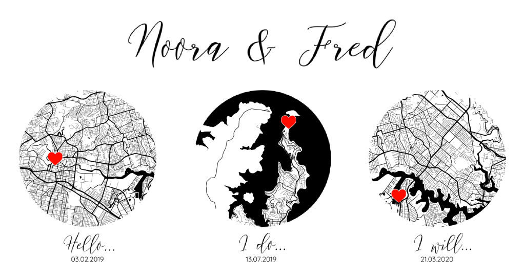
Michael: Hello, Fred. So, I am a romantic at heart (don’t ask me about sad movies!). I loved your #IronQuest submission, Noora & Fred. Can you tell my readers the story behind it?
Fred:
Hello Michael, thank you for having me on your Tableau Community Spotlight series. I have always enjoyed learning about other #datafam members in the community through your interviews, and I am happy to share my story as well.
I have always found visualisations of personal topics very interesting and engaging. A month a go, Noora and I tied the knot and I was planning on creating a visualisation to tell our story together for a while, but I never had the chance to actually do it. I remember being touched by Fiorella’s viz ‘Our Story’, in her viz Fiorella used a minimalistic approach, she was able to communicate the milestones in her relationship with Chirs in a very effective way.
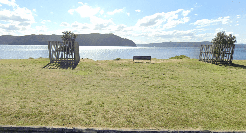
While thinking about a topic for March’s IronQuest challenge themed ‘Maps’, I got this idea of creating a viz that shows the places Noora and I had our key milestones on a map marked with the dates. This was the main idea for this visualisation. Gladly, gathering data was not a problem, all I had to do was to get the coordinates for the three places, I used Google Maps for that, yet, I had to fiddle a bit to get the exact coordinates of the park bench where I popped the question to Noora.
Here is the park bench
From there I began to think about the minimalistic design. I wanted the viuslusation to have black and white theme, so I used Mapbox Studio to design the map, and the layout was based on a #ProjectHealthViz entry I did in the past, where I used the same trick to create transparent circular shape containers to show the maps.
Here is the visualization.
Michael: You are a BI Specialist at JLL. Can you tell me about your role?
Fred:
Great question, as my journey only started with JLL last week -I am still learning all about my new role- I can tell you about what I found so far…
JLL has a strong innovation focus, they are a leading technology company, specialising in Commercial Real Estate. JLL aims to use data in a different way than usual in the real estate world. They also make sure to maintain a great culture and fun environment.
In my first week, JLL launched a new program called Alteryx Adventurer, which aims to help the team to develop their Alteryx skills by providing different learning paths to follow. The journey includes 5 different levels of difficulties -from Rookie to Rockstar- to pass each level, each team member will have to solve a number of exercises and get involved in community projects, besides gaining the Alteryx certifications (Core & Advanced).
Another thing that I found interesting was the Viz Review session. During the session, a team member will present their work to the team and everyone gets the chance to provide feedback. I personally found this session very useful as it can be difficult sometimes to reach out to people to get feedback.
From a personal standpoint, I have found a high level of satisfaction during my first week at JLL, I am actually amazed by JLL’s focus on analytics and commitment to building such a great data culture internally, as I have never experienced such a culture in my previous roles. You can instantly see that JLL has invested a lot of time building their culture, which I am happy to be part of.

Michael: You live in Sydney, Australia. Can you tell my readers why Sydney is such a great place to live?
Fred:
Simply in two words, ‘spectacular nature’. Sydney contains 100s of beaches, ranging in size from a few meters to several kilometres. It is home to gorgeous coastlines and magical gardens which make it a destination for tourists, as they are always rewarded with unique attractions and activities.
Sydney is a huge city in both size and population, it’s Australia’s -and probably Oceania’s – most famous city, it contains such exciting landmarks like The Sydney Opera House and The Sydney Harbour Bridge. Despite being a very expensive city to live in, Sydney frequently ranks in the top ten of the most livable cities in the world. This reputation has always made Sydney very attractive to lots of people from all over the world to visit, live or study.
Finally, Sydney has its own unique melting pot of culture, bringing together from all walks of the earth their own traditions, food and music, making it the ideal place for cultural explorers and -most importantly- foodies. If you happen to visit Sydney (after this madness is over) feel free to reach out and I will ensure you get the best experience out of your visit.
Michael: Can you tell me your three favorite Tableau tips and tricks?
Fred:
There are many, I will try to stick to three.
- Create an ‘Apply’ button for Parameter: If you have lots of filters add an apply button ‘using parameter action’ to refresh apply all filter at once. Zen Master Ken Flerlage has a great blog explaining this: https://tinyurl.com/y9dvsxmm
- Map zooming: If you have a map on a dashboard and you don’t want users to zoom in/out while scrolling. You can turn-off the zooming ability from the dashboard by going to Maps > Maps Option > Allow pan and zoom – remember this must be done from the dashboard and not the sheet.
- Dual Axis: if you want to create a dual-axis chart, simply put the first measure (Green Pill) on the shelf, then drag the second to the right-end of the graph while holding the Shift key and voila!
Michael: Can you tell me your three favorite Alteryx tips and tricks?
Fred:
I love Alteryx, it is full of hidden tricks
- Multiple Browse Tools at Once: I am a big fan of short-cuts, this one adds a Browse tool after selected tool(s). If the selected tool has multiple outputs, a browse after each output. Select the tool(s) you want to add the browse tool after and press CTRL+SHIFT+B
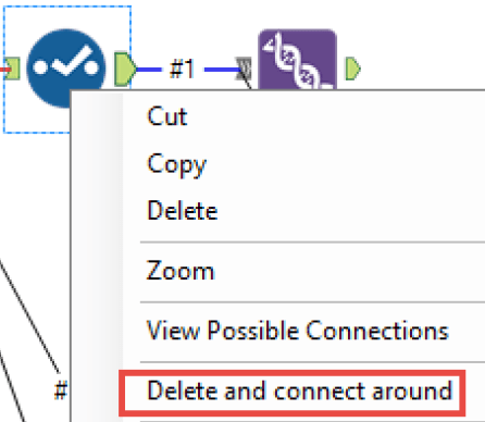
- Delete and connect around: When deleting a tool that is connected, Right-Click on the tool and select Delete and connect around.
- Indenting Formulas: Indenting/unindenting a block of instruction in the formula tool could be done by the ‘Tab’ key. However, using Crtl + ] provides a smaller indentation with text spaces instead of tab and Crtl + [ does the opposite
Last one, here is a document that contains hundreds of Alteryx tips and tricks from Europe Inspire 2019. Make sure to check it out.
Michael: What is next on your “To Do” list? What can the Tableau community expect to see from you in the near future?
Fred:
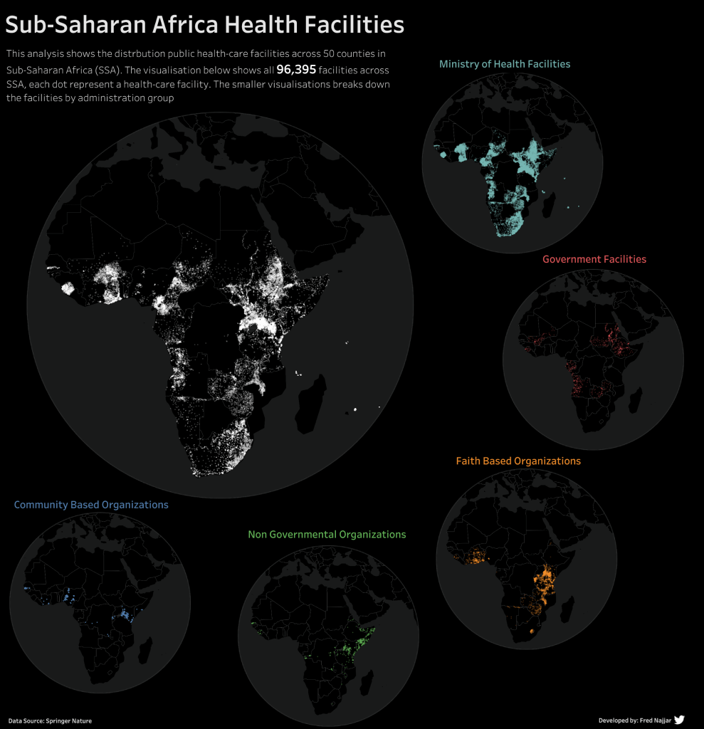
I have always been inspired by the #datafam’s commitment to community projects, which I want to get back into. I have a pile of half-done projects that are sitting in the backlog that I want to finish. I definitely want to get my Tableau and Alteryx certifications. Finally, I want to collaborate more on Tableau projects with other people from the community as my first collaboration experience with Frederic Fery was great fun and I learned loads from him.
Here is the viz I did with Freddy.
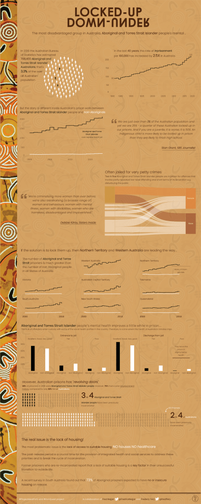
Link: https://public.tableau.com/profile/fred6420#!/vizhome/Locked-upDown-under/Locked-upDown-under
Tableau Public
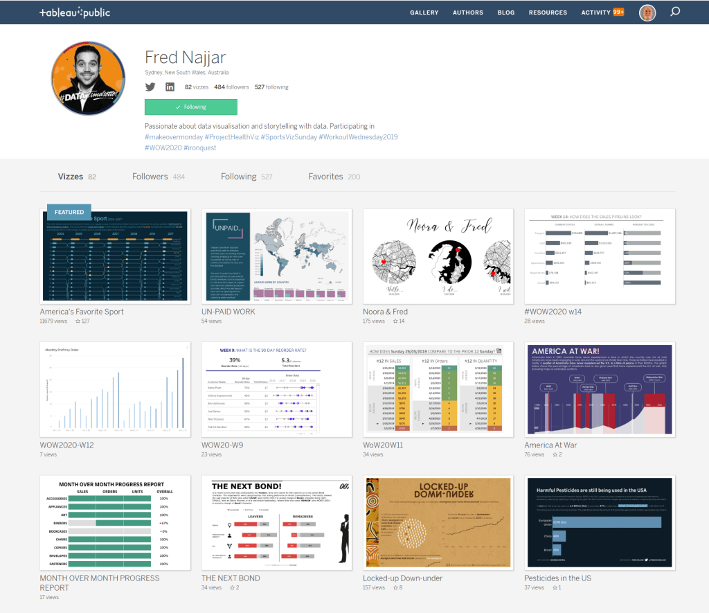
Here is a link to Fred’s Tableau Public page. The screenshot below shows a partial list of some of his datavizzes.
Link: https://public.tableau.com/profile/fred6420#!/