David Borczuk Bio
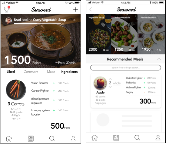
Hey! My name is David Borczuk and I work as a clinical data analyst at Alkermes, which is a small pharmaceutical company based in Waltham, Massachusetts. I have been using Tableau for around 2.5 years, and absolutely love it! However, prior to my debut in the Tableau world, I was a busy graduate student. In 2019, I graduated with my Master’s in Health Informatics at Northeastern University, where I learned about the intersection between information technology and health care. Throughout my graduate career, I had the opportunity to learn about user experience and user interface design and subsequently designed three healthcare smartphone applications. My favorite one, which I called Seasoned, was an app that “gamified” cooking to promote healthy eating. Essentially, you scored points by using ingredients that had health benefits and simultaneously learned about the benefits and detriments of these ingredients. When I was finished with my thesis, I looked back at the work that I did and said to myself, “Wow, I honestly cannot believe I had so much fun with all this design work!” That was my epiphany moment where I realized that design meant more to me than I thought. It was not until I started using Tableau, however, where my passion for design blossomed and accelerated.
QUESTIONS
Link: https://public.tableau.com/profile/david.borczuk#!/vizhome/TheAdventuresofLewisandClark/Dashboard1
Michael: Hello, David. I absolutely love you recent dataviz, The Adventures of Lewis and Clark. Can you tell me readers your motivation for creating this dataviz, how you found the data, its design, and how you then created it in Tableau?
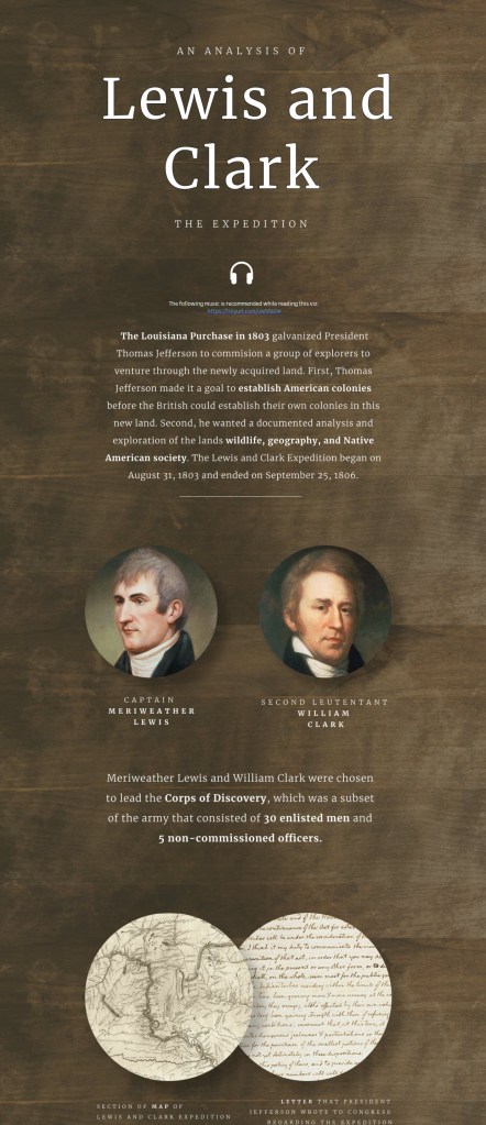
David: I think that visualizing history is a fascinating vector for design, and I am always on the lookout for rich datasets that showcase interesting information from our past. For the #IronQuest challenge in March, the theme was built around using maps, so that certainly narrowed my focus. I really wanted to create a visualization that captured my data storytelling design style. I felt that the best way to visualize a story with maps is through a documented journey across a certain geography. The Oregon Trail was the first idea that popped up, but I felt like everyone learned about that in grade school. I wanted to tackle a topic that was recognizable but not fully understood. After a lot of thought, I decided that the western journey of Lewis and Clark checked all the boxes.
The data for Lewis and Clark’s journey was not consolidated in one place, but I was fortunate enough to find a spatial file on Koordinates.com that not only plotted their journey, but also included a hyperlink to a website that curated all of their journal entries. The temperature and weather data was also compiled in a structured format in an academic journal article that described the journey. The data on animals discovered, plants discovered, and notable events, however, was scattered across several online archives, which I had to unfortunately extract manually. To compile all of the data together, I created an Excel file that listed all the notable events and wildlife discoveries for each day of Lewis and Clark’s journey.
The design of this viz was challenging because I had a lot of information to convey, but I also wanted to keep the reader interested throughout the entire experience. When I design an infographic or dashboard, I am assuming that a reader will spend an average of 10-20 seconds on my entire visualization. Adding a sense of immersion may increase this attention span, but I try to prioritize quick, bite-sized visual experiences so that the reader can leave with a few cool insights. For this viz, I really wanted to push the level of immersion so that I could stretch this attention span as much as possible. To do this, I first created a narrow dashboard width so that the reader’s eye does not need to travel very far in order to consume content. Second, I wanted to tell the story through pictures, so I interspersed photos of Lewis and Clark as well as some historic documents that were relevant to their journey. To immerse the reader even more, I provided a link to some music that the reader could listen to while scanning through the viz. Lastly, I wanted to layer the entire viz on a wooden background to make it seem like the reader was being “briefed” on this exciting mission at a round table just like their experience at Camp Dubois, Illinois! To complement this “scene,” I created a custom Mapbox map to make it seem like their journey was being described on a parchment map!
So, you are probably asking, “How did David make all of these designs?” To make all of the pictures, font, and backgrounds, I used a program called Figma. It is an online design editor, similar to Adobe Illustrator, but it’s free and on the cloud! After I assembled the pictures and designs in Figma, I exported them as image files and put them into the Tableau dashboard. Then, I layered the Tableau visualizations on top of the assembled Figma images. Stay tuned for a tutorial on how I design with Figma!
Michael: You are a Data Visualization Designer in the pharmaceutical industry. Can you discuss how you use Tableau in your current role and a little bit about your design philosophy?
David:
The Clinical Data Analytics team at Alkermes are subject matter experts in Tableau and data visualization, and our job is to leverage Tableau to solve various business problems across different clinical functional groups. My role is mainly optimizing the design, user experience, and visual best practices of the data that we are analyzing, as well as making sure that our insights are properly communicated to our end users. When providing oversight for our clinical trials, it is important that data is conveyed accurately and quickly in order to ensure the best health and outcome for our clinical trial subjects. A lot of the dashboards that I create are for our Drug Safety and Pharmacovigilance (DSPV) team, where I provide patient profile data and adverse event signaling data in real-time. Tableau has allowed the DSPV team to quickly analyze adverse event signals for patients that are taking our experimental drug products, which decreases the latency between the inception of an adverse event and our ability to respond and liaise with the principal investigator at the site.
My design philosophy at work follows a very similar design philosophy in my personal projects. I want to make sure that the information being presented is not only clear and concise but also answering the essential business questions of our end users. I also want to tell a story with the data that is presented, so that the readers of the visualizations do not have to put pieces of a puzzle together. By creating complex calculations behind the scenes and displaying the information that directly answers the questions of my end-users, I reduce time, cognitive load, and, consequently, frustration. Lastly, I am always thinking about how I can design a dashboard that can scale. In pharma, there are always going to be more clinical trials, and these clinical trials may have a completely different study design than the previous one. How do you design a dashboard that can display the same information for both of these studies without having to redo the entire layout? It takes a lot of initial planning, but once a scalable dashboard is implemented, it is just a matter of pointing Tableau towards the new data and everything works like magic!
Michael: Can you tell me your three favorite Tableau tips and tricks?
David:
- Creating floatable lines: If you float a blank object in a dashboard, go to the “Layout” tab, create a border around it, and reduce the height or width of the blank element to 1 pixel. If you reduce the height to 1 pixel, it will be a horizontal line, and if you reduce the width to 1 pixel, it will be a vertical line. If you want to make a thicker line, instead of drawing a border around a blank element, create a black background and reduce the height or width to around 2-3 pixels. I love this trick!
- Creating a Timeline: I love to use circles on a timeline to illustrate two-dimensional data. To create a timeline, make a calculated field that just has the number “0” in it and drag that calculated field to the rows or columns shelf. Then, drag the dependent variable measure to the opposite shelf, and put the independent variable on detail. Change the mark type to circles, and you should then have a series of dots on a single line across the dependent variable!
- Dimming a Picture: Any time you are creating a visualization that sits in front of an image, it is important to dim that image so that there is ample contrast between it and the visualization. To do this, float a black square onto a dashboard and reduce its opacity to around 75%. Then, fit the black square over the image and, ta-da, you’re done!

Michael: It has been years since I have been to Boston (it gets wicked cold there!). Pretend I have never been there. What would be the top 3 things you would recommend I go see?
David: It definitely can get cold here, which is why I’m going to take that into account when giving you my recommendations! The first activity I recommend is seeing at least one museum, whether it is the Museum of Art, the Museum of Science, the New England Aquarium, or the Natural History Museum. If you’re getting hungry, nothing is more iconic than eating at an Italian restaurant in the North End and then grabbing a pastry from Mike’s Pastry (I’m sorry, Modern Pastry, I’m in the other camp). To end your night, I would then stroll through Faneuil Hall, and, weather permitting, walk down to the Boston Public Garden! If you still have enough time, try to walk on Newbury Street for an evening of shopping, ice cream tasting, and coffee drinking. Oh, and don’t forget the Duck Tours!
Michael: What is next on your “To Do” list? What can the Tableau community expect to see from you in the near future?
David: I have been so inspired by the passion, commitment, and work ethic of the Datafam, that I feel like it’s time to really show my appreciation. This year, I really want to give back to the Tableau Community, whether it is giving webinars about Figma design, my design philosophies, or my idea of a “Viz Night” where people watch me create one of my Makeover Monday designs step-by-step. I also announced earlier this year that I was going to release some free dashboard designs by this Spring, which I’m going to try my best to do (but it may be delayed until the Summer). I am always trying to think of innovative ways to teach others what I’ve learned in order to continue this awesome legacy of data visualization designers for years to come! Stay tuned! 😉
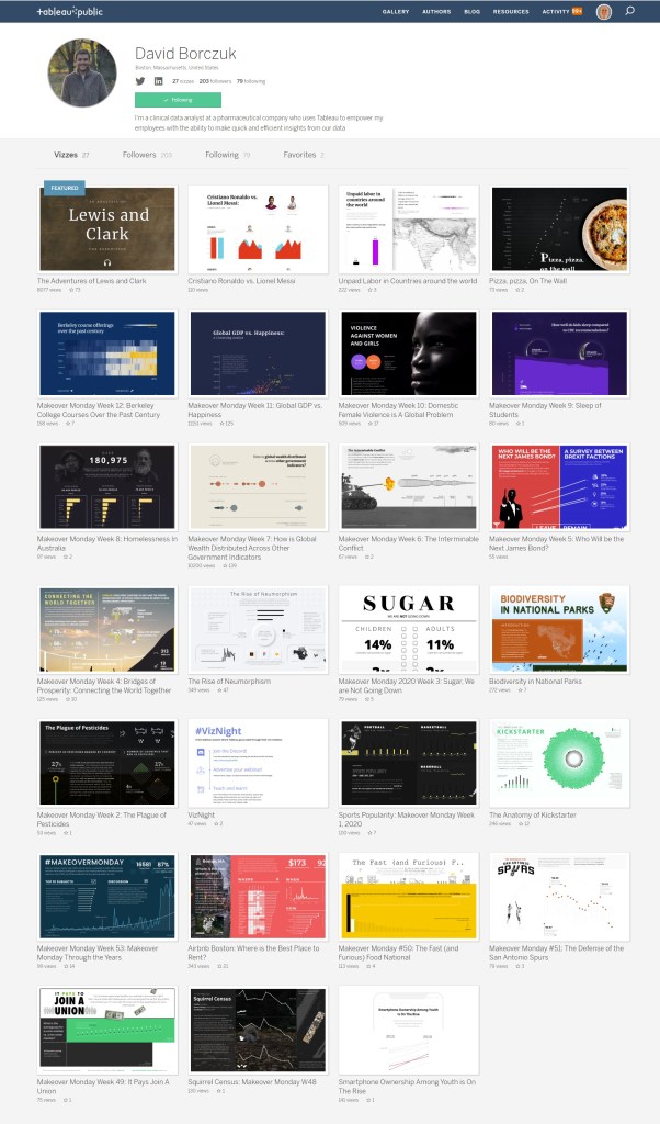
Tableau Public
Link: https://public.tableau.com/profile/david.borczuk#!/