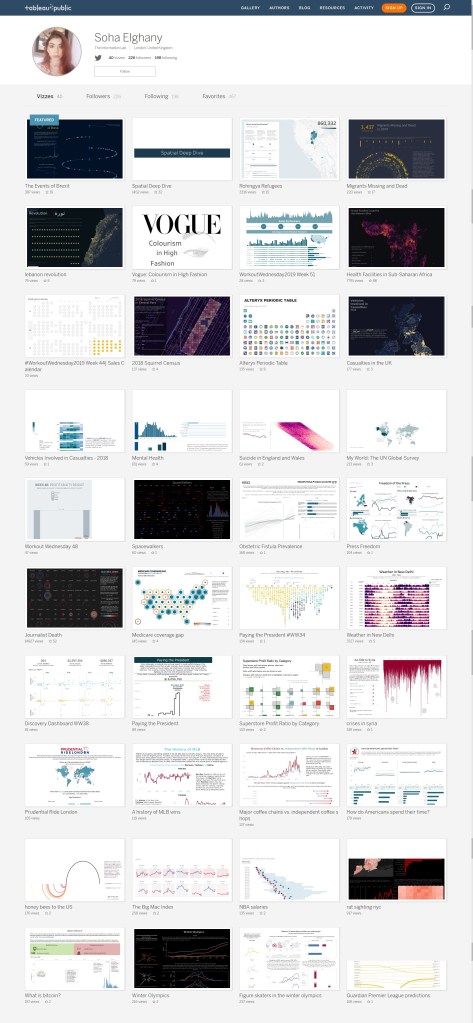
Soha Elghany Bio
Soha is a psychologist that developed an intrigue for data during her MSc in psychosis. She conducted a research study into factors affecting sense of presence in a virtual reality social environment, which has been submitted to the journal of Cyberpsychology, Behaviour and Social Networking. This was Soha’s first insight into the impact data and research can have, and she wanted to be able to answer more complex in-depth questions with data. Her experience encouraged her to explore a career within the data field and led her to encounter Tableau, and the integral role of storytelling in data can have.
Outside of her passion for data, she is a future yogi that enjoys expressing her creativity through her art and losing herself in fiction.
QUESTIONS
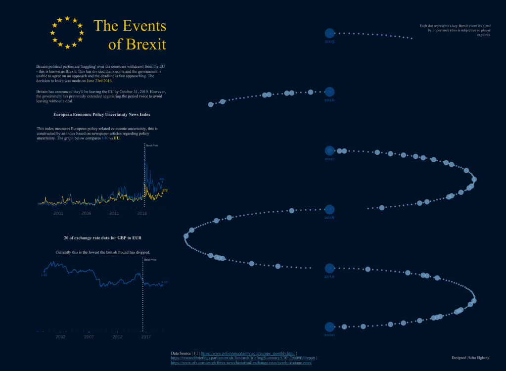
Link: https://public.tableau.com/profile/soha.elghany#!/vizhome/CurvedTimeline_15701326253720/Brexit
Michael: Hello Soha. I really liked your curved timeline to tell the story of The Events of Brexit. Can you tell my readers your process for developing this dataviz? For example, how did you decide on the topic, find and gather the data, design and then develop the data viz in Tableau?
Soha: How I decided on the topic is the easiest question to answer, I live in the UK and I’m British. It’s hard to be a British citizen and not have an opinion about the political landscape that’s happening right now, especially since my parents are immigrants, originally from Egypt – so this is even more reason as to why this topic meant a lot to me.
Once the shock of Brexit happened and the constant bombardment of information I kept seeing around me I kept wondering how did this happen. How did Britain reach this point in history and why did the vote lead to the result it did. The solution to these questions for me was let’s find data and visualise this.
Finding and gathering data was the hard part. It took 5 months of research in my spare time to be able to curate my data source of Brexit events, and one of the challenges I faced was that the longer it took me the more catching up I had to do. This experience taught me patience and endurance I found in the financial times, in the UK gov website and policy uncertainty. Design-wise I always knew my visualisations main focus was going to be a timeline of events, a straight timeline would have caused my visualisation to be very long (this is before I saw Ken Flerlage amazing viz: https://public.tableau.com/profile/ken.flerlage#!/vizhome/PresidentialElectionsTimeline/Timeline). I wanted the colours to be a reminder of the EU colours considering the topic, and the layout was based on sketching various wireframes until I found the layout that worked.
Michael: You are a psychologist with the The Information Lab. Can you tell my readers a little bit about how you use Tableau at work?
Soha: The Information lab is a consultancy company, which is also a Tableau and Alteryx partner. We strive towards introducing people to Tableau and Alteryx to help them solve their problems with the tools they need. It was founded by Tom Brown with the goal of striving towards introducing people to Tableau and Alteryx to help them solve their data problems with the tools they need, which will make data accessible and able to utilise it to make decisions. This is done through consultancy, training and selling licenses. Within The Information Lab, there is the data school led by Andy Kriebel and Carl Allchin, where the goal is to hire people who are passionate about data, want to learn and grow these skills to become Tableau and Alteryx Consultants. These people go through 4 months of intensive training into these tools and they become consultants where they can share the knowledge they’ve learnt and help clients become more data-led.
My role at The Information Lab is a Tableau and Alteryx consultant, I’ve been there for 2 years. Currently, my role is purely tableau and Alteryx client side, where I help clients on a 6-month basis, with the integration and utilisation of Tableau. This could involve training people, building dashboards, automating work, and more complex work involving connecting to APIs through Alteryx and visualising that on Tableau. More recently I’ve been exploring the Tableau developer side of things with Tableau’s APIs such as building web data connectors. This is the main thing of what I love about my role it consists of building innovative solutions and pushing the tools I have to new limits. The focus of my work is to always help clients be more analytical by getting the most out of the tool in the way that suits their current and future needs and solves the current problems that they have. In my company, we also have a pro-bono section run by Benedetta Tagliaferri where we can offer our skills to help NGO’s with their data problems. I’ve helped Equal Measures with building out their visualisations that are hosted on their website alongside Laine Caruzca and Nils Macher: https://data.em2030.org/2019-sdg-gender-index/key-findings/. This was all possible due to the company culture The Information Lab fosters.
Michael: Can you tell me three of your favorite Tableau Desktop tips and tricks?
Soha: That’s a difficult one, I love Tableau copy and paste feature for calculations and dashboards. I’ve lost count over how many times I just copied a dashboard and pasted into a new workbooks, it saves me so much time vs. re-creating the whole thing.
Utilising reference lines in a stack bar chart to show total is one of my favourite little tricks, I’ve used it multiple times in client-side dashboards.
A common client request I’ve gotten is the ability to switch the date aggregation on a chart e.g. Daily to Weekly on a dynamic date axis. A quick parameter would allow an end-user to easily switch between different levels of date granularity this gives the end-user the flexibility they need to analyse the day in the way they want.
Lastly the ability to Drag and drop flat files or Tableau data extracts connections.
On an overall level, every time I go on Twitter I’m learning a new trick from someone in the community and that’s one great tip to anyone who’s new in Tableau.
Michael: I am currently teaching a Tableau Desktop Associate Exam prep class at work. You previously have blogged about preparing for the exam. Can you share five tips with my readers on how best to prepare for this exam?
Link: https://www.thedataschool.co.uk/soha-elghany/tips-for-the-tableau-desktop-qualified-associate-exam/
Soha: My advice would first get to know what kind of studying style works for you. I’m the kind of person that gets anxious over exams so my strategy is to over-prepare, write notes and complete practice papers.
Read the Tableau Exam Prep Guide & take the practice paper in the guide it helps provide guidance on what topics you should focus on for the exams also it definitely helps you get used to the way the questions are worded in the exam. Getting used to the wording of the exam is critical it’s something I struggled with the most and why I found the questions difficult at times so my best advice is to break down the question into key points, read them carefully and then re-read them again. Also, remember you are allowed to use google in your exam!
LearningTableau.com is an amazing site that was key to helping me pass and learn. It has practical exams in all of the key topics that could come up in your exam and is a great source of knowledge. I would recommend working through all of the example questions and going through the step-by-step solutions guide. There are also practice papers which you can practice and take they cost £7 and I would recommend paying for it, it’s great at covering the topics and preparing you for the exam with a mixture of practical and knowledge-based questions. Paula Muñoz created a data visualisation about the exam that I would definitely recommend you take a look at here.
Michael: What do you feel is missing from Tableau Desktop? What features would be on your wish list to see added to the application?
Soha: Spellcheck! I’m one of those people that has become so reliant on spellcheck and auto-correct, that not having it in Tableau has caused me to make dumb spelling mistakes – this is something I’m sorely awaiting.
For the size element, I wish I could set size by value instead of just be a slider – it gets my OCD going when I have to keep going back and forth to make sure everything is sized the same way e.g. thickness of my bars.
Michael: What is next on your “To Do” list? What can the Tableau community expect to see from you in the near future?
Soha: OK wow, that’s a big question, I honestly don’t know. I’m doing more Tableau work with various NGO’s right now and that is currently occupying my time. I am focused on creating more viz’s around various social causes that I’m passionate about. I’m hoping my work can help spread awareness, increase people’s empathy and bring about positive change even if that change where all I’ve done is change one persons opinion that’s more than enough in being a step closer to bring about positive social change.
I am hoping to do more with the Tableau API’s, this is encouraging me to learn JavaScript, which is exciting and innovative. Currently, I’m working on a project using Mapbox where I’m visualising the US – Mexico Border so definitely keep your eyes peeled for some scrollytelling js fun!
Tableau Public
Link: https://public.tableau.com/profile/soha.elghany#!/