This week I decided I wanted to experiment with Slope Charts.
The slope chart is the line chart’s fraternal twin. Line charts display three or more points in time while slope charts display exactly two points in time.
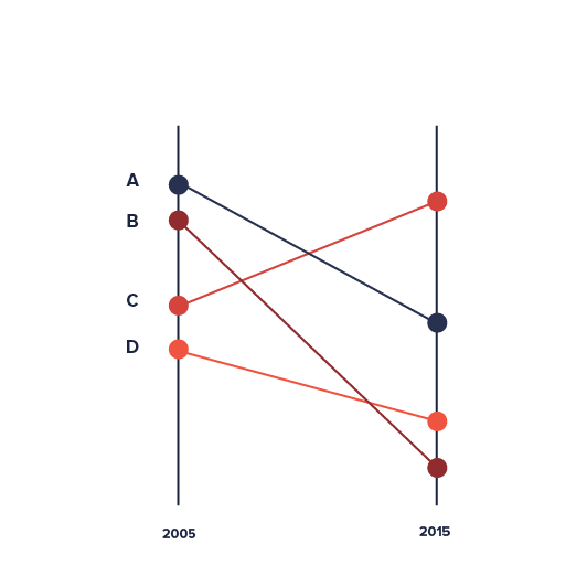
Defined by Edward Tufte in his 1983 book The Visual Display of Quantitative Information, this type of chart is useful for seeing (referred to the example above):
- The hierarchy of a dimension’s values in both 2005 and 2015 [the order of the dimension].
- The specific numbers associated with each dimension’s values in each of those years [the data value next to their names].
- How each dimension value’s numbers changed over time [each dimension value’s slope].
- How each dimension value’s rate of change compares to the other dimension value’s rates of change [the slopes compared with one another].
- Any notable deviations in the general trend (notice “B” in the above example and it’s downward slope).
Here is the link to my dataviz for this week on Tableau Public.