
I am slowly catching up on my #MakeoverMonday entries.
San Francisco is one of my favorite cities. I recently saw a news special about this particular issue, and it frustrates me that this is happening to the elderly and poor. San Francisco housing and rental rates are ridiculously high, and if there is money to be made, landlords are going to take advantage of that.
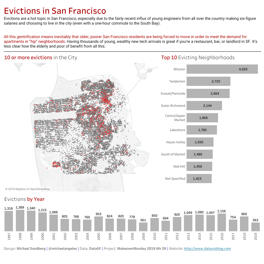
I have been itching for a #MakeoverMonday with the possibility for a map for a while. I see this situation as rather bleak, so I used two (maybe three) bleak colors: a darker grey and a darker red. I wanted to keep it stripped down, so I did not add anything more than the title, map, top 10 neighborhoods affected, and the number of evictions per year.
Here is the link to my dataviz for this week on Tableau Public.

I recently stumbled onto your blog and really like the ‘makeover monday’ posts, where do you often look for your data?
Hi Heather. The #MakeoverMonday datasets are published on data.world. In other instances when I need data, I tend to go to subject-related, watchdog groups, and Government sites to download the available datasets I need.