
This week, I submitted my first ever entry into a Tableau-related dataviz competition. The competition is #IronQuest and the topic had to relate to sea creatures. I contacted Sarah Bartlett, the organizer of the #IronQuest, to see if I could use a mythical sea creature. She confirmed I could, so I decided to have my entry focused on on of my favorite mythical sea creatures, The Creature From The Black Lagoon.
I really liked Joshua Smith’s A Fan Made Data-Driven Tribute to Captain Marvel (see screenshot snippet below). I had recently interviewed Josh for my dataviz blog and talked to him a bit about superheroes. Josh is more of a Marvel Comics person (e.g., Avengers, Captain America, Spiderman, etc.) and I am more of a DC Comics person (e.g., Superman, Batman, Wonder Woman, etc.). But, both of us agreed we could cohabitate in the world with this difference between us, so I decided to use his Captain Marvel dataviz as the foundation for my Creature dataviz.

Josh was very generous in reviewing multiple iterations of my dataviz as I was developing it. I will point out recommendations Josh made as I progress through this blog post. With his knowledge of creating a dataviz to have a comic book-style look-and-feel, his recommendations and insights were invaluable to me.
As a young boy (and probably as a grown man now too), I have always loved monster movies. I think the original Frankenstein movie was brilliant. I loved the early 1960s-1970s Planet of the Apes movies, and even have my home office decorated in Planet of the Apes merchandise. I use to go to the San Diego Comic-Con every year with my boys when they were younger, and have met most of the original cast from these movies. Plus, some years at Comic-Con, they even had props from the original movies on display.

But I digress.
I have always had an affection for the Creature From The Black Lagoon movie. When I was a kid, we use to go to the movie theaters on Saturdays and watch movies all day long. There were monster movies, the old Batman serials, Westerns, etc. Admission back then was 50 cents for the entire day.
The Creature was always an interesting concept. Here was this half-man, half-fish dating back to the Devonian Period. As was typical in most monster movies, there were a group of “good” scientists who wanted to understand and communicate with the Creature. On the other side, there was the “bad” scientists who wanted to kill him, stuff him, and put him on display (and make a lot of money).
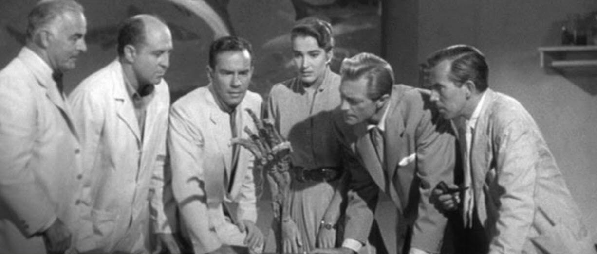
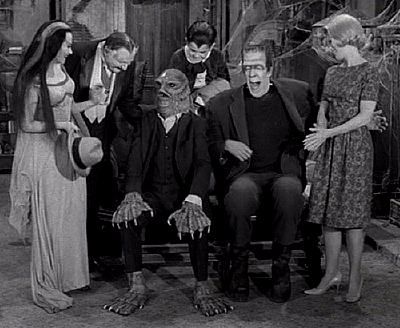
It has been a while since I had actually watched the movie. So, I found a copy on YouTube and watched it again. As I watched the movie, I wrote down key words, things of interest and events that occurred during the movie. The main thing that stood out to me, and was the basis for the plot, was the discovery of the fossilized skeletal hand with web fingers. This event set into motion the expedition back to the Amazon River to see if they could find the rest of the Creature’s skeleton.
So, as I started to sketch out the dataviz on paper, I had an idea where a photo of the skeletal hand was at the top of my dataviz with a brief summary of the plot of the movie. Fortunately, I was able to find a photo of all of the scientists, at the institute, standing around the skeletal hand and discussing it in a scene from the movie.
I also keyed in on words and sentences from the movie such as Devonian Period and Amazon River.
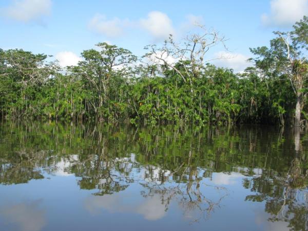
I did some additional research, and found a blog of a river boat company that did tours of the Amazon River. One of the things noted in the blog was them following the Napo River through the tributary and entering the Black Lagoon. I thought having a spatial map of that area of the Amazon River would help set a feel for location and context of where the action was taking place. I did some Google searches and found a Shapefile that contained the rivers located in that area. To give it additional context, I added an annotation where the river boat company stated they entered the Black Lagoon. Creating the map and adding an annotation of where the Black Lagoon was was a fairly straightforward thing to add to the dataviz.
In following Josh’s Captain Marvel dataviz comic-style, for my narratives, I used floating text boxes with a title of the topic, followed by a brief description. Josh used the font Tableau Light, all uppercase, and italicized to give it more of a comic book look-and-feel. He recommended I do the same, and I followed this method. In later reviews, Josh mentioned that I should put a border around the text using the second or third largest line width. I added this using the third largest line width size, and decided on using black as the border color, which I felt emphasized the text more. Josh also recommend I add 5px of inner padding inside each text box so the the text was not flushed against the border of the text box.

Now, before I continue, I need to provide a disclaimer here. I use Tableau every day at work. However, most of the data vizzes I create are move interactive grid reports. My employer is still finding their legs in regards to using Tableau and the business communities comfort level is with this style of reporting. In the future, I envision more visual data visualizations being incorporated into the mix, but for now, it is what it is.
With that said, I do not do a lot of highly visual data visualizations at work. So, my entering #IronQuest was a way for me to do some of the things I have been wanting to do, as well as using some of the newer features in Tableau such as Set Actions (more on this in a bit).
Based on past readings I did, I knew that the Amazon River was one of the longest rivers in the world. I did some additional research and was able to find a dataset for the longest rivers in the world. Since I did not want to use a lot of space for this chart, I limited it to the top five. I used a simple horizontal bar chart (my usual go-to chart) for this.
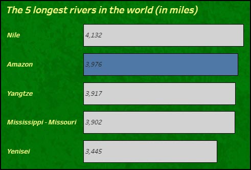
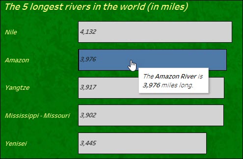
I want to point out a best practice I follow here for my tooltips. I try to have my tooltips be sentences versus the default label/value that Tableau provides. Below is a screenshot of the tooltip I used in the bar chart above.
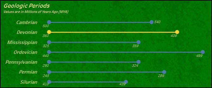
Next, I wanted to include something about the Devonian Period as it is mentioned several times in the movie. I again did some Google searches and found quite a bit of information on this topic.
Each of the geologic periods were noted in values of Millions of Years Ago (or MYA). I first thought about building a simple timeline, but wanted to try something different. I have used dumbbell charts in the past and thought this would be a good way to express a geologic period’s beginning and end. I also included in the tooltip some of the characteristics that were associated with that geological period.
So that the Devonian Period stood out, I used a different color to emphasize that period. The yellow shade I used I color picked from the Creature From The Black Lagoon movie poster to (1) use colors consistent with the poster, and (2) to work with a small set of colors overall.
The next piece of the narrative I wanted to include was about the fact that there were two different people playing the Gill-Man (NOTE: Because of copyright and other legal issues with Universal Pictures, you will see the Creature often referred to as the “Gill-Man” in non-Universal Pictures references). In my old Comic-Con convention days with my boys, we had the opportunity to meet Ben Chapman and Ricou Browning on several occasions. They are both very generous with their time with their fans, and both overall nice guys. I wanted to pay a tribute to both of them, as well as introduce this little known facts to the every day viewer of this dataviz.
Although, there is no Tableau magic in this portion of the dataviz, I though it helped with the story, and helped keep the reader interested in continuing to view the rest of the story.

SET ACTIONS AND SWAPPING IMAGES
Previously, I had viewed Lindsey Poulter’s Tableau Public excellent workbook on Set Actions (I had previously interviewed Lindsey as well). I really liked her example using set actions to swap (or rotate) images. I thought I could add an element to my story where I showed Creature From The Black Lagoon movie posters from around the world. Lindsey had previously published step-by-step instructions of how she did this on her blog post, Rotate Images Using Set Actions, and between her Tableau Public workbook and the blog post, I was able to integrate this feature into my dataviz.

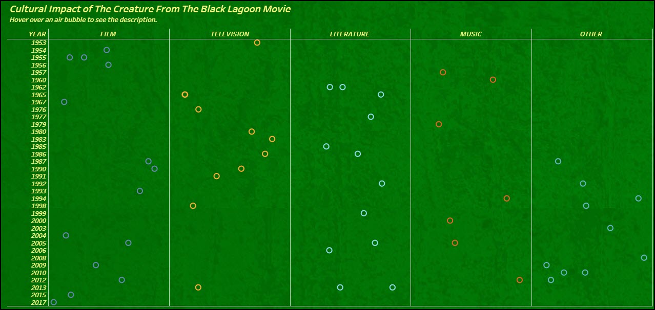
JITTER PLOT
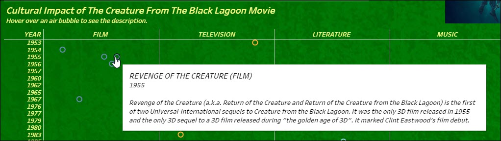
There are A LOT of cultural references to Creature From The Black Lagoon. In fact, I included over 50 of them in my dataviz. I wanted to include these cultural references as a chart in my dataviz. I decided to have the chart organized by year and then media type within each year. The problem here was that there could be multiple cultural references within a year and a media type. I discussed this with Josh and he recommended I try to use a Jitter Plot.
I found a great tutorial by Michael McFadden on how to create a jitter plot on The Data School’s web site. As Mr. McFadden explains,
The main reason to use a jitter plot rather than a strip plot is when you have too many marks overlapping and either you want to be able to select any individual mark (which is difficult or even impossible if the marks overlap entirely).
Michael McFadden
I created a small example to ensure this chart would work for me. I really liked it and now had to proceed to the difficult task of finding, harvesting, formatting, and storing the cultural references data.
PREPPING THE CULTURAL REFERENCE DATA
Fortunately, there was a Wikipedia page of the cultural impact of the Creature From The Black Lagoon. I reviewed all of the information on this page, and came up with a format for it. However, I felt some of the references were either inaccurate or incomplete. Fortunately, Google was a lifesaver here. I was able to take the verbiage I saw and type it in as a search string in Google. For example, for The Munster’s episode where Uncle Gilbert visited, I wanted to find the name of the episode and the year it first aired on television. I typed “Munsters episode Uncle Gilbert,” and lo-and-behold, several television web sites that track episodes for shows pointed me to the exact episode, it’s name, and the date it first aired.
BRIEF INTERMISSION:
So, indulge me for a second. I wanted to share a bit of dialogue from this episode with you. It was one of my favorite episodes.
Herman Munster: We were a little curious, where did you get all that gold?
Eddie Munster: Yeah, Uncle Gilbert, where did you get all those neat Spanish Doubloons and rare gold pieces?
Uncle Gilbert: Oh, those! Why, Eddie my boy, that’s, eh, loose change I picked up in ships and treasure chests lying around in my neighborhood.
Eddie Munster: No foolin’?
Uncle Gilbert: Sure, that’s one reason I wouldn’t live any place else in the world. Oh, there’s a lot of advantages, my boy, to being the Creature from the Black Lagoon.
END OF INTERMISSION
Other references that were in my head and not on Wikipedia were a bit more challenging. I remembered a country song by Patty Loveless where she talks about The Creature From The Black Lagoon. I though the song was titled “That’s All I Think About These Days.” It took me several variations of Google searches to find out the actual name of the song was “I Try To Think About Elvis.”
So, after using what I found on Wikipedia, my own personal remembrances, and just doing lots of Googling, I came up with over 50 cultural references. However, this is just a small sample of references. There are a lot more out there.
BACKGROUND COLOR
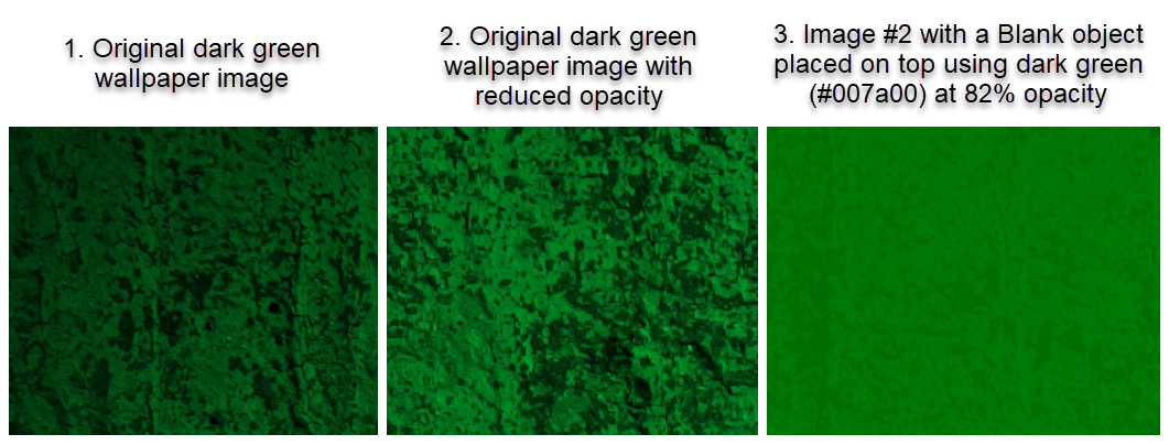
The background image went through several iterations (more than the three examples I show below). Josh felt that the original background had a lot of contrast in it between the green and black. He felt this was not a bad thing, but it was a bit distracting. He recommended me toning the background down by laying a slightly transparent “Blank” object over the background. He suggested I make the Blank object green, and then tweak the opacity so that the black still comes through – but with lower contrast, so it isn’t distracting.
As you can see in the image color evolution screenshot below, Image #1 was the image unaltered that I started with. I then reduced the image’s opacity directly using Snagit to create Image #2. In the final version (Image #3), following Josh’s recommendations, I created a green Blank object at 82% opacity and laid it on top of Image #2.
Once I did this, the colors in the various charts I had placed on top of the background image seemed to pop more, and this really improved the dataviz overall.
ATTRIBUTION, REFERENCES, SOURCES
Long ago, I learned the hard way of the repercussions of not attributing your sources. If you take anything from this blog post, I hope this is the main one you remember.
ALWAYS CITE YOUR SOURCES!
Since much of my dataviz is based on the format of Josh’s Captain Marvel dataviz, I wanted to include that in the attribution detail in Tableau Public. However, this did not work for me. I would paste in Josh’s URL for attribution, it seems to recognize that it was a dataviz from Joshua Smith, but would not let me save the page. I tried this several different ways but with no success. As of the posting of this blog post, I still have not been able to add attribution to Josh on Tableau Public.
However, I did add Josh to my attribution, references, and sources section at the bottom of my dataviz. I also added Lindsey Poulter as I used her Image Swap worksheet to create my image swapping. If you end up using a lot of different data sources and image sources like I did, I recommend you paste the information and URL in a Word document and maintain a list as you are developing your dataviz. You can then format it in the Word document, and then cut-and-paste it into a Text Object in Tableau.
SUMMARY
I am glad I decided to enter #IronQuest. It helped remind me of the time allocation needed for gathering data, designing, editing content copy, and building a Tableau dataviz. As I think back to all of the great datavizzes I really admire on Tableau Public, these #datafam members really put a lot of time and effort into what they created. Kudos to all of them.
I also realize I need to participate more in activities like #MakeoverMonday and #WorkoutWednesday. This is truly the best way to hone the craft that is Tableau; by continually creating datavizzes utilizing different chart types and techniques.
I hope you found my discussion on how I created my Creature From The Black Lagoon dataviz helpful. You can view it on Tableau Public by clicking here.
