Joshua Smith Bio
My path into data visualization is like many others: convoluted, messy, and more akin to sailor becoming shipwrecked in a new land than a Captain elegantly following the stars. I’ve worked in retail, food service, ministry, recycling, and analytics. I’ve dropped out of grad school twice, a folklore program and a bio-statistics program, to pivot my career and take advantage of new opportunities. I entered the BI and analytics space five years ago, moving from ETL into reporting and into data science. My diverse / bizarre background provided me with a unique perspective into communicating insights, and I became the lead of a data visualization consulting practice, overseeing the work and growth of about 30 consultants. Simultaneously, I served as the lead data storyteller in a data science practice. Currently, I’m the Creative Director, Analytics, at Front Health, developing analytics products for clients and providing data visualization design strategy consulting in healthcare.
QUESTIONS
Link to full viz: https://public.tableau.com/profile/datajackalope#!/vizhome/IronViz_15561510177280/Dashboard12
Iron Viz Process Blog Post: https://www.jackalopedatadesign.com/2019/05/my-ironviz-process-research-analyze.html#more
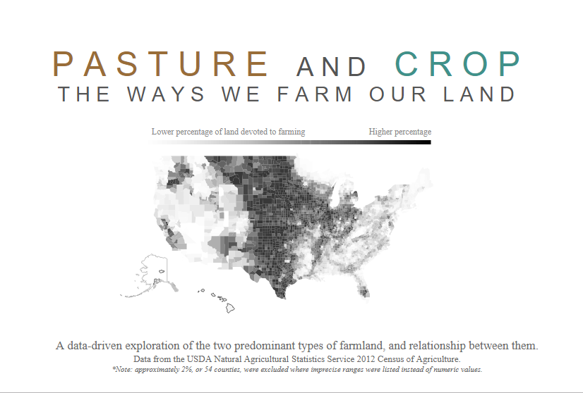
Michael: Hello Josh. First off, congratulations for being the winner for the 2019 Tableau Iron Viz global qualifier with your data visualization Pasture and Crop: The Ways We Farm Our Land.
If I may, I’d like to ask you questions a bit differently that I usually do in my interviews. My reasoning for this is that I just loved how you broke down your process in your blog post on your Jackalope Data + Design web site (link provided above).
After going through several iterations, you ended up with a three phase, 21 step process to create your IronViz entry as you visualized in the screenshot below.
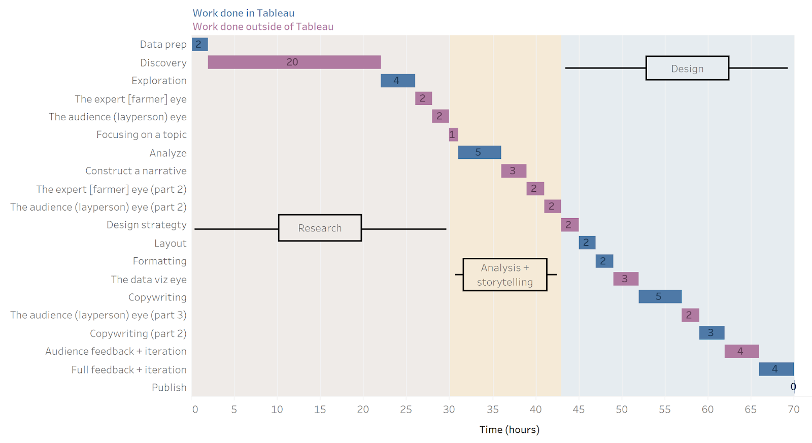
You spent approximately one-third of your project time on research. In reading your blog post on the process, you did some extensive research to get to your summary argument (shown below).
So, from all this research, I found the truth I wanted to tell: I wanted to show the world that agriculture is more complex than a redneck on a tractor, and that our sustainability efforts need to match this complexity. I get frustrated by media and pop culture marketing of agricultural trends (don’t get me started on “free-range” chickens, where the minimum requirements are often poorly executed and actually cause a number of health issues in chickens).
So, a couple of questions here.
- Most of us learned how to research and profile data as part of our jobs in the IT/BI & Analytics profession. You talk about examining the variables, studying the metadata, reviewing census data definitions, and then researching industry trends. How did you learn how to do all of this and then be able to determine what was necessary to reach your summary argument?
Joshua: Great question. My emphasis on research comes from both my creative and analytical backgrounds. In creative arts, especially writing, the best novels come from deep research to create a storyworld that feels authentic. For example, I’m re-reading American Gods by Neil Gaiman. I’m struck by how much research he had to do to understand the lore and mythologies of so many different cultures and to portray his characters in ways where each one feels so unique and descriptive of the various cultures they represent, even down to the speech patterns. As my professional roles began incorporating more UI/UX design, UX research became a skill that expanded this same “storyworld” mindset. Someone once told me that UX design is really just about writing a story. The users of my analytics are the characters, so I have to do a lot of research to understand the setting and the characters in order to create that story. I need to weave an interactive narrative that addresses their conflicts (pain points) meaningfully.
On the analytical side, I had the pleasure of working for, and being mentored by, the greatest analyst and data scientist I ever met: Dr. Chris Holloman. Chris always emphasized a deep understanding of the data generating process. Where does this data come from? How is it created? This was so important to Chris that it was a very large part of our analytics process, either before or in tandem with basic univariate, exploratory analysis. The most important lessons were the times when understanding the data generating process dramatically changed our analytical plan. For example, one time Chris and I worked for a quick-service restaurant, trying to build predictive models to help drive faster service. Before we got our hands on the data, Chris worked with the client to get us a lot of time “behind the scenes”, so we got to stand in the kitchens watching the magic happen as burgers were created. We noticed so many important details that completely changed how we looked at the data. For example, orders are marked as “fulfilled” when an associate pushes a hidden button. The button is a binary, so there’s no way to skip orders. If there was a long order in the queue, other orders might be delivered first, but they couldn’t mark them as complete until the first order was delivered. This explained so many patterns in the data where we saw one order take a really long time, and then three or four orders being completed in milliseconds. This presented an interesting challenge – our dependent variable, time to delivery, was completely flawed. If we hadn’t seen the kitchens in action, we’d have missed this – and delivered incorrect or inaccurate analyses.
So my emphasis on research is both about understanding my storyworld, but also about understanding the data. I’ve found, repeatedly, that a failure to do this is the most certain indication that an analysis will be incorrect or flawed. Without deep research, we’re either misrepresenting the story or we’re misrepresenting the data – both of which are ethical failures for the data visualization and analytics disciplines.
2. You sought feedback from local farmers (subject matter experts with deep experence) and laypersons (co-workers, non-data people, etc.).
Can you talk a bit how you presented your findings to each group? For example, with your local farmers, did you approach them with charts and summaries of your findings, and I am curious, what assumptions did they find most incorrect?
Joshua: I’ll admit I had a leg up since I grew up surrounded by farmland, which gave me some initial insights. However, I personally grew up on a lumber farm, which only gets harvested once every few years – so relying on farmers that worked with livestock or some of the faster-rotation crops was important. One of my best friends comes from a family of hog farmers, and he was a very strong source (we also meet for exercise most mornings, so we could have frequent touch-points to review my analyses). I also had farmers in my network from home, and then I also work with a couple farmers. When working with the farmers, I often didn’t happen to have my charts in front of me. A few times we had a whiteboard or paper present, so I would draw the general trends I saw. Our conversations were very casual and exploratory, e.g., “why would a farmer report land that was both cropland and pastureland?”, or “are there reasons why more chemicals are used for corn?”
I found that some of my assumptions about crop rotation were flawed. Growing up in a rural school, crop rotation was actually part of our curriculum. However, I assumed crop rotation was a year-over-year thing, but I found out that a lot of crop rotation happens within a year. Also, I assumed livestock farmers that grew their own crops were devoting it to their livestock (as hay), but another friend told me that a common practice is to harvest and sell the head as grains, and to keep the stalks as straw for bedding (while keeping some of the grains as protein supplements for their livestock). I also learned a lot about farming families which made me incredibly distrustful about the demographic data, e.g., farmers living away from their farms; often that’s because families will spread out away from the farm, but still live relatively close: For example, my one friend has an entire road named after his family. Only his parents live “on” the farm, but they all live within a mile of one another. Or, another example is the issue of women in farming: anecdotally, many of my farming friends felt like there are a ton of women in farming, but there’s a more nuanced issue where women aren’t considered the head of the household, so it looks like women aren’t as present in the industry (although this describes another women’s rights issue). I couldn’t find any ways to sort this out from the data. There were a ton of things I learned, even as someone familiar with the basics, but these were probably the most critical to my final story.
For laypeople, I tried to get a blend of data literacies, but just as important I wanted to figure out what’s interesting to non-farmers and non-data people. That’s tricky: often the things I found interesting were boring, because non-farmers lacked the context. Other times, I found something to be obvious, but non-farmers found it intriguing because they’d never seen it before. This often took the form of a bunch of exploratory charts that I would show laypeople, explain the chart, and ask for their reaction. I did several rounds of this until I felt like I landed on some interesting trends that could be interesting to a wider audience. I remember one that was most fascinating to me: the difference between fertilizer and manure use vs. the percent of cropland in a county. I locked in on those trends early on, but all the laypeople thought it was boring – until I provided enough context. The feedback from laypeople really hammered in the idea that my final work really needed to have a ton of context, or else audiences wouldn’t understand why my insights were so important.
3. One of the things you emphasize in your blog summary was that you did not just sit at your computer and hack this out. With the ease of quickly creating data visualizations in any BI&Analytics tool, it is easy to forget that it is really all about the data, and the truth underlying that data. I especially like the fact you took a break for five days to let it percolate in your head to develop new ideas and outcomes.
Can you expand a bit more on your thoughts on this?
Joshua: There’s a few things from my process I want to emphasize — things I don’t think get enough vocal value. First, you’ll note that I had Tableau open for less than half of my process. That’s because of the emphasis I put into research, design strategy, and feedback.
Part of it is that the research – e.g., talking to farmers or reading periodicals – couldn’t happen in Tableau. But I’ve also found that, with any creative art, a lot of the magic happens in the real world. I’ve solved some of my most challenging problems, or made some of my greatest art, while tilling soil or cutting firewood or reading a book or even sleeping. There’s something about getting into the real world that let’s my brain create metaphors, which translates into new abstract structures to understand what I’m working on.
As for setting the project aside for five days, this comes more from my creative background (specifically creative writing). I have a few published poems, and most of the publications came are revisions that came from letting it set for quite some time (even years). Sometimes it feels like driving off-road: even though I’m exploring new territory, I’m also creating my own trenches and eventually I can get stuck in my own tracks. If I set it aside, the ground dries back up and I can get traction to drive onto new ground. I can get so focused within my current mentality that my focus is too narrow, and setting it aside helps my current ideas “dry” a little, and I can get out of them and explore something new.
And, on top of that, there’s a certain irony in that the first IronViz feeder, with the agricultural theme, came out during one of the busiest times for farming. As someone that maintains a pretty healthy garden (about 25’ by 18’), I’ve got a lot of initial work to get it going, so I had to set it aside to make sure I got the soil ready for planting.
4. You show a lot of passion in your Design Strategy commentary. Can you discuss your design strategy in terms of advice for others to use as inspiration going forward in their careers?
Joshua: I had a really big turning moment in my career when I was talking to someone that runs a design consulting company. He said to me, “I think you’re kind of like me. I’m really good at design strategy. I’m o.k. at design implementation. My best work comes by finding and working with and leading a team of really good artists.”
I hadn’t thought about the difference between the two, but it’s a really important nuance. Most of my professional work has been exactly that: I’ve worked with a team of designers and developers. It was my job to listen to the client and figure out ways that data, presented through a well-designed UX, could help them solve their problems and accomplish their goals. I was responsible for identifying the data to analyze, the architecture of the experience (how many dashboards? how do you navigate from one to the next?), the content mapping (what information lives where, and who accesses it?), and the very rudimentary wire-frames (how is content organized?). However, I felt like my designs were really good, but not amazing. Meanwhile, the designers on my team could take my ideas and evolve them to the next level.
It contributed to some severe impostor syndrome for quite some time, until I had the conversation I mentioned. I realized that there is a difference between the two, and I’m really good at all the things that go into a good design. I’m good at the research, and defining the problem, and casting a vision on how we can solve that problem. However, I’m better at leading others to innovate within that vision.
My IronViz is a great example. Everyone I showed said the same thing: it looks “clean”. It was a compliment, but it also demonstrated that I’m a traditionalist. Compare that to Sam Parson’s IronViz entry, where everyone said “wow!”. Now, having read Sam’s thoughts on this blog, I know a good amount of strategic thinking went into his viz as well, and I’m not implying he’s not good at strategy – but it isn’t hard to see that his IronViz entry is more innovative within his strategy than mine was (and, for what it’s worth, I think it’d be a blast to pair our talents up on a collaborative viz – so Sam, here’s an invite!).
If you’re wanting to up your design strategy game, research is key. At the core of design strategy is being able to adequately define everything. From there, the easiest starting point is to think about the user experience: what do you want users to feel, learn, and do? Then, make sure all your design choices reflect that. If you want them to feel excited, use bold colors and high contrast! If you want them to feel calm, use softer colors and a lot of white space. Carefully architect your insights so they are accessible to your intended audience – and, don’t be afraid to present them in a way that isn’t storytelling (in fact, I would say most of our vizzes, including my IronViz entry, are not stories, but rather expositions or descriptions). There are other rhetorical techniques that can be just as powerful as storytelling, so trying to force something to be a story when there aren’t characters or events means you’re missing some really important paradigms of communication.
…in fact, I would say most of our vizzes, including my IronViz entry, are not stories, but rather expositions or descriptions.
One last note on design strategy: when someone provides feedback, don’t blindly apply it. Compare it to your design strategy. I’m not a huge fan of directive feedback that ignores strategy. “Don’t use red and green” may not be helpful for a Christmas viz! Instead, think about what you’re trying to accomplish. If you get feedback that your viz might not be accessible to the red-green color blind, see if you can tweak the saturation or luminosity without abandoning the red-green colors. This is just an example, but most of the feedback I see is simply a directive, but there’s little to no explanation on where that directive is coming from. If someone provides directive feedback, it’s helpful to ask why they are suggesting that, so you can’t find out why your execution isn’t accomplishing your design strategy. If you’re providing your feedback, consider pairing your directives with why you’re suggesting that (and maybe abandon the directive!) – this allows the person to go back to their design strategy and re-evaluate their execution.
…most of the feedback I see is simply a directive, but there’s little to no explanation on where that directive is coming from.
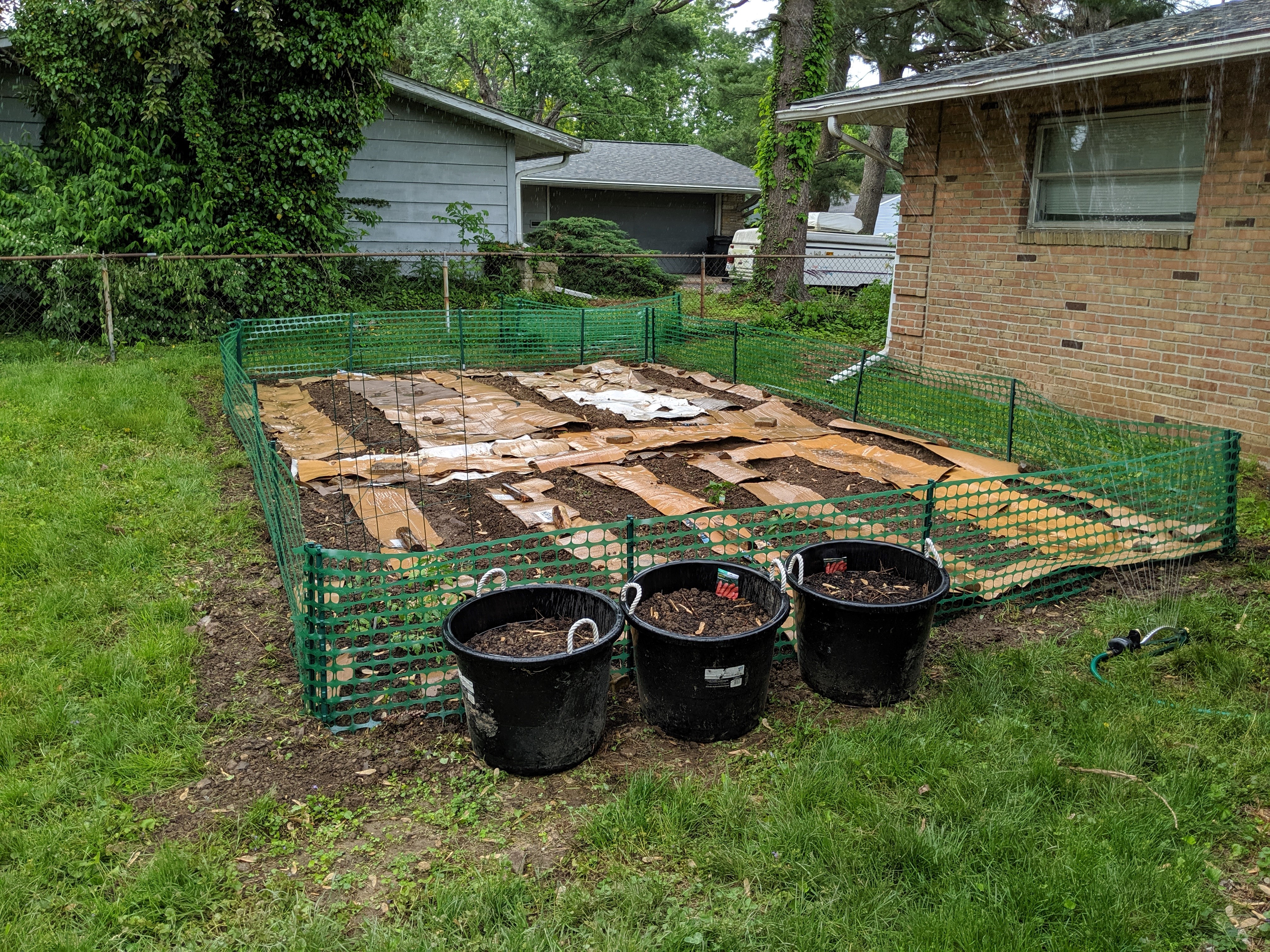
Michael: My wife has a big herb garden in our yard. It spans a 6 foot by 3 foot above ground vegetable planter (keeps the dogs from eating everything!), several long rectangle planters for herbs, ceramic pots of flowers, etc.
I found this photo of your herb garden on Twitter. Can you tell my readers a bit about your garden?
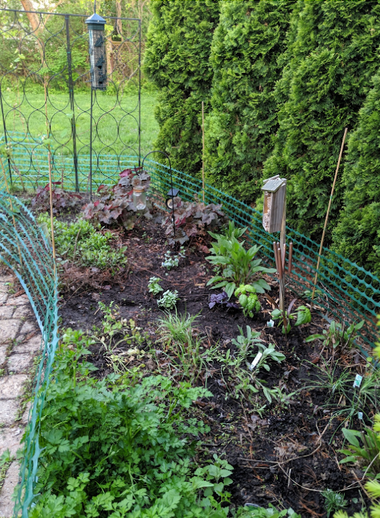
Joshua: There’s really four parts to my garden. The first, the part you noticed, is my herb garden. We’ve got a good variety of things that grow, but with an emphasis on things that come back every year or at least for two years. We’ve got parsley, cilantro (hint, don’t grow those two next to each other, they are hard to distinguish when they intermingle!), oregano, purple and sweet basil, catnip (actually makes for a good tea, and fights of mosquitoes), chives and garlic, sage, eucalyptus, and four mints: spearmint, peppermint, chocolate and mojito. The mints are pretty invasive, so we have to cut them back – but they also make for a nice cover in other landscaping areas.
My main garden is a mix of vegetables and melons. Half the garden is devoted to large vines or bushes: watermelons, cantaloupe, honeydew and cucumber. These are pretty water-intensive, so I can focus my sprinkler there for the bulk of my irrigation. The other half of the garden is zucchini, peppers and pepperoncinis, green beans, and tomatoes.
The buckets you see is the next part, for carrots and sweet potatoes. I don’t care to till super deep for root vegetables, so we use buckets (make sure to drill holes to draining!). It’s a bit tricky to find enough top soil without scalping my yard, but those buckets will give us a lot of heavier veggies.
Then we have our berry garden, which is a slower process. They are perennials, so we don’t lose our progress every year – but it takes more time to get them going. We’re at year two for our blueberry bushes, blackberries and raspberries. I imagine we’ll get a good handful of each this year, but we’ll probably start getting a good harvest next year or the year after. We also have our strawberries there.
And, not really our garden, but we’ve got five mulberry trees and an apple tree and a walnut tree. The apple and walnut trees currently aren’t producing much because they need some pruning, but with a little bit of work we should be getting buckets of both (although there’s a chance the walnut tree might be keeping the apple tree from producing, so I need an expert consult on that).
We can’t truly claim organic, because we didn’t buy all organic seeds and starts. However, we don’t spray anything for insects or weeds or fertilizer (our fertilizer is organic manure). Instead, we try to maintain a balanced ecosystem. We try not to kill spiders and centipedes because they eat a lot of the damaging insects. We plant things that will invite natural pollinators like bees and butterflies. We put cardboard over our walkways to prevent sunlight from getting to most of the weeds, and we till it into the soil the next year for the earthworms. I let much of my garden decompose in the fall so that some of the nutrients are replenished. All of these are things we can do on a small scale to avoid chemicals – but, before we judge farmers, it’s important to realize that a lot of this is really difficult to do at scale, and I’m not in danger of losing any income if it doesn’t work.
This gardening keeps me really busy over the summer, but it’s incredibly enjoyable and keeps me really active. I spent most of my youth working outside, and being stuck inside with abstract measures of productivity of my biggest struggles working in analytics. This weekend and evening work helps address that, and it puts food on our table.

Michael: The Jackalope. Myth or misunderstood? Why does the jackalope appeal to you.
Joshua: It’s definitely a myth, although there is a virus rabbits get that makes them grow things that look like horns or antlers.
There are a few fun details about the jackalope that I’m drawn to. First off, it’s a blend of things that shouldn’t go together, which really captures my diverse skillset that comes from my convoluted background. Often in IT you’ll hear that someone that has all the skills needed for data science or UX design described as a unicorn. However, I don’t think of myself that way for two reasons: first, I’m not elegant enough to be a unicorn; and second, I’m not advertising myself as the complete package. It’s more that I have an unexpected combination of skills that provides a unique value, not that I have all the skills.
Second, the jackalope appeals to some of my other interests. It’s a folktale, and my first attempt at graduate school was in a folklore program. I love folktales and folk traditions, and the ways these things communicate meaning. Also, the jackalope is very rural Midwestern and western. My rural, Midwestern upbringing is a big part of my identity, so the jackalope felt fitting. Even though the original tale isn’t from my home state, it is commonly told and recognized here so it feels like a symbol of home.
Michael: So, with the IronViz Championship waiting for you at TC19, how do you get yourself ready for this?
Joshua: Good question! I’ve been really focused on getting my garden back up to speed, so I haven’t been in Tableau much outside of work. I’ll be diving back in soon, but I’ll be reaching out to a few people for advice. The cool thing about the #datafam is that I’m not going to be on stage alone. There are so many important people that have helped me get here, and I’m going to continue working with them to refine my skills.
Also, I’m really excited to see who I’m up on stage with, and I don’t mean that from just a competitive perspective. I hope the other two contestants become good #datafam friends. Sure, only one of us will win, but I don’t know that it’s fair to say the other two “lose”. This challenge is such an honor, and regardless of the outcome, I know that there is going to be tremendous growth between now and November. I’m hoping that the three of us can share that with one another, while maintaining a friendly competition. I love watching boxing, and one of my favorite parts are when the athletes congratulate each other after the match (let’s ignore the trash talk for show before the fights!). I’m kind of excited for that moment, regardless of which side of the equation I’m on.
NOTE: Below is a link to an article and video about Joshua’s role in providing customer solutions using Tableau. It is titled Front Health improves clinical quality, patient health, and total cost of care with Tableau.
Tableau Public
Link: https://public.tableau.com/profile/datajackalope#!/