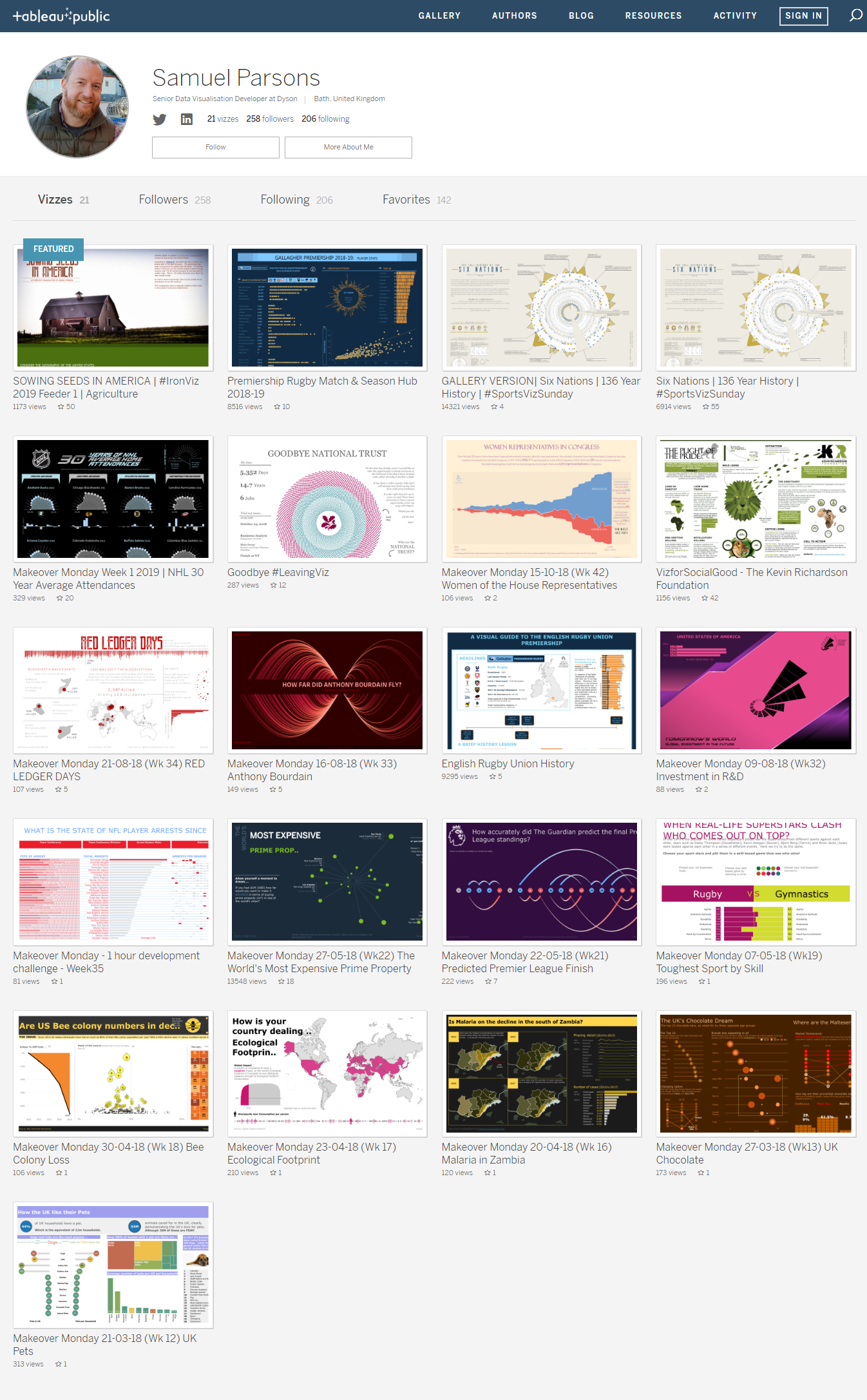
Sam Parsons Bio
Sam Parsons is only one year into his Tableau journey and has been working as a Senior Data Visualisation Developer for Dyson for the last 6 months; which is his first Tableau specific job.
He lives near the Georgian City of Bath in the UK and is a proud father of three beautiful children; all under 7, and his wife has been hugely supportive and understanding of the new Tableau career; which takes up so many of Sam’s evenings after the kids have gone to bed.
Sam is an active member of the Tableau community and has recently participated in #IronViz for the first time, finishing 2nd in the Global Feeder 1 – Agriculture. He has three #VOTDs, with two of those coming from vizzing data from the sport of Rugby Union; which has now been demoted to 2nd in Sam’s list of passions, after Tableau!
QUESTIONS

Link to full viz: https://public.tableau.com/profile/sparsonsdataviz#!/vizhome/SOWINGSEEDSINAMERICAIronViz2019Feeder1/SOWINGSEEDS
Michael: Hello Sam. You recently posted your IronViz 2019 submission on Tableau Public. It is titled Sowing Seeds in America. [NOTE: These questions were submitted to Sam prior to him being selected as second place in the Global IronViz Feeder 1 – Agriculture].
I think it is incredibly well done and is beautiful to view.
Can you tell my readers the process you went through to develop this data visualization? For example, how you gathered and prepped the data, created the design, and translated that into Tableau?
Sam: Thank you! This was a hard project to put together. It has been well documented that this feeder for the IronViz competition was difficult for so many, due to the size and nature of the data set. It was the first time, I believe, that Tableau provided the data and didn’t allow any additional data sets to be used to supplement it. This for me was brilliant, because I haven’t yet found a method for finding my own data sets successfully – I think that is a skill in its own right!
The creation of this viz actually started with the European IronViz from this year. I learned a lot through trying to put together a viz for that competition, which ultimately I failed to complete. With the European IronViz, I spent far too long working on developing a ‘story’, ‘flow’ within that viz and then a huge amount of time designing composition. That composition design was done using paper and pens, drawing out ideas, concepts and refining the design. After which I had left myself too little time to find the data I needed and produce the charts and narrative. The data I found ultimately caused me to stop that viz. Why? Well, the subject was Renewable and Sustainable Energy and all the data I was coming across was from research journals that were heavily caveat-ed and I ultimately didn’t feel qualified to represent the data well.
That failure, was great for learning how I should approach a project such as IronViz.
So for the Agricultural Feeder competition, I was actually buoyed when they announced the data was provided! Great! I thought that saves me time trying to find my own data, I can now concentrate on the Design, Composition and Story!
Early on a few members of the community posted on Twitter about how they had restructured the data using Alteryx workflows. Combining all the individual data tables into one data set and then pivoted the many columns of individual metrics into a long-form data set; better suited for loading into Tableau. One of the first to do this was Sean Miller, who I’m proud to call my #datafam (even though I’ve never met him!), I took Sean’s reworked data set and then started to explore the data in Tableau (Sean was credited for this at the bottom of my IronViz entry).
So where to start with this viz? I have a theory with #IronViz that those vizzes that create flow and a story the reader can follow naturally, tend to do really well. With this in mind I wanted to create a long-form viz, one that the reader can follow the story easily from top to bottom. Others like to use multiple pages of single-screen views, much like a book. I personally don’t feel these work, the interactivity and loading times for each page detract from the user experience. You can be moving through the pages following the story, but if you want to re-cap on something earlier or look again at a previous page that could be related, it’s arduous to do so. It’s far easier if you quickly scroll back up on the same page without inducing any loading times. It’s even worse if your pages are larger than a single screen view, then you have scroll around and switch pages!
So that’s that. Then, I had decided on a long-form viz and I decided to keep the size of the viz so the width was small enough to fit on a generic laptop (1600px). Again the advantage is that the user only has to scroll up and down to follow the story and insight. There was no scrolling side-to-side. Now, I get most people would interact with the viz on a phone, but I was gambling the judges would be using a laptop to work from. On a phone the viz is still small enough across not to cause an real issues, especially if the viz is viewed using Kevin Flerlage’s tip of adding “:showVizHome=no” to the viz URL; which makes the viz fit to the viewers device.
I mentioned before, that part of my European IronViz failure was due to spending too much time on design and planning of that viz. I was determined not to make the same mistakes here, so I set straight away to delving into the data. I played around with the data sets searching for little nuggets that could form the basis of my IronViz entry, and I found plenty. I actually produced an exploratory dashboard, which used a similar method to Lindsey Poulter’s viz of Age Comparisons of NBA Teams, which allows the user to select and open up the underlying detail.

So for this, I was using Average Crop Usage at State level and selecting to find the individual counties. This fed a basic map and some bar charts, but was perfect for exploring the data.
The only issue was the interesting data stories I found were isolated to single states or counties. I wanted to find an angle that covered the whole of the country, something that had greater depth and would fit my plan of a long-form flowing viz.
Part of my personal goals for 2019 is to learn Mapbox. I have been spending a lot of my spare time learning how to manipulate Mapbox and get better with setting up base maps as I want them. The IronViz data set lent itself very nicely to being visualized with maps, which then prompted the idea of rather than try and find a particular story within the data to talk about from the beginning of the viz, why not just represent the data itself and explain how the data can differ across the country.
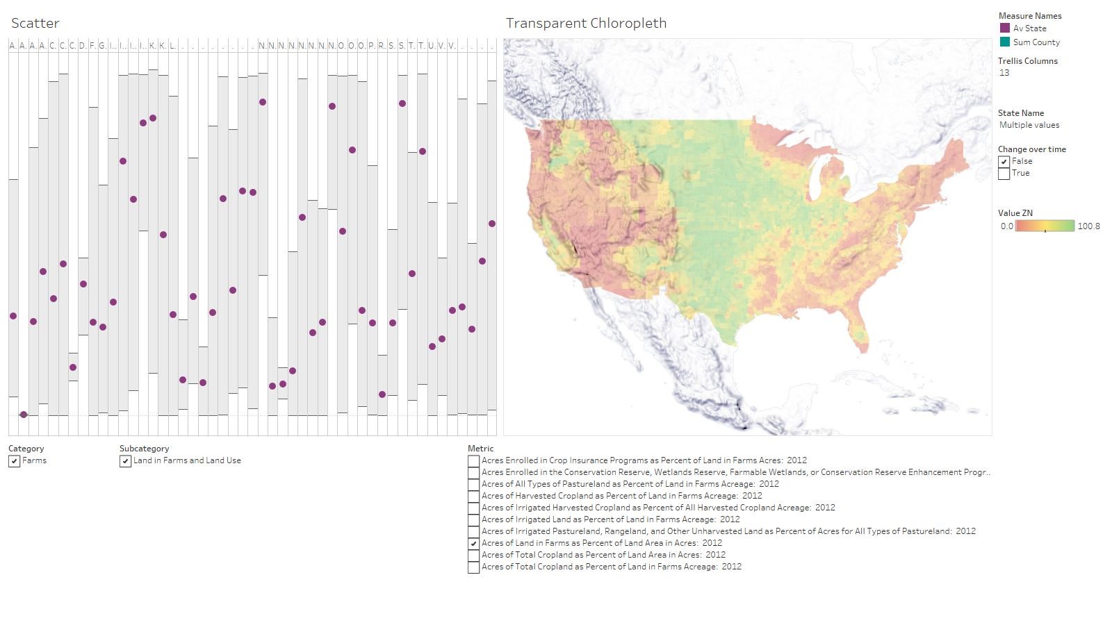
Within the data set there was a variety of data from Fruit / Orchards, Livestock, Vegetables and a few varieties of Crop. I decided (rightly or wrongly) there was likely to be more regional variations with growing of crops, considering the topography and the impact of regional weather. I started by creating a simple Choropleth map, using Total Cropland as a percent of farms acreage, which I took to mean what percentage of farms are used for cropland. When I created this map, I could clearly see there was a weighting of Cropland from the middle of America to the East Coast. Now, I don’t know America very well; I have never been there, I would struggle to tell you where all the states are. I certainly couldn’t tell you about the geography of America. So I found this distribution of crops interesting. I moved on and continued to import my Mapbox base map, to try and make something a little more attractive than the standard Tableau maps we all see regularly. When doing so, my Choropleth hid most of my beautiful Mapbox base I had painstakingly created. Well that wouldn’t do! So I thought, could I make my Choropleth a little opaque? Would that help? I moved the Opacity slider in Tableau and EUREKA! What was this!? I could see the Rocky’s coming through down the left hand side of America right where the least concentration of cropland was showing on the Choropleth! Amazing!
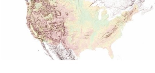
(People living in America will be saying, yeah so what?) For me, this was great because I had found my angle, my unique selling point for this viz. I could give context to the data for all those readers that, like me, did not know the geography of America well. This is the perfect starting point to my viz!
So with that found I quickly moved to my pen and paper! I VERY roughly (I was excited, I wanted to get back to Tableau!) sketched out a how I could make a story from this, that readers like me could follow the data through.
I quickly formulated a plan:
Top of the viz: Set the Context – how does the density of cropland varies across America and how does the topography of the Rocky Mountains and other ranges impact the ability to grow crops in certain states?
Middle of the viz: Explore how the states vary and crops are grown through all counties.
Bottom of the viz: Individual states detail, which crops are grown in each state, moving back to are there regional favouritism (which crop has the highest percentage of farm land for each county) of certain crops? e.g., are crops like wheat favorited in one area of the country?
I had decided that I was going to use Mapbox as the basis of my first map, so there was going to be a more natural feel to this viz. That meant to me that producing a viz full of icons in an infographic kind of way probably wouldn’t fit. Again I leveraged my European IronViz failure, which I had used photographs as background images, which section titles and text detail overlaid on them.

I felt this kind of imagery would work nicely with a Mapbox based map. I looked through a number of different websites to try and find good imagery for agriculture and I spend a long time trying to find an image that would work across the top of the viz and also contained earthly colours that I could use across the rest of the viz composition.
When I settled on the image of the barn – which had great space in the sky to add a title or sub-text, I then took colours from that to use elsewhere. The blue-grey roof, was used on the Mapbox colouring of the mountain ranges and some sub-text. The red-brown walls, was initially used as the background colour for the whole viz, until I decided to change that to a shade of green that was close to the grass in the picture. The red-brown was then used for some of the main text and rectangular enclosures on the first map.

I then moved on to create the middle section of the viz. I won’t go into the details of that here, I have already touched upon that in a guest blog post for Kevin Flerlage. As I mention before, when discovering the data and its insights I had set up a state-by-state worksheet that allowed the user to find the distribution of the counties through interaction – selecting the state average to display the individual county results for that state. The plan was to use this in the middle section, because I loved the interaction that gave the reader. The problem being was space. There was little of it, due to my choice of dashboard size (width only 1600px), there were 50 states to show and I also wanted to leave room for a Country map that the user could see changing as they interacted with the state multiples. The other issue was Texas! I was cursing Texas when I got to this section, because I had spent a few days, trying to perfect the interactivity, small multiples and bee-swarm charts that were revealed after interaction. Texas has over 250 counties! To display these as a bee-swarm in a space the size of your thumb is impossible! So, I knew the chart this cried out for, it was a Violin Plot – A Box ’n’ whiskers could have also don’t the job – but that is not as sexy and can actually be hard to read sometimes. So I decided I needed to create Violin Plots. I have never created them before, so a quick google search revealed only a couple of tutorials of people using them in Tableau. Luckily for me Gwilym Lockwood had a very detailed tutorial. I worked through his tutorial the best I could – it didn’t all work, but I got it to work enough for what I needed. These Violin plots we made to be subtle to give just enough of an impression to the reader what was happening within a state and how counties were distributed. This was perfect, because it added interest to help prompt the user to interact. They see a different Violin profile and they want to click and see what that does to the map.
At first I had the map next to the small multiple Violin charts changing to a single state view when selected, but I felt this effectively stopped the flow of the story. You select a state plot, the map changes to that state and then what? Nothing. There is no further flow to the bottom half of the viz. So I came up with the concept of trying to link the middle section and the bottom section through visually guiding the reader with lines. You select your state, the country map stays on country, but highlights that state – so again geographically you can see where you are selecting (especially important if you are not from the USA). This in turn sets off highlighting of a couple of line sheets. The first, what I call Croplines, polygon lines created to draw the eye down from the map, and then visually to come out at the reader, taking the space horizontally under the violin plots, this was intended to look like a field that had been drilled. I wanted to use a flash of yellow, as that linked to my colour of crops in the maps, but also really popped out from the background. These lines were great, but they ended in a flat, unattractive bottom horizontal line. I didn’t like it, it needed visually to be broken up and the line to be finished off. So I decided to add a bar chart that drop down from the flat edge of the Croplines. This was perfect for breaking that harsh edge up. The intention was for this bar chart to be changeable in its metric, the same applied to the violin plots and the map above the Croplines. I wanted to be able to choose an individual crop type, to really increase the interactivity. Sadly, that had to be scrapped. It was too intensive on Tableau, there was too much data and it took an age for Tableau to respond to the user interactions. So I had to compromise that added interaction for the greater good – the reader’s usability and experience interactivity. I wasn’t finished there though I still needed to make that link to the State map, the flow needed to continue, so I introduced thin and subtle curved lines that lined up with the Dropbar chart and the lines at the other end all drew together and met at the State map. These lines also highlighted the same as the Croplines and the Dropbar Chart. I was really pleased with the effect this had within the viz and it almost gave the viz a showpiece element. The interaction at on the violin plots lead the user to follow the flash of yellow line down through to the State map.
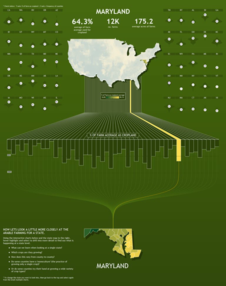
Which leads us to the bottom of the viz and last design elements. So we have given context at the beginning and some interactive detail in the middle of the viz, now I needed to provide greater detail for the reader to discover more insights about the data. I did this through listing the different crop types, and showing via a Treemap / bar chart which crops an individual state preferred to grow. Interaction allowed the user to dive into county level as well. The last element was another Mapbox map that was controlled via the crop types by the Treemap / bar chart. That map was given circles, one per county, and each circle represented a single crop type – the county’s most preferred crop (e.g., the crop they devoted the most percentage area of their farms). On selecting a crop type the map to the right would filter to only show those counties that had that crop type as their preferred crop. This was intended to help the reader find further stories around regional crop preferences and to supplement this, I provided links to the IronViz data and some weather data, and encouraged users to continue the discovery.
I finished the viz off with another photograph, which I felt helped balance the viz as a whole, with the photo at the top. I played around with the colours a little, introducing a graduated background going light green to dark, this was to help with the visual flow from top to bottom, but it’s a more subtle cue to the reader. Much of the text and labels were written at the last point and if I had more time I would have devoted a little more time on those narratives.
I’m really proud of this IronViz entry because my goal in entering the competition, was not to be on stage at TC19, but rather test myself against a community I look up to so much. I have been working with Tableau for a year on and off, and been active in the community as well. Yet, I didn’t really know where I fitted in terms of my skill levels. How good am I? So, I wanted to use IronViz as a testing ground to find out. This is partly the reason I did not pass my viz through other people asking for feedback before publishing, or asking for help with difficult elements such as Violin plots. I wanted to test myself and produce something that is my own. I was stunned with the result and totally over the moon. It’s been a great process to go through and so far hugely rewarding.
Michael: Can you tell my readers how your Tableau journey began?
Sam: Ah man, this is a fun question for me. I’ve actually come full circle with my career. Tableau has given me an opportunity to reconnect with a side of me that I thought was lost and never coming back.. Sounds cryptic right!? Let me explain. I grew up loving Art. I was always drawing as a kid, I loved it, I had a flair for it. I went to University and studied Product Design and Manufacturing – essentially a Design degree ran from the Engineering Department. Due to the intense engineering nature of the degree I found a lot of the exams tough – I was someone that loved to draw, trying to muddle their way through thermodynamic, fluid equations and much, much more. While my design excelled, some of my other exams didn’t. I finished University, lost a little confidence in my own ability and fell into work for the National Trust – conservation Charity in the UK. I worked for 14 years within Finance and became a Business Analyst. I had a flair for Excel, I guess the logic of it fitted with my engineering background! And then last year the National Trust brought in Tableau as it’s preferred reporting solution.
They linked up with The Data School in London and Joe Macari joined up from the School to deliver our training. He was the one that introduced me to the Tableau community and he stressed the need to get involved online, on Twitter, on Tableau Public and participate with #MakeoverMonday. I loved the look of Tableau immediately and I was sold! I tried to embrace learning Tableau and joining in on Twitter – which at first was quite alien to me. Who was going to care what I was posting!? Is there a point to me doing it? I had those doubts, but I stuck with it, I tried to strike up conversations with others and join in. It turns out that was the best piece of advice I think I had been given in my career to date!
I posted my first viz in March 18 and by May 18 I had my first Viz of the Day (VOTD)!
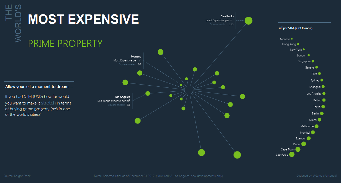
Sadly though, even with the training sessions Joe delivered. I wasn’t able to use Tableau in my day job, I had Excel work that was too critical to stop doing. So I took to learning and developing my skills at home in the evenings. I posted my first viz in March 18 and by May 18 I had my first Viz of the Day (VOTD)! I was a bit of a gift, its one of the simplest VOTD’s you will see, but it was from #MakeoverMonday and about The World’s Most Expensive Prime Property – how many square feet could you afford in different cities around the world for $100M. That though, was the kick that made me think, maybe I can do this and be good at it?
I then didn’t use Tableau for another 3 months! Work got crazy, pressure was great, I didn’t have time to do anymore. It was a great frustration to me, because I found a new tool I loved, it allowed me to have fun and be creative, but I didn’t have time to use it! So the decision was made, I needed to leave to find a job that allowed me to use Tableau on a daily basis, I couldn’t see the end in my current role at the National Trust. So in August 2018, I set to producing a few more vizzes to increase my online profile. Luckily another one of those was VOTD – where I sourced my own data and visualized The Rugby Union English Premiership League History.
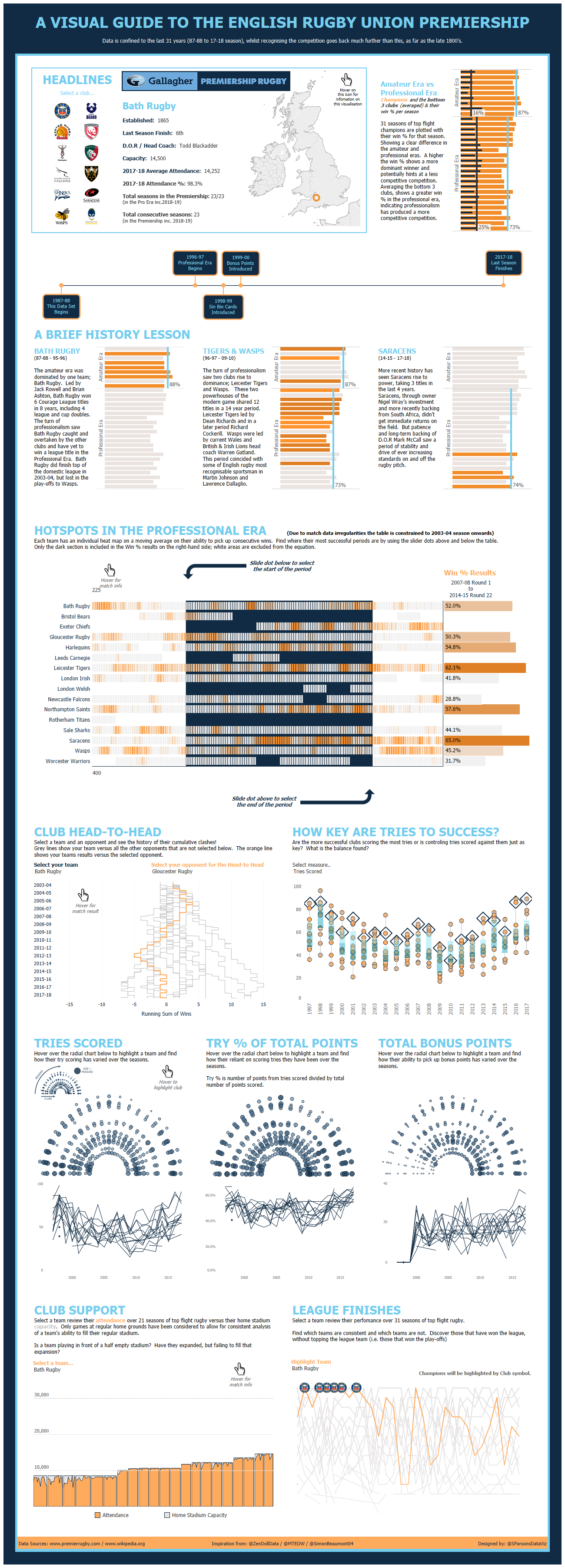
Rugby is a passion of mine, so this was a lot of fun to put together – I look back now and think I would change so much! I had only half finished that Rugby Union viz when I applied for my first Tableau role, I applied to Dyson for the role of Senior Data Visualisation Developer. I very nearly didn’t because I felt I was really pushing the boundaries of what I could achieve. Let’s not forget I applied for this 6 months after I published my first viz to Tableau Public, but in those 6 months, I wasn’t using Tableau at work and I stopped for 3 months completely at one stage! So somehow with 3 months Tableau experience I was able to show Dyson enough that I landed the role within two weeks of applying!
I then set to producing more vizzes in Tableau public, seeking advice from one of our Tableau contractors, Steve Thomas. Just trying to use my three month notice period as effectively as I could to up-skill myself as quickly as I could. In that time I only produced a few more vizzes on Tableau Public, but one of them I was particularly proud of, which was the Kevin Richardson Foundation viz. This was produced as part of the #Vizforsocialgood project and I came up with the idea of creating a Lion head using polygons. I believe this viz started to raise my profile a little within the Tableau Community and to have one of the Zen Masters, Ken Flerlage, at the end of the year call it out as his ‘Viz of the year’ because he thought it deserved more recognition than it got, was stunning!
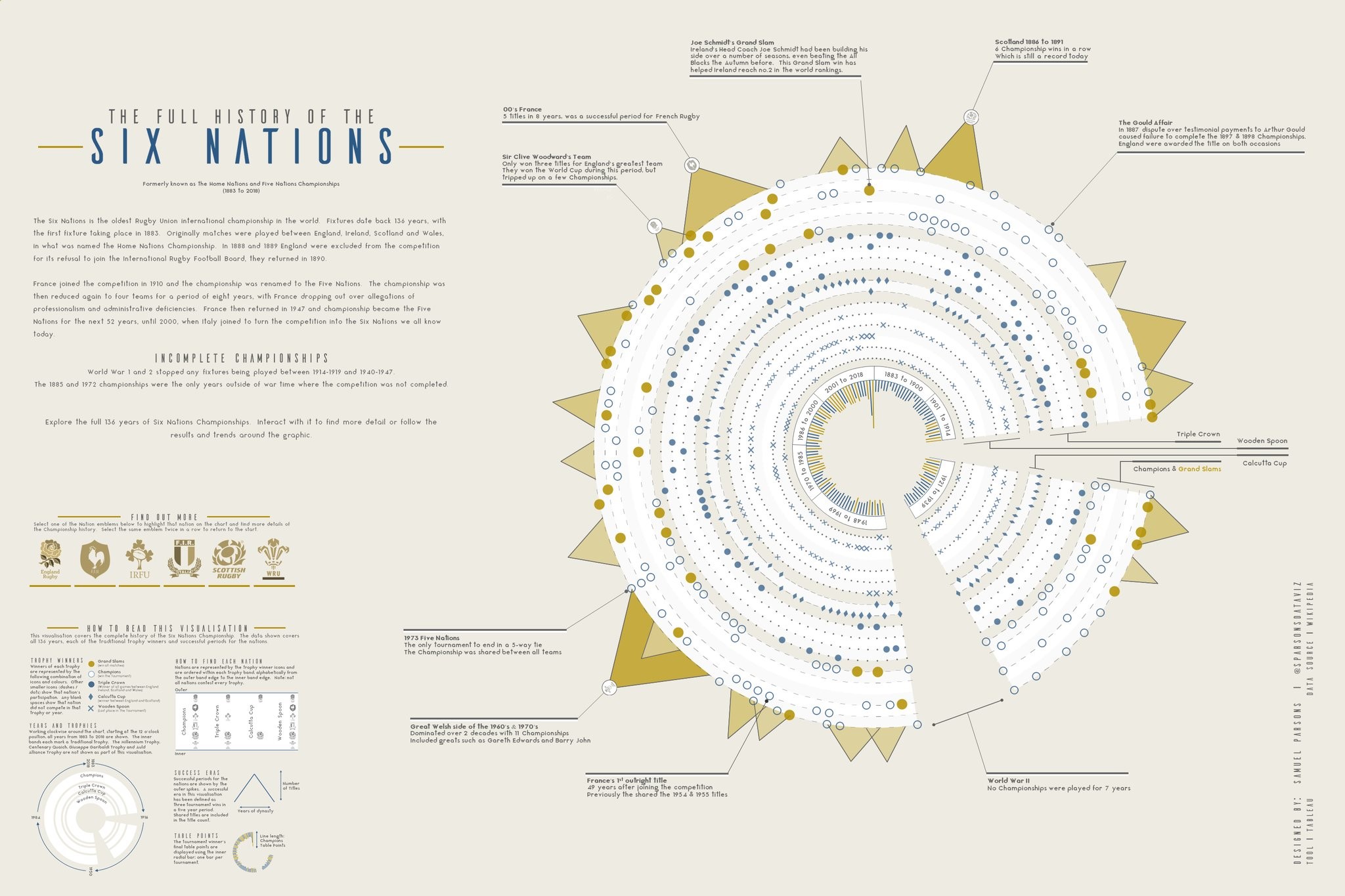
I now have been using Tableau daily for 6 months since joining Dyson. I’ve become more particular over what I do in the Tableau Public space. I don’t seek to rush vizzes out anymore, I scrap a lot of vizzes, because I hold myself to high standards now. Probably my favorite viz so far has been the History of the Six Nations I produced. This was because I had seen a lot of really interesting radial type vizzes that are produced outside of Tableau, you can find lots using Pinterest. But I hadn’t seen any / many using Tableau with multiple levels of detail. You will see radial charts, but they will have only one element to them. With this viz I had three or four elements going on in the same Radial. I wasn’t sure I could do it in Tableau, but after a few weeks of preserving I managed to get it to work. It won VOTD and was produced for #SportsVizSunday. I particularly like it because it again is on Rugby Union and works as a standalone poster, is visually attractive for a sport viz (which is hard to achieve) and technically challenged me!
Michael: You are a Senior Data Visualisation Developer at Dyson. Can you talk a little about how you help your business partners at work in their data visualization needs using Tableau?
Sam: Well, I still feel relatively new to Dyson – I’ve only been here for 6 months. Yet I must admit I feel very much like I have landed on my feet. My role at Dyson is purely a Visualisation role, I do very little if anything with building or amending data sets – this is perfect for me. I’m all about designing dashboards and engaging users through visualization! I have made my mark within the company already much quicker than I had expected, through a piece of work I ended making far bigger in scope than I was asked for. I was asked to review my own team’s suite of reports and find a way to make them more cohesive and connected visually. What I ended up producing was a comprehensive set of design standards, support document and review process around branding and design. Which sets out what our analytical output should look like. This document was entirely built within Tableau, it covers the whole range of Tableau elements, detailing design best practice, colour principle, technical Tableau help, how our reporting works and I was able to embed 12 dashboards of different chart types to provide inspiration to our developer. This was aimed at on-boarding new users, whilst also helping those that have been using Tableau for 3-4 years understand principles around design they may not have understood previously. This was build for my own team originally, but we felt it was so detailed, so comprehensive and of a great standard that I then opened it up to the rest of the business and their own analytical teams, whether they use Tableau or not! I have been running face-to-face sessions on how to use this document and how to help embed it within other teams. It has been hugely successful with a large quantity of teams adopting it for their own purposes. Which isn’t too bad having delivered that only four months into my career at Dyson (not to forget this is my first Tableau-centric role!).
I am continuing to develop this set of standards, which I’ve named the Tableau Design Framework. I’m constantly looking to keep pushing the boundaries on what we do to best support our end users.
To give a little context of my own team at Dyson. I work for the Global Quality team. We work with the largest data sets in the organisation, and our data is all centered around Reliability of our machines, Connected data of our products with apps, Safety data, user reviews / perception and even Corporate Social Responsibility (CSR). These data set are vast, and rich with information. We use Machine Learning to further enrich our data also. As part of my first 6 months. I contacted face-to-face surveys with our end users, to understand which reports they were using, why they were using the reports they did and what was their perception of the standard of our reporting, from both and insight and design perspective. As part of this we had a particular focus on overhauling our Reliability focused dashboards. We are now just at the point of delivering these new reports, vastly reducing down the number of reports our users were interacting with and focusing the insight through different channels. Effectively cleaning up the reporting suite and making a more obvious pathway for the users to follow to get their insights. All of this has been done with adhering to our Design Framework standards. We have also worked through the backlog of core reporting updating all to meet the Tableau Design Framework standards, so now our reporting suite is meeting that objective of being a more cohesive and visually connected set of reports. This is a success I’ve very proud of. We are now working on Brand and have a far more professional feel to our reports.
Within Dyson I have tried to make myself available as a Tableau Champion, running training sessions for new users, being available for ad-hoc help and advice across all teams. I happily make myself available for presenting Tableau at Lunch and Learn sessions as well.
I have been working on getting the Tableau Design Framework published to Tableau Public, but so far I have been stopped at the 11th hour. I hope in the future I am able to share it with everyone in one form or another.
Michael: Can you tell us three of your favorite Tableau Desktop tips and tricks?
Sam: OK, let me think! I would never do well in one of those Tableau Tips Battles that they sometimes have on stage at the conferences. But here are a few tips I like to use:
- Measure Values. For a long time with Tableau I found applying measure values on my worksheet hugely frustrating, as when I dragged Measure Values to the Marks Card, it would bring with it most of the measures I had in the data and then I would have to drag off the ones I didnt want and then add in the ones I did need. So my tip is this. Before dragging Measure Values to the Marks Card, drag Measure Names to the Filter Card and then select the measures you need with the filter. After that filter has been applied, then add the Measure Values to the Marks Card and hey-presto the measure you need are there instantly!
- This is less of trick, but more about good practice. After completing a dashboard, you may find you have a high number of Calculated Fields in against your Dimensions and Measures. You may have even spent so long on that dashboard / workbook that you’re not sure which are used anymore. I personally believe it is good practice to go through and tidy up your workbook before signing it off. To do this, In the Data Pane on a worksheet, select the little down arrow next to the search symbol, in that list select “Hide all unused fields” this will take away any fields from the Dimension / Measure Lists that are not used. What I like to so is then select “Show Hidden Fields” from the same drop-down list. This brings those hidden field back into view, but they are grayed out. You can then go through each grayed out calculated field and confidently delete them from the workbook, without any fear of impacting your Dashboards. I feel this is good to do, so any other Developers in your team can then pick up your workbook in the future and they are presented with a clean set of calculations which they can work with and understand.
- My last tip is to utilize containers and padding. Especially in Business Dashboards, you want control in how your Dashboards are presented and to know they will render consistently. For this reason I have instructed our teams to only build dashboards using containers and avoid floating as much as possible. Once you have your container structure in your Dashboard, then my tip its to create space between your charts, KPIs and text using Padding, we mostly use Outer Padding for this, unless you are trying to create a Divider line – in which case Inner Padding is good to bring through the background colour of the worksheet. Padding is preferable because it is not asking Tableau to render any additional objects on your dashboard, which is the other option for building space between charts using Blanks or Text Boxes.
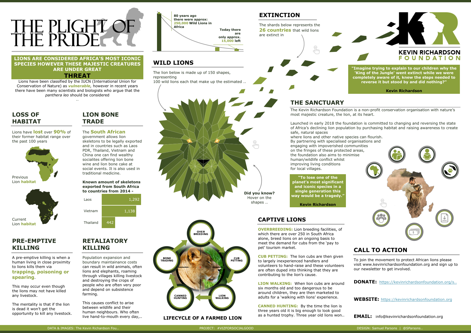
Michael: You have been involved with #VizForSocialGood. I loved your The Plight of the Pride data visualization. Can you tell us a bit about The Kevin Richardson Foundation?
Sam: Kevin Richardson is a conservationist from South Africa that has a mission to highlight the status of Lions in Africa and the problems they are facing through captivity, habitat loss and bone trade. Kevin created the Kevin Richardson Foundation in 2018 that has a sanctuary reserve that is home to 30+ Lion that have been rescued from captivity.
‘The Plight of the Pride’ viz was my take on the data that was made available through the #VizForSocialGood project. I found the subject hugely engaging, I hadn’t appreciated the issues that Lions face today and was really happy to take part in this project. The center piece of this visualization really started to get me noticed out in the community. I created it by hand drawing the line head on paper, scanning that image into my laptop, I think used Paint (Yes, Paint!) to find the coordinates of every point on every shape that made up the Lion. These x-y coordinates were then input into Excel and then I was able to load that data into Tableau to produce an interactive Polygon Lion. I then from there tweaked a lot of the shape and colour of the Lion and at the time I tweeted a GIF that showed the process of be putting together the whole viz from start to finish (Link). That went down really well at the time. I am already thinking of doing more things like this using Polygons. It’s just a matter of finding the right subject.

Michael: If you could magically be alone in a room with Francois Ajenstat, what would you ask him to add into Tableau Desktop?
Sam: Haha, this is where I have to admit my naivety, I had no idea who this was until recently when I read one of your other interviews!
This is difficult, because with each release, Tableau spoils us with amazing new features. I know a number of the community have been vocal about supporting more fonts in Tableau Public, but I understand there is licencing issues around this, so I’m not going to list that one.
Here are my 3 requests:
- A really quick win would be introducing a Spell Checker. I find all the time that I’m having to take my text our of Tableau and paste it into Word to check the spelling. That’s just bonkers! Even with my IronViz, I did this and still managed to miss typos.
- I would really like a button that when you are creating a chart in a single worksheet, you can press that button and it shows you how that chart is rendering in your dashboard. I find a lot of the time when using circle mark types, that you can size the circles in the worksheet and then they appear a different size in the dashboard, so you have to flick between one and the other till you get it right. So a button that could pop up the viz from the dashboard would be ideal for me!
- Lastly, this is something I encounter all the time at work, when creating a business dashboards, is after creating a hierarchy of different category levels or region & countries, you then want to filter by all these options. You end up either adding multiple individual filters, or composing you dashboard, by building in charts that hold the same information, so you can filter using actions. What I would like is a Hierarchy Filter type, so you can filter through the hierarchy level and options all within the one filter.
So for example, all within one filter: Open up ‘America’ from a list of countries > open up “Montana” from the list of states> then select a number of Montana counties to filter the view.
Michael: What is next on your “To Do” list? What can the Tableau community expect to see from you in the near future?
Sam: I have been working on a few map based visualizations. Trying out a few different styles, annoyingly I’ve not got anything ready for publishing at the moment.
In June, I am massively excited to be going to my very first Tableau Conference in Berlin. I will be meeting up for the first time with a lot of people I have connected with in the community over the past year. It’s going to be great to finally meet in person those people and talk data viz with them! Not to mention getting fully immersed into the conference. One thing on my agenda is to attend any talks on Extensions. I’ve never used this feature of Tableau and I am keen to hear of use cases in other businesses.
Lastly, I’m going to see what the next IronViz feeder round topics are and leave it to then to decide if I will compete again. I’m not feeling any real pressure to compete, and will take it as it comes!
Tableau Public
Link: https://public.tableau.com/profile/SParsonsDataViz#!/