Who is Martin Telefont?
Data Visualization Enthusiast; Generally Curious – Mostly Harmless.
QUESTIONS
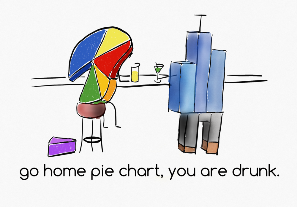
Link: https://www.martintelefont.com/sketches#/the100dayproject2019/
Michael: Hello Martin. I love the cartoons you post on Twitter. Can you tell my readers a little bit about The 100 Day Project?
Martin: Hi Michael. Thanks for having me. Thanks for the compliment. That I am doing the project was a bit of an accident. I sketched cartoons for an article Alli Torban (@AlliTorban) worked on. After seeing early drafts she encouraged me to try it. It’s been challenging at first to post a cartoon every day. But feedback has been great and I am starting to get the hang of it. By the way the article was later featured on the Tableau.com page. Here is a link to it: https://www.tableau.com/about/blog/2019/5/critiquing-data-visualizations-channel-empathy-and-be-productive
Michael: In you post on Medium.com, Topics in Dataviz: A Primer for Getting Started, you state:
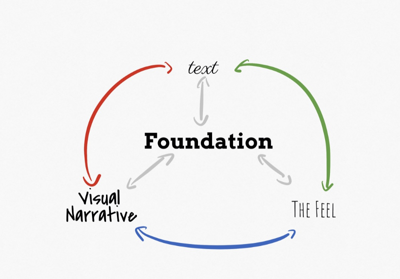
Foundation
Know thy data …. and own the story you can tell with it.
Data is the material we have at our disposal. Knowing the data is a vital part of determining which story you can tell. A good question to ask yourself is whether you know the system the data describes well enough to detect odd trends or errors.
Can you talk about this a bit?
Martin: Sure thing. There is this saying that data is the new oil, and I kind of agree with that, but then again it’s not really oil. You can turn oil into a lot of things, if you know the chemistry, but data will only let you do so much. On the other end of that of course is “If you torture the data long enough, it will confess to anything” from How to Lie with Statistics.
Data is the new oil.
If you got into Dataviz to communicate insights, you don’t want to go there. The funny thing about the Dataviz community is that we are all amateurs. So people are very open to helping each other out, because we all started somewhere else. If you need help with data that you don’t know enough about, the best you can do is ask somebody that may know more about it then you.
If you torture the data long enough, it will confess to anything.
How to Lie with Statistics

Michael: In your post on towardsdatascience.com, Data Visualization Sketch — US Supreme Court, you discuss the process you followed to create the data visualization for this. Can you discuss your typical process in creating a data visualization in some detail for my readers?
Link: https://towardsdatascience.com/data-visualisation-sketch-us-supreme-court-5ff4855181ea
Martin: Ah yessss. Looking back I am a bit embarrassed about these early posts. I would say my process was pretty decent but my technique wasn’t very good. When I did these plots I had almost a week of d3.js under my belt and had only heard about observablehq.com
But everything considered they turned out OK. I would say I usually approach a visualization from one of two directions. Data or Story. The first is usually more fun. You get to see what is in the data and see what works and what won’t. The second is a bit of a scavenger hunt and jigsaw thing.
What is central to both approaches for me is sketching. When I have a pen in my hand the work feels more real, less abstract. I grew up in a house filled with sketches in the design thinking style my Dad made when he worked on a project. I am glad some of that rubbed of on me.
I would say after that it’s all about figuring out which step feels right. Sometimes I go into color and then to metaphor encoding, or start with lettering. As funny as it sounds sometimes the data tells you want you should do next.
Michael: I am curious, what is your day job?
Martin: I am involved in the Human Brain Project, one of the European Flagship programs. It’s an interesting place. Like Dataviz it is very interdisciplinary and a great place to grow. I started out as a neuroscientist. I did a tour or two in Neuroinformatics and data curation, then ended up in Project Management. My team and I are focusing on quantitative quality control. Which is a fun challenge in itself. But when you add research and infrastructure building on top it adds a couple of twists and turns.
Michael: What is next on your “To Do” list? What can the data visualization community expect to see from you in the near future?
Martin: To be honest, I am not sure. I have spending the last 3 months in Data Visualization Society slack channels. I am still trying to cope with the experience of having every aspect of Dataviz a channel away. I started collaborations with people I always wanted to work with. Some of this takes time to gel, but I see first signs of some maturing from project sketches to something to lean on. I’d say expect me to continue to take on more than I should, and pull off something neat every now and then. 🙂
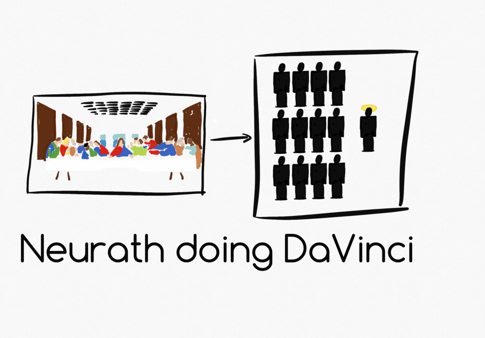
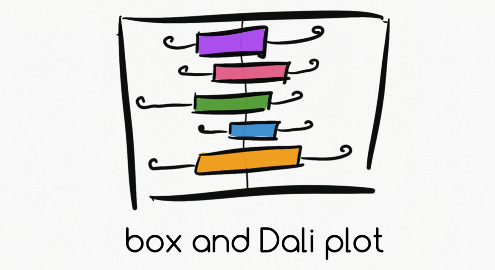
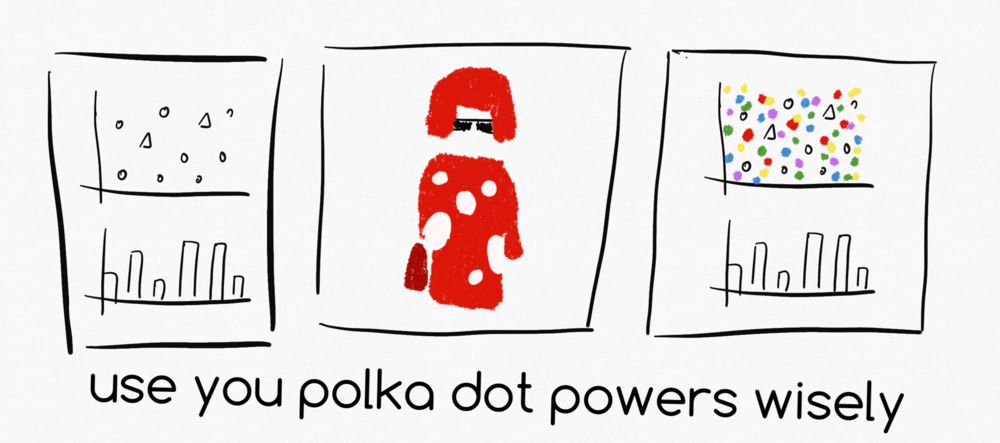
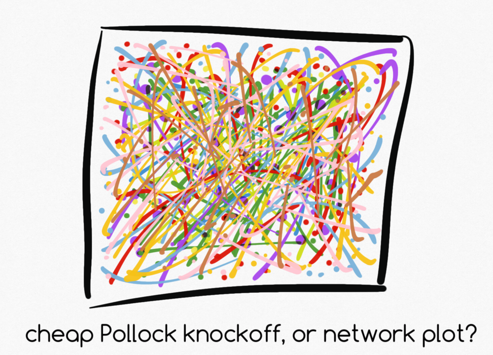
Here are a few of Martin’s The 100 Day Project Posts
Link: https://www.martintelefont.com/sketches#/the100dayproject2019/