
Marc Reid Bio
Marc Reid is an Independent Tableau Developer based in London helping clients make the most of Tableau.
Marc has a software engineering and business analysis background but more recently studied for MSc in Business Intelligence to focus his career in the area of data and analytics. He went on to join The Information Lab’s Data School programme where he developed his Tableau and Alteryx skills, learning from some of the best practitioners in the field.
Marc posts regularly on his data visualization blog, datavis.blog, and can also be found on Twitter and Linked In.
Outside of work, Marc enjoys travel and photography.
Questions
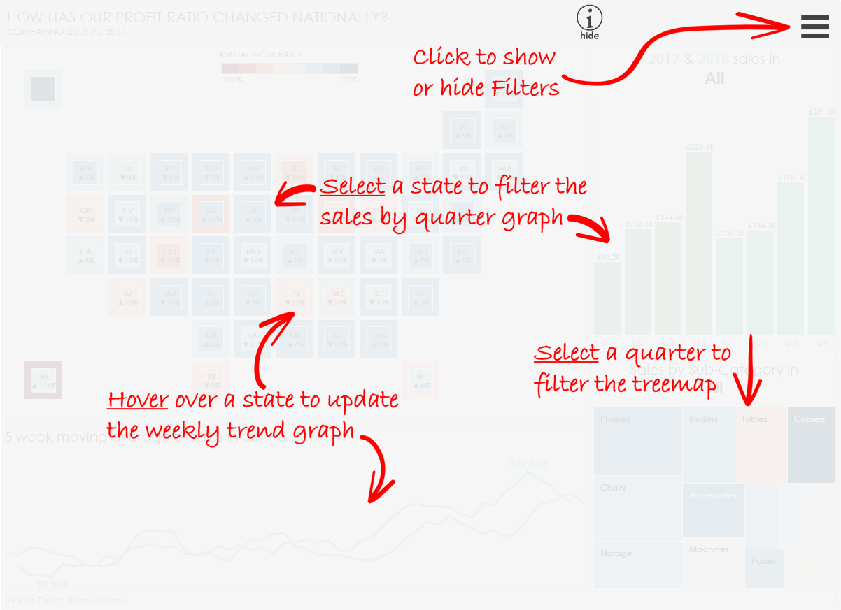
Link: https://datavis.blog/2019/03/10/show-hide-containers/
Michael: Hello Marc. I really like the creative examples you have on your https://datavis.blog/ and have created using Tableau Desktop v2019.2 Beta. In particular, I personally have an immediate need for the use case for the toogle help screen you created.
Can you discuss a bit, for my readers, what motivated you to create this feature and how you did it?
Marc: Hi Michael. I’d seen this type of feature appear more frequently in websites – popups that guide you, as a first time user, through the site, its features, where to find what you need etc. – and I thought this would be very helpful for a first time user of a dashboard so they can get the most value from it in the shortest time – like a quick-start guide.
I frequently add text instructions to a dashboard, but it’s hard to make it so prominent without it being distracting (if the text is always there). The nice thing about these overlays is, once you’ve read and understood the information, you can just switch it off, so there is no ongoing distraction away from the charts.
With the introduction of Show/Hide Containers, the implementation becomes fairly straightforward. I took a screenshot of the dashboard and pasted it into PowerPoint, where I then overlayed the arrows and text I needed. Then I deleted the screenshot of the dashboard and saved the remaining arrows and annotation as an image, which could then be brought into Tableau inside a floating container. The magic ‘toggle button‘ is then added to the container which allows the container to be hidden and shown with a simple click.
YouTube Link: https://www.youtube.com/watch?time_continue=10&v=QJ7euzd9bZc

Link: https://datavis.blog/2019/03/17/popup-charts/
Michael: Another Tableau Desktop v2019.2 Beta example you show on your blog is the ability to create Popup Charts. Can you discuss this new feature a bit and how you created this using Tableau Desktop?
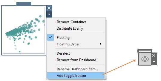
Marc: A nice attribute of the new container toggle buttons is that they behave like other dashboard objects, so you can insert them into another container and then add another toggle button to that ‘outer’ container – so you then have nested toggle containers!
This allows you to simulate menu and sub-menu functionality, which is kind of what I did here – so clicking on the spanner icon expands a menu of options, then clicking on each option (e.g., color) then reveals a sub-menu of options (e.g., different colors). This image shows the linkage between buttons and the containers they control:
The Parameter Actions feature allows you to update the value of a parameter dynamically by passing a value to it that is sourced from the marks in the view. This is quite a powerful feature as it opens up all kinds of opportunities for user interaction, making selections, dynamic reference lines etc. Set Actions, from 2018.3, had already opened up many of these options (see @datavizlinds great work on that front) and Parameter Actions are definitely a great addition to the toolbox.
The nice thing about parameters is that they are global to the workbook, so they can be accessed from any worksheet regardless of what data source is used, as well as from simple text boxes and worksheet titles so, pretty much anywhere!
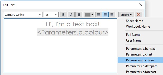
It also means you can use one data source to hold the values you want to use to populate your parameter(s) and another data source with your actual data:

YouTube Link: https://www.youtube.com/watch?time_continue=1&v=NLTddomk1Po
Michael: You are an Independent Consultant. Can you tell my readers the kinds of services you offer?
Marc: My focus is on Tableau – building dashboards, promoting data visualization best practice, managing data sources and user access, and helping clients to clarify their requirements and focus on the underlying questions they are trying to answer. I’ve also worked with other tools such as Alteryx and SQL for data preparation and cleaning and generally exploring the data and getting the structure right for Tableau.
Michael: Can you tell us three of your favorite Tableau Desktop tips and tricks?
Marc:
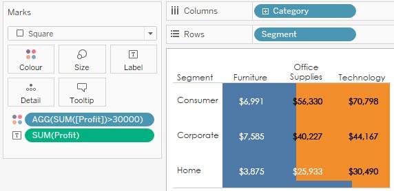
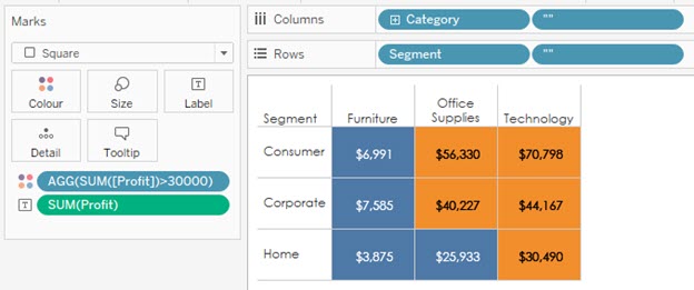
1) When using a discrete pill on the color shelf in a highlight table, the colors can overlap into surrounding cells when you increase the size of the square. To stop this, you can add another discrete pill, which can just be two quotes (“”), to both Rows and Columns. For full details see Ryan Sleeper’s blog post here: https://playfairdata.com/3-ways-make-handsome-highlight-tables-tableau/
Before
After
2) When working on a ‘busy’ dashboard with lots of worksheets and actions, it can be easy to trigger, for example, a filter actions when you’re just trying to select the sheet. A nice tip is that you can select a worksheet on a dashboard by clicking with the mouse wheel and it wont trigger the action. Picked that one up at The Data School.
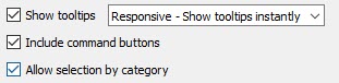
3) This one is a built-in feature that seems less known about, at least I don’t see it used all that much. In the tooltip you can expand the selection based on the dimensions in the view. To make this work you need to ensure that “Allow selection by category” is switched on – the third option in this list, which shows inside the tooltip dialogue box.
In the example below, I’ve selected one cell in the table:
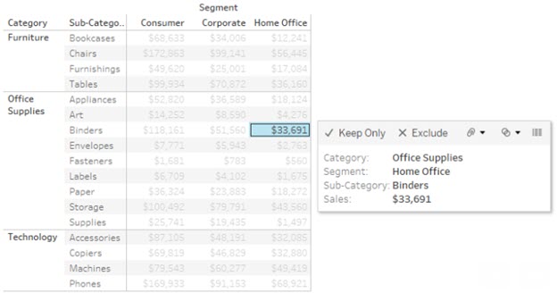
By then clicking the category “Office Supplies” in the tooltip, all cells that are also of category “Office Supplies” will be selected:
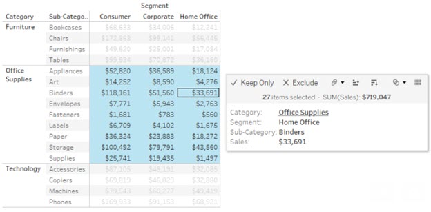
I could also click on “Home Office” to select all cells that are of that segment. This becomes much more useful when working with scatter plots where it’s not always so easy to make these kinds of selections manually.
Michael: Now that you have had some time to experiment with Tableau v2019.2 Beta, what do you think is still missing in Tableau Desktop?
Marc: With the last couple of releases and the current beta, there’s been leaps forward in functionality, especially around the user experience and the ability to interact directly with the marks in the view, all of which create a more immersive and engaging experience.
As someone who spends a lot of time in Desktop day-to-day, it’s more the little things that I sometimes feel are missing. I’d like the dashboard building process to more fluid and less hindered by workarounds or ‘extra’ steps. My wish list would be:
- Copy and Paste objects
- Copy and paste formatting between objects
- Multi-select – to move multiple objects at once, or format multiple objects in one operation
- Alignment – e.g., select 3 floating text boxes and align top, or align all to the right
- Templates – e.g., for adding a logo image or standard footer text to all dashboards (similar to the “Slide Master View” in PowerPoint)
- More options to set defaults – e.g., for quick filter settings
- Ability to set borders on select sides of objects
Michael: So, I just did a presentation at the Tableau Fringe Festival – EMEA on How to Prepare for the Tableau Desktop Specialist Exam. I am now currently preparing for the Tableau Desktop Qualified Associate Exam. You are a Tableau Desktop Certified Professional. Can you discuss this exam a bit and how people can best prepare to take it?
Marc: The main advice I would give is to practice, which sounds obvious but I found that, even though the exam is 3 hours, the time did go by quickly. Unlike the QA exam, which is multiple choice questions, the CP is 100% practical and you are using Tableau for the full duration, so being really familiar with the product and with a wide variety of techniques – filters, sorting, LODs, table calcs etc. – will help in completing the questions in less time.
How to practice? participate in some of the many community projects that exist – there are many to chose from, and participating in different ones can help build a variety of skills. For example, I find that #MakeoverMonday helps me to think about dashboard design and story telling and #WorkoutWednesday helps me to practice new techniques that I may never have considered before as well as practice specific functionality – for example, Andy Kriebel has set some great workouts for table calculations – if you’d like a good challenge, have a go at this one!
Even if you’ve been using Tableau for a while, I’d also recommend going back and viewing all the intoductory free training videos that Tableau provides. I found them to be great reminders of best practice and techniques.
Plan your time – check what sections are worth how many points and divide your time accordingly.
Finally, take a look at Simon Beaumont‘s blog post on this very topic for many more tips: https://www.vizionaryblog.co.uk/blog/so-you-ve-taken-desktop-qualified-associate-now-onto-professional
Michael: What is next on your “To Do” list? What can the Tableau community expect to see from you in the near future?
Marc: I enjoy exploring the new features of Tableau and what possibilities they open up so I’ll likely continue to do that.
I’ve committed myself to completing every #WorkoutWednesday this year as I find it a great way to continue to develop my Tableau skills. I‘m currently a couple of weeks behind though, so playing catch up.
I’m also keen to learn more about Tableau Server to better understand what’s happening “under the hood” when Tableau is working its magic. To make a start on that, I recently attended the first Server Tableau User Group (or #STUG), which was a lot of fun and great to meet some of the community‘s Server experts and hear the discussions.
Another great community project Preppin‘ Data (led by Carl Alchin and Jonathan Allenby) is gaining lots of momentum and I’d like to try some of those challenges as well.
I was also catching up with podcasts recently and enjoyed listening to Chris Love share his thoughts on the Hashtag Analytics podcast with Ann Jackson and Luke Stanke around the idea of taking more time with visualization projects, digging deeper into the data and working on original content and that’s got me thinking about working on a something outside of what I normally do, so let’s see where that goes.
Tableau Public
Link: https://public.tableau.com/profile/marc.reid#!/

