Dr. Klaus Schulte is a Professor in the Department of Economics of Münster University of Applied Sciences in Germany. His teaching and research area is Business Administration with a focus on Management Accounting.
In less than a year, Dr. Schulte went from being a Tableau newbie to becoming the European IronViz Champion.
His other work areas include:
- Cost accounting and cost management (traditional procedures, planning processes)
- Strategic management accounting (strategic performance indicator systems, e.g. Balanced Scorecard)
- Functional management accounting (in various functional areas such as procurement, marketing, logistics)
- Cross-functional management accounting (e.g., investment and risk controlling)
QUESTIONS
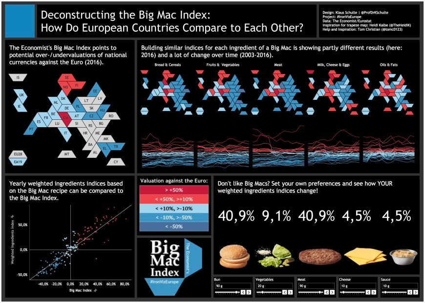
Michael: Hello Klaus. Last year, you were selected as the IronViz Europe Champion with the entry I show above.
Can you please tell my readers the process you used to find the data you needed, design the dataviz, and finally, build it in Tableau?
Klaus: Sure! Initially, we were given the data from The Economist’s Big Mac Index some weeks ahead of the competition. The Big Mac Index points to potential over- and undervaluations of national currencies against the dollar all around the world by comparing a national big mac price in dollar to the big mac price in the US.
Very quickly my attention went towards Europe where I found it quite interesting, that the Big Mac Indices of the European countries all look quite similar, but also have these differences in value, although huge parts of Europe are part of a common market and a lot of countries even share the same currency. So, my first choice was to focus on Europe.
Then my second choice was to play with the product – the Big Mac – itself and I was lucky to find Eurostat data of indices related to the ingredients of a Big Mac.
By bringing in this data I wanted to answer two analytic questions:
- Does a weighted ingredients index based on Eurostat data differ from the Big Mac Index? (The answer is: basically not!)
- And can I take an ingredients index as an indicator for over-/undervaluations in countries where you don’t have McDonald’s and a Big Mac like for example in Iceland. (The answer is: Yes!)
In the next step, I wanted to find a design that is able to communicate this analysis. With the design, I also wanted to play with the Big Mac/burger theme. When I was googling around and when I saw a burger box and realized that they are made out of trapezoids and rectangles, a great viz by fellow German Heidi Kalbe came to my mind.
In this viz Heidi created a trapezium tile map. While she used trapezium shapes in a grid, I wanted to use polygon data due to the special #IronViz situation, having no time to figure out the right size of the shapes to make the distances between the shapes look really accurate. With a polygon map, I would be able to just bring in the data, set a border and go for it (a step-by-step instruction on how to build it can be found on my blog).
To build my map I first sketched it in PowerPoint:
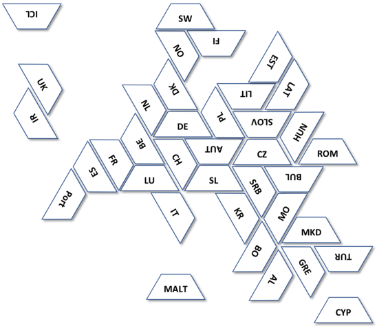
Then I needed just a little bit of geometry. I built my trapezes out of three equilateral triangles what allowed me to calculate the coordinates of my trapezes in Excel very easily. The rest was just bringing the data to Tableau and creating the viz.
With this map, I was able to communicate my analysis very effectively. I went for a big map for the Economist’s Big Mac Index and for several small maps for the ingredients. And the best thing was that I was able to create these charts very quickly.
Michael: Can you tell my readers how you first started using Tableau, how you are using it in the classes you teach, and what kinds of projects your students are doing with Tableau?
Klaus: I was introduced to Tableau by Thierry Driver from Tableau’s academic team who did a workshop at our business school in November 2016. In the follow-up of this workshop, I downloaded the product, but only started using it since summer 2017, when I decided to use Tableau in class from winter term 2018/2019 on.
The idea was to bring data visualization closer to my accounting students because management accountants are often not too familiar with data visualization. I also wanted to include a Tableau Training, because as a University of Applied Sciences we strongly believe that applying things we talk about in the classroom is the best way to learn. Since I had no BI experience so far, all my Tableau work was necessary to prepare myself, because as you can imagine, it’s always good to be some steps ahead of your students.
I also wanted to include a Tableau Training, because as a University of Applied Sciences we strongly believe that applying things we talk about in the classroom is the best way to learn.
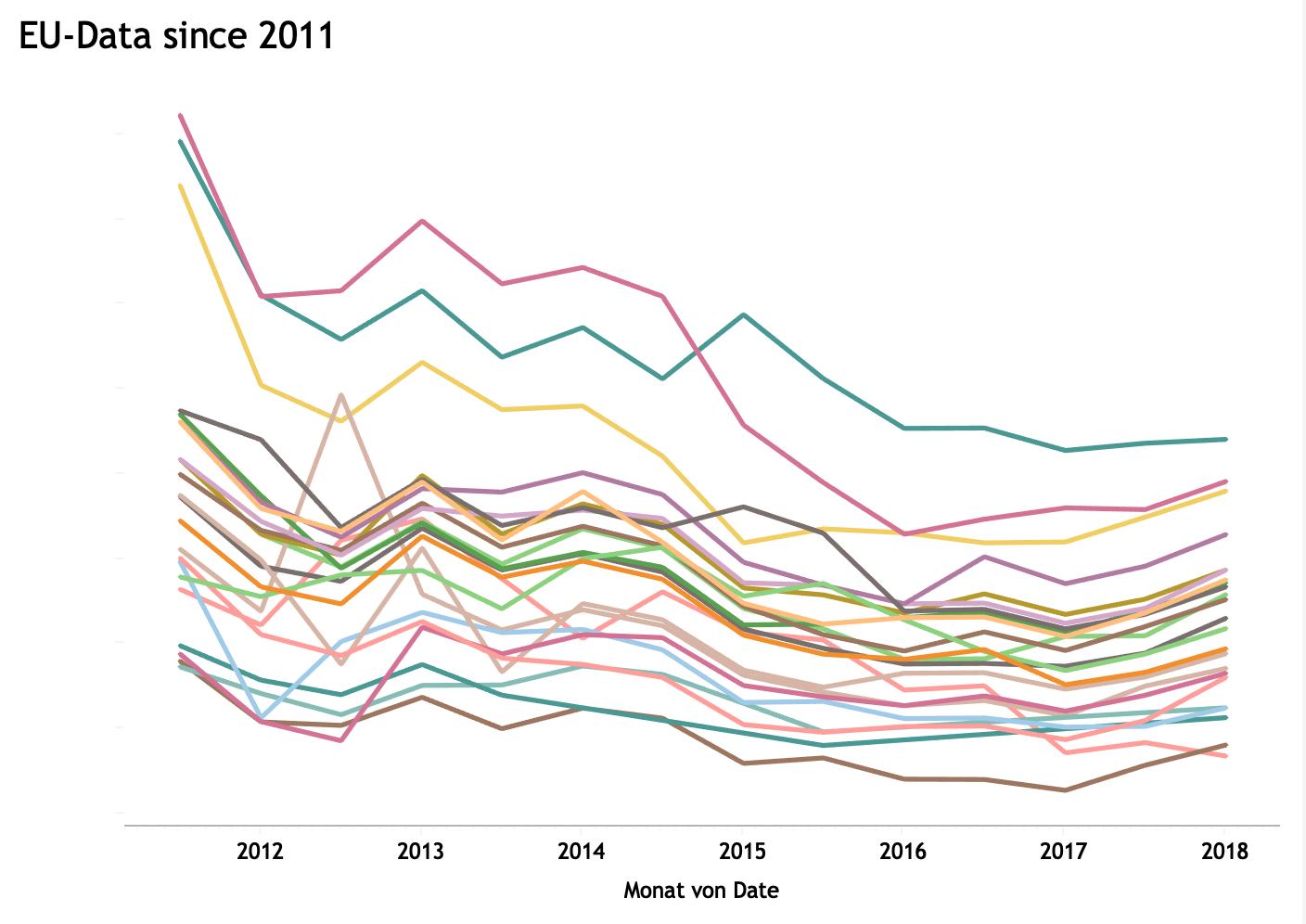
To learn Tableau, I participated in a lot of community projects such as #makeovermonday, #sportvizsunday, #vizforsocialgood, and #workoutwednesday. What also helped me a lot was to visit a two-day Tableau Intermediate training in Amsterdam where I got a deeper understanding of how Tableau actually works.
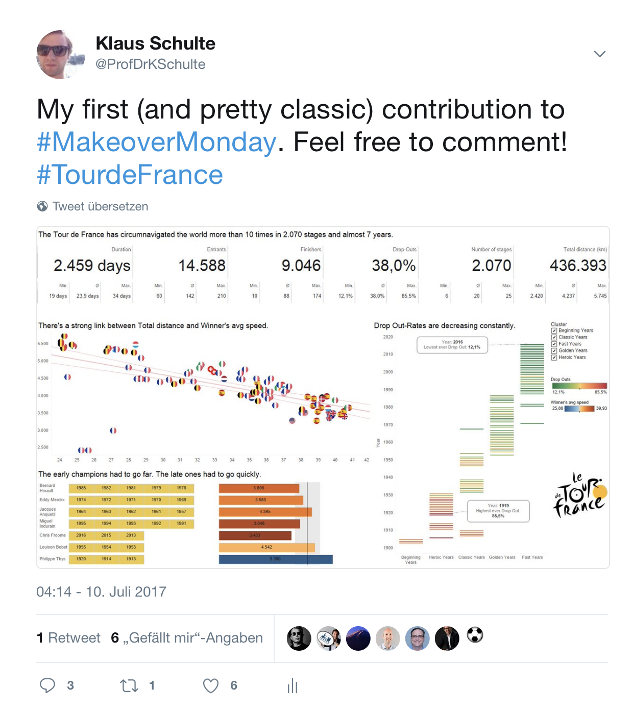
Today I’m using Tableau in my courses at the master’s level in our Accounting, Controlling & Finance program. Actually, there are two courses, one is a lecture on data visualization in the first semester where a Tableau training is included. In this lecture I want my students to create visualizations on clean datasets like provided by #makeovermonday.
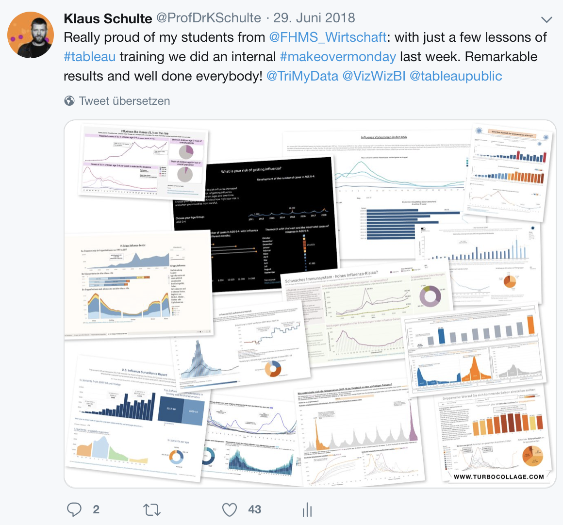
The second lecture in the third semester is more like a project, where my students visualize data from real-world companies. These projects can focus on improving already existing (static) reports but also on answering their analytic questions for example in the areas of procurement, marketing, or logistics.
Michael: Can you tell us three of your favorite Tableau Desktop tips and tricks?
Klaus:
- Dragging a table calculation from a(ny) shelf to the measure shelf to create a new calculated field.
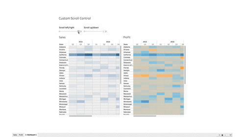
- Synchronized scrolling for multiple sheets (Link)
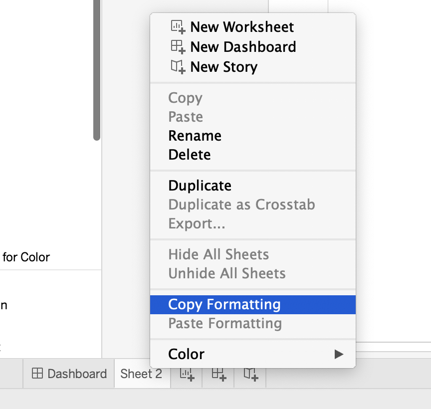
3. Copy and paste worksheet formatting
Michael: Last year, you attended TC18. Can you tell us a few of your favorite sessions or events you attended and why they were your favorites
Klaus:
- Mike Cisneros: You are an artist | How and why to get started making public data visualizations (YouTube)
Very inspiring, funny, profound! Mike is a world-class presenter and there were lots of nuggets to take away from this presentation!
2. Tableau Conference 2018 Opening Keynote
It was my first Tableau Conference. I really liked the opening part!
3. Data Night Out
I had a blast at Data Night Out at a spectacular venue. After leaving the Superdome we went to the French quarter where I met a lot of people from the community!

Michael: What is next on your “To Do” list? What can the Tableau community expect to see from you in the near future?
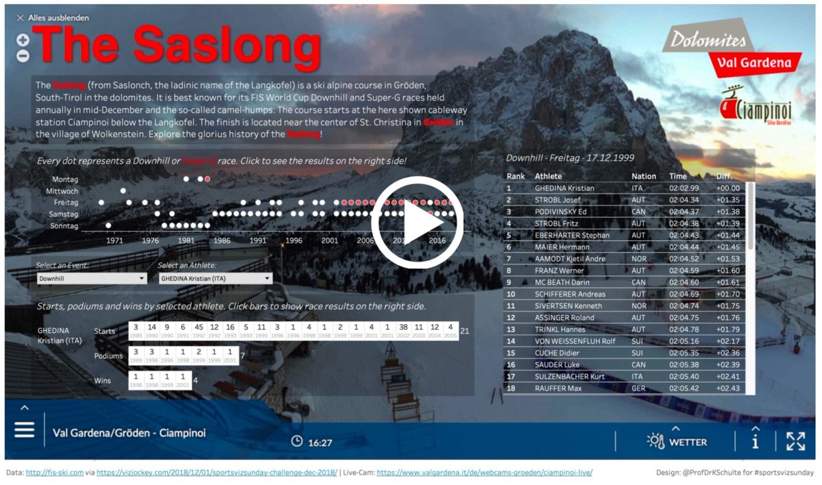
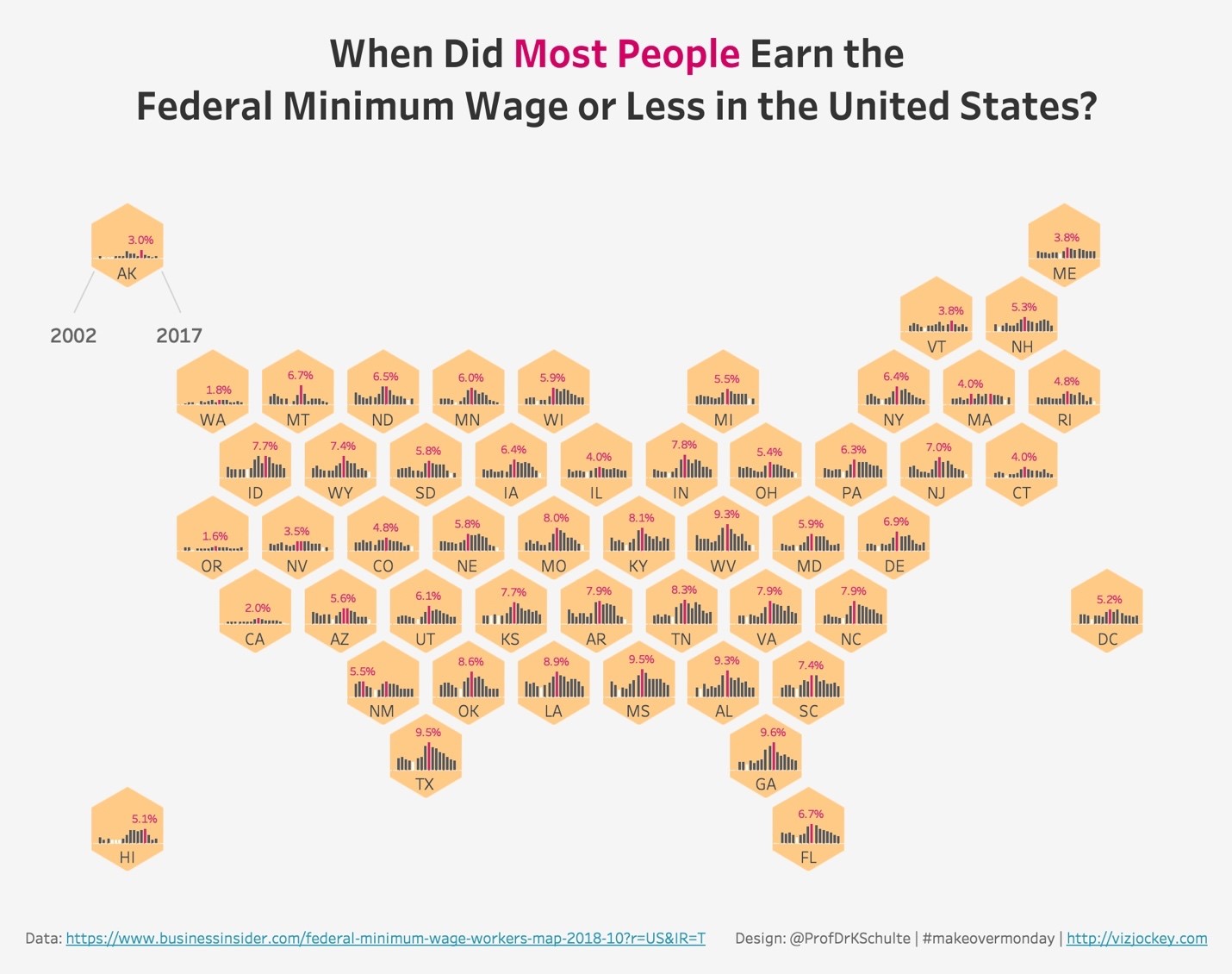
Klaus: I really like thinking about how to use Tableau in innovative ways and to blog about it, like for example my custom zoom control for multiple maps, the combination of background videos and dataviz or just recently the integration of sparklines/sparkbars into a hex map. This is something I want to continue.

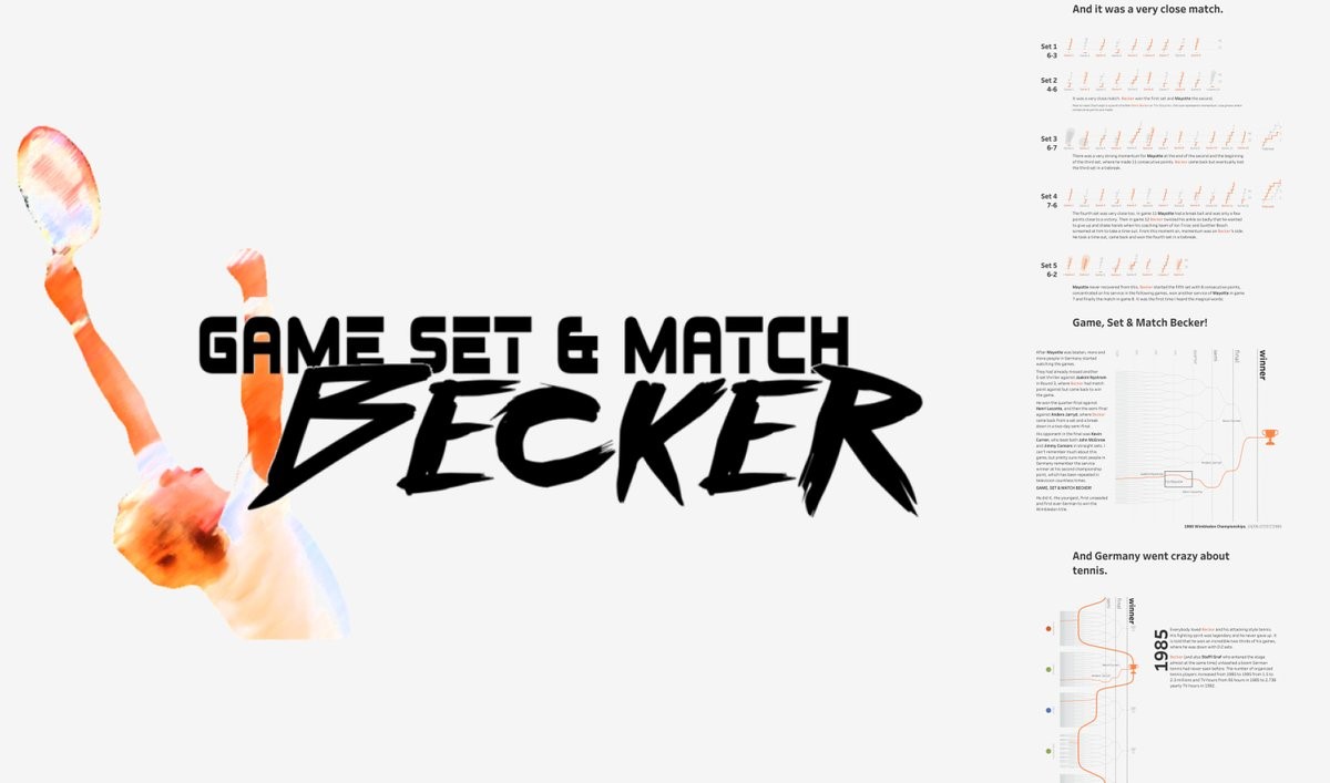
I also enjoyed a lot collaborating with Ludovic Tavernier when creating our data essay about tennis legend Boris Becker. We have already some ideas about future projects so there might be more to come.
Furthermore, I would like to continue participating in community projects like #makeovermonday, #sportsvizsunday, and #workoutwednesday and attend both conferences. I’m in particular looking forward to TC Europe in Berlin. It will be great to meet my friends from the community on home soil.
Tableau Public
Link: https://public.tableau.com/profile/klaus.schulte#!/