

Karen Hinson is a Lead Analyst on Chick-fil-A’s Field Analysis & Performance Reporting team. Prior to joining Chick-fil-A in 2013, Karen was a Senior Data Analyst at Invesco. At Chick-fil-A, Karen is responsible for producing reports and dashboards that measure the health of the business.
Karen was part of the team that launched Tableau Server at Chick-fil-A. Today, she continues to champion Tableau to elevate analytics across the organization. Karen earned her B.S. in Finance from the University of South Carolina and her M.B.A. from Georgia Tech. She enjoys sharing her passion and enthusiasm for data and analytics, speaking at universities, Data + Women events, Tableau User Groups and industry conferences.
QUESTIONS

Michael: Hi Karen. So, I need to start this interview by stating the fact that my boss is totally in love with Chick-Fil-A. Two years ago, for his birthday, I got him the Dept 56 Eat Mor Chikin sign, and this year, for Christmas, I got him one of your TC18 T-shirts.
So, with that said, I want to begin the interview with asking you what you do for Chick-Fil-A and what kind of data problems do you help them solve?
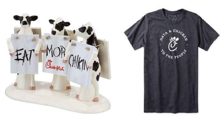
Karen: That’s awesome! I hope your boss enjoys the “Data & Chicken” shirt!
Chick-fil-A is a wonderful place to work. My job on the Field Analysis and Performance Reporting team is all about using data to “tell the story” behind our menu, sales and profits. Here are a few examples of Tableau dashboards I’ve created at work:

The one above was built for our Executive Committee and is focused on 12 KPIs.

The one above tracks Sales, Transaction Count and Check Average Growth for the prior week (since we’re closed on Sundays, a week for us is the past 6 business days).
To increase business acumen, all CFA staff receive a subscription to this dashboard on a weekly basis.
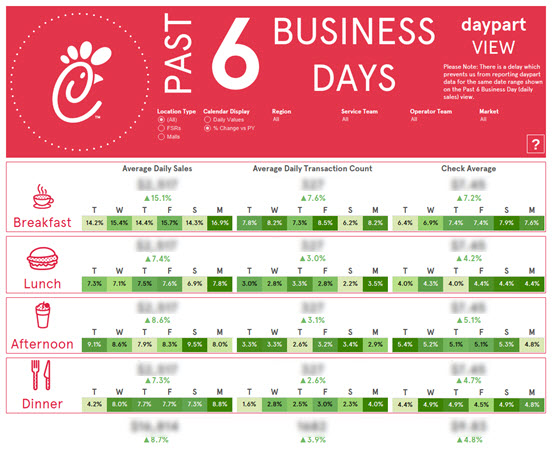
The view above displays data for the prior week broken out by daypart (can be filtered for a specific region/service team/operator team/market).

This month, I’m working to produce the 2018 Annual Performance Report (above is a look at the APR I built last year – entirely in Tableau).
Michael: Can you tell my readers how you first started using Tableau?
Karen: I began working for Chick-fil-A in April 2013. My boss at the time had recently discovered Tableau and introduced me to it. I was instantly impressed; I had never used a software that made it so easy to make sense of and visualize data. I made a conscious decision to invest a LOT of time & energy toward developing my skills and becoming an expert. Everything I was asked to build, I used Tableau to build it. Over the next two years, my boss and I convinced the business to invest in Tableau Server. Today, Tableau dashboards push data and insights to the masses at Chick-fil-A.
Over the next two years, my boss and I convinced the business to invest in Tableau Server. Today, Tableau dashboards push data and insights to the masses at Chick-fil-A.
Michael: Can you tell us three of your favorite Tableau Desktop tips and tricks?
Karen:
#1 Sure, this one is really simple but useful… using shortcut keys like ALT+Shift+R or ALT+Shift+C to add a field to rows/columns.
#2 Want to use a special (non-supported) font in a viz you’re publishing to Tableau Server or Tableau Public? Save the font as an image and insert the image in your viz.
#3 This is a trick I’ve been using for years involving complex filters. It’s pretty complicated but has certainly proven very helpful!
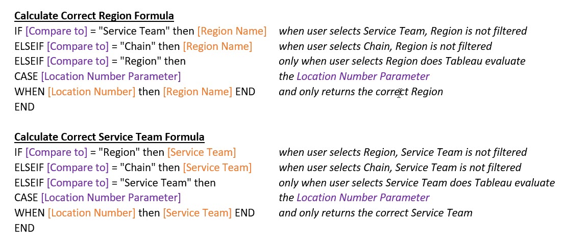
Here’s the scenario… Have you ever wanted to create a view like the one below that allows users to select a specific location (in this case, a restaurant) and compare that location against a relevant peer group (in this case, that restaurant’s Service Team)?
- First step is to create a parameter allowing the user to identify the specific location (my parameter is called Location Number… but this could be a store number/employee number/customer number/etc).
- Next step is to create a Compare Against parameter with choices. For example, perhaps you want users to be able to select from these 3 options:
- Chain
- Region
- Service Team
If you’ve ever attempted to do something like this, you know the difficult part is… when a user selects “Chain,” they want to see how their location compares to all other locations across the chain. However, if a user selects “Region” or “Service Team,” they want to see how their location compares to others in the applicable Region or Service Team.
Which means…
- You must identify the correct Region or Service Team (based on the Location Number parameter) and
- Return data only for those locations within that specific Region or Service Team
How?
Create calculated fields to identify the correct Region and Service Team locations. These formulas will be used to filter Region and Service Team fields in the data.

Next step: Drag Region to filter. Click on Condition and set Region = the “correct” Region value by adding a formula like this to the By Formula section:

Drag Service Team to filter. Click on Condition and set Service Team = the “correct” Service Team value by adding a formula like this to the By Formula section:

Why does this work?
Region is filtered (Region = Calculate Correct Region value). Same for Service Team.
Which means…
Michael: Last year, you attended TC18. Can you tell us a few of your favorite sessions or events you attended and why they were your favorites?
Karen: Yes! I look forward to attending the conference every year. This was my fourth one! Here’s a picture of me and my co-workers out in New Orleans.

This year, I really enjoyed Mike Cisneros’s You are an Artist session! Definitely worth checking out… it was brilliant!
Another highlight from TC18… Fanalytics (primarily geared toward Tableau Public authors). Loved it.
This was my second time speaking at the conference. My session was called Vizspiration (How Chick-fil-A Transforms Ideas into Business Value).
Last thing… Really enjoyed the morning devotionals organized by my buddy, former Zen Master Nelson Davis
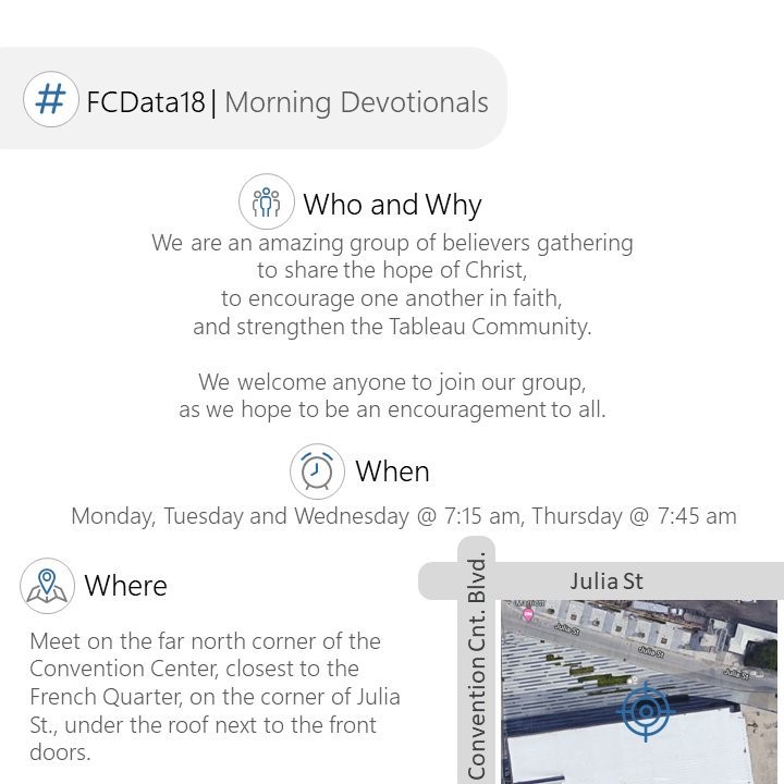
Great fellowship! I love spending time like this with others in the Tableau Community!
Michael: I use to go to Atlanta a lot for my previous company as my entire team was located up in the Alpharetta/Roswell area. It seems to me that a lot of big companies in your area use or build business intelligence & analytics tools (for example, I remember from my past life that Home Depot used MicroStrategy). Do you feel Atlanta is becoming a hub for IT companies similar to Silicon Valley in California?
Karen: I certainly hope so. There are a handful of Fortune 500 companies headquartered in Atlanta, and there’s a LOT of tech talent in the area. Did you know the Atlanta Tableau User Group was the first TUG to originate in the United States?
Michael: What is next on your “To Do” list? What can the Tableau community expect to see from you in the near future?
Karen: One week from today, I’m traveling to NYC with Tableau to present at the 2019 NRF conference.
I’m
also expecting baby #4 next month! So I will be on a hiatus this Spring.
However, if this maternity leave is anything like the last one, I will likely
create vizzes like this in
my “spare time.” J

Tableau Public
Link: https://public.tableau.com/profile/karen.hinson#!/

