

Lindsey Poulter Bio
Lindsey Poulter is a data visualization and Tableau enthusiast. She enjoys combining business strategy with design best practices to build innovative dashboards. Currently, she works at Wells Fargo as an analytics consultant, where she is responsible for creating dashboards for executives and customers within the IT department. She has been using Tableau for 4.5 years and has worked across various industries, ranging from pharmaceutical marketing to financial software. In her free time, she enjoys blogging about new ways to use Tableau or creating visualizations about (mostly) basketball. Lindsey currently resides in Kansas City but is planning to move to New York City in January.
Questions
Link: https://public.tableau.com/profile/lindsey.poulter8872#!/vizhome/SetActionDrilldown/ChooseaMetric
Michael: Hi Lindsey, Happy New Year! On your blog, http://www.lindseypoulter.com/, you have been discussing Set Actions quite a bit lately. Can you talk a bit about Set Actions and how they will help us in our development of data visualizations in Tableau?
Lindsey: In my opinion, set actions are the most powerful new feature since the level of detail (LOD) expressions were released in 2015. However, like LODs, the use cases for set actions and the new capabilities they provide weren’t immediately apparent to me. But, once I was able to wrap my head around how to apply them, I couldn’t stop thinking about all the use cases!
On its face, set actions allow the end user of a dashboard to choose which values are in a set and have the dashboard dynamically update depending on the selections. Previously, there was no way for a user to choose from a list of values which to include in the set. The selections however can only be made from a worksheet and not through dropdowns or radio buttons like filters. This isn’t inherently a bad thing, as interactivity is what takes a lot of Tableau dashboards to the next level. Set actions introduce new ways to have a dashboard react to the clicking or hovering on a data point. I like to think of set actions being the same as filter actions, however, instead of placing the selected value(s) on the filters shelf, the value(s) can be used in calculations, on the marks card, on the rows/columns shelf, or as a filter.
This capability opens a whole new world of possibilities. It allows for new functionality through the ability to take the value a user has selected and perform some function- such as showing additional detail or similar data points. For example, Corey Jones put together this example on his blog about using a parameter to show an additional level of information for only one category.
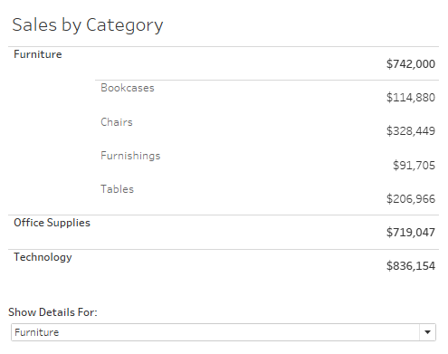
He also included an example of how to create the same table using set actions. So, instead of having to use the parameter dropdown, directly clicking on one of the categories will show the details.
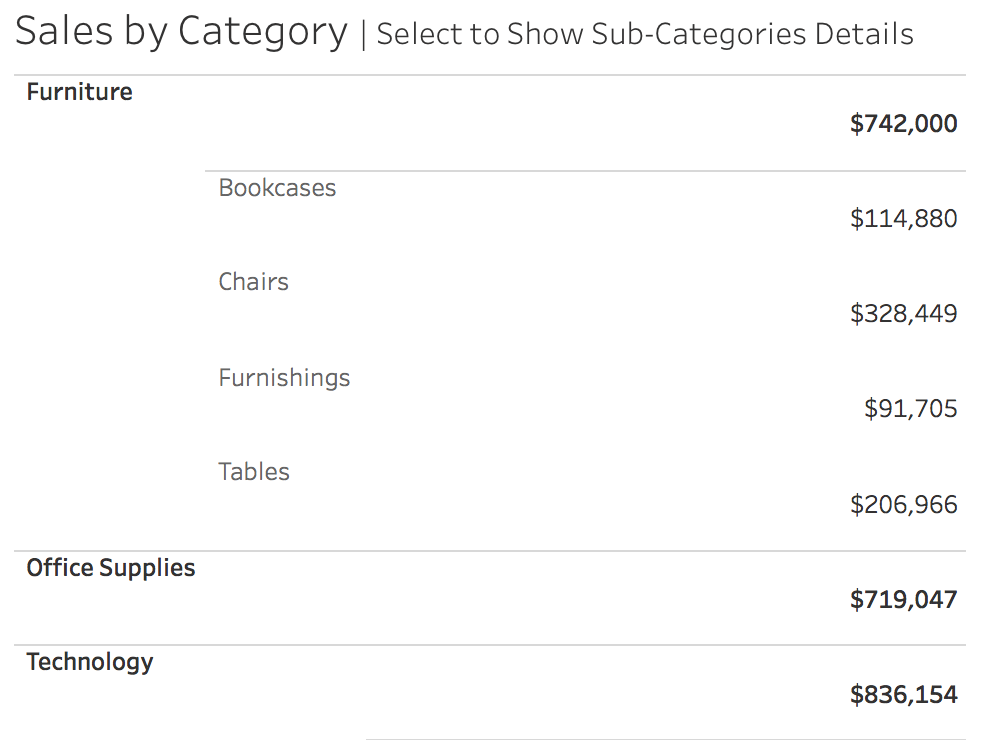
Set actions expand the toolbox of possibilities when deciding the right user experience. Does it make more sense to use a parameter or to have the user click to expand? What I particularly like about set actions in this example is that the user doesn’t have to break their flow to go somewhere else on the dashboard to change the value.
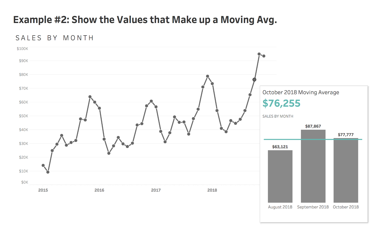
The ability to know what value the user has selected, and then use that in calculations, allows for a lot of flexibility. In this example, showing a three-month moving average for 2018 sales, hovering over any point shows the actual values that make up the moving average. A calculation can be written to return what value is in the set, such as October 2018, and then an additional calculation can be written to also return the two prior months.
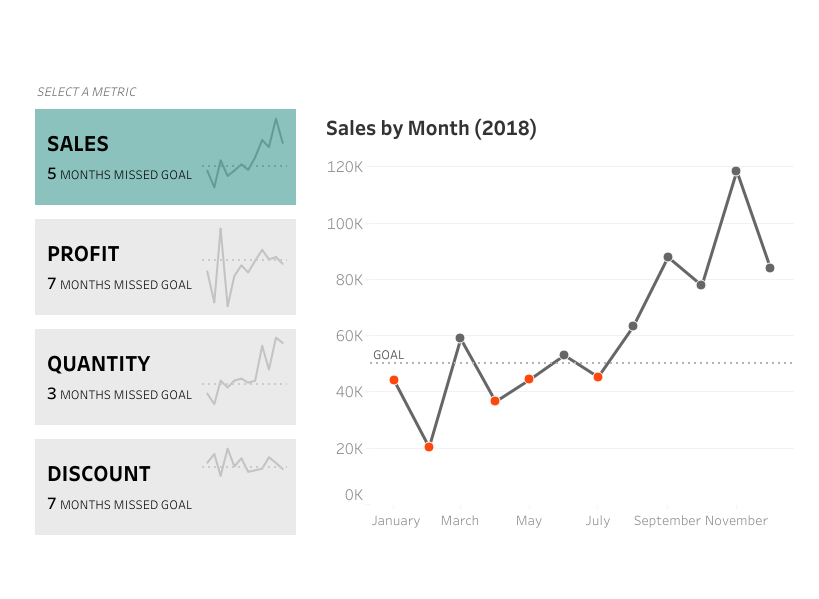
As with all new features, set actions can be used in ways Tableau probably didn’t intend them to be. One way is to create a set on a dimension, such as a region, and tie those values to something unrelated. If the central region is IN the set, show the sales metric, if the east region is IN the set, show the profit metric, etc. This allows for the ability to create custom buttons to switch between metrics or dimensions!

Have I convinced you yet that set actions expand our toolbox of possibilities when developing Tableau visualizations?
Michael: Can you discuss how you use Tableau at work? What pain points with data do you help your business community solve using Tableau?
Lindsey: If I was on 2018.3 at work I would have a lot fewer pain points! We are currently on 10.5, but our dashboards rely heavily on navigation buttons, collapsible filters, and hierarchies… all things that would be much easier to accomplish with the new built in features!
As for what I do at work, I am responsible for creating automated dashboards that allow various stakeholders within the company to monitor the areas they are in charge of. The goal of most dashboards is to allow individuals to quickly find the areas that need improvement, allowing them to swiftly take action. I am never the end user of a dashboard, so I work alongside the subject matter experts to understand the business need, the data nuances, and how to provide an end product that will allow them to be successful. I am very fortunate in my position in that a lot of the dashboards I work on start out as proof of concepts (verse the stakeholder needing it right away!) and allow me to be creative. Innovative solutions are highly encouraged, which allows me to try out ideas I’ve read about from the Tableau community. My team is often approached with an idea or a data set and given the space to find the best way to present the data. After we decide on an approach and test it out, we roll out the methodology or idea to be on all applicable dashboards we produce.
I am never the end user of a dashboard, so I work alongside the subject matter experts to understand the business need, the data nuances, and how to provide an end product that will allow them to be successful.
As with most companies these days, Wells Fargo has a vast amount of data, from many different systems. The biggest pain point I help solve is finding ways to display all the disparate information in one place, in a way that makes sense. Normally, stakeholders want an aggregated, high-level view of their data but still be able to drill down into it. Often a lot of the dashboards I build are to diagnose data quality issues!
Michael: Your blog web site is fairly new. What motivated you to start your own blog?
Lindsey: I have been active in the Tableau Twitter community for almost three years. In March of 2017, Matt Chambers reached out to me encouraging me to start blogging and sharing my ideas. I set up my domain name, header, and blog and started my first post about my data visualization journey. However, I never finished that post and wasn’t sure how I could contribute something new or original to the Tableau community. Fast forward to the 2018 Tableau Conference. It was my third conference, but my first time making an effort to connect with the people I knew from Twitter. Through conversations with others and hearing so many amazing speakers, I was inspired to share my thoughts and ideas on a medium other than Twitter. I finished up the blog post I started in March of 2017 as my way of announcing that I, like many others after TC, was starting a blog. I wasn’t sure what my next blog post was going to be, but it didn’t take long for me to begin experimenting with set actions and wanting to share my methods with everyone else!
Michael: Besides Set Actions, can you tell us three of your favorite Tableau Desktop tips and tricks?
Lindsey: I have a lot of favorite Tableau Desktop tricks! However, if I had to choose, I would say these tricks are things I constantly use in my day job. Almost every dashboard I make has large KPIs displayed at the top, so I enjoy any tip that makes it easier/faster to create them!
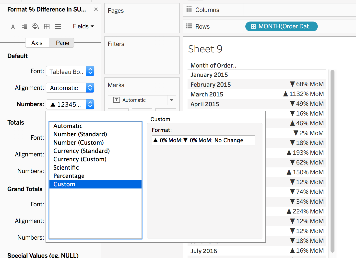
My favorite trick is using custom number formatting to add text or alt codes to numbers. I frequently use it to add triangles to percent change values or abbreviations after values, such as Month-over-Month (MoM). It eliminates the need to create additional calculations. The format is positive formatting; negative formatting; zero formatting.
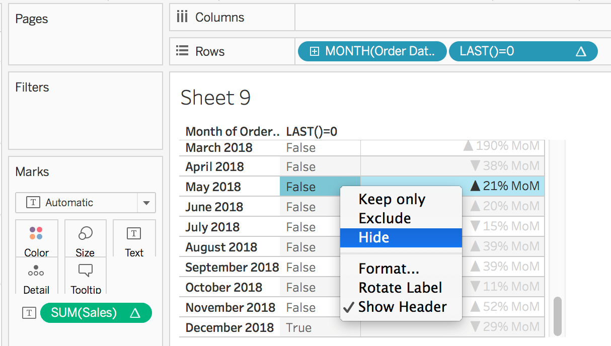
My second favorite trick is hiding data. To build off the last example, if I wanted to only show the most recent month, December 2018, I couldn’t apply a December 2018 filter because it would remove November 2018 data (and make the MoM not work). So, hiding the data allows it to still be used in calculations but not be visible in the view. I like to add a calculation called LAST()=0, which will evaluate to true for the value that is the last row in the view. Then, right-clicking on false and selecting hide will “hide” (and not filter) every row that evaluates to false.
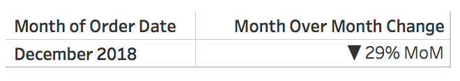
The end result is a one row table showing the most recent month.

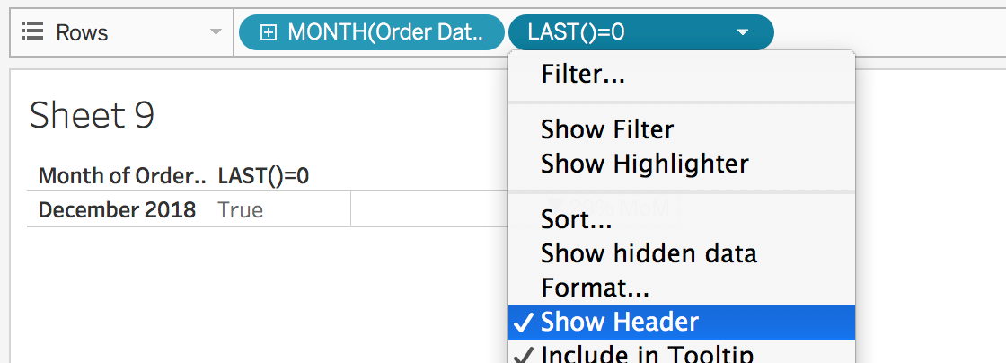
To play on this even further, my last tip is formatting the KPI. Right clicking on the LAST() calculation and unchecking show header will remove that column from the view.
Double-clicking in the columns shelf and then typing “Month over Month Change” (including quotes) will then add a title above the number (just be sure to hide field labels for columns!).
Or, the KPI can be formatted in a more visual way. This can be achieved by switching the order date to the columns shelf, adding discrete sales to the columns shelf, and adding the percent difference in sales to the color mark.
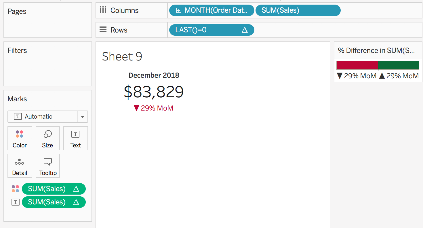
These steps create a KPI using one worksheet and very minimal calculations!
Michael: You previously worked with Ryan Sleeper and participated in the Kansas City Tableau User Group he ran. Can you tell us how Ryan has influenced your career and what tricks he has taught you?
Lindsey: I learned of Ryan the same day I learned about Tableau. Ryan was very well known in the Kansas City analytics world and when my boss assigned me, an intern, the task of experimenting with Tableau, he also passed along Ryan’s website. So, right off the bat, Ryan was a helpful resource for me. His blog was a combination of how-tos but also included posts on things such as color theory and dashboard design. I had bounced around between accounting, graphic design, and web development, so Ryan’s writing helped me realize that data visualization was the sweet spot for all my interests.
Fast forward two years and Ryan and I ended up working together for two months before he started his own company. I had the best time working with Ryan and continued to learn from him. It was invaluable to have someone to bounce ideas off of and discuss everything from color to chart types to how much white space a dashboard should have. One of the best tricks Ryan has taught me is the power of producing clean, simple dashboards. One really tiny trick Ryan taught me was that on a PC if you right click on a measure and drag into the view, you can choose the aggregation before the pill is added into the view!
One really tiny trick Ryan taught me was that on a PC if you right click on a measure and drag into the view, you can choose the aggregation before the pill is added into the view!

Michael: Your local NFL team, The Kansas City Chiefs, has an amazing quarterback in Patrick Mahomes. Are you a fan of the Chiefs and do you think they can win the Super Bowl this year?
Lindsey: Growing up in Kansas City, the Chiefs and the Kansas Jayhawks were never really good at football. Therefore, I devoted most of my sports watching to a winning team…. KU basketball. Every single year when the Chiefs did have a promising start, and I would get my hopes up, I was always disappointed by a terrible playoff loss. So, admittedly, this year, I’ve been really cautious to get on the bandwagon or think the Chiefs will even make it to the Super Bowl. However, the vibe around KC feels much different than previous years… largely due to Mahomes.
Michael: What is next on your “To Do” list? What can the Tableau community expect to see from you in the near future?
Lindsey: Going into 2019, I want to continue to consistently blog and share my ideas with others. I’m still really excited about set actions, so I plan to continue experimenting with new ways to use them. On my Twitter, I have frequently shared ideas for ways to use set actions, such as a hierarchical filter, but didn’t blog about how to due to the end result being less than ideal performance wise. So, my goal is to find new ways to engineer these ideas so that others can use them. I also have a few ideas for visualizations I want to build, specifically around the Oscars and women’s running shoes options, so I hope to be able to share more original visualizations. Lastly, I plan on turning my set actions posts into a presentation that I can speak at different Tableau User Groups.
Tableau Public
Link: https://public.tableau.com/profile/lindsey.poulter8872#!/

