
RJ Andrews is a data storyteller. He is the author of Info We Trust: How to inspire the world with data https://amzn.to/2ryc4gf , a lavish adventure exploring how to inspire the world with data. RJ is the creator of https://infowetrust.com where you can enjoy many of his award-winning data stories. When not working on his own projects, RJ helps organizations solve information problems all over the world. Follow him on twitter @infowetrust https://twitter.com/infowetrust

Michael: Hi RJ. First off, congratulations on your forthcoming book, Info We Trust: How to Inspire the World with Data.
Your book is more about the “craft” of data visualization as opposed to a ‘best practices’ or tools book. What does craft mean to you?
RJ: Wiley originally came to me because they were seeking to develop something for their audience to read after learning the best practices.
Best practices are kind of like software defaults, they can get you going, but can’t carry you all the way to do truly great work. The kind of work that not only opens people’s eyes but the kind of work that pushes the craft forward. If best practices could, then we would just program them into a computer and walk away.
Craft is the ability to produce something useful using skill, artistry, and your own two hands.
Further, I have found that best practices are just as easily employed by critics as creators. To really create though you need something more. Info We Trust is built for creators, and that’s why I anchor on the word craft. Craft is the ability to produce something useful using skill, artistry, and your own two hands. That’s what we do! It’s a very human word and helps build connections between us and almost 400 years of statistical visualization.
In that sense, craft is tech-agnostic. The craft is built around principles that connect 1880s Parisians to 2020s Shanghainese. Even though data, cultural norms, and execution technology are very different, people aren’t all that different. Craft also builds connection across all the people participating in this craft.
But I am rarely an absolutist! You may call the craft something else. Perhaps you prefer data visualization, data journalism, dashboard design, or infographic creation. I like data storytelling. The craft waves many banners across various communities. Call it whatever you want.
Michael: Is this book what’s missing from the current library of dataviz books?
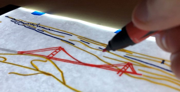
RJ: I believe you will be delighted to find that Info We Trust is very different from the current library of dataViz books. Some of its distinguishing features include: It frames the data storyteller as a hero of the information age. It connects our craft to the great saga of civilization. It features insights from a broad field of information arts (think: museum design, storytelling, comics). It elevates timeless principles for creating new ways of looking at the world. It is a beautiful artifact. Info We Trust has over 300 hand-drawn charts, diagrams, maps, and depictions—all illustrated by me just for this book.
Michael: What aspects of dataviz do you most struggle with?
RJ: In some sense, it’s all a struggle. Data storytelling is a multi-disciplinary craft. The consequence of this is that you have to straddle many techniques, tools, practices in order to produce anything. Stats, code, story, data, design… I am not an expert or best at any of these. I do believe I am pretty good at stitching them all together, but at any one moment I’m only engaged in a narrow activity, and I never feel good enough.
One specific aspect of the stitching together—the glue—that is always challenging is deciding what project to execute. Whether it is your own passion project or which client project to engage with. The most power a creative has is to say NO. Data stories take months, sometimes years, to produce. I have more project ideas than I have to time to pursue. I can’t commit to one casually. It’s an important decision!
Michael: My first introduction to your work was your Endangered Species infographic you published several years ago. When I teach internal Tableau classes at work, I always show my students this infographic. Can you tell my readers what inspired you to create this infographic, where you got the data from, and how you designed it?
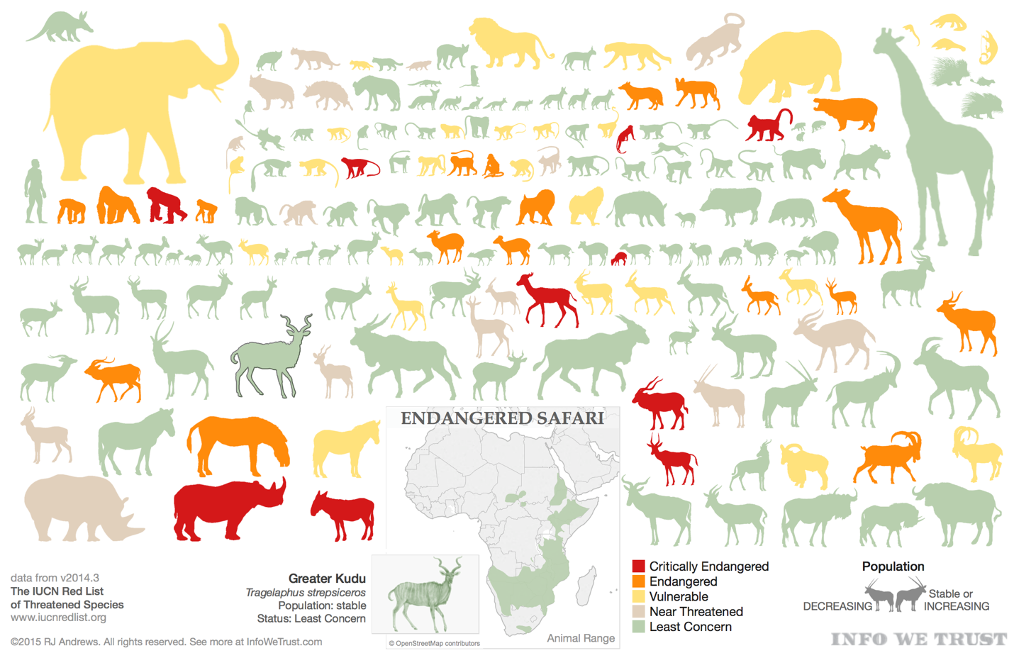
RJ: Pouring over an old beat-up field guide I found on a dusty shelf in a Kenyan library was the primary inspiration for this work – but it has deep roots. I grew up with ZooBooks, a magazine that featured a different animal in each short issue. Descriptions of animal behavior combined with great pictures and diagrams fascinated me and was one of my earliest introductions to infographics.
Fast-forward 20+ years and I am living in Kenya, within driving distance of some of the most incredible wildlife the world has to offer. I’ve had the great fortune to be able to travel to many Kenya Wildlife Service National Parks and reserves and have been, like most, stunned by the animals. Both the diversity and density of species in many of these parks are amazing, and saddening when I learned that even now the animals are not near the levels where they naturally should be.
The interactive is packed with a ton of information so that, just like I used to spend hours reading and re-reading ZooBooks, you can really settle in and enjoy it for a while. Dimensions used include color (threatened species status), size (animal’s actual relative size), direction facing (population increasing/stable or decreasing), and placement (animal classification).
While not as obvious, animals are positioned close to their relatives. So carnivores are on top, above monkeys and apes, who are above all of the food. Key large animals (elephant, rhino, giraffe, and cape buffalo) anchor each of the corners. Within each of the sections, related animals are also grouped. The lesser kudu is next to the greater kudu, all of the colobus monkeys are together, zebras keep each other company, etc. The threatened species data is from the IUCN Red List.
Michael: You and I are both big fans of the work of Charles Joseph Minard. Can you tell my readers what it is about his work that you find most interesting? Also, besides him being famous for his infographic on Napoleon’s March in the War of 1812, what other works of his are your favorites?
RJ: What stood out to me after assembling a visual catalog of Minard’s work https://infowetrust.com/seeking-minard/ , beyond its surprising volume, is how often Minard returned to the same themes and chart designs year after year, updating his maps as new data became available. Some of these topics held his attention for over 20 years and provide a window into how his craft evolved as he used each data refresh to tweak the design.
Beyond this personal evolution, these series also paint vivid data stories of the different commercial topics Minard was concerned with. These longitudinal visual studies are something Minard was very intentional about. He sometimes included historic predecessors with new charts for easy comparison and annotations that explained why things had shifted. My favorite series from him is on the global cotton trade, a group that culminates in a triptych that (I believe) makes him the first data storyteller. I once produced a video short on this series: https://youtu.be/sQdpQkDGCAU

Michael: Speaking of the Tapestry Conference, you attended this year’s conference last week in Miami. What were the top things you learned from attending the conference?
RJ: This year had the most impressive talks yet, and that’s saying a lot. Our craft, our practice, is growing up fast. I am excited for how far we have advanced, and for how much energy there is to keep getting better.
Michael: What is next on your “To Do” list? What we expect to see from you in the near future?
RJ: My job in 2019 is to continue to share my enthusiasm for the craft of data storytelling, especially via the book, and continue to learn all I can by producing excellent data stories, and keep talking to everyone in the data visualization community.
