
Readers:
Some of you may be wondering why I am devoting my blog posts lately to the midterm election that just occurred. My reasoning for this is that I think some of the most creative data visualizations are created right before and after a major election cycle.
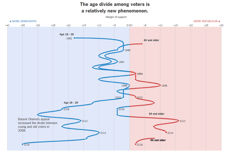
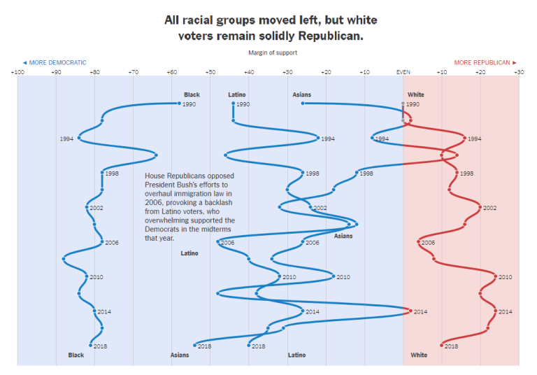
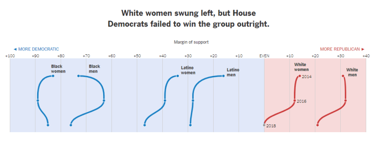
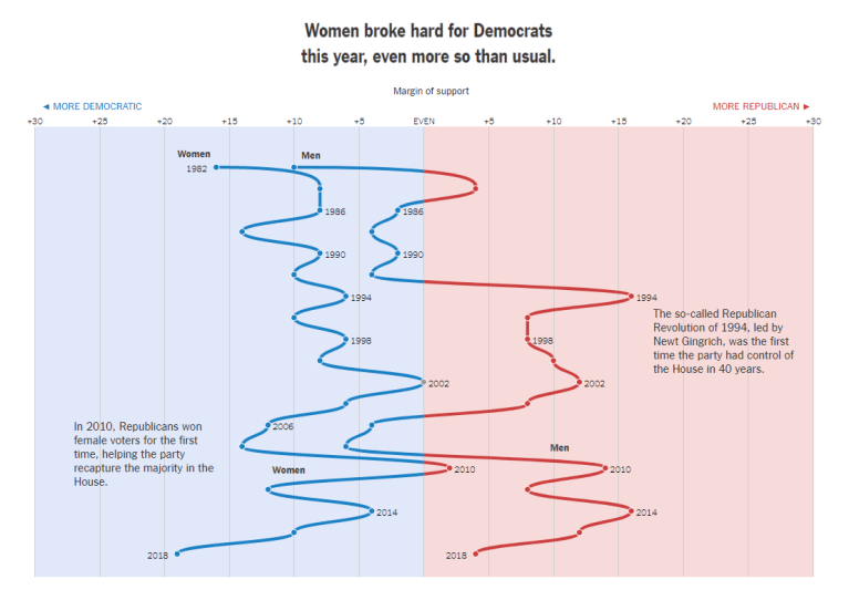
Today, I am showcasing some charts that were created by The New York Times which illustrate how voting blocs have shifted from the 1980s to now.
I found these to be very interesting and important.
I hope you enjoy reviewing these.
Regards,
Michael

Source: K.K. Rebecca Lai and Allison McCann, Exit Polls: How Voting Blocs Have Shifted From the ’80s to Now, The New York Times, November 7, 2018, https://www.nytimes.com/interactive/2018/11/07/us/elections/house-exit-polls-analysis.html.
