
Lindsay Betzendahl – Biography
Lindsay Betzendahl, a 15-year veteran of the healthcare industry, discovered Tableau after constant frustration with static reports and ineffective chart types she reviewed with hospital providers as a Network Manager. After downloading the free version of Tableau in 2014 and developing use case examples of how it can transform data insights, she launched a quest to overhaul her company’s visual analytics structure for good. Now, the Director of Analytics & Innovation, Lindsay leads her company in Tableau implementation, dashboard development and best practices, server administration, and leads a local TUG (Tableau User Group), all while providing dashboard consultation to a team of Tableau analytic developers.
Despite using Tableau for the past four years, it was not until late in 2017 that she joined the Tableau Community on social media and became an active participant in Makeover Monday. Since then, Lindsay communicates regularly with Tableau users about dashboards and data. She recently launched Project Health Viz, a social initiative to increase the volume of visualizations about healthcare topics and spread health awareness throughout the Tableau Community.
Lindsay’s thoughts and insights can be found on her blog, Viz Zen Data (https://vizzendata.com).
Questions
Michael: You recently started your own data visualization blog, Viz Zen Data, this past April. In your introductory blog post, you quote John Tukey.
The greatest value of a picture is when it forces us to notice what we never expected to see. — John W. Tukey
Can you tell my readers what this quote means to you and why it is important?
Lindsay: This is one of my favorite data visualization quotes for a few reasons.
I’ve always loved infographics and artistic design. My mom is an artist, so I grew up with an appreciation of visual atheistic. I understood early on that good design actually could take a lot of effort. The little details are incredibly important. In art, the sum of the parts really does make the whole. Similar to Ken Flerlage’s blog post about pointillism in Tableau, the individual shapes do not look like much, but when they are all put together they make an incredible image.
I discovered Tableau during a time when my company was paralyzed by data. As a healthcare company, we have powerful population health information that can inform legislative decisions and improve quality of care for people; however, interpreting massive tables and disjointed charts was excruciatingly painful.
Tableau has helped us to have more insightful, engaging, and curious conversations about our data. People can actually see the answers to their questions. Folks are energized about data – even those that used to say they hated it!
The other reason I love this quote, is while a picture forces us to see something we didn’t expect, the right picture can force us to understand something we didn’t understand before.
I often tell the Tableau developers I work with to play around with chart types – explore the data first before settling on an ‘expected’ chart.
I often tell the Tableau developers I work with to play around with chart types – explore the data first before settling on an ‘expected’ chart. Sometimes, the simple exercise of manipulating the data and testing chart types beyond what is available in ‘Show Me’, can really bring a story to life. Ultimately, that is what data visualization is about to me. It’s about the story – the meaning, the ‘why?’, that ‘what next?’, and the ‘wow, I didn’t know that.’
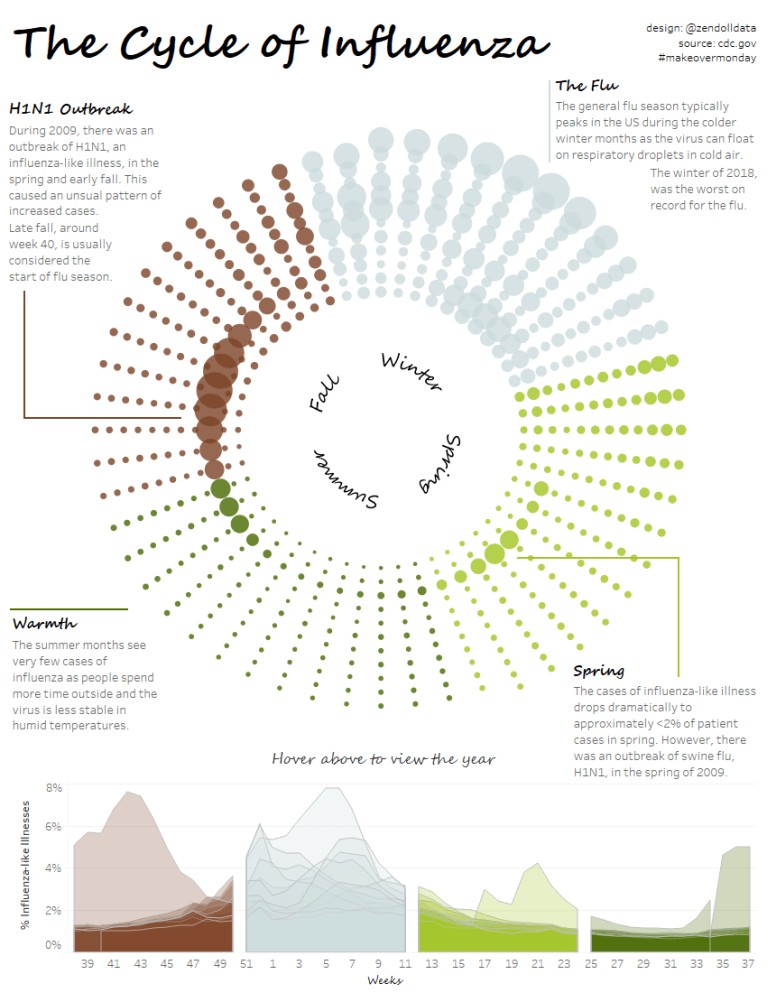
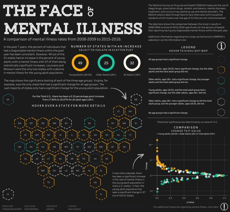
Recently, I completed a Makeover Monday visualization about influenza. The data was structured perfectly for a line graph – it was a time series data set with some expected patterns. However, I did not feel interested in the data as a line, and the story felt lost. Despite it being a great chart type, it actually made the interpretation of the results harder to find.
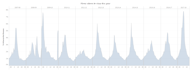
My final visualization was a radial graph that highlighted the cycle of influenza. This, I felt, visually showed when people typically got the flu and how there was a year that did not follow that pattern. I was then able to visually call-out that difference with text annotations. This pictured truly forced me to see what I did not expect to see, and that is what data visualization is about for me – seeing the unexpected.
My other favorite quote is by Chip and Dan Heath, who write, ‘Once we know something, we find it hard to imagine what it was like not to know it.’ This, for me, is the power of visual graphical expression. Data visualization provides people with intense knowledge via the image, and usually, that image sticks. People remember pictures, so if you want to create change, create fabulous visual stories that people will remember.
You can find a recent blog post on my journey to making my Cycle of Influenza viz here: https://vizzendata.com/2018/06/27/the-cycle-of-influenza-creating-a-radial-time-series-chart/
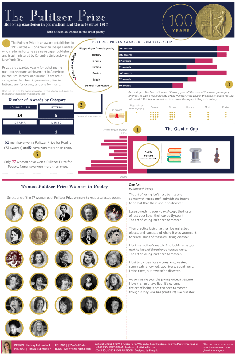
Michael: You recently submitted an entry for Tableau’s IronViz for Books and Literature. Can you tell us a bit about your entry, what motivated you to apply, and the challenges involved in create an IronViz-level Tableau workbook?
Link: https://public.tableau.com/profile/lindsay.betzendahl#!/vizhome/shared/D6PX86P22
Lindsay: Ha, well I’m not sure my viz was really ‘Iron Viz-level’, but to some degree that is what didn’t matter to me.
I learned about the Iron Viz competition while at my first Tableau Conference in 2015, and, to be honest, I didn’t really think too much about it again until this year. Much of my Tableau work had been at work. I had done a few personal vizzes, but infrequently. The more I participated and interacted with the Tableau Community, the more aware I became of what others were doing in Tableau and found the support from other Tableau users so valuable.
If you have not heard of Iron Viz, it is Tableau’s intense competition where three individuals, chosen from three feeder events, create a visualization on stage in front of thousands in under 20 minutes during the annual conference. It is intense!
I decided I was going to participate this year for a few reasons – the first being that I discovered few women submitted entries compared to men. I didn’t want to continue that statistic! Secondly, I felt I had nothing to lose. I struggled to think of reasons why I shouldn’t participate and I couldn’t come up with any.
To be honest, I didn’t create my visualization with any expectation to even come close to winning. I did it to be. I wanted to be present in the community. I wanted to be challenged, both in my creation, but also in finding the time and commitment to enter the contest. I wanted to be humbled. I wanted to be vulnerable by sharing my dashboard and being open to feedback.
Deciding to enter the contest was the easy part. The challenge was what came next. My biggest struggle was to find a data set. I’m not a programmer. I don’t know Python, SQL, or any other coding language. I don’t know how to scrape websites for data. I can’t code to make data ‘better’ or ‘cleaner’. This means I needed a clean table to use and those can be hard to come by. This meant that I handpicked and created my data set, which also meant that my data was simple. However, for my first submission, I was okay with that.
I think what I learned is that you really need to think through from start to finish what you want to create in the beginning. I didn’t really have a vision when I obtained the data. I just knew that I had a goal of participating. I think this prevented me from being more thoughtful with the type of data I wanted to use and, perhaps, what data would give me strong analytic abilities and chart types. Tableau judges submissions on analytics, design and storytelling. If I ever submit again I need to boost my analytics.
If I were to participate again, I would take some time to think about the charts I want to use and what analytical capacity a data set has that I can take advantage of. Secondly, I may draft out my ideas on paper first, just to think through the story more comprehensively. I hope I can participate again as I really found the experience valuable and now I can say I’ve participated in the Iron Viz competition!
Michael: Tell us a bit about your #projecthealthviz initiative.
Link: https://vizzendata.com/2018/05/24/projecthealthviz-a-new-social-data-initiative/
Lindsay: There are so many great Tableau initiatives out there and it is certainly hard to participate in all of them. Some test your Tableau skills in presentation or calculations, like Makeover Monday or Workout Wednesday, and others have a mission, like Viz for Social Good or the National Day Project. What I found was that there seemed to be a limited number of health or healthcare related vizzes on Tableau Public – or if they did exist, they were buried.
I wanted to create a platform to do two things: 1) Increase the sheer number of visualizations about healthcare. Why? Because it is one way to increase someone’s chance of seeing them and I’m passionate about healthcare, specifically mental health as that is my background. I see a ton of sports-related vizzes on Tableau’s ‘Viz of the Day’ and plenty of sales-related data sets, but not healthcare. 2) I wanted to provide a ‘mini community’ for the healthcare Tableau users. A place that folks could find data that made sense to them or that they were interested in. This was an opportunity to also connect with the Tableau Healthcare User Group and provide, hopefully, a place to collect useful data sets through the project’s Datadotworld profile.
So how it works is that each month I post a data set on Datadotworld and then share the links and my version of the viz on Twitter, Tableau Public, and Instagram. Folks can share their interpretations of the data on Twitter by tagging me (@ZenDollData) and using the hashtag #projecthealthviz, posting to the project on Datadotworld, or even emailing me! As things pick up, I will write a blog post about some of the submissions. I hope further expand what I do with the project after more people join in. So stay tuned!
Michael: Can you tell us three of your favorite Tableau tips and tricks?
Lindsay: Using Unicode Characters. I wrote a blog post about this (https://vizzendata.com/2018/04/20/unicode-for-all/) recently because I use these characters a lot to make custom legends or enhance my dashboard annotations. I dislike Tableau’s native legends and try to avoid them whenever I can.
Copy formatting and copying dashboards. I’ve learned a lot of time savers over the years so I can create a beautifully polished dashboard from start to finish within a day. The copy formatting function on a worksheet is very helpful when I need to have formatting consistency in my tables or graphs. I also often copy an entire dashboard especially if I have certain things all lined up where they need to be, such as my company’s logo, a header, filters, etc. Then I delete the worksheets and replace them with new ones.
Naming conventions for calculations. If you have ever worked with a data set that has lots of measures, dimensions and/or calculations, then you know that sometimes it’s hard to find your calculation again or remember what they connect with. For example, if I create a parameter and a calculation to go with it, then I name the calculation “p.xxxxxx” so that I know it goes with a parameter and I can easily find it alphabetically or if I search for it.
Michael: What is missing from Tableau Desktop (don’t include anything that is going to be released with v2018.2) and why do we need it?
Lindsay: Spell-check. How is this not available yet? I think folks laugh when I suggest this, but when I am using a lot of text in labels, annotations, titles, etc. to tell a story, I prefer to know the spelling is correct. I see misspellings in dashboards often, and it’s distracting.
Custom reference line tooltips and legends. Currently, the tooltip of a reference line 1) can’t be turned off, and 2) can’t be changed. I prefer not to label my reference lines, but I would like to edit the tooltip. Additionally, I dislike Tableau legends. I wish I could change the squares to a circle and be able to have them embed in a viz or under the title without floating it.
Michael: What is next on your “To Do” list? What can the Tableau community expect to see from you in the near future?
Lindsay: I really hope to spend some more time on my blog and curating data sets for Project Health Viz. I expect to be able to provide more support around Healthcare visualizations and discussions around common challenges. Additionally, I hope to present at a future Tableau Healthcare User Group and collaborate with the Healthcare team. I’ve very excited to be attending the Tableau Conference again this year, so I really am looking forward to meeting so many inspirational folks from the Tableau Community.
Tableau Public Link: https://public.tableau.com/profile/lindsay.betzendahl#!/

And I am glad I did. What a treasure you are to the Tableau Community!