
Readers:
 First off, Happy New Year. I hope you all had a chance to relax and enjoy the holidays.
Back in 2016 during the Presidential election cycle, I posted a chart created by Robert Mann, Who Lies More – A Comparison (see image to the right). This chart generated a lot of comments and strong opinions.
With the election long over and President Trump about to complete his first year in office, I thought I would revisit this chart and the refreshed data provided by Politifact.
Below is my version of this chart.
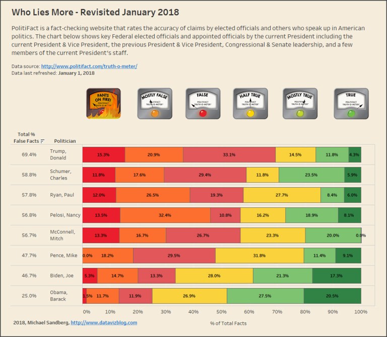
I created the chart using Tableau v10.5 and a horizontal stacked bar chart. I also took the latest data from PolitiFact. PolitiFact is a fact-checking website that rates the accuracy of claims by elected officials and others who speak up in American politics. The chart above shows key Federal elected officials and appointed officials by the current President including the current President & Vice President, the previous President & Vice President, Congressional & Senate leadership, and a few members of the current President’s staff.
To view the chart on Tableau Public, click here.
My goal is to revisit this chart throughout the year. As candidates from both sides of the aisle campaign for various public offices, I will try to add them to this chart. However, I do not want to add anyone who does not have at least 25 or more facts recorded by PolitiFacts.
Just for the record, I am an Independent voter. I consider myself somewhat of a moderate and try to balance my opinions on what a politician says and then does once they are elected.
I hope you will join me on this journey and come back every so often to see my updates to the data.
Best regards,
Michael

Chuck Schumer should be more truthful. 🙂