
First, Either a Joke or Quote
He uses statistics as a drunken man uses lamp posts — for support rather than illumination.
Andrew Lang (1844-1912)
Source: Treasury of Humerous Quotations
What is Forecasting?
Forecasting is a planning tool that helps management in its attempts to cope with the uncertainty of the future, relying mainly on data from the past and present and analysis of trends. [1]
Forecasting starts with certain assumptions based on the management’s experience, knowledge, and judgment. These estimates are projected into the coming months or years using one or more techniques such as Box-Jenkins models, Delphi method, exponential smoothing, moving averages, regression analysis, and trend projection. Since any error in the assumptions will result in a similar or magnified error in forecasting, the technique of sensitivity analysis is used which assigns a range of values to the uncertain factors (variables).

Types of Forecasting Methods
There are two main approaches to forecasting – the Qualitative Method and the Quantitative Method. The image below shows two approaches for forecasting demand.
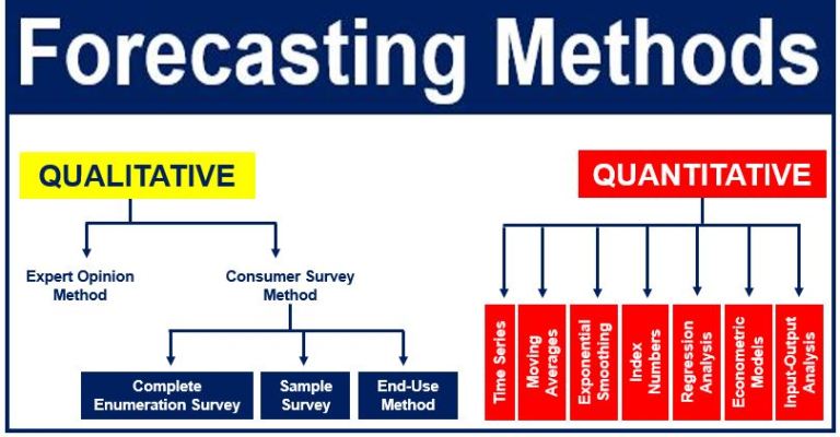
Qualitative Methods: these are subjective and are based on the judgment and opinion of experts or consumers. When no past data is available, qualitative methods are used for making medium-to-long-range decisions. Market research is a type of qualitative forecasting method.
Quantitative Methods: in these, future data is forecast as a function of past data. These methods are appropriate when we have past numerical data, and when we can reasonably assume that some of the data patterns are likely to continue in the future. Quantitative methods are generally used for making short-term and medium-term decisions.
Average Method: forecasts of all future values equal the mean of the historical data. This method is appropriate with any type of data where past data is available. If we let historical data be denoted by yT, then we can write the forecasts as:
 Even though the time-series notation has been used here, it is also possible to use the average approach for cross-sectional data. Then the forecast for unobserved values is the average of the observed values. (Image: otexts.org)
Naïve approach: said to be the most cost-effective prediction model, it provides a benchmark against which other, more sophisticated models may be compared. This approach is only appropriate for time-series data. With the naïve approach, the forecasts are equal to the last observed value.
Drift Approach: this is a variation on the naïve approach. It allows forecasts to increase or decrease over time, where the drift (amount of change over time) is set to be the average seen in the historical data. Hence, the forecast for T + h is given by:
 This is like drawing a line between the first observation and the last, and extrapolating it into the future. (Image: Wikipedia)
Seasonal Naïve Method: accounts for seasonality by setting each forecast to be equal to the last observed value in that season. For example, the prediction value for all future months of May will be equal to all previous May values. The forecast for T + h is:
 Where m = seasonal period, and K is the smallest integer greater than (h – 1)/m. (Image: Wikipedia)
The seasonal naïve approach is especially useful for data that has a particularly high level of seasonality.
Creating a Forecast in Tableau
Forecasting requires a view that uses at least one date dimension and one measure. For example:
- The field you want to forecast is on the Rows shelf and a continuous date field is on the Columns shelf.
- The field you want to forecast is on the Columns shelf and a continuous date field is on the Rows shelf.
- The field you want to forecast on either the Rows or Columns shelf, and discrete dates are on either the Rows or Columns shelf. At least one of the included date levels must be Year.
- The field you want to forecast is on the Marks card, and a continuous date or discrete date set is on Rows, Columns or Marks.
Note: You can also create a forecast when no date dimension is present if there is a dimension in the view that has integer values. See Forecasting When No Date is in the View.
To turn forecasting on, either right-click (control-click on Mac) on the visualization and choose Forecast >Show Forecast, or choose Analysis >Forecast >Show Forecast.
With forecasting on, Tableau visualizes estimated future values of the measure, in additional to actual historical values. The estimated values are shown by default in a lighter shade of the color used for the historical data:

Prediction Intervals
The shaded area in the screenshot above shows the 95% prediction interval for the forecast. That is, the model has determined that there is a 95% likelihood that the value of sales will be within the shaded area for the forecast period. You can configure the confidence level percentile for the prediction bands, and whether prediction bands are included in the forecast, using the Show prediction intervals setting in the Forecast Options dialog box (see screenshot below).
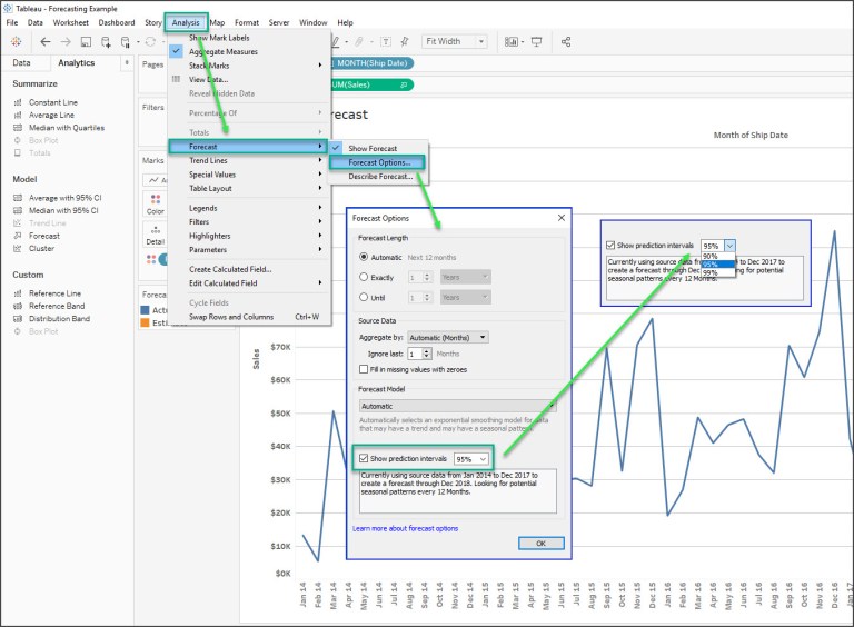
If you do not want to display prediction bands in forecasts, clear the check box. To set the prediction interval, select one of the values or enter a custom value. The lower the percentile you set for the confidence level, the narrower the prediction bands will be.
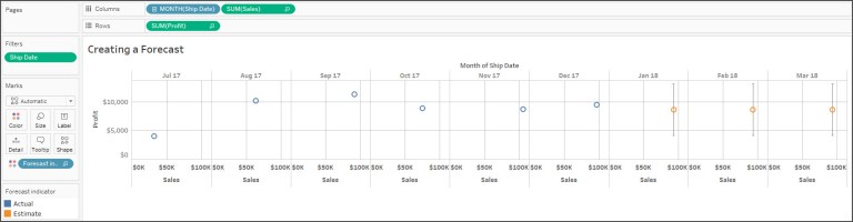
How your prediction intervals are displayed depends on the mark type of your forecasted marks:
| Forecast mark type | Prediction intervals displayed using |
| Line | Bands |
| Shape, square, circle, bar, or pie | Whiskers |
In the following example, forecast data is indicated by orange shaded circles, and the prediction intervals are indicated by lines ending in whiskers.
NOTE: Whiskers are typically seen in a box and whisker plot, a box drawn around the quartile values, and the whiskers extend from each quartile to the extreme data points.
FYI, the box-and-whisker plot is good at showing the extreme values and the range of middle values of your data. The box shows us the middle values of a variable, while the whiskers stretch to the greatest and lowest value of that variable. The box-and-whisker plot was invented in the 1970’s by John Tukey. [4]
Enhancing Forecasts
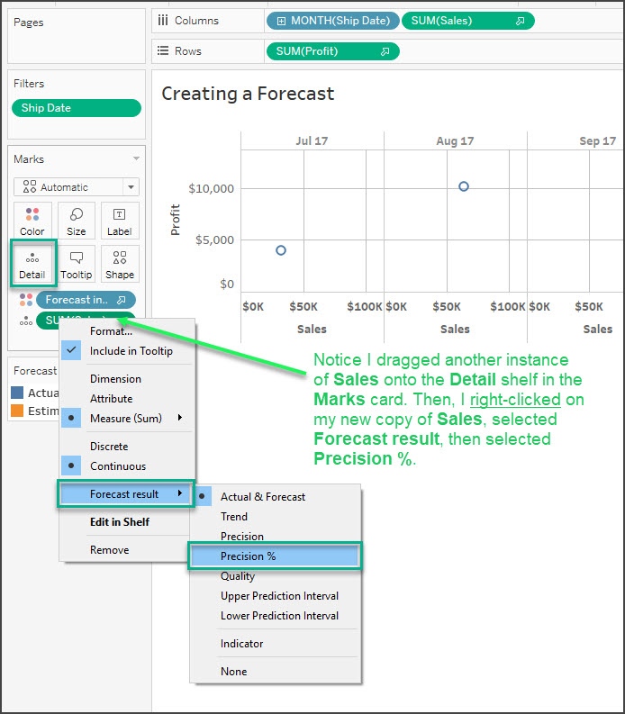
For each forecast value, consider verifying the quality or precision of your forecast by dragging another instance of the forecast measure from the Data pane to the Detail shelf on the Marks card and then after right-clicking the field to open the content menu, choosing one of the available options. In my example below, I selected Precision %.
Forecast Field Results Descriptions
Tableau provides several types of forecast results. To view these result types in the view, right-click (control-click on Mac) on the measure field, choose Forecast Result, and then choose one of the options.
The options are:
- Actual & Forecast – Show the actual data extended by forecasted data.
- Trend – Show the forecast value with the seasonal component removed.
- Precision – Show the prediction interval distance from the forecast value for the configured confidence level.
- Precision % – Show precision as a percentage of the forecast value.
- Quality – Show the quality of the forecast, on a scale of 0 (worst) to 100 (best). This metric is scaled MASE, based on the MASE (Mean Absolute Scaled Error) of the forecast, which is the ratio of forecast error to the errors of a naïve forecast which assumes that the value of the current period will be the same as the value of the next period. The actual equation used for quality is:

The Quality for a naïve forecast would be 0. The advantage of the MASE metric over the more common MAPE is that MASE is defined for time series which contain zero, wheras MAPE is not. In addition, MASE weights errors equally while MAPE weights positive and/or extreme errors more heavily.
- Upper Prediction Interval – Shows the value above which the true future value will lie confidence level percent of the time assuming a high quality model. The confidence level percentage is controlled by the Prediction Interval setting in the Forecast Options dialog box.
- Lower Prediction Interval – Shows 90, 95, or 99 confidence level below the forecast value. The actual interval is controlled by the Prediction Interval setting in the Forecast Options dialog box.
- Indicator – Show the string Actual for rows that were already on the worksheet when forecasting was inactive and Estimate for rows that were added when forecasting was activated.
- None – Do not show forecast data for this measure.
BTW, you can repeat the process to add additional result types for each forecast value.
By adding such result types to the Details shelf, you add information about the forecast to tooltips for all marks that are based on forecasted data.
In my final example below, I added a bit more formatting and show how the tooltip will look in the final data visualization.

Sources:
[1] businessdictionary.com, Forecasting, BusinessDictionary.com, http://www.businessdictionary.com/definition/forecasting.html.
[2] Market Business News, What is forecasting? Definition and meaning,
Market Business News, http://marketbusinessnews.com/financial-glossary/forecasting-definition-meaning/.
[3] Tableau Software, Forecasting, Tableau Software Help, Breadcrumbs: All Tableau Help > Tableau Help > Design Views and Analyze Data > Work with Time > Forecasting, http://onlinehelp.tableau.com/current/pro/desktop/en-us/forecasting.html.
[4] Wilson, James W., Box and Whisker Plot, University of Georgia, Mathematics Education Department, Intermath Dictionary, http://intermath.coe.uga.edu/dictnary/descript.asp?termID=57.

360DigiTMG offers courses ranging for basic to advanced, start your career journey with us and let us aid you in bagging your dream job.
best data science institute in hyderabad