Readers:
My friend, Chuck, shared the above graphic with me and I thought I would share it with the Data Visualization community to get your thoughts. I will give mine at the end of this post after providing background on this infographic.
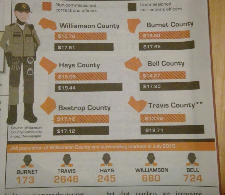
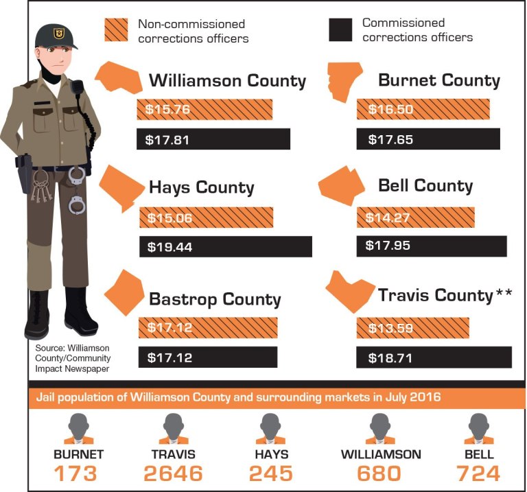
![]() This infographic was originally published in the Community Impact Newspaper for Williamson County, Texas as part of an article titled Corrections officers, Williamson County officials clash over pay raises. It is part of a story about pay for corrections officers.
This infographic was originally published in the Community Impact Newspaper for Williamson County, Texas as part of an article titled Corrections officers, Williamson County officials clash over pay raises. It is part of a story about pay for corrections officers.
Both non-commissioned and commissioned Williamson County corrections officers received 4 and 5 percent pay increases, respectively, to their starting pay as part of the fiscal year budget for fiscal year 2016-17. Some officers argued that the county did not make adjustments for the cost of living in the area for non-commissioned officers.
There were two versions of this article: one on their web site (click here to read) and the one in the printed version of the article in the newspaper. Many of the readers felt there was some oversight in the preparation of the information in the printed version of the newspaper as the faces of the cartoon “convicts” at the bottom part of the graphic all look like black or dark skinned men. In the web version of the article, the “convicts” have gray faces (see comparison below).
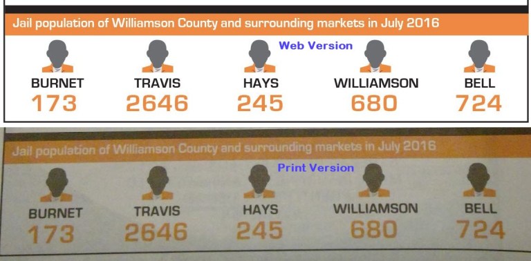
In reviewing the comments associated with this article, one reader, Lalena Parkhurst, was the person to originally point out this variation of the face color. She felt that the Community Impact Newsletter “provides a valuable service to the community and that the reporting is timely, relevant, and community oriented.” However, Ms. Parkhurst took issue with the graphic in the printed version.
Ms. Parkhurst was concerned about the bottom section showing jail populations in the surrounding counties. On the web site, the faces of the people look gray. In print (see image at the very top of this post), they look dark brown, making them appear to be black or dark skinned men. This plays into negative stereotypes about men of color. She felt this was probably not intentional. However, in her pointing this out, she hopes the Newsletter will take her feedback as an opportunity to improve their graphics in the future.
Checking your Graphic for Bias
In a typical laundry checklist for validating your graphic to ensure you are not introducing bias, these typical points of what not to do are usually on most checklists.
- Using a title that suggests something different than the data.
- Leaving off scales or labels.
- Using a small range of numbers on the scale to make differences look greater.
- Using a very large range of numbers on the scale to minimize differences.
- Beginning the scale at a number other than zero.
- Using a scale with uneven increments.
- Using a 3D design to make it harder to compare bars and lines.
- Surveying a very small sampling of people.
I think another point to consider for this list is to review colors to ensure the colors do not imply good or bad when that is not the intention (e.g., using stoplight colors for a line chart where color has no significance) or use color, in our case, for the faces that may imply a certain race, creed or color of people.
In this specific case, I would like to think there was no intent to imply the “convicts” were of a particular race. My reasoning behind this is that using multiple colors in newsprint can be expensive. I believe they focused on two primary colors in their color palette, orange and brown, and changed the faces to brown from this color palette as the closest color for a face (orange faces would seem a little strange).
This still does not let them of the hook. A good editor or reviewer should think about the impact the colors used might have on its readers. You might argue that the readers and I are being overly sensitive about this, but when you are in a situation where this kind of bias is continually implied, it just adds more to the frustration and subconscious perception people may have.
As always, I welcome your thoughts.
If you would like to provide your own personal feedback to the Williamson County/Community Impact Newsletter, click on the link here.
Best regards,
Michael

When I contacted the editorial staff, they responded, “Our team designed this graphic with great consideration and decided to use a gray silhouette so as not to imply any gender or color.” While I would like to believe that is true, the use of color for the correctional officer seems inconsistent with that approach. Nevertheless, it sounds like they did give some thought — just not enough. I’ve certainly made similar errors in the past. As designers and writers, we have a great responsibility. We must not be complicit in contributing to negative biases against people of color. We should consider it a moral design challenge to choose words and images that do not reinforce some of this country’s most unjust behaviors and by doing so put law-abiding citizens at risk.
Thanks for your thoughtful reply.