Readers:
In Part 1 of this series on data blending, we began to explore the concepts of data blending as well as the life-cycle of visual analysis.
Today, in Part 2 of this series, we will dig deeper into how data blending works.
Again, much of Parts 1, 2 and 3 are based on a research paper written by Kristi Morton from The University of Washington (and others) [1].
You can learn more about Ms. Morton’s research as well as other resources used to create this blog post by referring to the References at the end of the blog post.
Best Regards,
Michael
Data Blending Overview
Data Blending allows an end-user to dynamically combine and visualize data from multiple heterogeneous sources without any upfront integration effort. [1] A user authors a visualization starting with a single data source – known as the primary – which establishes the context for subsequent blending operations in that visualization. Data blending begins when the user drags in fields from a different data source, known as a secondary data source. Blending happens automatically, and only requires user intervention to resolve conflicts. Thus the user can continue modifying the visualization, including bringing in additional secondary data sources, drilling down to finer-grained details, etc., without disrupting their analytical flow. The novelty of this approach is that the entire architecture supporting the task of integration is created at runtime and adapts to the evolving queries in typical analytical workflows.
A Simple Illustrative Example
In this section we will discuss a scenario in which three unique data sources (see left half of Figure 1 below for sample tables) are blended together to create the visualization shown in Figure 2 below. This is a simple, yet compelling mashup of three unique measures that tells an interesting story about the complexities of global infant mortality rates in the year 2000.
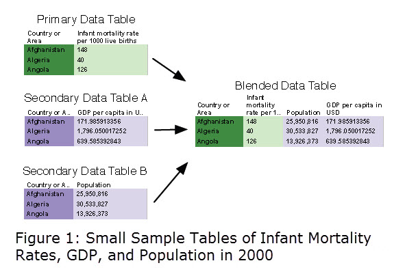
Image: Kristi Morton, Ross Bunker, Jock Mackinlay, Robert Morton, and Chris Stolte, Dynamic Workload Driven Data Integration in Tableau. [1]
In this example, the user wants to understand if there is a connection between infant mortality rates, GDP, and population. She has three distinct spreadsheets with the following characteristics: the first data source contains information about the infant mortality rates per 1000 live births for each country, the second contains information about each country’s total population, and the third source contains country-level GDP. For this analysis task, the user drags the fields, “Country or Area” and “Infant mortality rate per 1000 live births”, from her first data source onto the blank visual canvas. Since these fields were the first ones selected by the user, then the data source associated with these fields becomes the primary data source.
This action produces a visualization showing the relative infant mortality rates for each country. But the user wants to understand if there is a correlation between GDP and infant mortality, so she then drags the “GDP per capita in US dollars” field onto the current visual canvas from Data Table A. The step to join the GDP measure from this separate data source happens automatically: the blending system detects the common join key (ı.e. “Country or Area”) and combines the GDP data with the infant mortality data for each country. Finally, to complete her analysis task, she adds the “Population” measure from Data Table B, to the visual canvas, which produces the visualization in Figure 2 below associated with the blended data table in Figure 1.
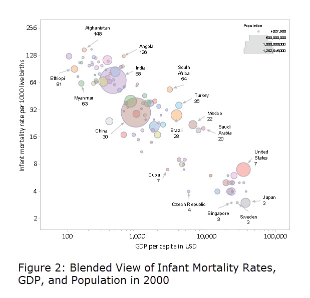
Image: Kristi Morton, Ross Bunker, Jock Mackinlay, Robert Morton, and Chris Stolte, Dynamic Workload Driven Data Integration in Tableau. [1]
Hans Rosling, Gapminder and Data Blending
The Gapminder World interactive graph below shows how long people live and how the number of children a woman has is affected by how much money they earn using different data sources.

Image: Hans Rosling’s Wealth and Health of Nations (Gapminder.org) [2]
 In the screenshot above, the y-axis shows us Children per women (total fertility) . The x-axis shows us Income per person (GDP/capita, PPP$ inflation-adjusted). The series data points (the bubbles) show us population for each country. If you were to click the Play button, you would see as an interactive “slide show” how countries have developed since 1800.
This demonstrates the flexibility of the data blending feature, namely that users can dynamically change their blended views by pivoting on different data sources and measures to blend in their visualizations.
In the screenshot below, Mr. Rosling explains how to use the interactive Gapminder World application.
Also, Mr. Rosling has provided Gapminder World Offline, which you can use to show animated statistics from your own laptop! It can be run on Windows, Mac and Linux. Here is a link to the download installation page on the Gapminder.org site.
And here is a link to the PDF for the Gapminder World Guide show above.

Image: Hans Rosling’s Gapminder World Guide (PDF) [2]
Next: Usage Scenarios and Design Principles
——————————————————————————————————–
References:
[1] Kristi Morton, Ross Bunker, Jock Mackinlay, Robert Morton, and Chris Stolte, Dynamic Workload Driven Data Integration in Tableau, University of Washington and Tableau Software, Seattle, Washington, March 2012, http://homes.cs.washington.edu/~kmorton/modi221-mortonA.pdf.
[2] Hans Rosling, Wealth & Health of Nations, Gapminder.org, http://www.gapminder.org/world/.
