So I go from talking about Florence Nightingale and her achievements yesterday to poop today. *Sigh*
Not every infographic needs to be two feet tall with dozens of icons, charts and graphs. Sometimes an infographic can get its message across with a single image. Infographics like this one which feature some interesting facts about poop and its image of a multi-color poop. I’m hoping that is not real poop. I’m hoping that is play-doh poop. In any case, it is a visual that catches you quickly and the color coding disarms the potential vulgarity or distaste that poop’s more natural coloring might cause. [SOURCE]
I have reviewed some really poopy infographics, but I have to say this is the poopiest of them all. Let’s get to know our poop.
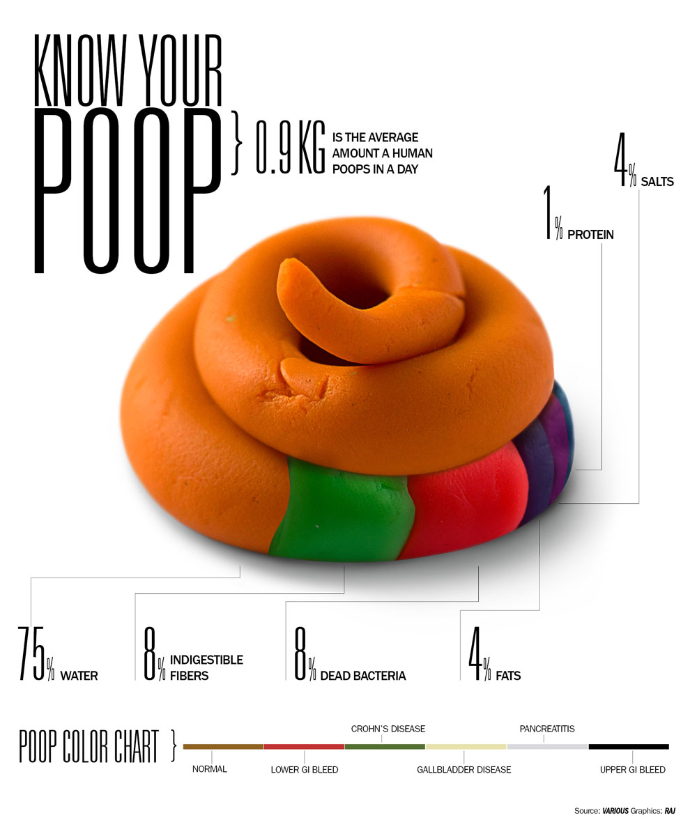
For the record, your average poop contains:
- 1% protein
- 4% salts
- 75% water
- 8% indigestible fibers
- 8% dead bacteria (eww!)
- 4% fats
This infographic is the poop. This poopy, bizarre infographic was created by the_digitalmonkey.

yew
yuck
icky