I love the history of data visualization. From Minard to Snow, I love to read the historical stories about the various graphs and maps that played a significant part in World history. Each month, I will have a special column titled “DataViz History” where I will showcase one of these visualizations. This month I am highlighted Florence Nightingale’s Diagram of the Causes of Mortality.
 While Florence Nightingale is most well-known as the founder of modern nursing and worldwide healthcare reform, she was also a passionate statistician and a pioneer in statistical graphics. [SOURCE]
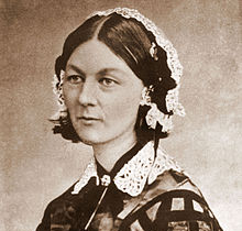
Florence Nightingale was born on May 12, 1820, to a wealthy, upper-class British family. Her parents provided her with a well-rounded education that included mathematics, in which she excelled. As a young adult, she rejected the expected role of a woman of her status and entered nursing in 1844 despite the opposition of her family.
During the Crimean War, she was recruited by the Secretary of War, Sidney Herbert, to assemble a team of nurses to serve at the British hospital in the Crimea at Scutari. When she arrived at the hospital, she found it to have horrid conditions with poor hygiene, overworked staff, and a lack of food and supplies. She immediately set to work improving the conditions of the hospital with hard work and compassion. In addition to the horrid hospital conditions, she also found the medical records to be disorganized, deficient and inconsistent between hospitals. She then began systematizing the medical record keeping and collecting data for analysis. By the time Florence left the Crimea in 1856, the conditions of the hospitals in Crimea improved drastically, with death rates dropping from 42% to 2%.
After returning to Britain, Nightingale remained greatly disturbed by the many needless deaths caused by disease in the military hospitals in the Crimea. As a result, she asked Queen Victoria to appoint a Royal Commission on the Health of the Army so that the data she had collected in the Crimea, as well as other army medical data, could be analyzed for medical reform. She turned to William Farr, a leading British statistician and a founder of medical statistics, to help her analyze the data.
The statistical analysis of the data from the Crimea showed that the unsanitary living conditions led to the diseases that caused the high mortality rates, not lack of food and supplies as she had originally believed. They also discovered that the problems in the military hospitals were not limited to wartime. In peacetime, soldiers died at twice the rate as civilians aged 25 to 35.
The statistical analysis results showed a strong need for reform, but Nightingale feared that Queen Victoria and the members of Parliament who could enact reform would not be likely to read or understand her statistical reports. Thus, she created a clever graphical presentation of the statistical results called a polar area diagram, which has also been referred to as a “coxcomb.” The figure below shows the polar area diagrams, “Diagram of the causes of mortality in the army in the East,” that Nightingale used to persuade Queen Victoria of the need for reform by improving the sanitary conditions of military hospitals.
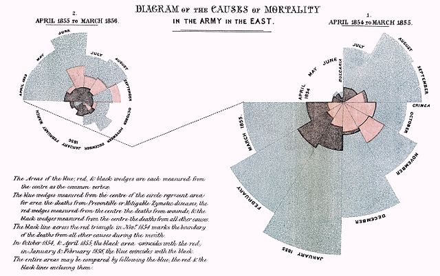
In these polar area diagrams, the circles are divided into 12 wedges, representing months of the year. The area of each wedge is proportional to the number of deaths for that month. The blue part of the wedges represents death due to disease, the red part of the wedges represents death due to wounds, and the black part of the wedges represents death due to other causes. The polar area diagram on the right shows the months from April 1854 to March 1855, and the polar area diagram on the left shows the months from April 1855 to March 1856. The deaths caused by disease generally increased from April 1855 to March 1856. However, when a sanitary commission arrived from Britain in March 1855 to improve the sanitation of the hospitals, the deaths due to disease dropped dramatically. Nightingale’s use of graphical presentation of statistics, her report and the commission were powerful tools that persuaded the government to reform sanitation methods in both military and civilian hospitals.
Nightingale continued to use statistics to reform medical record-keeping in Britain and to reform sanitary living conditions in rural India. In 1858, Nightingale became the first woman elected as a Fellow of the Royal Statistical Society for her work on army and hospital statistics and sanitation reform. She was also elected as an honorary member of the American Statistical Association in 1874. Nightingale died on Aug. 13, 1910, at the age of 90. She left a legacy of many saved lives and medical reform that was fueled by the use of statistical graphics as a powerful tool of persuasion.

2 thoughts on “DataViz History: Diagram of the Causes of Mortality – Florence Nightingale”