Monopoly set to replace one of its tokens, asking fans which piece to retire [SOURCE]
At nearly 80 years old, Monopoly is set to retire one of its eight classic tokens. And it’s up to fans to choose which ones will remain on the board to pass “GO.” The Hasbro-owned game kicked off its “Save Your Token” campaign last month, asking players to vote for the tokens they want to keep. The racecar, iron, Scottie dog, wheelbarrow, shoe, top hat, thimble and battleship are at all risk for the ax. The iconic game piece with the least amount of votes will be sent to the slammer forever, with no “Get Out of Jail Free” card in sight. It will be replaced by one of Monopoly’s newly-proposed tokens: a toy robot, helicopter, cat, guitar or diamond ring. Hasbro developed the new pieces in an attempt to modernize the Depression-era brand, said Jonathan Berkowitz, vice president of marketing for Hasbro Gaming.
“The tokens that are in the game today represent household items from the 1930s when the game was first introduced,” Berkowitz told the Daily News. “We wanted to introduce a new token to the game that’s more representative of today’s Monopoly players.” Gerrick Johnson, a toy analyst for BMO Capital Markets, told USA Today that sales of board games have dropped dramatically in recent years as people turn to their smartphones and tablets for entertainment.
Since I collect antique Monopoly pieces (yes, I know it is weird), I went out to the Monopoly web site and decided to vote. My favorites are the Scottie Dog and the Top Hat (I always called it a Magician’s hat as a kid). I figured if I had to kill off a piece it would be the Iron (all that ironing my mom made me do as a kid probably played into this).
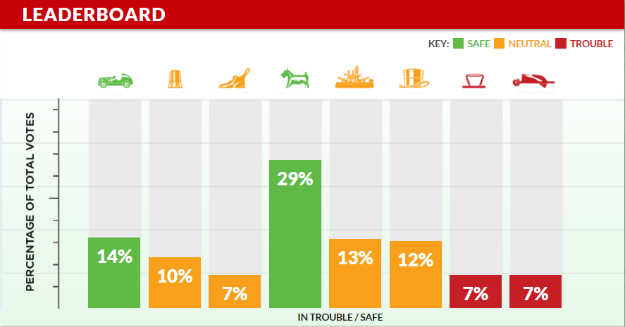
Once I voted, it showed me a vertical bar chart of the latest voting results (Note: These results were on January 10th, 2013).

The chart shows each of the classic tokens horizontally along the top X axis and indicates by “stoplight” color if the token is safe, neutral or in trouble. They provide us a percentage of total votes for each token with the percentage number in a large font inside the bar (where possible) or above it.
Commentary on the Leaderboard Chart
What I wanted to do was tell you what I did not like visually from my first, immediate look at the chart.
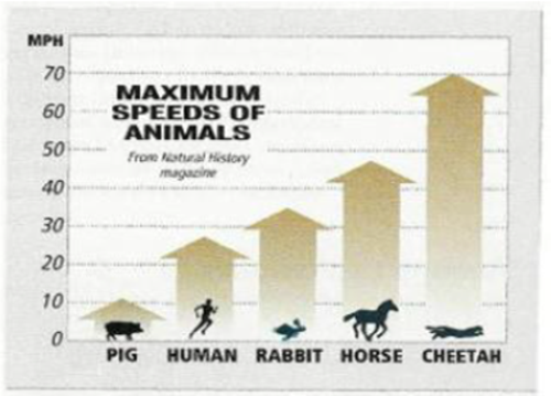
First, I found my eyes were having to look at the token image on the top X axis and then divert my gaze downward to look at the percent total vote for that token near the bottom X axis. It was almost a “nodding” motion with my eyes to visually compare the token image with the percentage. I think the chart would be better represented if the token image was at the base of the bar on the bottom X axis similar to the example below for Maximum Speeds of Animals Chart. Second, since I don’t think the worst case scenario where one token would have 100% of the vote will happen, I would have adjusted the Y axis so that you would see a portion of the bar for the 9%, 7%, 6% and 4%. I could argue that a horizontal bar chart would be easier to read, but I will leave it as a vertical bar for this discussion. I find the 32% and the 12% may be a bit skewed since the proportions don’t seem right. Also, I think if they sorted the bars from highest to lowest, you could quickly, visually look at the tokens to see where your favorites are in regards to the voting. It would have also given it that “horserace” effect of who was in the lead and who was catching up (perhaps the infographic would be more visually interesting if it was shown as a horserace between the tokens). Finally, I think the reader of the chart would want to also see the number of actual votes so they could determine which of the 12% tokens was truly ahead of the other.
And the winner (or loser) is…
Below is a screenshot I took yesterday of the latest results. I checked this morning and voting is now closed with the announcement to be made later today. I will post a follow-up blog what the results were.
Regards,
Michael