Takafumi Shukuya Bio
After graduating University from the Faculty of Commerce, I started my career as a network system engineer at a communication company in Japan. My job was to define requirements, design, build, and maintain my customer’s network system, and I had NEVER heard of “Tableau” at the time.
In September 2018, I was fortunately seconded to the IT department of an airline company, where I was introduced to Tableau. My new mission was to introduce and maintain a data analysis platform, including Tableau Server, and promoting data utilization in that company from the perspective of the IT department.
I really love my current job, and furthermore, Tableau and data visualization became part of my lifeworks, more than just a business.
In my private life, I used to play trombone in my Ska band, and also used to enjoy scuba diving. But now, as a father of 2 kids, I value the time spending with my family on the weekends. (Creating dataviz after my kids go to sleep!)

QUESTIONS
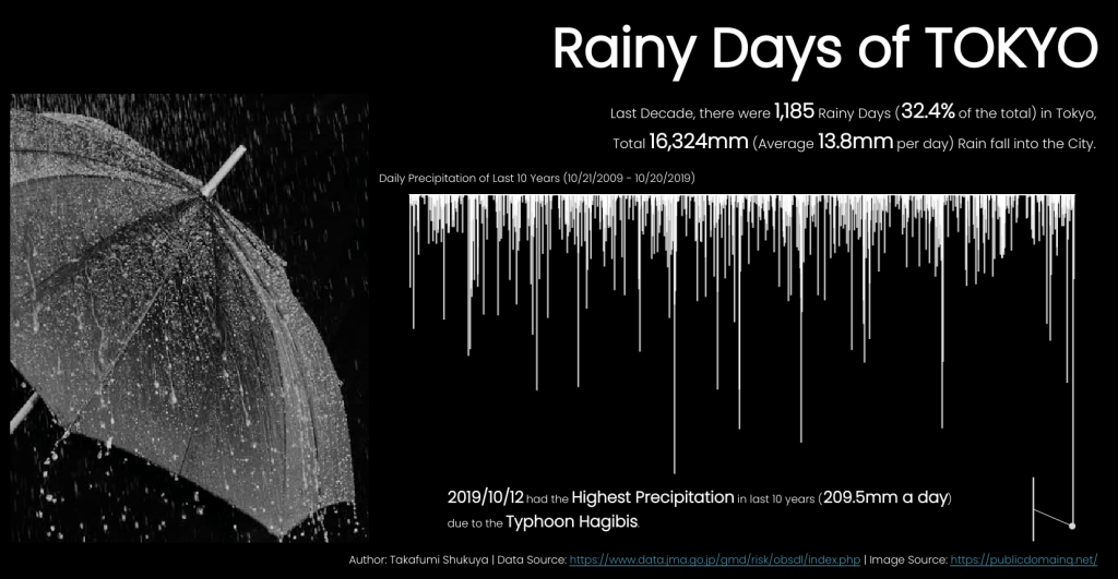
VOTD Link: https://public.tableau.com/profile/takafumi.shukuya#!/vizhome/RainyDaysofTOKYO/RainyDaysofTOKYO
Michael: Hello, Takafumi. Congratulations on your recent #VOTD, Rainy Days of TOKYO. I think this is a beautiful and very insightful data visualization. Can you please discuss the process you followed to gather the data, analyze it, design the dataviz, and then create it in Tableau?
Takafumi: Hi Michael! First of all, thank you so much for inviting me to your blog. It’s a huge honor to be in a part of this great series.
And thanks again for your kind words! I’m glad to hear you like my viz.
Let me look back to the past #MakeoverMonday, to talk about why I created this viz.
The week 43 of #MakeoverMonday 2019 was about sad topic – Suicides.
With this sensitive theme, very important message was shared from Bridget Cogley (@WindsCogley), which was really impressive for me.
“A key part of learning data visualization is how to share a message.
What kind of world do you want to create? Learn what you can.”
“A key part of learning data visualization is how to share a message. What kind of world do you want to create? Learn what you can.”
Bridget Cogley
Before that, I was thinking of making dataviz as just for fun.
But this message pushed me to make something that I want to share a story with others, and I finally came up with the idea of visualizing the big disaster that recently hit Japan.
This was the very first time making a dataviz other than projects like #MakeoverMonday, which means the first time starting from seeking data sources all by myself.
I fortunately found some clean data about daily precipitation of Tokyo at the Japan Meteorological Agency’s website and decided to compare the amount for the past 10 years.
When actually analyzed the data, even I was surprised how heavy the rainfall of Typhoon Hagibis was at that time.
To visualize the data, I wanted my viz to be simple and easy to understand. So, I selected a bar chart, but with a bit of ingenuity, I reversed the axis (like the famous ‘Iraq’s bloody toll’ viz) so that it looks like a rainfall. I did this to make it clear that it was a visualization about rain. Hopefully it worked.
I believe that the core of dataviz is to help people easily understand about the fact expressed by data. (Like the mission of Tableau!)
I believe that the core of dataviz is to help people easily understand about the fact expressed by data. (Like the mission of Tableau!)
Takafumi Shukuya
In other words, dataviz turns data to information, and that is the most beautiful moment in data visualization.
I was proud of this viz as a first fully original work of myself, and really surprised of being selected as a #VOTD.
If many people have seen this viz and realized about the situation in Japan, there is nothing better than that.
Michael: I see by viewing your Tableau Public that you are a regular participant in #MakeoverMonday. How has #MakeoverMonday helped you to improve your Tableau skills?
Takafumi: Yes! I’m now a regular participant and a big fan of #MakeoverMonday.
I started to join from week 38 of 2019, and I have been participating every single week since then. I really love doing this.
I think #MakeoverMonday is an extremely valuable opportunity to learn and practice about the real process of data visualization.
Every week, a brand new dataset is provided by the community leaders. Most of them are unfamiliar at first, so we start with analysis (and do some additional research if necessary) to understand the data, then decide the story to tell, and finally visualize it any way we want.
I believe this is a microcosm of the actual process of analyzing data in business, and by keep practicing it on a weekly basis, it strongly helps us improve the comprehensive skills (not just Tableau skills) of data visualization.
Besides, I have to tell you that I have a mentor, Satoshi Ganeko (@ritz_Tableau), who really helps me doing #MakeoverMonday.
He is a Tableau Public Ambassador, and I believe he is one of the best Tableau users in Japan.
Satoshi gives me feedback for my viz every week, and we have some discussion about the weekly theme if necessary. Through discussion with him, I have learned so many things. I got better perspectives on understanding data, and many Tableau tips I didn’t know before. Without him, I would definitely not have gained much.
As a result of 2019 (W38 – W53), I was selected on 3 weekly favorites.
For this year, I will do my best for further improvement!
Michael: Can you tell me three of your favorite Tableau Desktop tips and tricks?
Takafumi: OK, let me introduce some tips that I recently learned from others and felt very nice and useful.
- How to draw hollow circle on a map.
(Learned from Satoshi Ganeko (@ritz_Tableau))
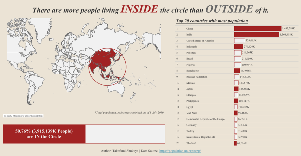
We can draw hollow squares using area annotation in Tableau, but not circles. But by stacking a map, image circle, and one more transparent map on top of the image circle, we can draw a hollow circle, and can select objects located inside the circle!
Here is an example of use – World Population CIRCLE In-N-Out
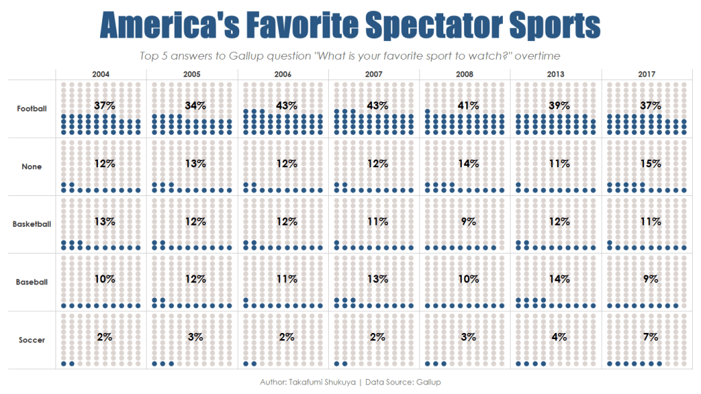
2. How to create waffle chart multiples with no additional data sets.
(Learned from Alexander Mou (@aleksoft) ’s blog post)
Creating a waffle chart itself is may not be new to many people, but the core of this tip is doing it with NO ADDITIONAL DATA. Plus, this method can be applied to other data densification techniques too.
Dig this blog post to know furthermore.
Link: https://vizdiff.blogspot.com/2019/12/creating-waffle-chart-multiples-in.html
Here is an example of use – America’s Favorite Spectator Sports
3. How to create gradient area chart.
(Learned from Ken Flerlage (@flerlagekr) and Kevin Flerlage (@FlerlageKev) ‘s blog post)
My favorite part of this tips is that gradient color has the quantitative meaning. Plus, it has the applicability that can be used for various graphs, so that I applied this technique to Marimekko chart.
Dig this blog post to know furthermore.
Link: https://www.flerlagetwins.com/2019/02/gradient-colors.html?m=1
Example of use – World Lakes

Michael: What do you feel is missing from Tableau Desktop? What features would be on your wish list to see added to the application?
Takafumi: As a server admin of Tableau Server, I often think about what is missing from Tableau Server rather than the Desktop.
In my opinion, the ease of use for web users is very important for promoting Tableau within the organization, but there is so many things that web users CAN NOT do in Tableau Server, like creating sets, parameters, filter actions and so on…
It will be great if we can do more using web in the future.
Michael: Can you tell me what the Tableau community is like in Tokyo? Do you have a local Tableau Users Group (TUG)?
Takafumi: Sure, there is many of it!
This dashboard made by KT (@DATA_Saber), the great leader of Japan TUG from the beginning, shows all the TUGs active in Japan.
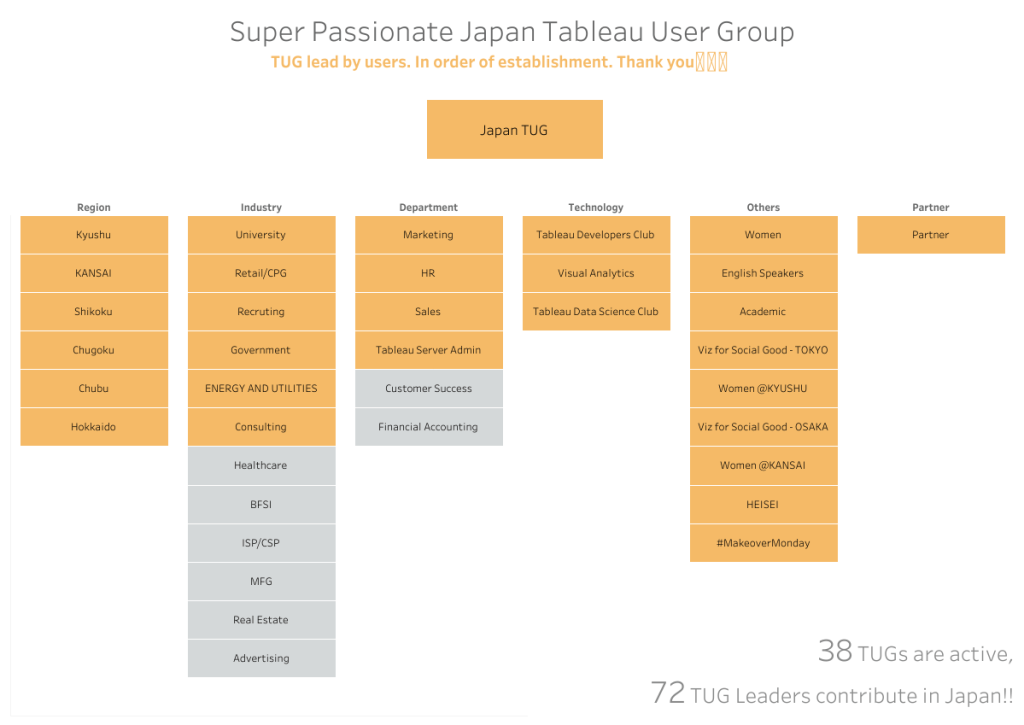
Last year, there were 83 user meetings (voluntary gatherings by users) held with about 3,900 participants. Many people connected and created a chain of inspiration through those events.
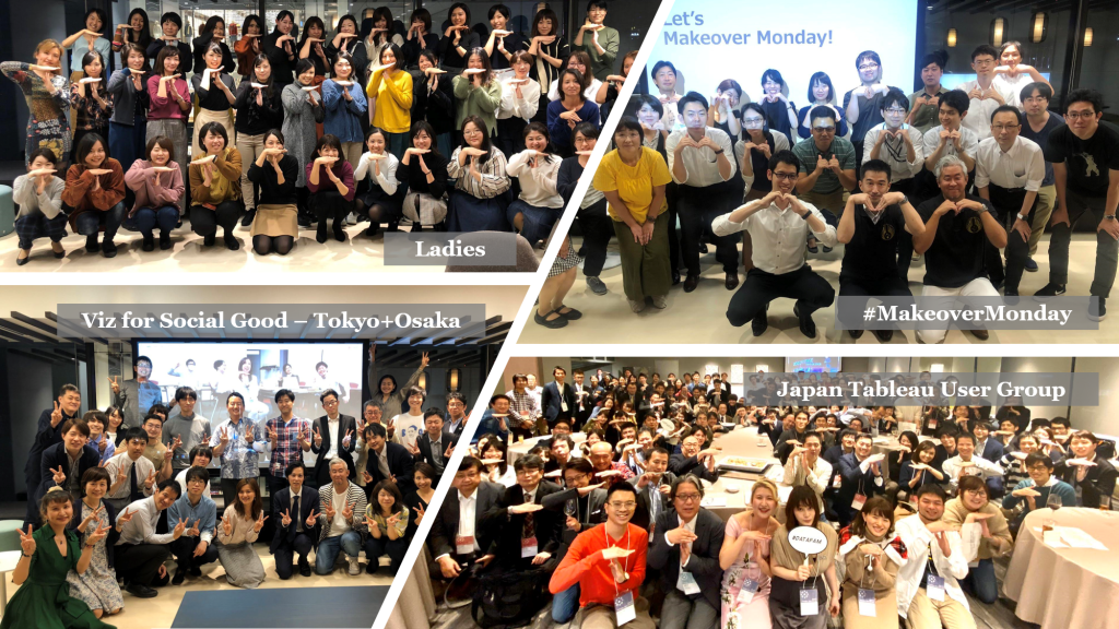
As for myself, I attended #MakeoverMonday meetup held in Tokyo, which strongly pushed me to join the #MakeoverMonday project. And I’m a great fan of Ladies user group’s blog, which provide very useful Tableau tips (in Japanese!) all the time.
I can’t thank enough to the community leaders, and I’m always amazed by the power of the community.
Michael: What is next on your “To Do” list? What can the Tableau community expect to see from you in the near future?
Takafumi: One of my resolution for this year is to be in the 100% club on #MakeoverMonday. So I will keep on vizzing week by week, and do my best to be listed on the favorites.
Also, I’m now planning for a collaborate viz with someone and looking forward to showing you our work in the future!
Tableau Public
Link: https://public.tableau.com/profile/takafumi.shukuya#!/