*Sigh*
Another year, and it is another year I am not at #TC19.
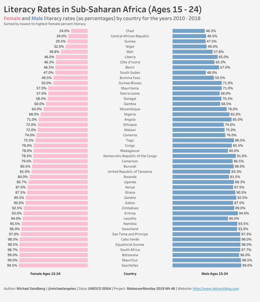
It has been a very busy week at work, so I kept it real simple. I was interested in trying to create a Butterfly Chart. A Butterfly Chart is two bar charts on either side of the y-axis. I also wanted the Country names to be in the center, so I did a little trick by creating a measure called Zero Axis, dropped it between the Female and Male metrics on the Columns, and added Country Name to the Text mark on Zero Axis.
Here is the link to my dataviz for this week on Tableau Public.