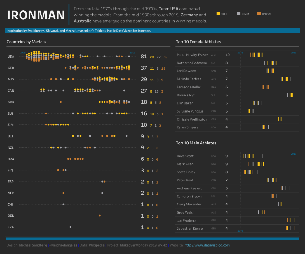
This week, it took a village for me to create this dataviz. Inspiration by Eva Murray, Shivaraj, and Meera Umasankar’s Tableau Public DataVizzes for the Ironman World Championship.
I liked how Shivaraj used a Bee Swarm Chart to compare distribution. I could not find a lot of information on Bee Swarm Charts and Tableau, but Nathan Yau did have something comparable on his website, FlowingData. Here is the link.
Here is the link to my dataviz for this week on Tableau Public.