Meera Umasankar Bio
Being born and brought up in India, I’ve always wanted to meet people from different countries and enjoy being around people with different culture. That’s when I was lucky enough to land in Middlesex university, London with a scholarship for my undergraduate on Computer Networking. It was an awesome 3 years of my life experience that I spent in London and my first time being away from my parents. After my graduation, I moved back to India where I was offered with an excellent first job opportunity at Accenture. This is when I started to use Tableau for the first time and I remember using 8.x version. It’s been more than 5 years and I still love using Tableau and I have been using it every day at work. I now work at Integrated Health Information System, a public health care sector organization supporting Singapore’s health related data.
My passion towards Data Visualisation has grown immensely this year that I spent most of my spare time participating on the data viz social projects or learning something new in Data Science. I live with my husband in Singapore and we love travelling. I recently was given this opportunity of being a Tableau Public Ambassador and I co-lead DataplusWomen community in Singapore.
QUESTIONS
Michael: Hello Meera. I have been a big fan of your work for a while. Congratulations on having 4 of your data vizzes selected for the longlist by Kantar Information is Beautiful Awards 2019.
They are:
Identity Theft In The US, News & Current Affairs category, Link: https://www.informationisbeautifulawards.com/showcase/4176-identity-theft-in-the-us
Penguins – Sea Birds, Unusual category, Link: https://www.informationisbeautifulawards.com/showcase/4172-penguins-sea-birds
Operation Fistula, Humanitarian category, Link: https://www.informationisbeautifulawards.com/showcase/4175-operation-fistula
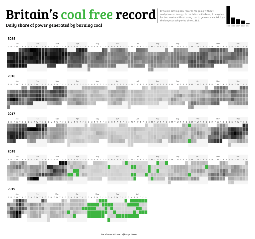
Britain’s Coal Free Record, Science & Technology category, Link: https://www.informationisbeautifulawards.com/showcase/4174-britain-s-coal-free-record
Can you tell my readers your process for developing your data vizzes? For example, how do you decide on the topic, find and gather the data, design and then develop the data viz? If it will help, let’s use the Britian’s Coal Free Record dataviz as an example.
Meera: Hi Michael, thanks so much for inviting me to your interview and its a pleasure to share my experience. I’m a big fan of your blog too!
Yes, I’m so happy and its an honour to see 4 of my Tableau vizzes on the long list on this year’s InformationIsBeautiful awards. I would like to mention about the 2 community projects which has taught a lot and has even helped me grow in my career. Also I would like to take this opportunity to thank/mention few people in the community whom I really look up to and helped me grow.
I have been using Tableau for nearly 5 years however it was just before a year that I have known about the Tableau community and its awesomeness. Thanks to Sarah Burnett, my ex boss who has always been so supportive, encouraging and giving feedback whenever I needed it. She has been an amazing mentor and an inspiration to me and I always look up to her. I would definitely say that without her, I wouldn’t have achieved so much in such a short time. I have loved using Tableau and also it has made me identify my new passion on Vizzing. Since the start of this year, I have been involved into social projects like MakeoverMonday and IronQuest.
I would highly encourage anybody who wonders where to start or who is eager to develop their Data Visualisation skills to start from the MakeoverMonday project. Its run by 2 amazing data rock-stars Eva Murray & Andy Kriebel where every week you would be given a dataset to viz about. My journey this year with MakeoverMonday has been amazing. It has taught me so much and definitely improved my design and visualization skills. I can proudly say that I can see the transformation from initial few first vizzes to what I build now. The invaluable feedback that I receive during the Viz reviews from Eva, Andy & Sarah Bartlett has been of great help and I always learn something new from every Viz Reviews which I also apply it at my work. Also I have challenged myself to do every single MakeoverMonday this year. Fingers crossed 😊 To know more, visit https://www.makeovermonday.co.uk/
IronQuest is an another social project hosted by an amazing person who is another data rock-star, Sarah Bartlett. IronQuest has a similar format to Tableau’s IronViz contest. You will be given a topic each month and you have to find your own dataset and visualize it. Finding your own data is going to be a lot of struggle and to be honest I have feared of participating in IronViz. To let go of that fear, I have been participating in every month’s IronQuest challenge. The good news is, I participated in this year’s 3rd IronViz feeder which was on Refugee Migration to the US and I was on cloud nine to see my viz the 5th on the Top 10 list.
Participating in these projects has helped me build a great Tableau Public profile and it has helped me with great career opportunities too!
I would like to share couple of examples and what is my design approach.
- Britain’s coal free record – this dataset was on how Britain has been setting record without coal powered energy (Link: https://www.informationisbeautifulawards.com/showcase/4174-britain-s-coal-free-record). The dataset had a lot of information like the Date, Demand, Frequency, Coal, Solar, etc. Sometimes when I see a dataset with so much information, I get held up. But one of the important things that I’ve learnt from the MakeoverMonday viz reviews is, you don’t have to show all the information. You can analyse the data and find your own story and it can be a simple viz which is more meaningful. For all the MakeoverMonday projects, I try to time box myself to not more than 4 hours. So when I saw a date field, the first chart that struck my mind was using a Calendar. Calendar view shows the daily usage of coal and it was perfect for this dataset. It exactly shows the daily power consumed and how Britain went without using coal for nearly 3 weeks. Developing this viz took me not more than 2 hours. And this was also the Viz of the Day chosen by Tableau Public 😊
But one of the important things that I’ve learnt from the MakeoverMonday viz reviews is, you don’t have to show all the information. You can analyse the data and find your own story and it can be a simple viz which is more meaningful.
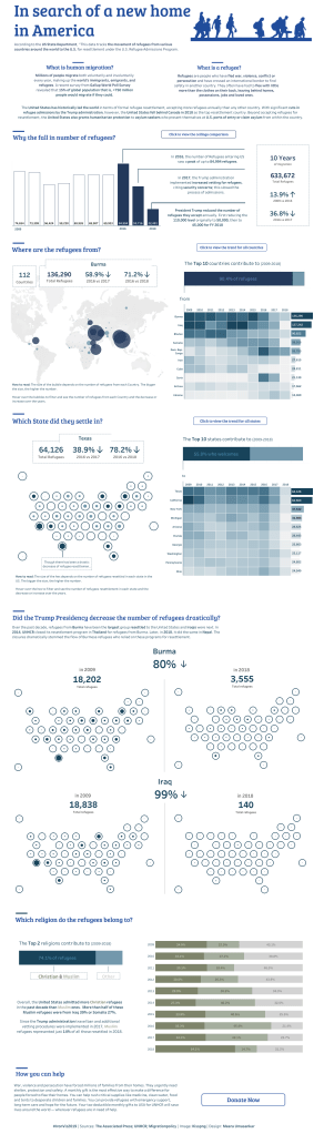
2. Refugee Migration to the US – My IronViz entry for this year’s 3rd feeder (Link: https://public.tableau.com/profile/meera6133#!/vizhome/IronVizRefugeeMigrationtotheUS/IronVizRefugeeMigrationtotheUS). To be honest, I was always afraid on entering an IronViz but I took it as a challenge this year and entered this one. The IronViz format this year was slightly different where they had given the dataset and there was no tension of finding your own. I spent only a day and a half to build this viz. I did my own analysis on the dataset and wrote down some interesting stories that I found out of it. I always sketch the initial views on a sheet of paper and then start vizzing on Tableau. I don’t really prefer using any complex chart types and even for my IronViz, I went with using very simple chart types with some new Tableau functionalities like using buttons and using a different type of a map chart. I love bar charts and there are even different ways of representing it. I learnt a lot from Jeffery Shaffer’s viz on Bar chart variations https://public.tableau.com/profile/jeffrey.shaffer#!/vizhome/BarHoppingThemeandVariationsonaBarChart/BarHopping. I have also been using a lot of heat maps on my vizzes lately. It helps to highlight the trend easily as soon as you see it and its also visually appealing.
Michael: You work for IHiS. Can you tell my readers a little bit about IHiS and your position there?
Meera: I work as a Senior Specialist in Data Visualisation at IHiS. Its been 3 months since I moved to this new opportunity and my first Health care domain related role. I work on multiple projects as a Data Viz expert helping the Clinicians and the Pharmacists to visualize their data in best and meaningful ways. Integrated Health Information Systems (IHiS) digitizes, connects, and analyses Singapore’s health ecosystem. Its ultimate aim is to improve the Singapore population’s health and health administration by integrating intelligent, highly resilient, and cost effective technologies with process and people. Being the only Data Visualisation expert in the team, its been quite challenging but also an amazing learning experience so far.
Transforming healthcare through smart technology, IHiS has garnered more than 80 awards for its innovations. It supports more than 50,000 healthcare users in Singapore’s health ecosystem through the application of clinical informatics, computer science, data science, mechatronics, standards based IT that enables information exchange and cross boundary workflows, analysis, statistical and machine learning techniques to discover insights.
Working at IHiS has been an amazing and a completely different experience so far as I get to interact directly with the Clinicians and Pharmacists to understand their requirements and expectations. Being part of the IHiS data science team, I have been gaining a lot of great experiences and a great opportunity for me to learn more AI and ML.
Michael: Can you tell me three of your favorite Tableau Desktop tips and tricks?
Meera: Well there are just too many tips and tricks! However below are some of them that I read or follow while I build my vizzes
- I have been recently enjoying the tips and tricks from Lorna Eden https://missdataviz.wordpress.com/category/tableautiptuesday/page/1/. Every Tuesday, Lorna publishes some cool tips on Tableau thats worth checking out.
- I love the new Tableau feature on sheet swapping using buttons on Tableau desktop. You can always find great blogs from the data rock stars in the community immediately Tableau releases its new features. I used sheet swapping feature on my recent IronViz entry and I referred to Kevin Flerlage’s blog https://public.tableau.com/profile/kevin.flerlage#!/vizhome/CasesforCollapsibleContainers/SheetSwap
- When it comes to designing a dashboard, I have set my own style. I prefer giving any viz a catchy title with a short description on the topic that you are viz is about. For my recent vizzes, I have started using this font Bree Serif which I find it very attractive. Another important aspect is choosing right colors for your dashboards and that is right when I read one of Andy Kriebel’s blog on using coolors.co.

Michael: You are the co-leader of the Singapore #datapluswomen. Can you tell my readers a bit about this organization and the benefits it provides?
Meera: DataPlusWomen is a community hosted in collaboration with Tableau software where data enthusiasts come together to discuss issues, learn new skills and network in the data related field. The theme would be more towards women in data. NOT restricted to women of course! 😊 I was really inspired by how this event was hosted in Europe and US and thought it would be great to host in Singapore too. I co-lead this community event with my ex-colleague Hansini. We had our inaugural event end of last year and so far, we have held 3 events. Our inaugural event was more on introducing this community in Singapore with interesting panel discussions on women-centric topics with Sarah Burnett and Hui Xiang. We planned to get a short survey from the attendees to know their interests to plan our future events. We have collaborated with Viz for Social Good community project and our last event was Data Visualisation best practices which was held at the Accenture offices. We were lucky enough to have Corey Jones join our event and he shared his experience on IronViz. Our next event is coming up soon & you can follow us on LinkedIn group https://www.linkedin.com/groups/13704617/
Michael: What do you feel is missing from Tableau Desktop? What features would be on your wish list to see added to the application?
Meera: Tableau has been doing an amazing job in understanding their customer needs and incorporating more and more new features. With few awesome features like Set Actions and Parameter Actions, I still miss just this feature of just copy pasting text boxes in a dashboard with spell check option.
With few awesome features like Set Actions and Parameter Actions, I still miss just this feature of just copy pasting text boxes in a dashboard with spell check option.
Michael: What is next on your “To Do” list? What can the Tableau community expect to see from you in the near future?
Meera: I will continue working on my current ongoing projects like MakeoverMonday and IronQuest for this year. Also, I’m too excited about attending my first Tableau Conference this year in Las Vegas. I can’t wait to meet people from #datafam in person and to get more inspired. My next year plan to is to work on projecthealthviz and start with own blog.
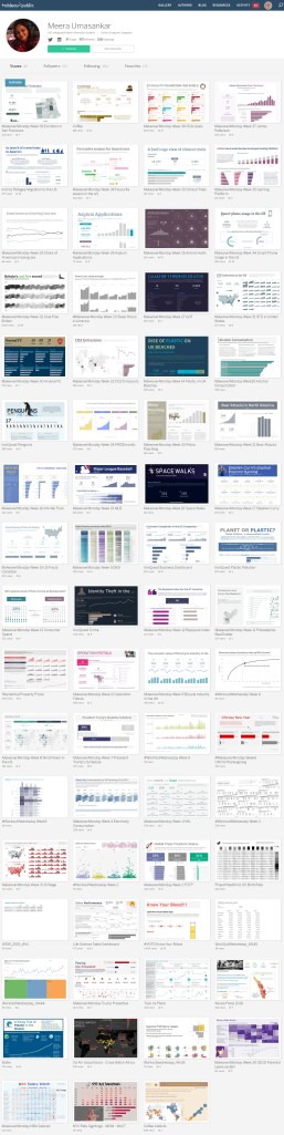
Tableau Public
Link: https://public.tableau.com/profile/meera6133#!/