Will Strouse Bio
Will’s data-viz journey began after graduating from Saint Anslem College in Manchester, NH with a degree in Criminal Justice, focusing on Criminology. His goal was to become an F.B.I. criminal profiler. While waiting for that dream to come true, he took any job he could find; selling cars, tiling, a start-up laundry business, and then a customer service call center associate position.
It was while listening to an endless stream of customers complaining about invalid coupons that he found an opportunity to apply his education and investigative instincts. After figuring out the underlying coupon code exposure (and stealing some just to prove his point), Will shared his findings with loss prevention investigators who then secured the system. He was offered a position as a Sr. Loss Prevention Analyst working with those same investigators. The role would develop from simple frequency outlier report building to automated, interactive behavioral analyse data visualizations.
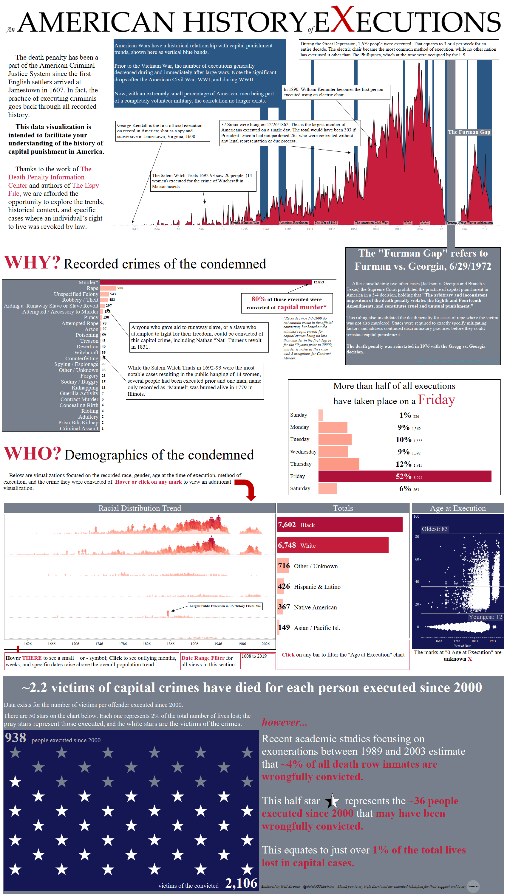
During this time, Will discovered the Tableau Community through the Boston Tableau User Group previously lead by Anthony Chamberas and Zack Leber. Over the next couple years, Will would present several times, including two keynote sessions on the Gamification of Interactive Fraud Dashboards and a data-art piece titled “An American History of Executions” which explores a data set containing every documented execution in the United States since 1600.
In 2017, Will decided to shift his career path away from focusing entirely on fraud analytics towards becoming a data visualization and analytics consultant. He joined Cleartelligence, Inc. near Boston, MA and was able to work across several industries such as life sciences, retail, and energy while also expanding his skills as a Tableau and Alteryx developer and trainer.
Still an active member of the Tableau Community, Will took over with Dustin Cabral as co-leaders of the Boston Tableau User Group earlier this summer. Will hopes to maintain the high standard of excellence and inclusiveness set by the previous leaders.
While not vizzing, Will lives with his wife Kerri, daughter Abigail, and son Henry on their farm in the scenic hills of Mont Vernon, NH, where they raise rare heritage breed chickens, ducks, and rabbits along with an assortment of organically grown crops.
He also has a talent for writing his own bio in the third person for some reason; sorry for breaking the 4th wall readers, but this whole formal bio section has always confused me. It’s weird right? If you are reading this far, there is good chance you already know me personally, or follow me on Twitter. If you want the short version of just the most interesting bits; time to get weird:
- I have read way more books about serial killers than I have American classics unless you include “In Cold Blood” which is kind of both but Smith and Hickock were certainly not serial killers…
- My wife and I hugged Founders Tree in Humboldt Park on our honeymoon; it was the 3rd most impactive experience of our lives together behind the births of our two babies. That tree is over 1,400 years old and over 325 feet tall.
- I am a die-hard Steelers fan that was born and raised in Massachusetts.
- Any place with a tree to person ratio less than 1,000 to 1 scares me.
QUESTIONS
Link to data viz: https://public.tableau.com/profile/william.strouse#!/vizhome/MyKidsAreWearingOutMyGuitarStrings/PlayThatAgainDaddy
Michael: Hello Will. I have been a big fan of your work for some time. I was admiring your data visualization on Tableau Public, My Kids Are Wearing Out My Guitar Strings. Can you tell my readers the story behind this dataviz as it sounds very personal? Also, can you talk about your process to harvest the data, design the dataviz, and then create this dataviz in Tableau?
Will: Hello Michael and thank you so much for including me in your Tableau Community Spotlight series. I am a long-time fan as well!
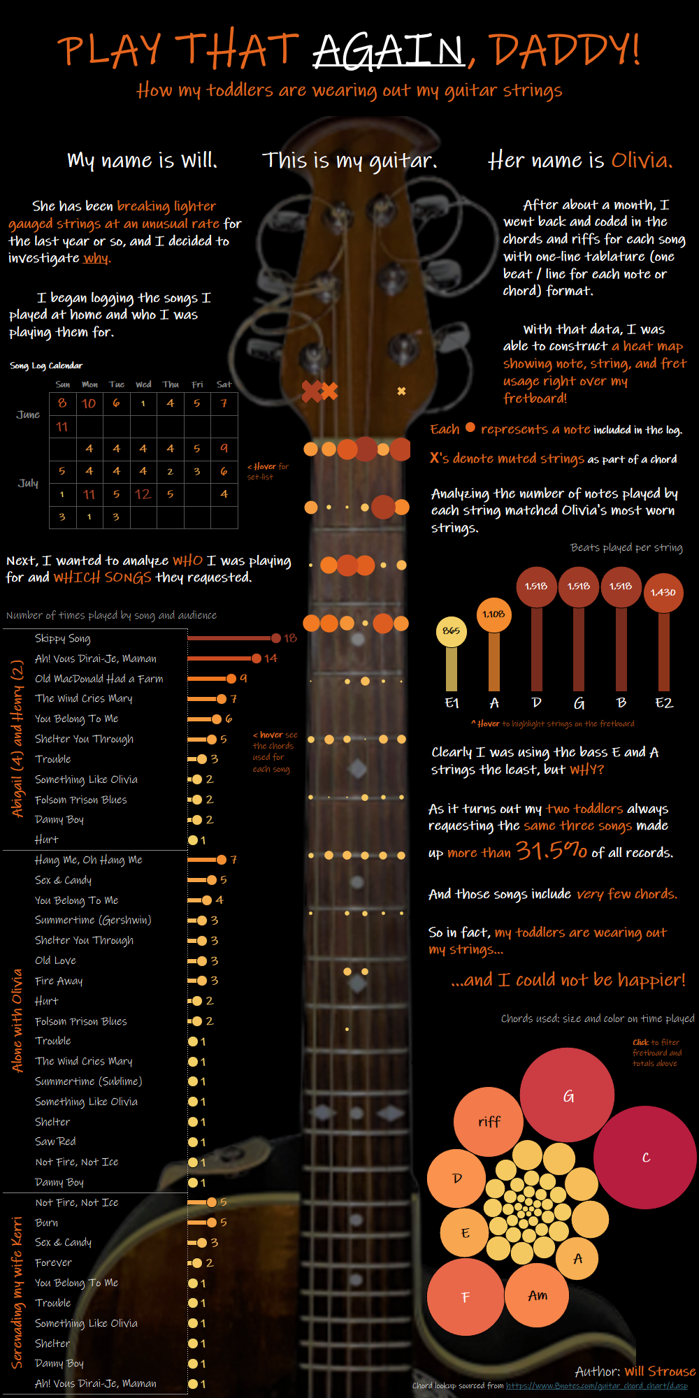
This viz was the product of an emotional roller coaster that started with the theme announcement of the second Iron Viz feeder for 2019. The topic of course was music. I was very confident in my approach. While my peers all scrambled for giant data sets with decades of album sales or trying to drain every line of code from their Spotify and iTunes accounts, my plan was to share the music I play at home with my family while also highlighting my smooth folk/blues 3-finger pickin’ style compared to open-chord-strumming many people associate with acoustic guitar.
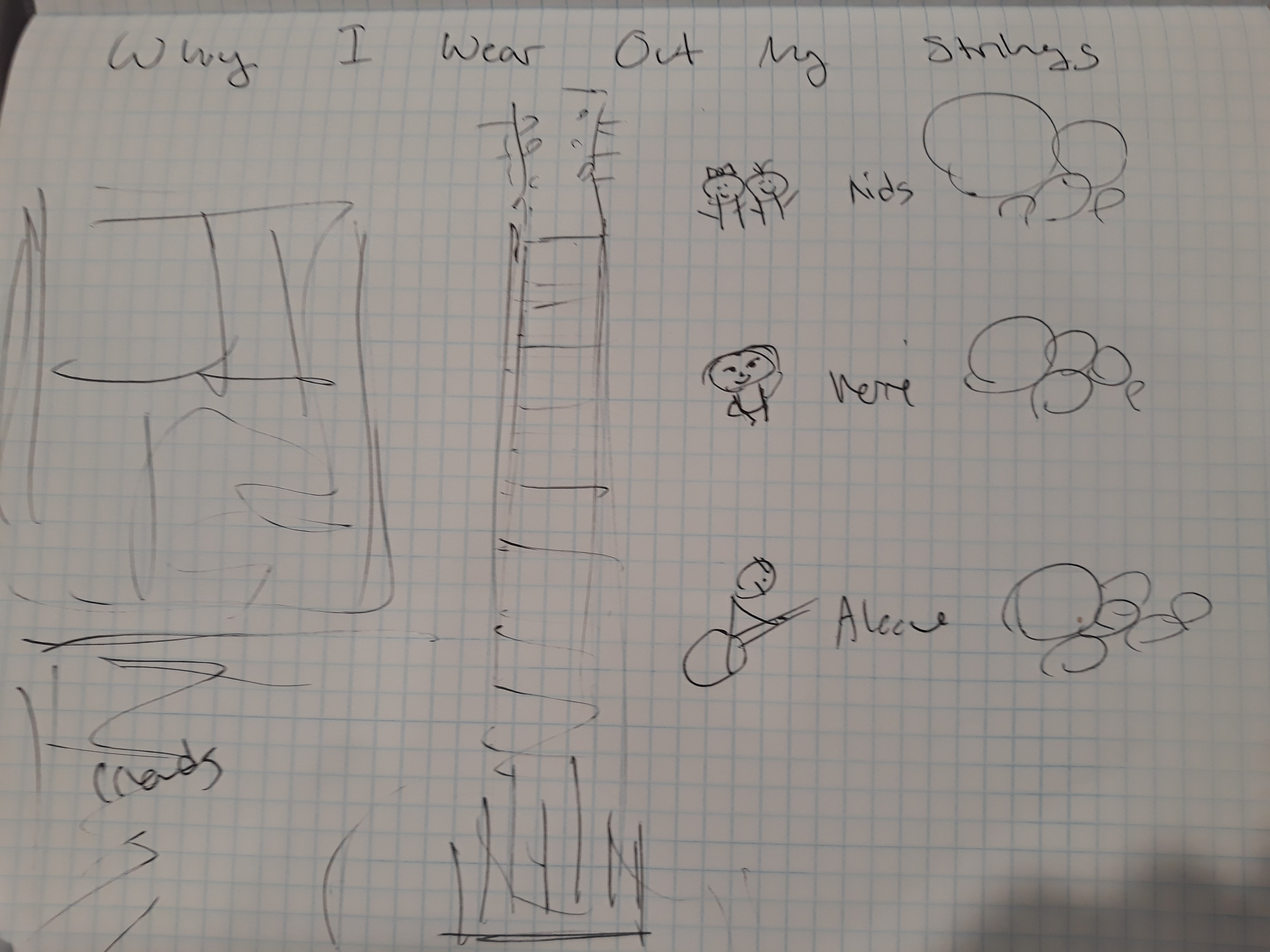
The featured view is a shape chart with a transparent background over a cropped image of my most used guitar (her name really is Olivia); a fretboard heatmap. That was the first element of the design that I sketched while trying to fill in the rest of my ideas around it.
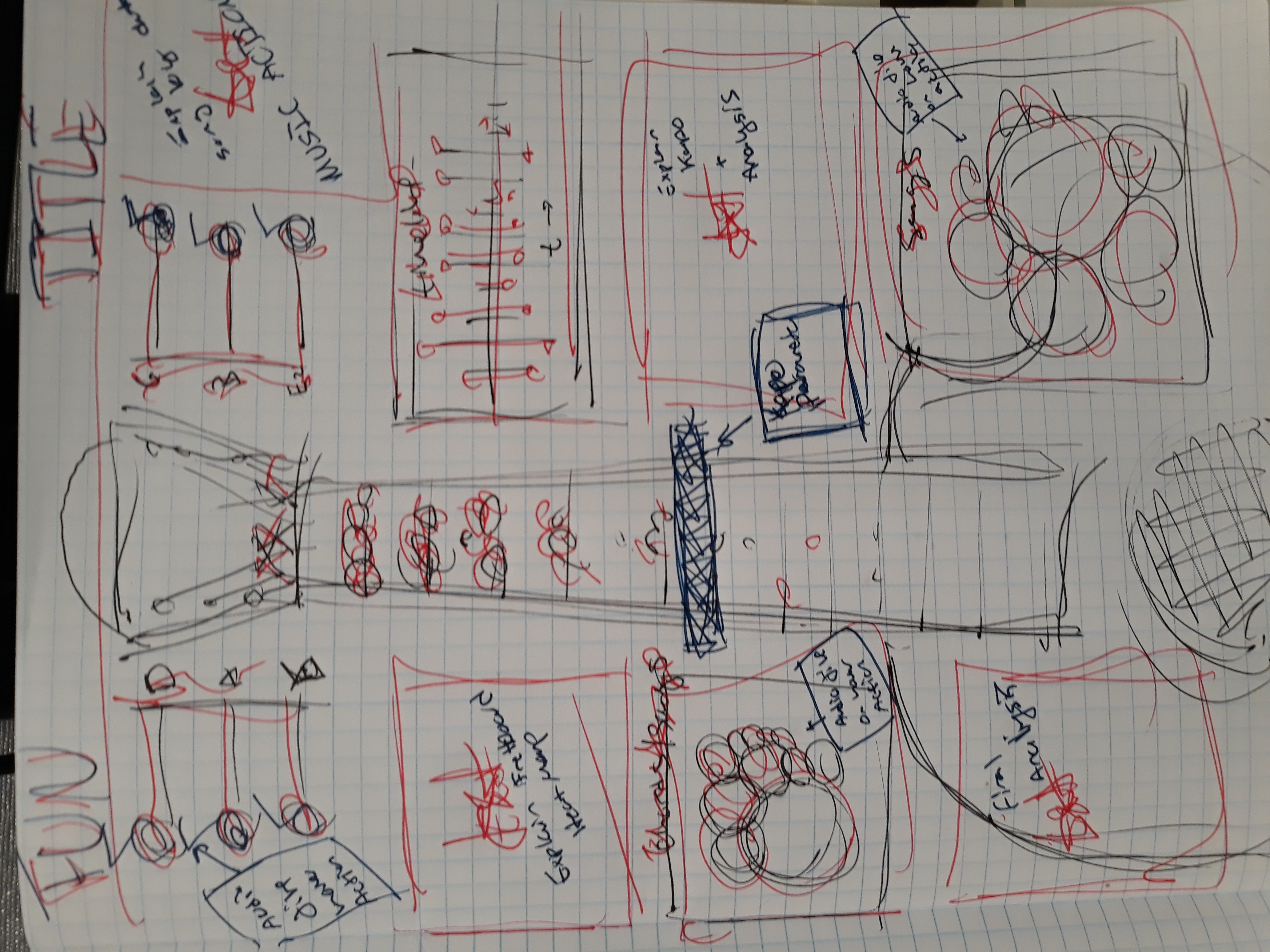
My viz-goals were to incorporate audio files of me playing songs, chords, or single strings that the users could hear through dashboard hover actions. Secondly, I needed to find some software that could not only record and edit the audio files, but also export as guitar tablature so the data would accurately show how often I hit each string and fret location. The cake-topper of this potential masterpiece was going to be a parameter-controlled capo so the user could see the songs in the exact key I use (a function of my admittedly limited vocal range). It was going to be beautiful! I told myself that this was going to be the ’72 Telecaster Deluxe of vizzes!
After a few weeks of logging songs and researching solutions I was stuck, unable to find a program to export the exact guitar tablature data needed to capture every pluck, pull, and hammer of my strings. Making audio files play on hover actions was not working either. Submissions from the Community started being published and shared, and I had nothing but one Excel sheet with a setlist log mostly filled in with kid songs.
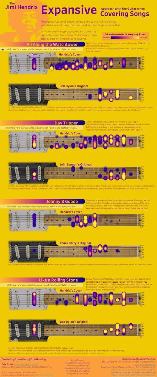
The last gut punch before I decided to quit was an entry from one of my favorite data artists, Steve Fenn. It was a viz more beautiful than I could have ever imagined. He built a series of fretboard heatmaps contrasting the playing style and complexity of several famous Jimi Hendrix covers against the original scores; and the heatmaps were over a cropped image of a Pearl White ’72 Telecaster Deluxe!
“Why even bother?” I lamented to my wife Kerri, making sure to mention the omen of the ’72 Telecaster Deluxe while formulating the rest of my excuse for throwing in the towel.
“But you don’t have one of those Deluxe’s, and you are no Jimi Hendrix,” she replied.
While I appreciate how my lovely wife rarely pulls punches, she could tell I was taken back by the curtness of her statement.
“You play the same couple songs ovah and ovah because the babies tell you to (her Mass-accent becomes more noticeable when she’s ahr-ticulating her ahr-gument). The story should be about them and your guitah, not you.”
Her honesty exposed the real flaw with the design; I was putting wow-factor functionality and fancy finger pickin’ (and myself) ahead of the most interesting story in that data. My next wire-frame was much simpler and refocused on the relationship between my toddlers and some very well-worn guitar strings.
The product of that journey was a piece of data art we are proud of, and an experience which helped to insert some much-needed humility to my approach to designing personal and impactful data stories.
Michael: You are an Sr. Data Visualization and Analytics Consultant at Cleartelligence. Can you tell my readers a little bit about your position at Cleartelligence?
Will: I joined Cleartelligence about two years ago hoping to become an expert Tableau developer and work across multiple industries. I expected long hours, tight deadlines, a series of client commanded made-to-order dashboards, and a demanding leadership team that only cares about getting the job done so we can move onto the next one. The reality is quite different.
At Cleartelligence, we make a point of partnering with our clients to understand the challenges ahead, articulate business questions, then develop solutions all while fostering a culture of data visualization empowerment. My clients have been great and we always feel successes are shared, and what I thought would be series of disconnected short term jobs was replace by solid long term business relationships.
From an internal culture standpoint, I cannot say enough about our team and leadership. My colleagues are all brilliant and offer a wide variety of experience and expertise. Consulting is a tough gig, but our senior partners do everything they can to set us up for success and always take the time to offer feedback. We are a family-first shop, and I am very proud to be a part of the Cleartelligence team.
By the way, we are looking for more passionate data visualization and analytics experts, so if any readers are interested please check out our careers page. A little tip, I strongly encourage any applicant to have at least a few samples posted on their Tableau Public profile!
Link: https://www.cleartelligence.com/careers
Michael: Can you tell me three of your favorite Tableau Desktop tips and tricks?
Will:
- “Random()” is a quick tip I picked up while learning to make jitter plots. Creating a custom calculation using “index()” offers more control. Here is a great how-to posted by Zen Master Ryan Sleeper of Playfair Data https://playfairdata.com/practical-tableau-why-and-how-to-make-customizable-jitter-plots/. Jitter plots are great for showing distribution when you have a high number of marks, something I deal with almost daily and a chart type that was featured in my first Iron Viz Feeder submission this year.

- For professional looking dashboards and engaging data-art, use Power Point background templates. This is kind tough for me to say because I am the guy who insisted the BostonTUG presentations are made using Tableau Stories instead of PowerPoint. I had used PowerPoint to make custom shapes or legends to later integrate into Tableau early in my career, but when I became a full time data-viz consultant my trusted colleague Dustin shared a whole suite of pre-made templates that made my executive KPI dashboards much cleaner and cut the development time in half. A dear member of my data-family Kevin Flerlage has a great blog on this topic as well, https://www.kevinflerlage.com/2019/07/how-to-create-background-images-in.html.
- Follow Jonathan Drummey on the Tableau Community Forum. A couple times a day my inbox lights up with notifications about complex Tableau and Tableau Prep problems from the community Jonathan solves and shares. He is without question the most brilliant and generous person I have ever met. Just following him on the forum will make you a much better developer.
Michael: I have been curious, and I just have to ask. What does DataNOTDoctrine mean?
Will:
I am very glad you asked this question, Michael. The name dataNOTdoctrine is a reminder to myself about the first time I felt the power of data visualization.
16,122 years lost to wrongful convictions is a statistic I will never forget.
My good friend, colleague, and BostonTUG co-lead Dustin Cabral was the person who introduced me to Tableau when we worked together at my last company. He helped me build some basic Tableau dashboards for business projects I was struggling with in Excel, then blew my mind with a piece he published on Tableau Public using data from the National Registry of Exonerations. 16,122 years lost to wrongful convictions is a statistic I will never forget. I had never seen anything like this in my criminology text books. There were so many ways to interact with the dashboard to explore the data. After 5 minutes or so, I realized there was no narrative. No text or catchy title inferring a moral obligation for criminal justice reform, pontification on the obvious racial biases revealed in the data, or a single sentence of text that offered his opinions. It was pure data analysis and no doctrine.
After 5 minutes or so, I realized there was no narrative. No text or catchy title inferring a moral obligation for criminal justice reform, pontification on the obvious racial biases revealed in the data, or a single sentence of text that offered his opinions. It was pure data analysis and no doctrine.
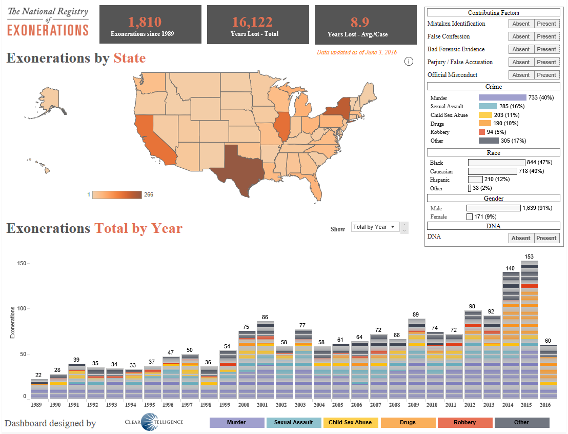
Link: https://public.tableau.com/profile/dustiboy21#!/vizhome/ExonerationDashboardv2/ExonerationsDashboard
What he taught me was that when people see data visualizations, they immediately assume all the underlying data is accurate and any opinion presented by the author is true as well. I keep that in mind when writing my own data stories, checking and citing my sources, and in my efforts to fully research complicated topics before offering an analysis in text to the reader. In other words, dataNOTdoctrine constantly reminds me that the fine line between parable and propaganda is based on the integrity of the author and the quality of the data.
dataNOTdoctrine constantly reminds me that the fine line between parable and propaganda is based on the integrity of the author and the quality of the data.
Michael: You are the co-organizer of the BostonTUG. Can you tell my readers a little about the BostonTUG, the kinds of activities you host, etc.
Will: Have you ever been to Fenway Park? How about the Redwood Forests in Northern California? That is how I feel at every single BostonTUG meetup; our corner of the greater Tableau Community gathering to share their passion for viewing and creating data visualizations. And not just great business dashboards, but beautiful works of data art too. Being asked to take over as co-lead with Dustin is without question the highest honor of my professional career.

Our meetups have been held at amazing venues all over Eastern Massachusetts such as Gillette Stadium, Fenway Park, and Harpoon Brewery just to name a few. Presentation topics can range from highly technical business use cases and success stories, to fun data stories and viz contests. Our keynotes regularly feature Zen Masters like Jonathan Drummey, Layla Manheim, Mike Cisneros, Ryan Sleeper, Steve Wexler, Dan Murray and at our next meeting in September Chantilly Jaggernauth!
While we think we have the best venues and speakers of any TUG in the world, the focus of our community is on our members. Between each meeting the community nominated great local data artists or singular vizzes with the tag #WickedVizzah. The top three entries are voted on a week before the next meeting and the winner gets some sweet swag and a chance to share their personal data-viz story on stage. Dustin and I were both given opportunities to present our passion for Tableau in the past and are committed to paying it forward as often as we can.

Here is a link to our next meetup if you or any of your readers are in Boston on September 19th https://usergroups.tableau.com/september2019bostontug
MIchael: What do you feel is missing from Tableau Desktop? What features would be on your wish list to see added to the application?
Will: Built in animation options on Tableau Server and Tableau Public would be an absolute game changer, but I would settle for spell check in text boxes!
Michael: What is next on your “To Do” list? What can the Tableau community expect to see from you in the near future?
Will: Your readers can find me holding back tears of joy at every single BostonTUG meetup for the foreseeable future. This group is so special to me. Dustin and I are really committed to putting everything we have into supporting this community and the people who make it so wonderful.
There are a few passion projects I hope to complete this year. One is a series of data visualizations about my home, Silver Fox Farm. We moved there in November of last year and have been observing and documenting everything from rare bird species like Golden Eagles, Bobolinks, and American Kestrels to what time of day our chickens and ducks lay the most eggs. Our goal is to use data visualization and analytics to guide our efforts to becoming a completely self-sustained permaculture habitat.
Another viz in development is about my struggles with obesity and mental health issues. This one is obviously personal, but I am sharing it because the best encouragement and support given to me over the years was from others openly battling the same problems. There are weight loss and BMI goals I want to hit of course, but if I am successful AND can inspire at least one other person to find their own path towards a healthier life, I will be very content.
Thank you again for the chance to share some of my journey with you and your readers!
Tableau Public
Link: https://public.tableau.com/profile/william.strouse#!/