
With me starting my new job with USAA last week, I decided it was time for me to become more involved in the opportunities out there for us to improve our data analysis, data visualization and Tableau skills. For me, this meant starting to participate in #MakeOverMonday.
For the record, I have never participated in #MakeOverMonday before. I recently began reading Andy Kriebel and Eva Murray’s book, #MakeoverMonday: Improving How We Visualize and Analyze Data, One Chart at a Time, and was fascinated by their insights and recommendations on how to create better data visualizations. I felt this was a good opportunity for me to improve my skills in data visualization as well as how I think about data. Although, I had attended various training classes from Edward Tufte and Stephen Few over the past 10-15 years, I felt Andy and Eva were offering a new generation of perspective on these topics. This is no slight to Mr. Tufte or Mr. Few (both of who I think are two of the original innovators and trail blazers in our field), but like everything we do in the business intelligence and analytics space, it was time for me to seek out new voices and perspectives on the topics of data visualization as well as data analysis in general.
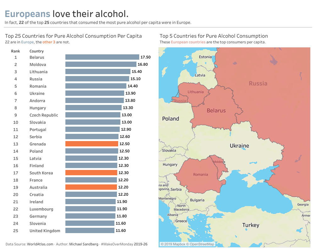
So, I completed my entry for week #26 which was based on the topic, Alcohol Consumption By Country and posted it on Tableau Public.
Here is the link.
Step 1: Reading the Article and Analyzing the Data.
I started out my analysis by reading the article on worldatlas.com, and I focused on a few key paragraphs and sentences.
…the best way to measure alcohol consumption anywhere in the world is through the per capita consumption of pure alcohol within a given country. “Pure alcohol” is an important constraint, as some forms of alcoholic beverages are very intoxicating, while others have much less actual alcohol within them.
This paragraph told me that I want to emphasize that we are referring to “Pure Alcohol” versus just using the term “Alcohol.”
We need to note here that we are not discussing rates of alcoholism, which is an addiction to the consumption of alcohol, but rather the average consumption of alcohol within a country. That is why we use per capita consumption of pure alcohol as a measurement to avoid being biased as much as possible.
I saw this as good information to know, but it was not something I needed to use for the story my dataviz would tell. I could have done additional research to find alcoholism rates in each of these countries, but I felt it was out of scope of the story.
European countries might exhibit such a trend because major producers of the biggest alcoholic brands originate from there, which can itself be attributed to the fact that drinking has been a cultural institution for these countries for many centuries, and the activity has been passed down through successive generations.
So, I thought it might be interesting to show which of these countries were producers of major alcoholic brands. I did some research and was not finding data I would have liked to use here, and again, this was my first #MakeOverMonday entry, so I thought I would save valued-added information like this for future entries I submit.
Another factor might be attributed to weather conditions. Many of the countries listed lie within some of the coldest regions on earth. Populations in these regions may tend to consume a lot of alcohol in order to negate the effects of cold weather, as alcohol can create an illusion of ‘warming’ the body.
Again, I also thought it might be interesting to show which of these countries had longer periods of cold weather. I did some research and was able to find data about weather conditions for these countries, but felt it was also out of scope of the story. Again, as I pointed out earlier, this was my first #MakeOverMonday entry, so I thought I would save valued-added information like this for future entries I submit. I really wanted to focus on learning the process of creating and submitting a #MakeOverMonday entry for this round.
…more research needs to be done to concretely define the effects of a high per capita alcohol consumption on a country.
Another interesting point, but really out of scope for this story.
Tableau Best Practices I Followed
More discussion coming later this week.
