
Marian Eerens Bio
Born, raised and currently residing in Belgium; Marian went to culinary school but changed careers when she got her first job in IT support. She’s held several operational roles in Customer Service since then (customer advocate, process specialist, team leader, global process leader); and until recently she was supporting the different teams around the globe by providing intelligence on performance levels and maintaining the organisation’s dashboards in Tableau. Her journey into data visualization and specifically Tableau was an ‘accidental’ one but her interest and fascination with how we visualize information to tell a better story has always been there.
After having attended her first Tableau Conference in London in 2018 she became active in the online community through initiatives like #MakeoverMonday which allowed her to further develop her skills and take the lessons learnt back to work. She recently obtained her first Tableau Certification and is currently working towards taking the Tableau Desktop Qualified Associate (DQA) exam.
Outside of work Marian enjoys going on culinary adventures and exploring different corners of the world through the lens of her camera.
You can connect with Marian via Tableau Public – LinkedIn – Blog – Twitter
QUESTIONS
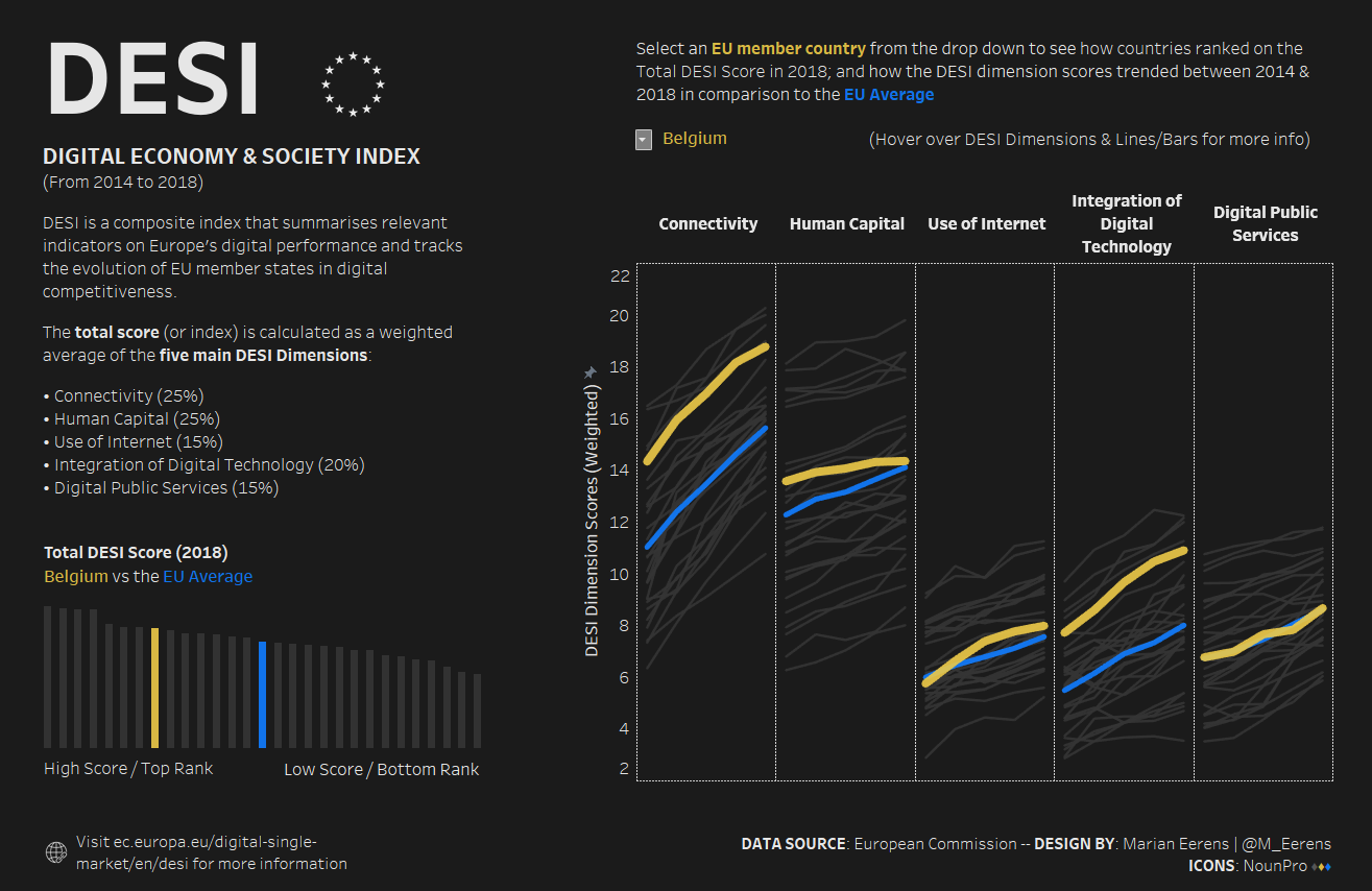
Michael: Hello Marian. On Tableau Public, your dataviz for DESI: Digital Economy & Society Index was recently selected as Viz of the Day (VOTD).
Can you tell my readers the process you went through to develop this data visualization? For example, how you gathered and prepped the data, created the design, and translated that into Tableau.
Marian: My ‘DESI’ was actually a late submission for MakeoverMonday. We’d been having some interesting conversations at work on our own “digital readiness“ and when I saw the dataset come out; I knew I had to create something with it and that I wanted to take my time.
I should mention that part of the design was very much inspired by Erik Rettman’s viz. It started with me wanting to see if I could replicate what he had created, and all the other pieces fell into place as I started building it out in Tableau. I wanted to add some additional context to help people understand what they were viewing. If you’re going to create an exploratory viz, I believe it’s important to provide just the right amount of information (not too much) to help people frame up the data. So I put in a few additional elements like how the score is calculated and a short explanation of the different dimensions.
Inspiration for me is something infinite. I usually get too many ideas then I know what to do with; for this project however the choice of colours was immediate. I wanted it to be ‘themed’ in using blue for the EU and yellow for the different member countries but the colours didn’t really pop on a white background, so I went with a very dark grey to really make them stand out and draw folks in. The choice of background meant that I didn’t have too many options to fill in the lines/bars so I went with a lighter shade of the background colour so you could still see the ‘part of whole’ but without taking away from the highlights which were meant to be the focus. You’ll see that all other text is white except for any mention of the EU or the different countries which was very much a deliberate choice.
With regards to the data-prep, I had some challenges with using calculations to add the rankings to the individual DESI dimensions, so I went back and added them to the data-source rather than using calculations. There are probably better ways to do it but that’s what I went with at the time.
One of the best reactions I received from folks after having received VOTD was actually when a colleague reached out to me because they had seen my work shown as “Viz of The Week” when they opened Tableau Desktop and they wanted to know more about how I created it. I’m currently putting the finishing touches on a blog post which will released as soon as possible.
Michael: Can you tell us a bit about how you use Tableau on a day-to-day basis in your work?
Marian: I started using Tableau a little under a year ago. We were having conversations at work about how we could operationalize our metrics more. Instead of being re-active and reviewing a table of numbers at the end of the month, the idea was to be more pro-active and start using the data to drive the performance of the teams. I did my homework on BI tools and stumbled onto Tableau. I knew at the time other departments were using it for reporting purposes, so I managed to convince my boss to send me to the Tableau Conference in London to get some training and learn what others were doing; and that’s really where my journey started.
When I look back, the very first dashboard I built (this was before I knew anything about Tableau or dataviz best practices) was just awful, but people were very excited about actually being able to see what’s happening on a daily basis which has been a real game changer. The KPI dashboards I launched have very much changed the conversations the teams are now having. Not only have they changed how we manage the ‘day-to-day’, but we also started having different conversations around making process changes to be able to better fulfill the needs of our customers.
Michael: Can you tell us three of your favourite Tableau Desktop tips and tricks?
Marian: This is always my fav question!
Changing Colours
This is a 2-for-1 and one my favourite tips to date. You can choose any colour for the different values straight from the ‘Edit Colors’ menu by simply clicking on the square in front of the value. And it gets even better, you can then drag the sampled colour to your ‘Custom Colors’ section preserving it for future use.

Information Button
This is the simplest information button you’ve ever created, and the best part is you won’t need to mess around with custom shapes.
- On the Marks Card double-click in the blank space at the bottom
- Type “i” in the blank pill
- Change the mark to ‘Circle’
- Change from ‘Detail’ to ‘Label’
- Change the size and colour of the circle as you see fit and adjust the font and colour of the “i” (I used Arial MT Bold in my example)
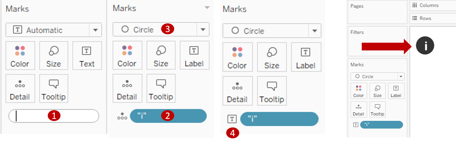
And if you really wanted to get creative, you could consider using ALT CODE characters or even some UNICODE arrows to create buttons as seen below.

Validating your Table Calculations
Something I picked up during a webinar (and which has really helped me out several times already) is when you are working with table calcs. Temporarily change the Mark to ‘Text’ and add totals to your columns and rows so you can validate the calculations are giving the results you expected.
Michael: You are a regular participant in #MakeoverMonday. Can you tell my readers how participating has helped develop your Tableau skills?
Marian: I haven’t been as active as I would like to be this year, but I’m am working on getting my groove back. Last year participating in MakeoverMonday really allowed me to practice my Tableau skills and get better insights into what makes a great dataviz. And I got to meet some pretty amazing people along the way.
For me joining the community was a way to learn from experts (for free!!) and practice, practice, practice. If you want to become good at something you have to put in the time, and I did pretty consistently over a period of 6 months … and it paid off. I passed my first certification exam and was able to elevate the quality of my dashboards at work up to a point where others started asking me to help them out with their designs.
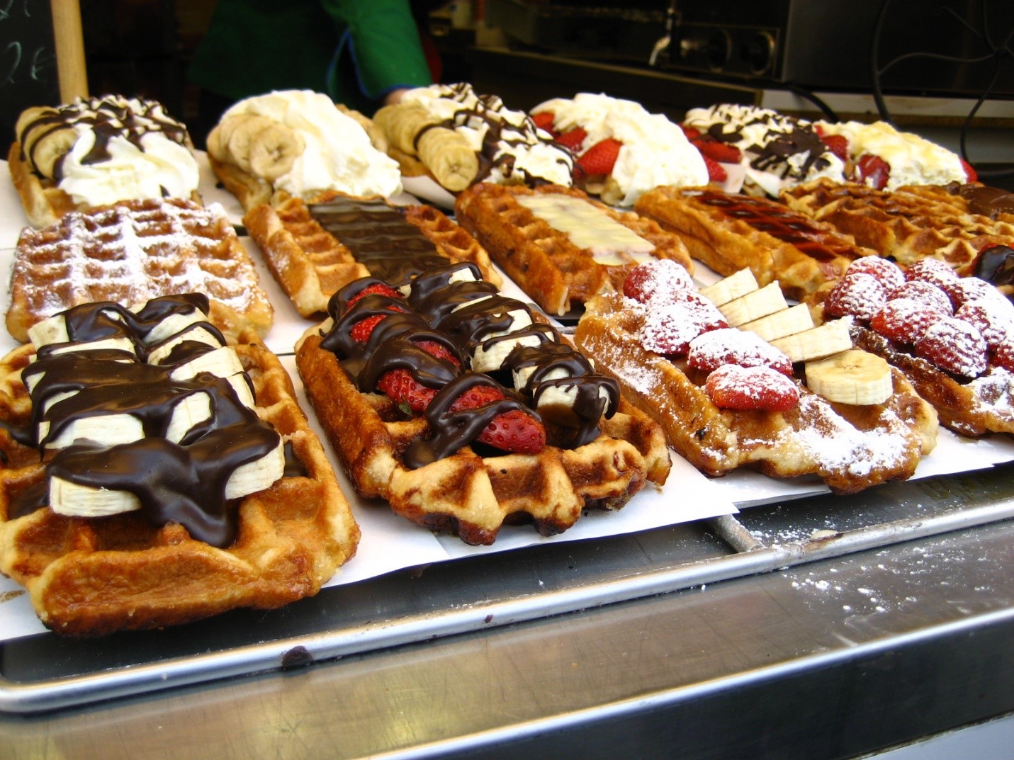
Michael: What makes a real Belgian Waffle great?
Marian: Not to make things too complicated but in Belgium there is actually no such thing as a ‘Belgian Waffle’. The 2 main varieties of waffles are called the ‘Liege Waffle’ and the ‘Brussels Waffle’. My favorite is the Liege Waffle and no toppings please, you don’t mess with a good thing. I have very fond memories of getting ready for boarding school on a Sunday afternoon and my mom had just baked a fresh batch for me and my brothers to take with us to school. The secret is in the dough and how well you’ve mixed in the ‘pearled’ sugar (the real thing, none of that DIY stuff please) so that it partly melt into in the dough as the waffles are baking. Don’t eat them when they come straight out of the iron, let them rest for a few minutes so the dough can set and cool off a bit.
Michael: What is next on your “To Do” list? What can the Tableau community expect to see from you in the near future?
Marian: Give back more. More blogging and supporting #VizForSocialGood.
2019 is also a year of trying new things and putting myself out there more so who knows, perhaps giving a talk at one of the upcoming conferences or user groups.
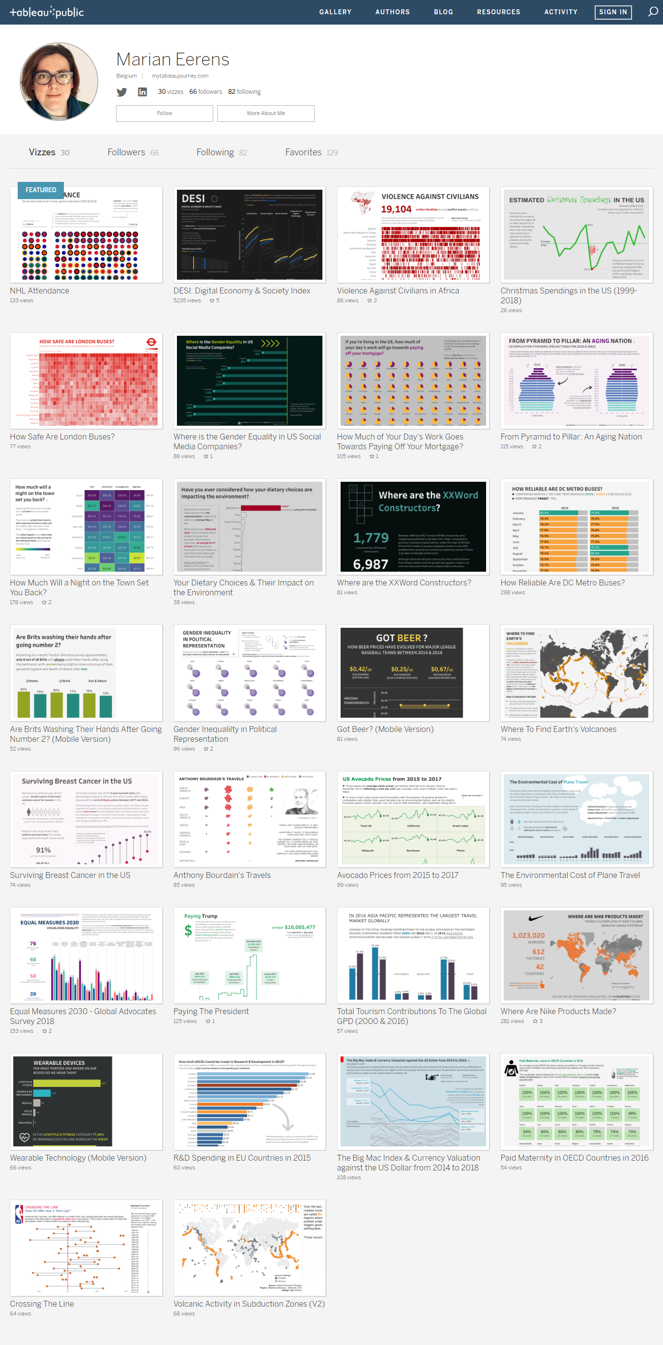
Tableau Public
Link: https://public.tableau.com/profile/marian.eerens#!/

One thought on “Tableau Community Spotlight: An Interview with Marian Eerens”